Principal Component Analysis in Python (Example Code)
In this tutorial, we’ll explain how to perform a Principal Component Analysis (PCA) using scikit-learn in the Python programming language.
Table of content:
Read further if you want to learn more about PCA in Python!
Step 1: Libraries and Data Preparation
First of all, we need to import the relevant libraries, which will help us with performing the analysis and visualizing the results.
import numpy as np
import pandas as pd
import matplotlib.pyplot as plt
from sklearn.datasets import load_diabetes
from sklearn.preprocessing import StandardScaler
from sklearn.decomposition import PCA

plt.style.use('ggplot')
A data set called diabetes of the scikit-learn library (formerly scikits.learn; also known as sklearn) will be used. First, we will load it using the load() function of scikit-learn, and then convert it into a pandas DataFrame. Finally, we will use the head() method to show the first 6 rows.
diabetes = load_diabetes()
df = pd.DataFrame(data=diabetes.data,
                  columns=diabetes.feature_names)

df.head(6)

Now we can go straight to the analysis and visualization!
Step 2: Data Standardization
We need to scale our variables before conducting the analysis to avoid misleading PCA results due to unit differences. To scale our data to the units with means of 0s and variances of 1s, also called standardization, we will use the StandardScaler class of scikit-learn.
First, we will create a StandardScaler class object, then use it to fit our data matrix and transform the data into the new scale. Please see below.
scaler = StandardScaler()

scaler.fit(df)

Diabetes_scaled = scaler.transform(df)
As a result, we obtained a two-dimensional NumPy array that has 442 rows and 10 columns. We can convert it to a pandas DataFrame to display the data decently. See the first six rows below.
dataframe_scaled = pd.DataFrame(data=Diabetes_scaled,
                                columns=diabetes.feature_names)

dataframe_scaled.head(6)

Now, we have the same data yet standardized. So we are ready to run PCA!
Step 3: Ideal Number of Components
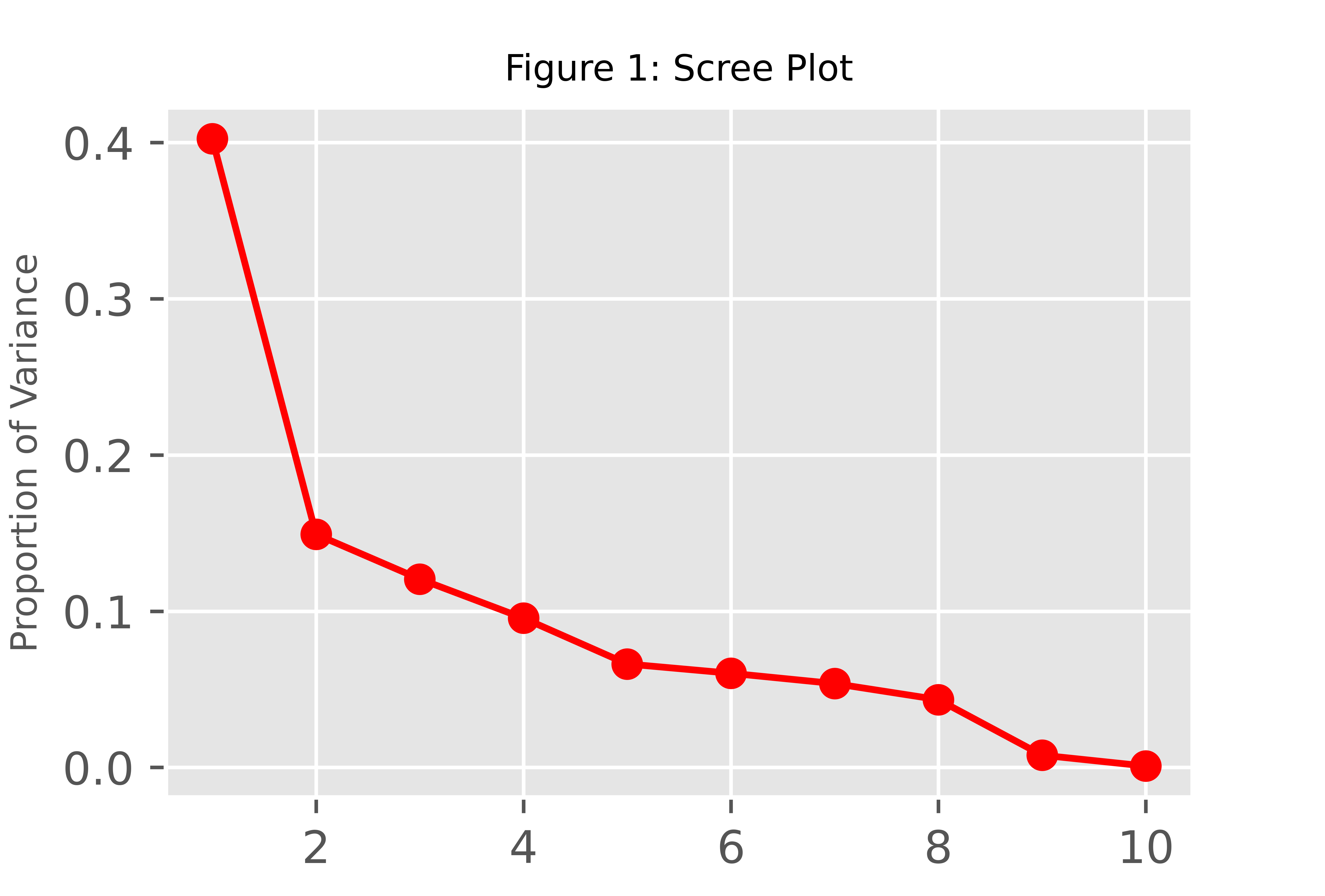
First, we should choose the ideal number of components before interpreting the results. One alternative is to conduct a PCA for all or an arbitrarily large number of components, then visualize the percentage of explained variance or the eigenvalues per component using a scree plot. Based on the graph, the optimal number can be selected. Let’s run our PCA for ten components!
pca = PCA(n_components=10)

pca.fit_transform(Diabetes_scaled)
Once we have our PCA done, we can extract the proportion of variance explained and the eigenvalues as follows.
prop_var = pca.explained_variance_ratio_
eigenvalues = pca.explained_variance_
In this tutorial, we will plot the scree plot using the proportion of variance explained. If you want to learn more about plotting a scree plot in Python, see our tutorial: Scree Plot in Python.
PC_numbers = np.arange(pca.n_components_) + 1

plt.plot(PC_numbers,
         prop_var,
         'ro-')
plt.title('Figure 1: Scree Plot', fontsize=8)
plt.ylabel('Proportion of Variance', fontsize=8)
plt.show()

Assuming the first 2 components should retain considering the elbow rule, we can rerun the PCA and interpret the results for the first two components.
Step 4: Principal Component Calculation and Result Interpretation
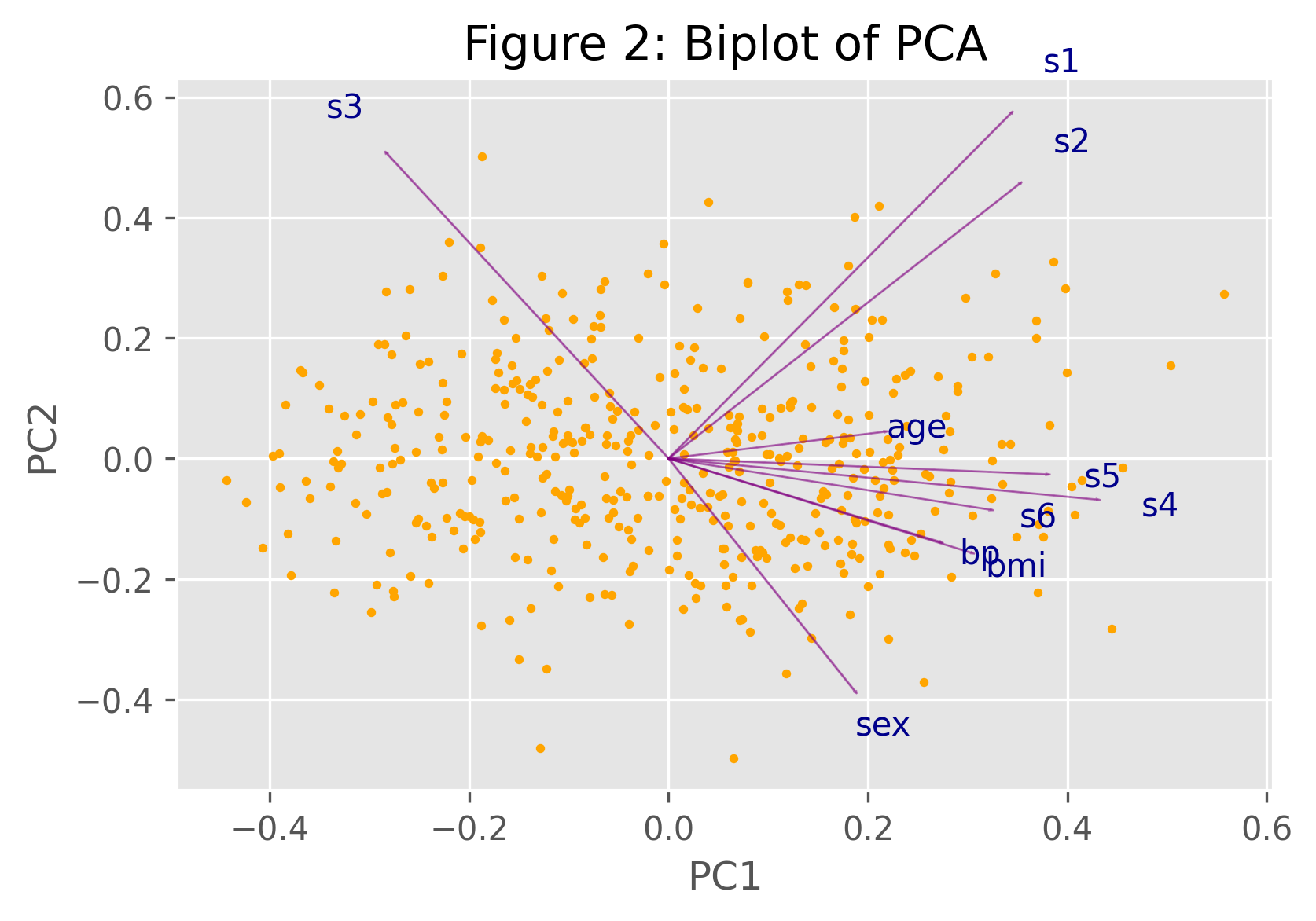
We will transform our variables into the principal components using the PCA algorithm of sklearn.decomposition. Afterward, we can visualize our results in a biplot for statistical inference. For other alternatives of PCA visualization, see Visualisation of PCA in Python.
pca = PCA(n_components=2)
PC = pca.fit_transform(Diabetes_scaled)
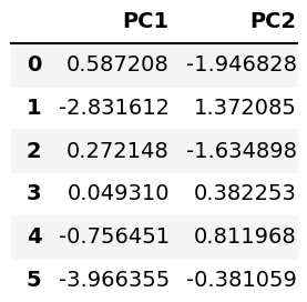
Let’s store the component scores in a DataFrame and check it via the head() method!
pca_diabetes = pd.DataFrame(data = PC,
                            columns = ['PC1', 'PC2'])

pca_diabetes.head(6)

Now, we can form the biplot. For further information on how to do this, see Biplot in Python. Here, we will use a user-defined biplot() function for the implementation.
def biplot(score,coef,labels=None):

    xs = score[:,0]
    ys = score[:,1]
    n = coef.shape[0]
    scalex = 1.0/(xs.max() - xs.min())
    scaley = 1.0/(ys.max() - ys.min())
    plt.scatter(xs * scalex,ys * scaley,
                s=5,
                color='orange')

    for i in range(n):
        plt.arrow(0, 0, coef[i,0],
                  coef[i,1],color = 'purple',
                  alpha = 0.5)
        plt.text(coef[i,0]* 1.15,
                 coef[i,1] * 1.15,
                 labels[i],
                 color = 'darkblue',
                 ha = 'center',
                 va = 'center')

    plt.xlabel("PC{}".format(1))
    plt.ylabel("PC{}".format(2))


    plt.figure()
After defining our function, we just have to call it.
plt.title('Biplot of PCA')

biplot(PC,
       np.transpose(pca.components_),
       list(diabetes.feature_names))

To understand the implied relations shown by the biplot above, please see our Biplot Explained tutorial.
Video, Further Resources & Summary
Do you want to learn more about how to perform a PCA in the Python programming language? Then have a look at the following YouTube video of the Statistics Globe YouTube channel.
You can also check some of the other tutorials available in Statistics Globe:
- What is a Principal Component Analysis?
- PCA Using Correlation & Covariance Matrix
- Choose Optimal Number of Components for PCA
- Scree Plot for PCA Explained
- Biplot for PCA Explained
- Biplot in Python
In this post you could read about how to perform a PCA using scikit-learn in Python. If you have any further questions, you can leave a comment below.
Subscribe to the Statistics Globe Newsletter
Get regular updates on the latest tutorials, offers & news at Statistics Globe.
I hate spam & you may opt out anytime: Privacy Policy.
Thank you!
Welcome to the Statistics Globe newsletter. From now on, I’ll send you regular emails about statistics, data science, AI, and programming with R and Python.
I’m Joachim Schork. On this website, I provide statistics tutorials as well as code in Python and R programming.
Statistics Globe Newsletter
Get regular updates on the latest tutorials, offers & news at Statistics Globe. I hate spam & you may opt out anytime: Privacy Policy.
Thank you!
Please check your email inbox and click the confirmation link to complete your subscription. If you don’t see the email within a few minutes, please also check your spam/junk folder.


2 Comments. Leave new
Thanks for the code however I found it confusing that you load the scaled diabetes dataset then scale it again? Maybe use “diabetes = load_diabetes(scaled=False)” so people can see the original dataset values then the scaled values.
Hi Mike,
Thank you for the kind comment and your feedback. The scaling in Step 2 actually changes the results. Please compare the datasets df vs. Diabetes_scaled to see the differences.
Best regards,
Joachim