How to Combine PCA & k-means Clustering (Example)
In this post, I’ll show the use of combining PCA with (k-means) clustering. The tutorial will contain the following sections:
Let’s just jump right in!
Introduction
Cluster analysis aims to identify hidden patterns or structures within an unlabeled dataset. More specifically, it aims to partition the data into groups such that data points within a group are more similar to each other than they are to data points in other groups.
In the presence of high-dimensional data, selecting relevant variables to be used in clustering could be hard. In that regard, employing PCA before clustering is useful to reduce the dimensionality of your data and discard the noise. PCA also brings another advantage by creating a new set of uncorrelated variables, ensuring each variable holds unique information and has equal significance in determining clusters.
Furthermore, the clustering results can be represented in a reduced dimensional space in relation to the initial principal components, which eases the visualization and interpretation of the results. Without further ado, let’s create our sample data for the demonstration!
Sample Data
As sample data, I will use the built-in mtcars dataset in the R programming language. This dataset contains the fuel consumption (mpg) and 10 aspects of automobile design and performance for 32 automobiles (1973-74 models). See below for the first few rows of the dataset.

As seen, the dataset contains 11 continuous and discrete (ordinal and nominal) numeric variables. To obtain reliable PCA results, I will exclude the discrete variables and only work with the fuel consumption (mpg), engine displacement (disp), gross horsepower (hp), rear axle ratio (drat), weight (1000 lbs) (wt) and 1/4 mile time (qsec). For alternatives of PCA working with categorical and mixed data, see our tutorial: Can PCA be Used for Categorical Variables?
Please also be aware that the retained variables will be standardized to avoid biased PCA results. See: PCA Using Correlation & Covariance Matrix for further explanation. If you are ready, let’s cluster it!!
Example: k-means Clustering Combined with PCA
The first step is to perform a PCA to reduce the dimensionality of the data. Then we can decide on the number of components to retain based on the percentage of explained variance per principal component.

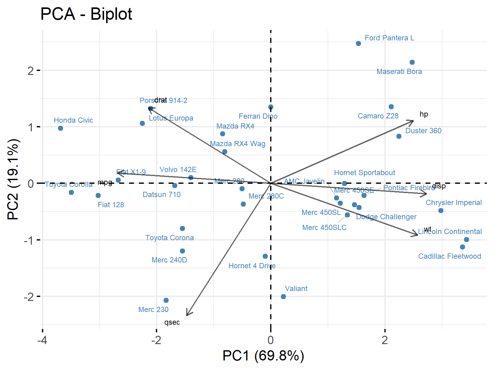
Table 2 shows that the first two principal components explain enough variation, with 90% in total. So we can use only these components to explain our data and neglect the rest, then visualize our data in 2D reduced dimensional space via a biplot.

Figure 1 shows that the higher PC1 scores correspond to increased horsepower, engine displacement, and weight but decreased fuel consumption, rear axle ratio, and quarter-mile time. Conversely, higher PC2 scores refer to increased rear axle ratio and horsepower but decreased weight and quarter-mile time. To learn more about how to interpret biplots, see Biplot for PCA Explained.
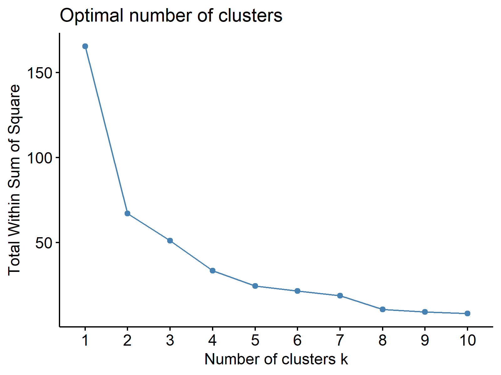
Knowing what the principal components represent, we can skip to the k-means clustering analysis. But first, we must determine the number of clusters to form. I will use the within-cluster sum of squares measure, which indicates the compactness of the clusters. A lower value indicates better clustering.
As the selection method, I will employ the elbow method, which suggests selecting the number of clusters at which the rate of decrease in the within-cluster sum of squares slows down and forms an elbow shape in the plot of choice. Let’s check the respective plot out!

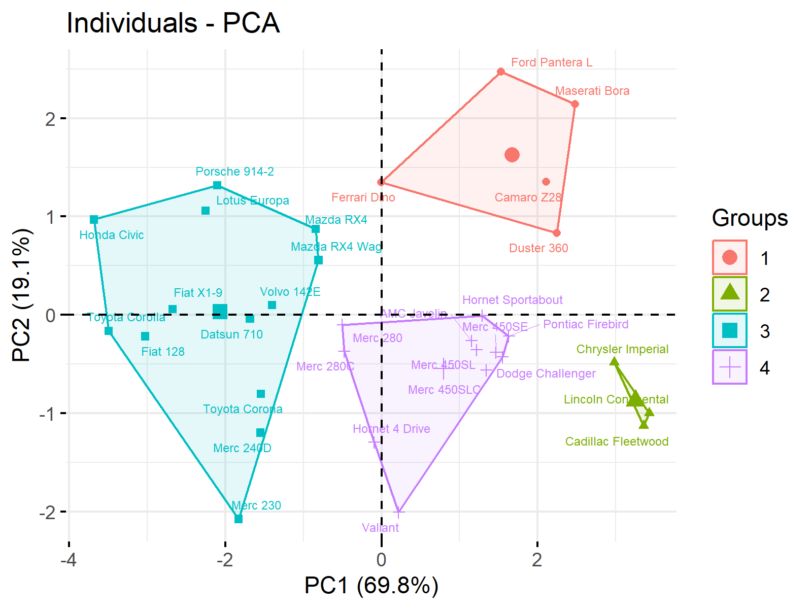
Based on Figure 2, forming 4 clusters is convenient for grouping similar observations. Relatedly, we can run our k-means cluster analysis, grouping our data around four centers, also known as centroids. See the visual of the results below.

You see how the data points are grouped based on similar principal component scores in Figure 3. Now we can interpret the clusters in the light of what principal components represent (check the biplot given earlier) as follows.
- Group 1 represents the cars with high horsepower (hp) but low 1/4 mile time (qsec).
- Group 2 represents the cars with large engine displacement (disp) and weight (wt) but a low rear axle ratio (drat).
- Group 3 represents the cars with increased rear axle ratio (drat), fuel consumption (mpg), and 1/4 mile time (qsec) but decreased horsepower (hp), engine displacement (disp) and weight (wt).
- Group 4 represents the cars with increased 1/4 mile time (qsec) and weight (wt) but decreased rear axle ratio (drat) and horsepower (hp).
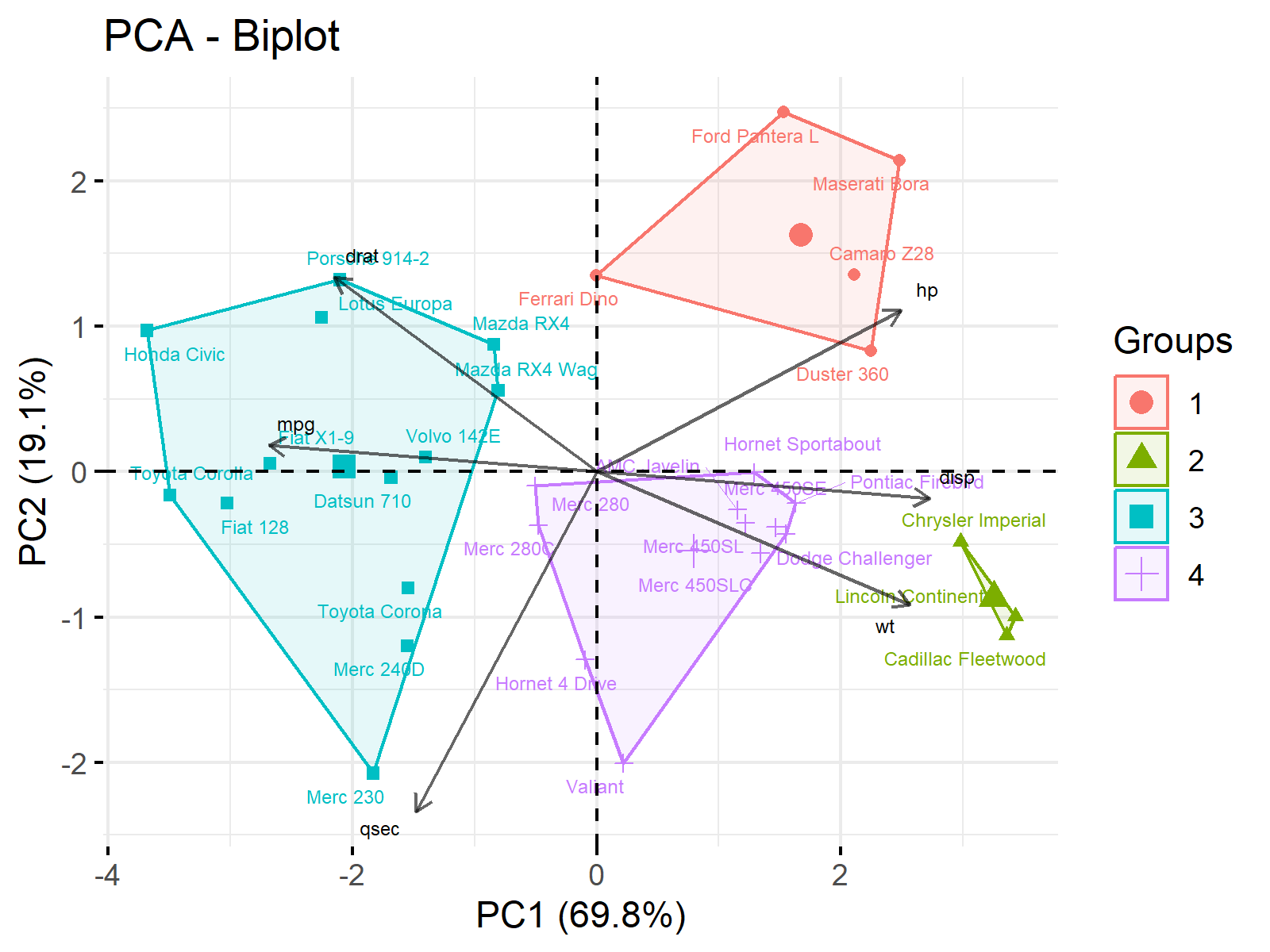
If you want to see all information regarding the component-variable relations and the clusters, then you can also visualize a combined plot as given below. But please be aware that this type of graph may not be the best option in the presence of a large dataset.

As you can see, the visualization and interpretation of the clustering results got easier using PCA. For the computation of the shown steps in R and Python, see our tutorials PCA Before k-means Clustering in R and PCA Before k-means Clustering in Python, to be published soon.
Video & Further Resources
Do you need more explanations on how to apply PCA before k-means clustering? Then you should take a look at the following YouTube video of the Statistics Globe YouTube channel, in which I explain how to apply k-means clustering after applying a PCA in R programming.
Moreover, you could check some of the other tutorials on Statistics Globe:
- What is a Principal Component Analysis (PCA)?
- Choose Optimal Number of Components for PCA
- Can PCA be Used for Categorical Variables?
- PCA Using Correlation & Covariance Matrix
- Principal Component Analysis (PCA) in R
- Visualization of PCA in R
- Biplot for PCA Explained
- Biplot of PCA in R
- PCA Before k-means Clustering in Python
- PCA Before k-means Clustering in R
You have learned in this tutorial how to combine PCA with k-means clustering in R programming. Please let me know in the comments section below if you have additional questions.
This page was created in collaboration with Cansu Kebabci. Have a look at Cansu’s author page to get more information about her professional background, a list of all his tutorials, as well as an overview of her other tasks on Statistics Globe.
Subscribe to the Statistics Globe Newsletter
Get regular updates on the latest tutorials, offers & news at Statistics Globe.
I hate spam & you may opt out anytime: Privacy Policy.
Thank you!
Welcome to the Statistics Globe newsletter. From now on, I’ll send you regular emails about statistics, data science, AI, and programming with R and Python.
I’m Joachim Schork. On this website, I provide statistics tutorials as well as code in Python and R programming.
Statistics Globe Newsletter
Get regular updates on the latest tutorials, offers & news at Statistics Globe. I hate spam & you may opt out anytime: Privacy Policy.
Thank you!
Please check your email inbox and click the confirmation link to complete your subscription. If you don’t see the email within a few minutes, please also check your spam/junk folder.


2 Comments. Leave new
Well explained. Can I get some reference book name regarding PCA basics to advanced mathematical explanation.
Hello Kayum,
I am glad that you liked our tutorial. You can visit our main PCA tutorial for the basic mathematical explanation. For more advanced mathematical explanations, you can check the book Applied Multivariate Statistical Analysis” by Richard A. Johnson and Dean W.
Best,
Cansu