Draw Biplot of PCA in Python (3 Examples)
In this tutorial, you’ll learn how to create a biplot of a Principal Component Analysis (PCA) using the Python programming language.
The table of contents is shown below:
Let’s get started!
Example Data & Libraries
First, we will import some libraries to be used in the tutorial.
import pandas as pd
import numpy as np
import matplotlib.pyplot as plt
import seaborn as sns
from sklearn.datasets import load_diabetes
from sklearn.preprocessing import StandardScaler
from sklearn.decomposition import PCA
Next, we will load the diabetes dataset containing ten features and a target column, which measures the disease progression in one year with respect to the baseline for 442 patients. Then, we will convert it into a DataFrame using the pd.DataFrame() function. After doing this, we will see what the first six rows of our data look like via the head() method.
diabetes = load_diabetes()
df = pd.DataFrame(data=diabetes.data,
                  columns=diabetes.feature_names)

df.head(6)

As seen, the dataset was successfully loaded. Now, let’s perform our PCA!
Scale Data and Perform PCA
Before performing the PCA, it’s important to scale our data to get better results. First, we will create a StandardScaler class object, then use it to fit our data matrix and transform the data into the new scale.
scaler = StandardScaler()

scaler.fit(df)

Diabetes_scaled = scaler.transform(df)
After this step, we will obtain the scaled data in a two-dimensional NumPy array with the exact dimensions as our original dataset.
Now, we can perform the PCA using the sklearn.decomposition.PCA algorithm. In this context, we will choose two principal components to perform our PCA, but see our tutorial Choose Optimal Number of Components for PCA if you want to learn how to select the ideal number of components in PCA.
pca = PCA(n_components=2)
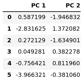
After running the analysis, we can observe the principal component scores in a pandas DataFrame, as shown below. The scatter points in biplots show this data.
PC_scores = pd.DataFrame(pca.fit_transform(Diabetes_scaled),
               columns = ['PC 1', 'PC 2'])
PC_scores.head(6)

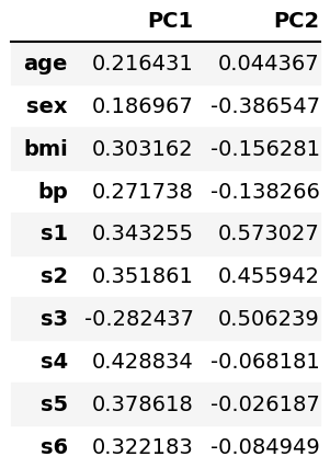
It is also possible to see the loadings in a DataFrame, as given below. The vectors in the biplots represent this data.
loadings = pd.DataFrame(pca.components_.T, columns=['PC1', 'PC2'],
                        index=diabetes.feature_names)
loadings

Data of Biplot
In the previous section, we showed what kind of data of PCA is used in biplots. Now it is time to store them in variables before plotting. The arrays of the first and second principal components’ scores are saved under PC1 and PC2, whereas the array of loadings is saved as ldngs.
PC1 = pca.fit_transform(Diabetes_scaled)[:,0]
PC2 = pca.fit_transform(Diabetes_scaled)[:,1]
ldngs = pca.components_
We should also define the scaling factors scalePC1 and scalePC2 to fit the data of PC1, PC2 and ldngs on the same plot. Additionally, we can define the target group names to label the target groups in our biplots, see features below.
scalePC1 = 1.0/(PC1.max() - PC1.min())
scalePC2 = 1.0/(PC2.max() - PC2.min())
features = diabetes.feature_names
All are set and done, let’s start plotting!
1. Biplot Using Matplotlib
In this section we will show examples of how to create biplots using the Matplotlib library. Let’s check the first example!
Example 1: Basic Biplot
In this example, we will create a basic biplot using a for loop to plot the loading vectors labeled per feature. Then, we will use the scatter() function to plot the scatter points.
fig, ax = plt.subplots(figsize=(14, 9))

for i, feature in enumerate(features):
    ax.arrow(0, 0, ldngs[0, i],
             ldngs[1, i])
    ax.text(ldngs[0, i] * 1.15,
            ldngs[1, i] * 1.15,
            feature, fontsize=18)

ax.scatter(PC1 * scalePC1,PC2 * scalePC2)

ax.set_xlabel('PC1', fontsize=20)
ax.set_ylabel('PC2', fontsize=20)
ax.set_title('Figure 1', fontsize=20)
First, we loop through each feature of features that we have previously defined. Inside this loop, you can find the ax.arrow() function, which plots the vectors to represent the loadings per feature and the ax.text() function, which labels the feature names for each vector. Right after this, the ax.scatter() function plots the scatter points mapping the scaled PC1 and PC2 scores.
Figure 1 is the visual we get by some default settings of Matplotlib. However, we can customize our biplot’s data points and loading vectors. Let’s see how to do it!
Example 2: Customized Biplot with Labeled Points & Colored-Resized Vectors
The size and color of the loading vectors can be easily customized by adding the head_width, head_length and color arguments into the ax.arrow() function, as seen below.
fig, ax = plt.subplots(figsize=(14, 9))

for i, feature in enumerate(features):
    ax.arrow(0, 0, ldngs[0, i],
             ldngs[1, i],
             head_width=0.03,
             head_length=0.03,
             color="red")
    ax.text(ldngs[0, i] * 1.15,
            ldngs[1, i] * 1.15,
            feature,color="red", fontsize=18)

    ax.scatter(PC1 * scalePC1,
                    PC2 * scalePC2, s=5)

for i, label in enumerate(PC_scores.index):
    ax.text(PC1[i] * scalePC1,
            PC2[i] * scalePC2, str(label),
            fontsize=10)

ax.set_xlabel('PC1', fontsize=20)
ax.set_ylabel('PC2', fontsize=20)
ax.set_title('Figure 2', fontsize=20)
Similarly, we can add the s argument into the ax.scatter() function to resize the scatter points. However, we need to define a for loop to loop through PC_scores.index to label the scatter points iterating through 442 individuals.
It would also be interesting to show the target groups of the dataset to see how they are segregated based on the new variables PC1 and PC2. Let’s see how to implement this in the next example!
Example 3: Customized Biplot Colored By Target
We will color our scatter points by the target group in this example. Considering the high number of target groups, we will cluster them into equally sized three groups to get a better visualization. To do this, the digitize() function of NumPy will be called to divide the observations based on the given quantiles.
target_groups = np.digitize(diabetes.target,
                            np.quantile(diabetes.target,
                                        [1/3, 2/3]))
As a result, we will get the target_groups array, which takes the values of 0, 1, or 2 indicating the group. Now we can plug it into the ax.scatter() function to color our biplot. Please also be aware that the color map 'viridis' will be included in the function via the cmap argument. Many other color map options are available in Matplotlib if you are interested.
fig, ax = plt.subplots(figsize=(14, 9))

for i, feature in enumerate(features):
    ax.arrow(0, 0, ldngs[0, i],
             ldngs[1, i],
             head_width=0.03,
             head_length=0.03)
    ax.text(ldngs[0, i] * 1.15,
            ldngs[1, i] * 1.15,
            feature, fontsize = 18)

scatter = ax.scatter(PC1 * scalePC1,
                     PC2 * scalePC2,
                     c=target_groups,
                     cmap='viridis')

ax.set_xlabel('PC1', fontsize=20)
ax.set_ylabel('PC2', fontsize=20)
ax.set_title('Figure 3', fontsize=20)

ax.legend(*scatter.legend_elements(),
                    loc="lower left",
                    title="Groups")
Note that we have also created a legend called legend1, which indicates the color-group matches, using ax.legend().
We could also use the seaborn library to visualize our biplots. Let’s see how differently it operates!
2. Biplot of PCA Using seaborn
This section will show how to create biplots using the seaborn library. Let’s start with the first example!
Example 1: Basic Biplot of PCA
Similar to the Matplotlib library, we will set a for loop to plot the vectors labeled per feature and then use a function to plot the scatter points.
plt.figure(figsize=(14,9))

for i, feature in enumerate(features):
    plt.arrow(0, 0, ldngs[0, i],
             ldngs[1, i])
    plt.text(ldngs[0, i] * 1.15,
            ldngs[1, i] * 1.15,
            feature, fontsize=18)

sns.scatterplot(x=PC1 * scalePC1,
                y=PC2 * scalePC2)

plt.xlabel('PC1', fontsize=20)
plt.ylabel('PC2', fontsize=20)
plt.title('Figure 4', fontsize=20)
First, we loop through each feature of features and run the plt.arrow() function, which plots the vectors to represent the loadings per feature and the plt.text() function, which labels each vector by the feature name. Right after this, the sns.scatterplot() function plots the scatter points mapping the scaled PC1 and PC2 scores.
Now, let’s see how to label the scatter points and change the color and size of the loading vectors in the next example!
Example 2: Customized Biplot with Labeled Points & Colored-Resized Vectors
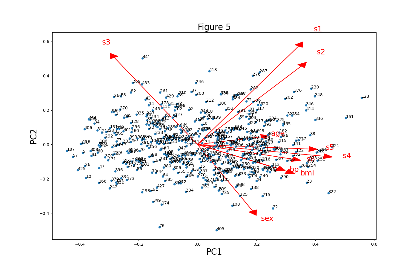
The code structure in Example 2 of the first section could be adapted to customize the scatter and vectors in seaborn. Briefly, the sns.scatterplot() function should be called, and the location of the functions should be defined as plt instead. See the code script below.
plt.figure(figsize=(14,9))

for i, feature in enumerate(features):
    plt.arrow(0, 0, ldngs[0, i],
             ldngs[1, i],
            color="red",
            head_width=0.03,
            head_length=0.03)
    plt.text(ldngs[0, i] * 1.15,
            ldngs[1, i] * 1.15,
            feature,
            color="red",
            fontsize=18)

sns.scatterplot(x=PC1 * scalePC1,
                y=PC2 * scalePC2)

plt.xlabel('PC1', fontsize=20)
plt.ylabel('PC2', fontsize=20)
plt.title('Figure 5', fontsize=20)

for i, label in enumerate(PC_scores.index):
    plt.text(PC1[i] * scalePC1,
            PC2[i] * scalePC2, str(label),
            fontsize=10)

Next, we will replicate the colored biplot in the first section using the seaborn library. Let’s see how it is done in the next example!
Example 3: Customized Biplot Colored by Target
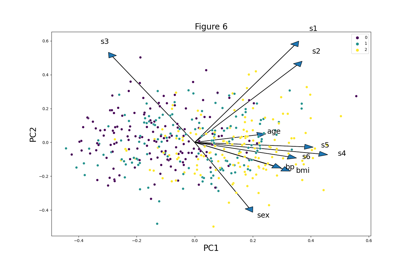
Also, in this case, we can adapt the code of Example 3 in the first section to color the biplot by the target using the seaborn library. You can see how the hue argument is set to target_groups below.
plt.figure(figsize=(14,9))

for i, feature in enumerate(features):
    plt.arrow(0, 0, ldngs[0, i],
             ldngs[1, i],
              head_width=0.03,
             head_length=0.03)
    plt.text(ldngs[0, i] * 1.15,
            ldngs[1, i] * 1.15,
            feature, fontsize=18)

sns.scatterplot(x=PC1 * scalePC1,
                y=PC2 * scalePC2,
                hue=target_groups,
                palette="viridis")

plt.xlabel('PC1', fontsize=20)
plt.ylabel('PC2', fontsize=20)
plt.title('Figure 6', fontsize=20)
Again, we have used the “viridis” palette, but feel free to choose the one that looks more appropriate in your case.

We have shown different customizations of biplots in Python using the Matplotlib and seaborn libraries. If you are interested in different ways and motives to visualize your PCA results, we recommend you to check our tutorial Visualization of PCA in Python. See you next time!
Video, Further Resources & Summary
Do you need more explanations on the steps and application of a Principal Component Analysis in Python? Then you should look at the following YouTube video of the Statistics Globe YouTube channel.
There are other tutorials on Statistics Globe you could have a look at:
- What is PCA?
- PCA Using Correlation & Covariance Matrix
- Choose Optimal Number of Components for PCA
- Learn Python
- Principal Component Analysis in Python
- Biplot for PCA Explained
- Visualization of PCA in Python
This post has shown how to create biplots for PCA in Python. If you have further questions, don’t hesitate to comment.


