Scree Plot of PCA in Python (2 Examples)
In this tutorial, you’ll learn how to create a scree plot of PCA (Principal Component Analysis) in Python.
This article will be structured as shown below.
Let’s take a look!
Load Libraries and Data Sample
The first step is to import the libraries to be used in this tutorial. These will help us to load our data sample, perform the PCA and create the scree plot.
import numpy as np
import pandas as pd
import matplotlib.pyplot as plt
import plotly.graph_objects as go
from sklearn.datasets import load_boston
from sklearn.decomposition import PCA
from sklearn.preprocessing import StandardScaler
Regarding the data sample, we will use the Boston Housing Dataset from the scikit-learn library (formerly known as scikits.learn and also known as sklearn). To load it, we will use the load() function, and then we will convert it into a pandas DataFrame.
boston = load_boston()
df = pd.DataFrame(data=boston.data,
                  columns=boston.feature_names)
We can see what this DataFrame looks like using the head() method.
df.head()

Let’s perform the PCA and visualize the result on different kinds of scree plots!
Standardize Data and Perform PCA
To perform the PCA, we will first standardize the data via the StandardScaler() class as follows.
scaler = StandardScaler()
boston_scaled = scaler.fit_transform(df)
Now, we can perform the PCA by specifying 6 components to be created for the sake of demonstration. If you are interested in methodological ways of selecting the ideal number of components, you can check our tutorial explaining how to choose the optimal number of components in PCA.
You can run the code below to perform the PCA using 6 principal components.
pca = PCA(n_components=6)
pca.fit(boston_scaled)
In order to visualize the scree plots, we should also extract the eigenvalues and proportion of explained variance as follows.
eigenvalues = pca.explained_variance_
prop_var = eigenvalues / np.sum(eigenvalues)
Now, we are ready to create our scree plots!
Example 1: Scree Plot Using Matplotlib
In this first example, we will create a scree plot using the figure() and plot() functions of Matplotlib and the arrange() function of NumPy. First, we will create a NumPy array via arrange() to store the indexes of the components. Then we will plot a line plot mapping the proportion of variance to the respective principal component index using the given marker via plot().
As the NumPy array starts from 0, we will add 1 to len(prop_var) so the component indexes will start from 1 on the x-axis.
plt.figure(figsize=(14,10))
plt.plot(np.arange(1, len(prop_var)+1),
                   prop_var, marker='o')
plt.xlabel('Principal Component',
           size = 20)
plt.ylabel('Proportion of Variance Explained',
           size = 20)
plt.title('Figure 1: Scree Plot for Proportion of Variance Explained',
          size = 25)
plt.grid(True)

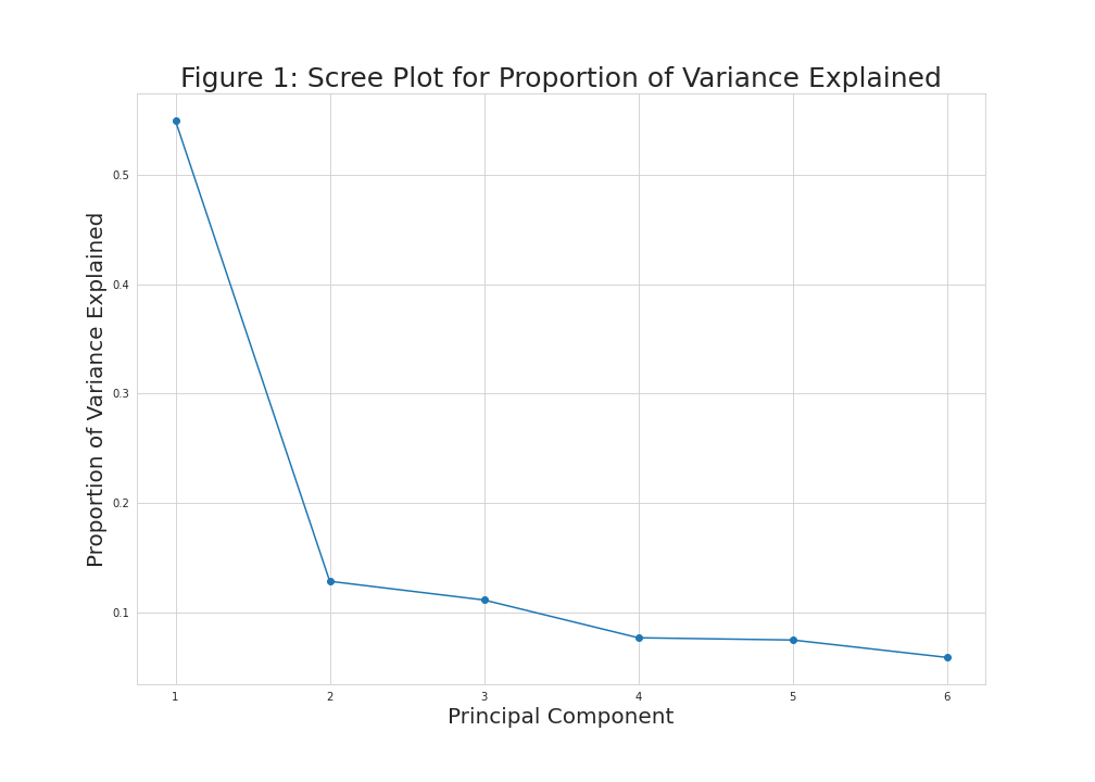
As seen in Figure 1, the first and second principal components explain around 50% and 10% of the variance, while the rest of the components explain smaller quantities that slightly vary, which refers that the first two components should be kept according to the elbow rule.
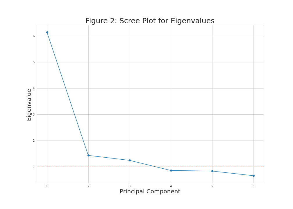
When considering Kaiser’s rule, the same plot can be visualized by using the eigenvalues with a horizontal line added via axhline(). For this kind of visualization, we should create an array that contains the eigenvalues instead of the proportion of variance, as shown below.
plt.figure(figsize=(14,10))
plt.plot(np.arange(1, len(eigenvalues)+1),
         eigenvalues, marker='o')
plt.xlabel('Principal Component',
           size = 20)
plt.ylabel('Eigenvalue',
           size = 20)
plt.title('Figure 2: Scree Plot for Eigenvalues',
          size = 25)
plt.axhline(y=1, color='r',
            linestyle='--')
plt.grid(True)

Now, we had a horizontal line intersecting the y-axis at 1 to see which principal components have eigenvalues greater than 1. These equal to the first three components in this case.
Example 2: Scree Plot Using plotly
A scree plot can also be created using the graph_objects module of the plotly library. To do so, first, we will create a figure called fig1. Then, as we did in Example 1, we will create a NumPy array containing the principal component indexes. After that, we will plug the indexes, proportion of variance, and mode of preference into the add_trace() function to create a line mapping the values in the scree plot. To customize our scree plot, we will use the update_layout() function.
Please check the corresponding code and output below.
fig1 = go.Figure()
fig1.add_trace(go.Scatter(x=np.arange(1, len(prop_var)+1),
                          y=prop_var, mode='markers+lines'))
fig1.update_layout(
    width=700,
    height=500,
    title=dict(
        text='Figure 3: Scree Plot for Proportion of Variance Explained',
        font=dict(
            size=20,
        )
    ),
    xaxis=dict(
        gridcolor='lightgrey',
        linecolor='lightgrey',
        linewidth=1,
        mirror=True,
        title=dict(
            text='Principal Component',
            font=dict(
                size=16,
            )
        )
    ),
    yaxis=dict(
        gridcolor='lightgrey',
        linecolor='lightgrey',
        linewidth=1,
        mirror=True,
        title=dict(
            text='Proportion of Variance Explained',
            font=dict(
                size=16,
            )
        )
    ),
    plot_bgcolor='white',
    yaxis_gridcolor='lightgrey',
    xaxis_gridcolor='lightgrey'
)
fig1.show()

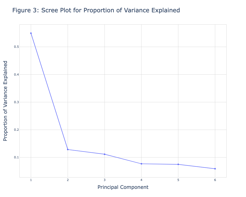
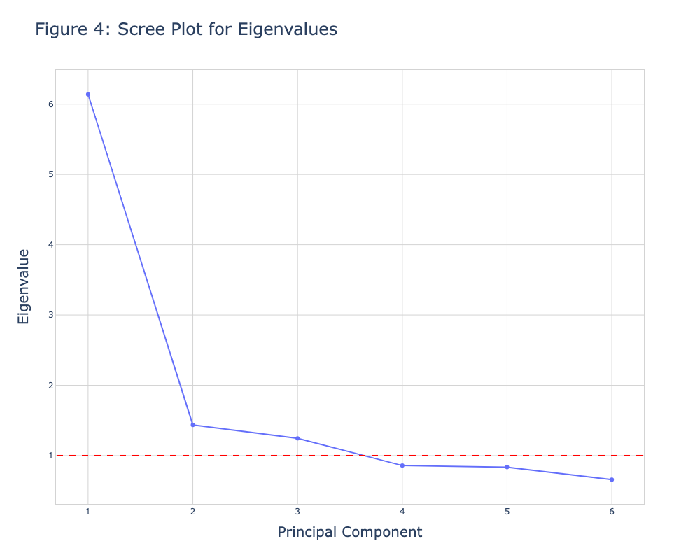
Figure 3 shows the same visual as in Figure 1. If one is interested in showing the eigenvalues instead of the proportion of variance explained, she could create a new figure named fig2 and replace the prop_var input with eigenvalues initialized at the beginning of this tutorial. We will also add the add_shape() function to include a horizontal line intersecting the y-axis at value 1.
See the respective code and the graph below.
fig2 = go.Figure()
fig2.add_trace(go.Scatter(x=np.arange(1, len(eigenvalues)+1),
                          y=eigenvalues, mode='markers+lines'))
fig2.update_layout(
    width=700,
    height=500,
    title=dict(
        text='Figure 4: Scree Plot for Eigenvalues',
        font=dict(
            size=20,
        )
    ),
    xaxis=dict(
        gridcolor='lightgrey',
        linecolor='lightgrey',
        linewidth=1,
        mirror=True,
        title=dict(
            text='Principal Component',
            font=dict(
                size=16,
            )
        )
    ),
    yaxis=dict(
        gridcolor='lightgrey',
        linecolor='lightgrey',
        linewidth=1,
        mirror=True,
        title=dict(
            text='Eigenvalue',
            font=dict(
                size=16,
            )
        )
    ),
    plot_bgcolor='white',
    yaxis_gridcolor='lightgrey',
    xaxis_gridcolor='lightgrey'
)

fig2.add_shape(type='line', yref='y', y0=1, y1=1, xref='x',
               x0=0.7, x1=len(eigenvalues)+0.3,
               line=dict(color='red', width=2, dash='dash'))
fig2.show()

This is how we can create a scree plot using the Matplotlib and plotly libraries. You can choose the one suitable for you to create a scree plot. If you want to explore other types of visualizations of PCA results, see our visualizations of PCA in Python tutorial 🙂 Take care until the next one!
Video, Further Resources & Summary
Do you need more explanations on how to use PCA in Python? Then you should have a look at the following YouTube video of the Statistics Globe YouTube channel.
There are other tutorials on Statistics Globe you can have a look at:
- Draw Biplot of PCA in Python
- Advantages & Disadvantages of Principal Component Analysis (PCA)
- Draw Autoplot of PCA in Python
- PCA Using Correlation & Covariance Matrix
- Draw 3D Plot of PCA in Python
- Learn Python
This post has shown how to create a scree plot of PCA in Python. In case you have further questions, you can leave a comment below.
Subscribe to the Statistics Globe Newsletter
Get regular updates on the latest tutorials, offers & news at Statistics Globe.
I hate spam & you may opt out anytime: Privacy Policy.
Thank you!
Welcome to the Statistics Globe newsletter. From now on, I’ll send you regular emails about statistics, data science, AI, and programming with R and Python.
I’m Joachim Schork. On this website, I provide statistics tutorials as well as code in Python and R programming.
Statistics Globe Newsletter
Get regular updates on the latest tutorials, offers & news at Statistics Globe. I hate spam & you may opt out anytime: Privacy Policy.
Thank you!
Please check your email inbox and click the confirmation link to complete your subscription. If you don’t see the email within a few minutes, please also check your spam/junk folder.


