PCA Before k-means Clustering in Python (Example)
In this tutorial, you’ll learn how to combine k-means clustering with PCA in the Python programming language.
Table of contents:
Let’s do this!
Relevant Modules & Sample Data
Let’s first install and import the relevant libraries for our use. We need the PCA, StandardScaler, and KMeans modules to perform PCA and k-means clustering and the Matplotlib, scipy, adjustText, and NumPy libraries for visualization purposes. We will import the pandas library and the data function from pydataset to create our sample data.
If you haven’t installed the needed libraries yet, you should first install them either by running the following commands in your Python environment (Jupyter Notebook, IPython, Google Colab, or some other) or running the following commands without exclamation marks ! in your terminal window.
!pip install scikit-learn                                             # Install libraries
!pip install pandas
!pip install matplotlib
!pip install scipy
!pip install adjustText
!pip install numpy
!pip install pydataset
The next step is to import the relevant libraries and modules.
from sklearn.preprocessing import StandardScaler                       # Import modules
from sklearn.decomposition import PCA
import pandas as pd
from sklearn.cluster import KMeans
import matplotlib.pyplot as plt
from scipy.spatial import ConvexHull
from adjustText import adjust_text
import numpy as np
from pydataset import data
Once all is set, we can load the sample data mtcars, which contains the fuel consumption (mpg) and 10 aspects of automobile design and performance for 32 automobiles (1973-74 models), from pydataset.
mtcars = data('mtcars')                                                # Load dataset mtcars
mtcars.head()                                                          # Print first rows
#                     mpg  cyl   disp   hp  drat  ...   qsec  vs  am  gear  carb
# Mazda RX4          21.0    6  160.0  110  3.90  ...  16.46   0   1     4     4
# Mazda RX4 Wag      21.0    6  160.0  110  3.90  ...  17.02   0   1     4     4
# Datsun 710         22.8    4  108.0   93  3.85  ...  18.61   1   1     4     1
# Hornet 4 Drive     21.4    6  258.0  110  3.08  ...  19.44   1   0     3     1
# Hornet Sportabout  18.7    8  360.0  175  3.15  ...  17.02   0   0     3     2
As seen, cyl, vs, am, gear and carb are discrete variables. We will exclude these variables from the analysis considering that PCA is designed for continuous data. For alternatives of PCA working with categorical and mixed data, see our tutorial: Can PCA be Used for Categorical Variables?
Please check below for the subsetted data.
subset_mtcars = mtcars.iloc[:, [0, 2, 3, 4, 5, 6]]                     # Subset mtcars
subset_mtcars.head()                                                   # Print subsetted mtcars
#                     mpg   disp   hp  drat     wt   qsec
# Mazda RX4          21.0  160.0  110  3.90  2.620  16.46
# Mazda RX4 Wag      21.0  160.0  110  3.90  2.875  17.02
# Datsun 710         22.8  108.0   93  3.85  2.320  18.61
# Hornet 4 Drive     21.4  258.0  110  3.08  3.215  19.44
# Hornet Sportabout  18.7  360.0  175  3.15  3.440  17.02
We will use this subset_mtcars dataset in the demonstration of combined PCA and cluster analysis. Without further ado, let’s jump into the analysis!
Example: k-means Clustering Combined with PCA
The first step is to perform PCA. In order to do this, first, we should standardize our data using the StandardScaler class, then perform the PCA via the PCA class. For further details, see our tutorial Principal Component Analysis in Python.
scaler = StandardScaler()                                              # Create standardization scaler
mtcars_std = scaler.fit_transform(subset_mtcars)                       # Standardize data
pca = PCA()                                                            # Compute PCA without reducing dimensionality
mtcars_pca = pca.fit_transform(mtcars_std)
Let’s now check the exact and cumulative explained variance per component to decide on the optimal component number for our analysis. We will call the explained_variance_ratio_ component of the pca object for regarding calculations.
explained_variance = pd.DataFrame([pca.explained_variance_ratio_,      # Extract explained variance per component
                                   pca.explained_variance_ratio_.cumsum()]).T
explained_variance.columns = ['Exp Var', 'Cum Exp Var']
explained_variance                                                     # Print explained variance
#    Exp Var  Cum Exp Var
# 0  0.697899     0.697899
# 1  0.191352     0.889251
# 2  0.055559     0.944811
# 3  0.025727     0.970538
# 4  0.020799     0.991337
# 5  0.008663     1.000000
Based on the Cum Exp Var column, the first two components sufficiently explain the data variation. Hence, we can reduce our data to 2-dimensional space, selecting these two components.
Now, let’s run the PCA for two components.
pca = PCA(n_components=2)                                              # Compute PCA for two components
mtcars_pca = pca.fit_transform(mtcars_std)
As seen, the number of components n_components was set to 2 while creating the PCA class pca. Then the created model was fitted for the standardized dataset mtcars_std.
The next step is to interpret the data in the reduced dimensional space via a biplot. Below, you can follow the steps of creating a biplot in Python.
plt.figure(figsize=(10, 6))                                            # Set figure size

plt.scatter(mtcars_pca[:, 0],                                          # Plot component score scatter
            mtcars_pca[:, 1],
            color='black')

texts = []                                                             # Initialize list of texts

for i, txt in enumerate(mtcars.index):                                 # Label data points
    texts.append(plt.text(mtcars_pca[i, 0],
                          mtcars_pca[i, 1],
                          txt))

for i in range(len(subset_mtcars.columns)):                            # Plot loading arrows (vectors)
    plt.arrow(0,                                                       # Locate arrows
              0,
              pca.components_[0, i]*3.5,
              pca.components_[1, i]*3.5,
              color='magenta',
              alpha=0.5)
    plt.text(pca.components_[0, i]*4,                                  # Locate text
             pca.components_[1, i]*3.5,
             subset_mtcars.columns[i],
             color='magenta',
             ha='center',
             va='center')

plt.title('PCA Biplot for mtcars')                                     # Plot annotations
plt.xlabel('PC1')
plt.ylabel('PC2')

adjust_text(texts)                                                     # Adjust text labels

plt.show()                                                             # Show plot
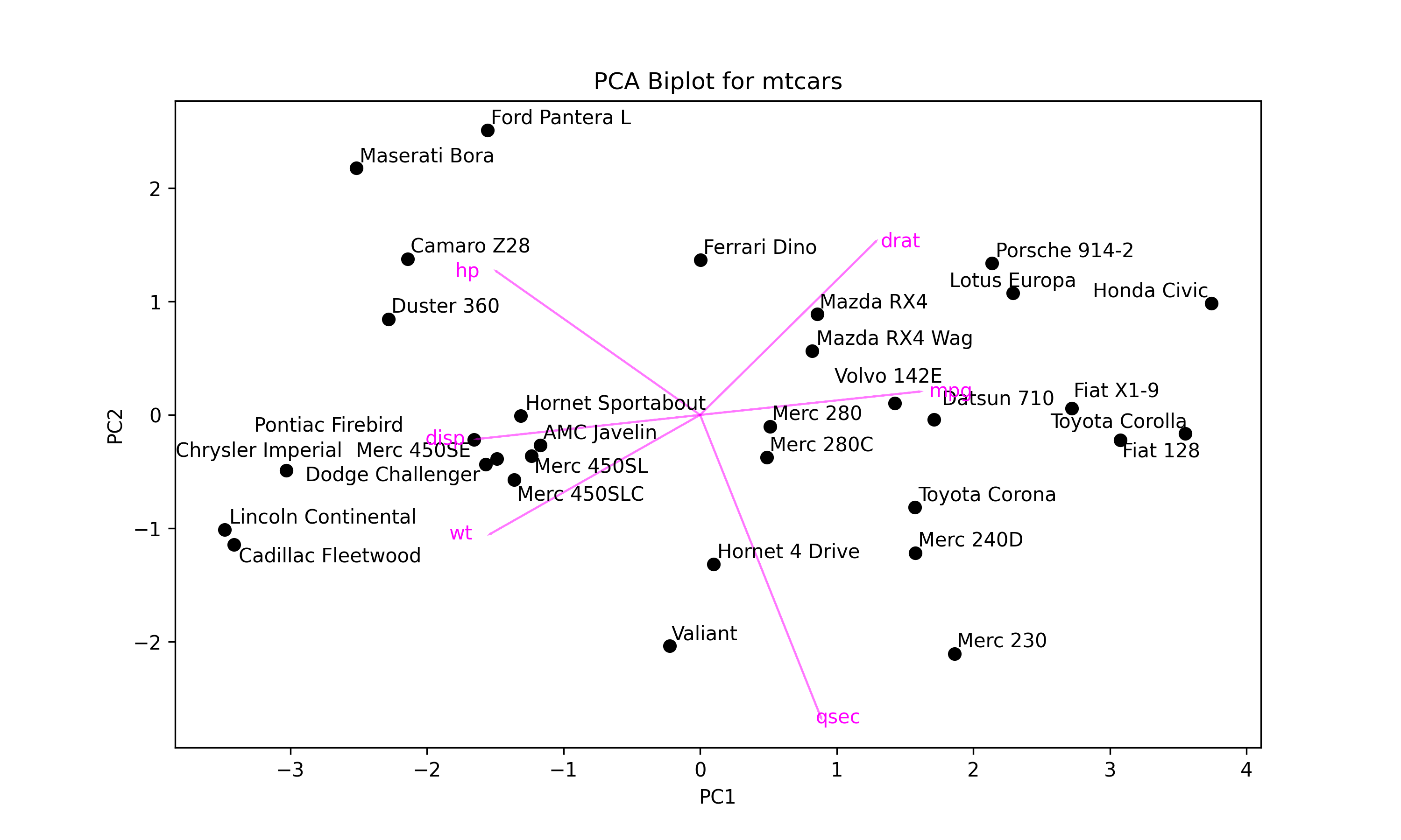
In the first for loop, the data points are labeled by their indexes, mtcars.index, which consists of car names, via plt.text().
In the second for loop, the arrows are centered around the coordinates (0, 0), colored in "magenta", and rescaled by the factor 3.5. The plt.text() function is called to label them by the column names .columns[i] of subset_mtcars also in the "magenta" color.
The adjust_text() function is employed to prevent overlapping between the data point labels, which are stored in the texts list in the first for loop. Please see the output below.

Next, we will conduct k-means clustering on our transformed dataset mtcars_pca using the KMeans() function.
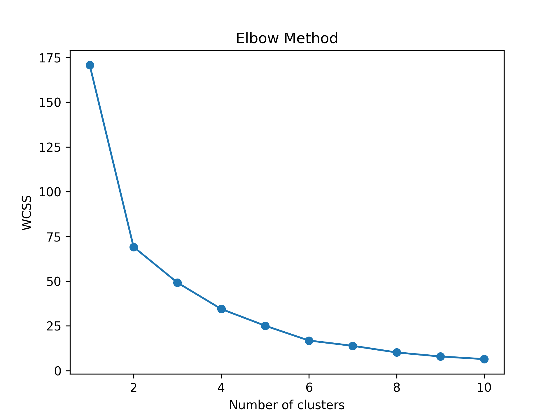
But first, we will run it for 1 to 10 clusters and calculate the within-cluster sum of squares for each cluster number. This will help us to determine the ideal cluster number. To evaluate the results, we will use the elbow method. For other statistics and selection methods, see here.
wcss = []                                                             # Create empty wcss list

for i in range(1, 11):                                                # Iterate through 11 clusters
    kmeans = KMeans(n_clusters=i)                                     # Apply kmeans clustering
    kmeans.fit(mtcars_pca)
    wcss.append(kmeans.inertia_)                                      # Append wcss to wcss list

plt.plot(range(1, 11), wcss, '-o')                                    # Plot Elbow graph
plt.title('Elbow Method')
plt.xlabel('Number of clusters')
plt.ylabel('WCSS')
plt.show()
The script returns the following line plot showing the within-cluster sum of squares per cluster number.

Based on Figure 2 above, forming 4 clusters seems ideal for clustering similar data points. Let’s now run our k-means cluster analysis for 4 clusters.
kmeans = KMeans(n_clusters=4)                                          # Run cluster analysis for 4 clusters
clusters = kmeans.fit_predict(mtcars_pca)                              # Assign clusters
The clustering information is saved in the clusters object. Next, we will use that information to show the clustering in the reduced dimensional space as follows.
colors = ['blue', 'green', 'red', 'cyan']                              # Define a color map

texts = []                                                             # Initialize list of texts

plt.figure(figsize=(10, 7))                                            # Set figure size

for i in range(4):                                                     # Iterate through 4 clusters
    ds = mtcars_pca[np.where(clusters==i)]                             # Dataset per cluster
    plt.scatter(ds[:,0],                                               # Plot scores
                ds[:,1],
                s=50,
                label='Cluster '+str(i+1),
                color=colors[i])
    for point, label in zip(ds, mtcars.index[np.where(clusters==i)]):  # Label car names
        texts.append(plt.text(point[0],
                     point[1],
                     label))
    if ds.shape[0] > 2:                                                # Check if data has >2 points
        hull = ConvexHull(ds)                                          # Compute hulls
        hull_points = np.append(hull.vertices,                         # Ensure hulls are closed
                                hull.vertices[0])
        plt.plot(ds[hull_points,0],                                    # Plot hulls
                 ds[hull_points,1],
                 color=colors[i])

if texts:                                                              # Adjust texts
    adjust_text(texts)

plt.title('Cluster Plot for mtcars')                                   # Plot annotations
plt.xlabel('PC1')
plt.ylabel('PC2')
plt.legend()

plt.show()                                                             # Print plot
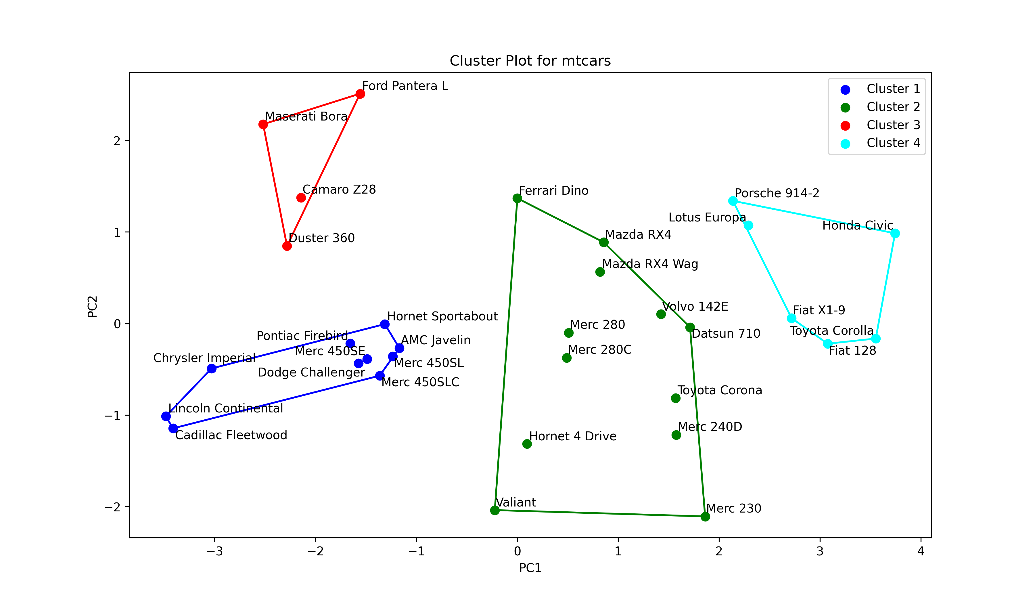
As seen above, we have started with defining a color list for clusters named colors. Then we created an empty list called texts to save the labeling texts, which are used in text adjustment, just like in Figure 1. Then a for loop was set to iterate over subsets ds filtered by the cluster.
In this loop, first, the data points are plotted and colored by a color in the colors list, colors[i]. Secondly, they are labeled by their indexes, more specifically, the car names, via a nested for loop. See the line starting with for point,.
Finally, the data points are enclosed by a convex hull if there are more than two points, checked by ds.shape[0] > 2. Next, the ConvexHull() function computes the hull. The points that are vertices of the hull are saved in hull_points, ensuring that the hull is closed by appending the first vertex hull.vertices[0] to the end of hull_points. The hull is colored by the cluster color assigned.
Remember that the aforementioned steps are repeated for each cluster. When the loop terminates, the labels in texts are adjusted, and the plot annotations, which also include the legend, are set. Please be aware that the labels of the legend were defined in plt.scatter() at the beginning of the script. Let’s see the graph!

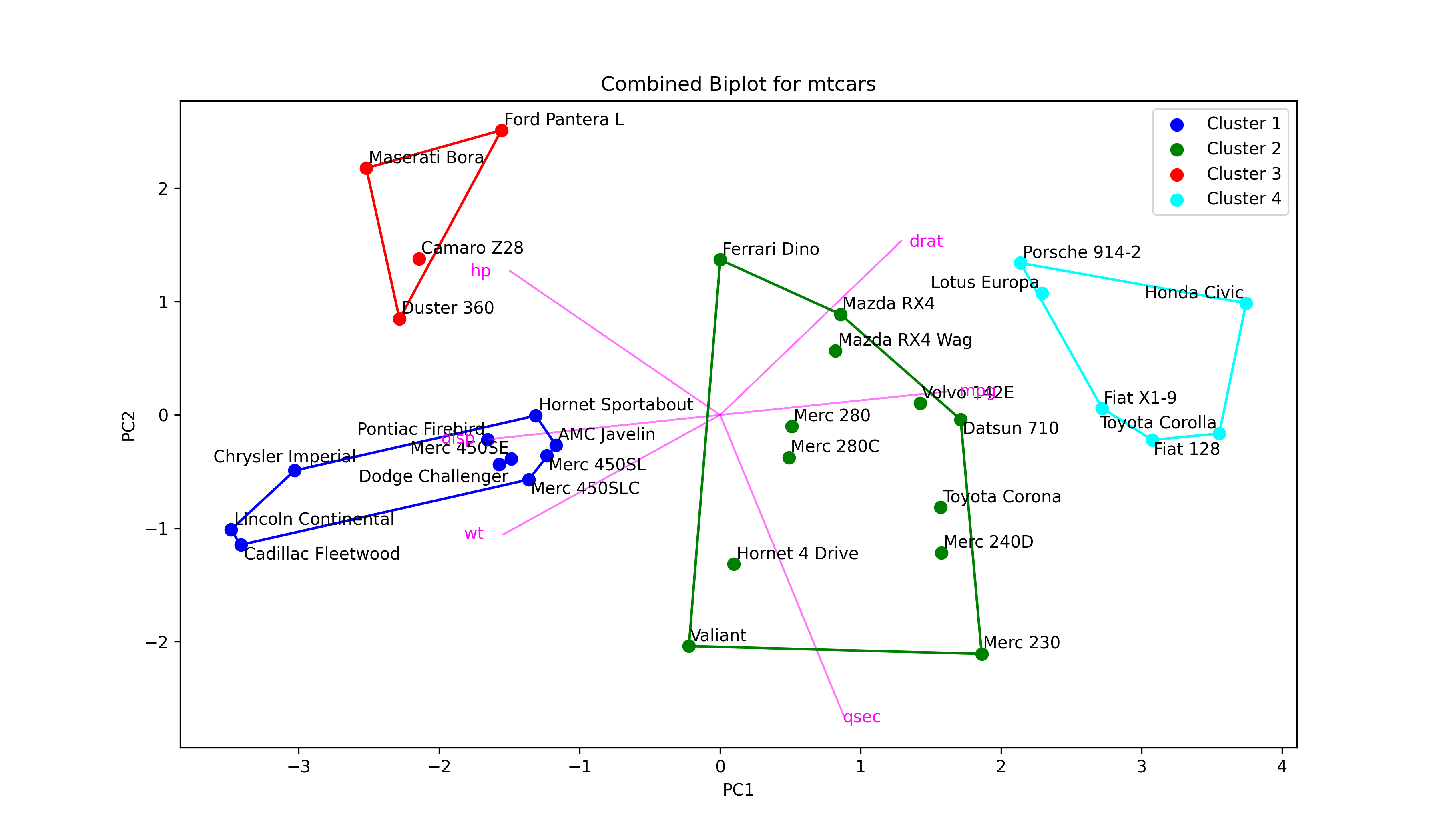
In Figure 3, the user can interpret how the clusters differ from each with respect to the principal components. At this point, it is important to understand what each principal component represents. Therefore, the biplot and cluster plot can be displayed next to each other. Or alternatively, a combined plot displaying all visual elements can be drawn as follows.
colors = ['blue', 'green', 'red', 'cyan']                              # Define a color map

texts = []                                                             # Initialize list of texts

plt.figure(figsize=(12, 7))                                            # Set figure size

for i in range(4):                                                     # Iterate through 4 clusters
    ds = mtcars_pca[np.where(clusters==i)]                             # Dataset per cluster
    plt.scatter(ds[:,0],                                               # Plot scores
                ds[:,1],
                s=50,
                label='Cluster '+str(i+1),
                color=colors[i])
    for point, label in zip(ds, mtcars.index[np.where(clusters==i)]):  # Label car names
        texts.append(plt.text(point[0],
                     point[1],
                     label))
    if ds.shape[0] > 2:                                                # Check if data has >2 points
        hull = ConvexHull(ds)                                          # Compute hulls
        hull_points = np.append(hull.vertices,                         # Ensure hulls are closed
                                hull.vertices[0])
        plt.plot(ds[hull_points,0],                                    # Plot hulls
                 ds[hull_points,1],
                 color=colors[i])

if texts:                                                              # Adjust data point texts
    adjust_text(texts)

for i in range(len(subset_mtcars.columns)):                            # Plot loading arrows (vectors)
    plt.arrow(0,                                                       # Locate arrows
              0,
              pca.components_[0, i]*3.5,
              pca.components_[1, i]*3.5,
              color='magenta',
              alpha=0.5)
    plt.text(pca.components_[0, i]*4,                                  # Locate text
             pca.components_[1, i]*3.5,
             subset_mtcars.columns[i],
             color='magenta',
             ha='center',
             va='center')

plt.title('Combined Biplot for mtcars')                                # Set title and axis labels
plt.xlabel('PC1')
plt.ylabel('PC2')
plt.legend()

plt.show()                                                             # Show plot
As observed, we have just added the script drawing arrows to the script of the cluster plot. Let’s see the final output!

Now you have a biplot, which also shows clustering. Even though this type of graph conveys information efficiently, it may not be the best option in the presence of a large dataset.
For the interpretation of the outputs in this tutorial, please visit How to Combine PCA and k-means Clustering Explained.
Video & Further Resources
Do you want to learn more about Principal Component Analysis in Python? Then I recommend having a look at the following video on my YouTube channel:
Furthermore, you might want to have a look at the related articles on this website. I have released several articles that are related to the combined k-means clustering with PCA already.
- How to Combine PCA & k-means Clustering
- PCA Using Correlation & Covariance Matrix
- Can PCA be Used for Categorical Variables?
- Visualization of PCA in Python
- Choose Optimal Number of Components for PCA
- Biplot for PCA Explained
- Draw Biplot of PCA in Python
In this article, you have learned how to make use of PCA in k-means cluster analysis in Python. If you have any further questions, please let me know in the comments section.
This page was created in collaboration with Cansu Kebabci. Have a look at Cansu’s author page to get more information about her professional background, a list of all his tutorials, as well as an overview on her other tasks on Statistics Globe.


