Autoplot of PCA in R (Example)
In this tutorial, you’ll learn how to create a scatterplot and a biplot using the autoplot() function for Principal Component Analysis (PCA) results in the R programming language.
The table of content is structured as shown in the following box:
Let’s start right away.
Load Libraries and Create Sample Data Set
Before we start, installing the libraries, ggplot2 and the ggfortify, is convenient.
install.packages("ggplot2")
install.packages("ggfortify")
If you have already installed these libraries in the past, just ignore this first step. Then skip to the following:
library(ggplot2)
library(ggfortify)
Next, we will call our sample data, which is a built-in dataset called iris in R.
data(iris)
head(iris)
# Sepal.Length Sepal.Width Petal.Length Petal.Width Species
# 1          5.1         3.5          1.4         0.2  setosa
# 2          4.9         3.0          1.4         0.2  setosa
# 3          4.7         3.2          1.3         0.2  setosa
# 4          4.6         3.1          1.5         0.2  setosa
# 5          5.0         3.6          1.4         0.2  setosa
# 6          5.4         3.9          1.7         0.4  setosa
Now, let’s perform our PCA using the sample data frame.
Perform PCA
In order to perform a PCA in R, we will choose all the columns except for the Species column since it is categorical. Hence, the first step is subsetting the dataset. For PCA designed for categorical variables, see our tutorial: Can PCA be Used for Categorical Variables?.
data <- iris[,1:4]

iris_pca <- prcomp(data,
                 scale=TRUE)
summary(iris_pca)
#Importance of components:
#                           PC1    PC2     PC3     PC4
# Standard deviation     1.7084 0.9560 0.38309 0.14393
# Proportion of Variance 0.7296 0.2285 0.03669 0.00518
# Cumulative Proportion  0.7296 0.9581 0.99482 1.00000
Now, we can visualize our PCA results via the autoplot() function.
Scatterplot using autoplot()
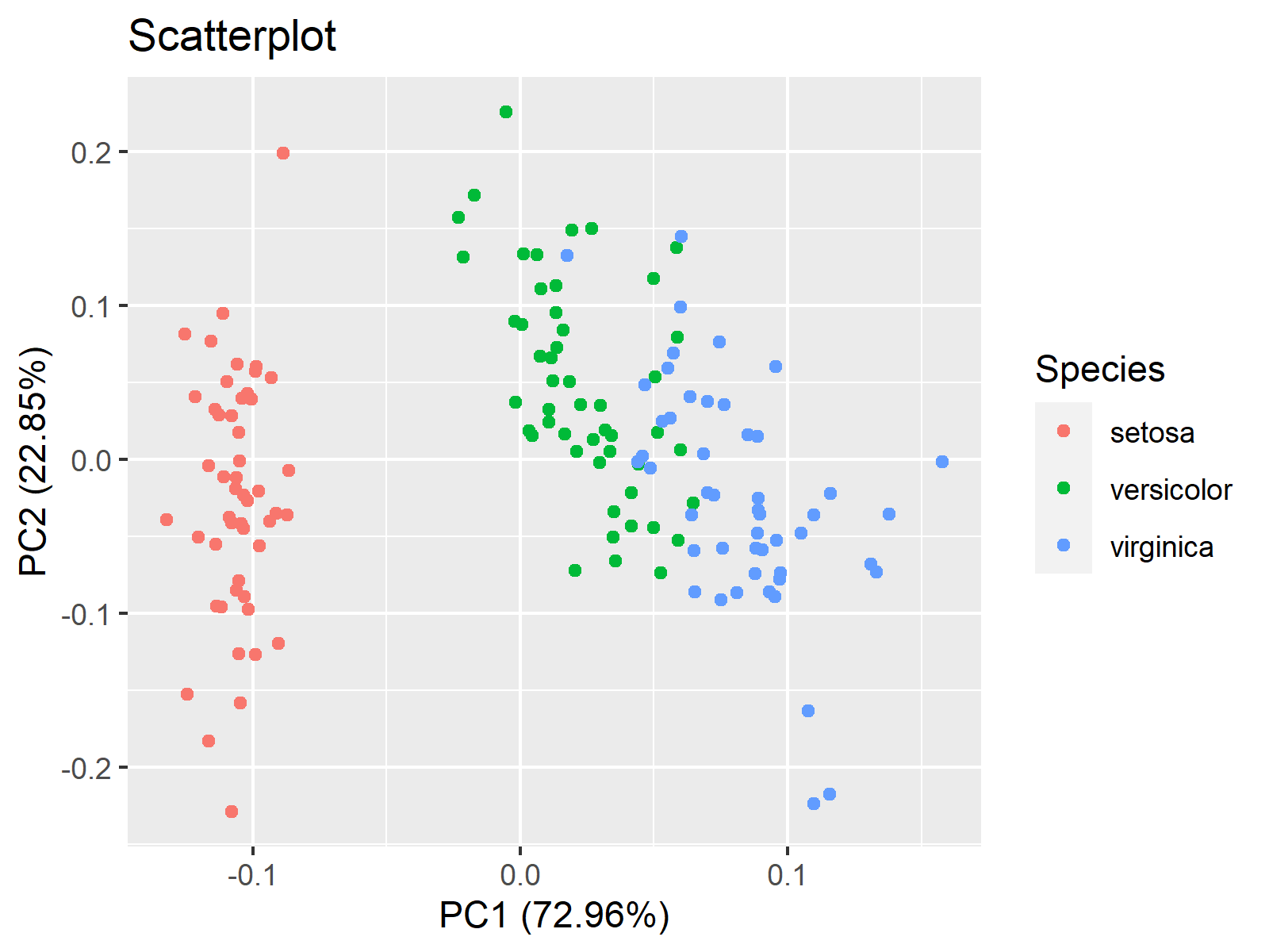
All we need to visualize our PCA on a scatterplot using the autoplot() function is to input the iris_pca object to the function. If the users want to add a title and color the data points by group, they should also use the data, colour, and main arguments.
autoplot(iris_pca,
         data=iris,
         main = "Scatterplot",
         colour = 'Species')

As seen, the axis labels specifying the principal components and explained variances (compare with the summary output of iris_pca) and the legend are added by default.
Biplot using autoplot()
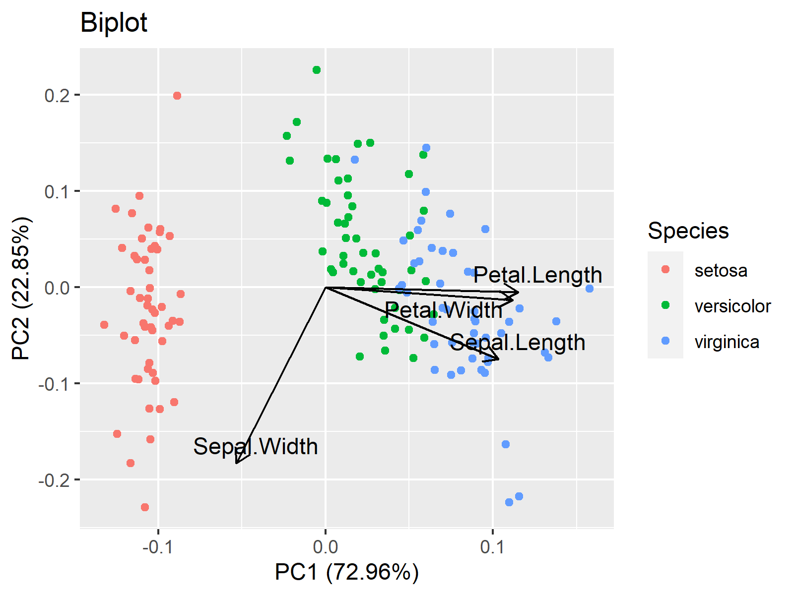
We should use some additional function arguments to plot a biplot via autoplot(). First and foremost, loadings should be set to TRUE to make sure that one of the main visual components of biplots, loading vectors, are added. Then the rest is about how to color and label those vectors.
autoplot(iris_pca,
         data = iris,
         colour = 'Species',
         main = "Biplot",
         loadings = TRUE,
         loadings.label=TRUE,
         loadings.colour = "black",
         loadings.label.colour="black",
         loadings.label.repel=TRUE)

We hope you found this tutorial helpful. See you at the next one!
Video, Further Resources & Summary
Do you need more background on how to perform a Principal Component Analysis in R? Then check the following YouTube video of the Statistics Globe YouTube channel.
You could also have a look at some of the other tutorials available on Statistics Globe:
- What is PCA?
- Can PCA be Used for Categorical Variables?
- Principal Component Analysis in R
- Scatterplot of PCA in R
- Biplot of PCA in R
- Biplot for PCA Explained – How to Interpret
This post has shown how to make an autoplot of a PCA in R. In case you have any questions, you can leave a comment below.
Subscribe to the Statistics Globe Newsletter
Get regular updates on the latest tutorials, offers & news at Statistics Globe.
I hate spam & you may opt out anytime: Privacy Policy.
Thank you!
Welcome to the Statistics Globe newsletter. From now on, I’ll send you regular emails about statistics, data science, AI, and programming with R and Python.
I’m Joachim Schork. On this website, I provide statistics tutorials as well as code in Python and R programming.
Statistics Globe Newsletter
Get regular updates on the latest tutorials, offers & news at Statistics Globe. I hate spam & you may opt out anytime: Privacy Policy.
Thank you!
Please check your email inbox and click the confirmation link to complete your subscription. If you don’t see the email within a few minutes, please also check your spam/junk folder.


8 Comments. Leave new
Dear all, thank you very much for your collaborations.
I have a not-so-trivial question.
I would like to format the biplot variables in different ways. For example, the names Sepal.Width and Sepal.Length wanted the first to be Sepal subscribed Width and the other Sepal.Length in italics. Can someone help me?
Very grateful for the attention.
Yours sincerely,
Alexandre Jardim.
Hello Alexandre,
Renaming the variables is very easy using the names function. With that, you can rewrite Sepal.Width as Sepal_Width as follows.
Then you can perform PCA. As you said, labeling the vectors in italics is not trivial since autoplot() doesn’t provide a direct way to italicize loading labels. However, you can do it manually using the geom_segment and geom_text functions of ggplot2. See below.
Please be aware that I rescaled the arrow lengths, which is done by default if you use the default settings of autoplot, to ensure that the arrows are visible in the graph. You can also try out other magnitudes to fit the labels better and use the just and just arguments for the adjustment. See the visual below.
Regards,
Cansu
Hello Cansu,
Thank you very much for your contribution.
Unfortunately, my problem has been partially resolved. I would really like my variable to be subscripted (i.e., SepalWidth).
I tried using the tag but it didn’t work. Do you know of any solutions?
Regards,
Alexandre.
Hello Alexandre,
You can easily change it by using the names function as I previously shared names(data)<-c("anyformat",...). If it doesn't answer your question, could you please give some examples for me to understand? Regards, Cansu
Dear Cansu,
I am very grateful that you have gone to great lengths to help me with this question.
Unfortunately, I still can’t solve my problem.
I am sending an image as I would like the variable names to be in the biplot.
https://i.im.ge/2023/05/20/hTLy8Y.Ex.png
Thanks again for all your help.
I hope you can help me.
Yours sincerely,
Alexandre.
Hello Alexander,
Thank you for the sample image. Creating a label variable using square brackets could help as follows. See the tutorial: Add Subscript and Superscript to Plot in R for further details. The general structure of the script is the same.
Regards,
Cansu
Hi Cansu,
Thank you very much for your efficient response and your time dedicated to solving it.
My question was literally solved!
The work you do is fantastic, thank you very much.
All the best.
Regards,
Alexandre.
Hey Alexandre!
Glad to hear that I could help!
Best,
Cansu