Change Legend Title in ggplot2 (2 Example Codes) | Modify Text of ggplot Legends
This article explains how to change the text of a ggplot2 legend in R. The tutorial is structured as follows:
- Example Data
- Change Legend Text with scale_color_discrete (Example 1)
- Change Legend Text with labs (Example 2)
- Further Resources for the Modification of ggplot2 plots
Let’s move on to the examples!
Create Example Data
First, we have to create some data for the examples of this tutorial:
set.seed(2468)                                                   # Set seed for reproducibility
data <- data.frame(x = c(runif(200, 0, 2), runif(100, 1, 3)),    # Create x variable
                   y = c(runif(200, 1, 3), runif(100, 2, 4)),    # Create y variable
                   group = c(rep("g1", 200), rep("g2", 100)))    # Create group variable
head(data)                                                       # Print first 6 rows of data
#           x        y group
# 1 0.9251444 2.510920    g1
# 2 1.1482466 1.688871    g1
# 3 0.7495806 1.476128    g1
# 4 1.8013962 1.462917    g1
# 5 0.4498683 2.673079    g1
# 6 0.6840810 2.449923    g1
Our example data frame contains an x variable, a y variable, as well as a group variable.
Now let’s see how the legend title looks by default. First, we need to install and load the ggplot2 package in R…
install.packages("ggplot2")                                      # Install ggplot2 package
library("ggplot2")                                               # Load ggplot2 package
…and then we can print a ggplot2 scatterplot as follows:
my_ggplot <- ggplot(data, aes(x, y, group = group)) +            # ggplot2 with 2 legends
  geom_point(aes(x, y, color = group))
my_ggplot                                                        # Print plot with default legend

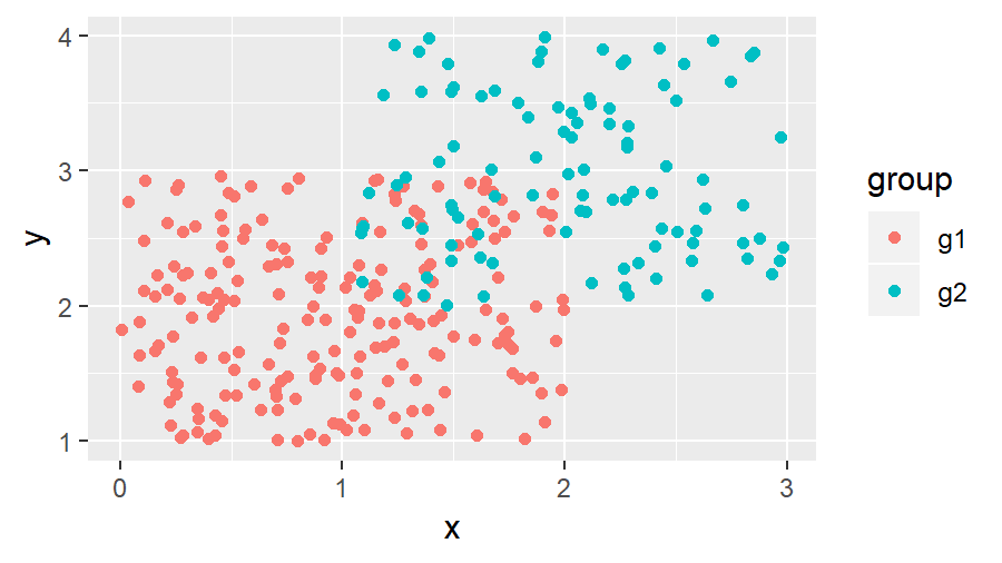
Figure 1: ggplot2 with Default Specification.
As you can see based on Figure 1, the default specification of the ggplot2 package shows the column name of our group variable as legend title.
In the following examples, I’ll show you two alternatives how to change the text of this legend title in R.
Let’s dive in!
Example 1: Change Text of ggplot Legend Title with scale_color_discrete
This example shows how to modify a ggplot legend title with scale_color_discrete:
my_ggplot + scale_color_discrete(name = "My Legend Title No. 1") # Manual legend title

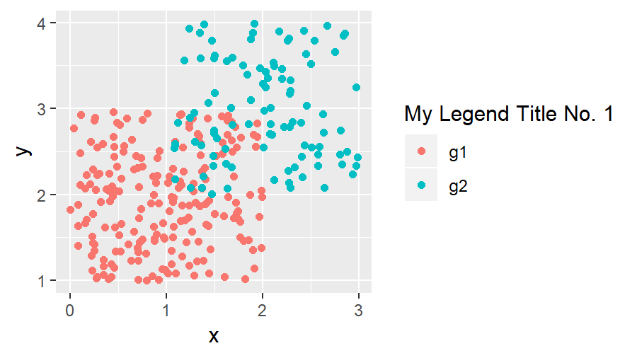
Figure 2: ggplot2 with Legend Title Modified by scale_color_discrete.
The previous R syntax changed the title to “My Legend Title No. 1”.
Note: We used the function scale_color_discrete, because our legend is created based on the color specification of our graphic. If we would have created our legend based on other aesthetics, we would have to use the corresponding scale_…_discrete function (e.g. scale_fill_discrete for fill). This is by the way true for all types of plots (e.g. histogram, barchart, dotplot, pairs plot and so on).
There’s another alternative, which is also quite popular for changing legend titles of ggplots. So keep on reading…
Example 2: Change Text of ggplot Legend Title with labs
The second alternative that I want to show you is based on the labs function:
my_ggplot + labs(color = "My Legend Title No. 2") # Manual legend title

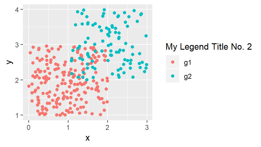
Figure 3: ggplot2 with Legend Title Modified by labs.
As you can see, the second example resulted in the same legend text as the code of example 1 (besides calling the legend title No. 2 at the end).
Note: We used the specification color = “…”, because our legend is created based on the color specification of our plot (see explanation above).
By the way, the labs function can also be used to change both legend titles in a ggplot2 graph with two legends. You simply would have to specify multiple arguments within the labs function (e.g. shape and color).
Tutorial Video & Further Resources for ggplot2
If you need more information about the syntax of this article, you can check out the following video I have published on my YouTube channel:
The ggplot2 environment provides many different possibilities for the formatting of our plots. If you want to learn more about the ggplot2 package, I can recommend the following YouTube video of Roger Peng:
Besides the video, you might also want to have a look at the other R programming tutorials of this website:
- Remove ggplot2 Legend Entirely
- Remove Legend Title from ggplot2 Plot in R
- Add Common Legend to Combined ggplot2 Plot
- Create Legend in ggplot2 Plot
- Change Position of ggplot Title
- R Graphics Gallery
- List of R Commands (+ Examples)
- The R Programming Language
This tutorial showed how to format the text of legends in ggplot2. If you have any feedback or comments, don’t hesitate to let me know in the comments!
Subscribe to the Statistics Globe Newsletter
Get regular updates on the latest tutorials, offers & news at Statistics Globe.
I hate spam & you may opt out anytime: Privacy Policy.
Thank you!
Welcome to the Statistics Globe newsletter. From now on, I’ll send you regular emails about statistics, data science, AI, and programming with R and Python.
I’m Joachim Schork. On this website, I provide statistics tutorials as well as code in Python and R programming.
Statistics Globe Newsletter
Get regular updates on the latest tutorials, offers & news at Statistics Globe. I hate spam & you may opt out anytime: Privacy Policy.
Thank you!
Please check your email inbox and click the confirmation link to complete your subscription. If you don’t see the email within a few minutes, please also check your spam/junk folder.


