Color Scatterplot Points in R (2 Examples)
In this tutorial, I’ll illustrate how to draw a scatterplot with colors in R programming.
The article will consist of the following content blocks:
Let’s start right away!
Example Data
We’ll use the following data as basement for this R programming tutorial:
set.seed(9832674)                  # Set random seed
x <- rnorm(300)                    # Create x variable
y <- rnorm(300) + x                # Create correlated y variable
group <- rep(1, 300)               # Create group variable
group[x > 0] <- 2
group[x > 1.5] <- 3
data <- data.frame(x, y, group)    # Create data frame
head(data)                         # Head of data frame
#            x          y group
# 1  1.0860581 -0.1031364     2
# 2 -1.0928708 -2.4610668     1
# 3  0.2750614 -0.6152865     2
# 4  2.4189857  1.6752551     3
# 5 -0.8131797  0.5929344     1
# 6 -1.4942538 -1.2267222     1
Have a look at the previous output of the RStudio console. It shows that our example data has three columns.
The variables x and y contain the values we’ll draw in our plot. The variable group defines the color for each data point.
Note that we have created the grouping column so that all values where x is smaller or equal to zero have the group value 1, data points with x larger than zero an smaller or equal to 1.5 have the group value 2, and data points with x larger than 1.5 have the group value 3.
Anyway, let’s draw these data…
Example 1: Drawing Scatterplot with Colored Points Using Base R
In this example, I’ll show how to use the basic installation of the R programming language to draw a colored scatterplot in R.
For this, we have to use the plot function and the col argument as shown below:
plot(data$x,                       # Draw Base R plot
     data$y,
     pch = 16,
     col = data$group)

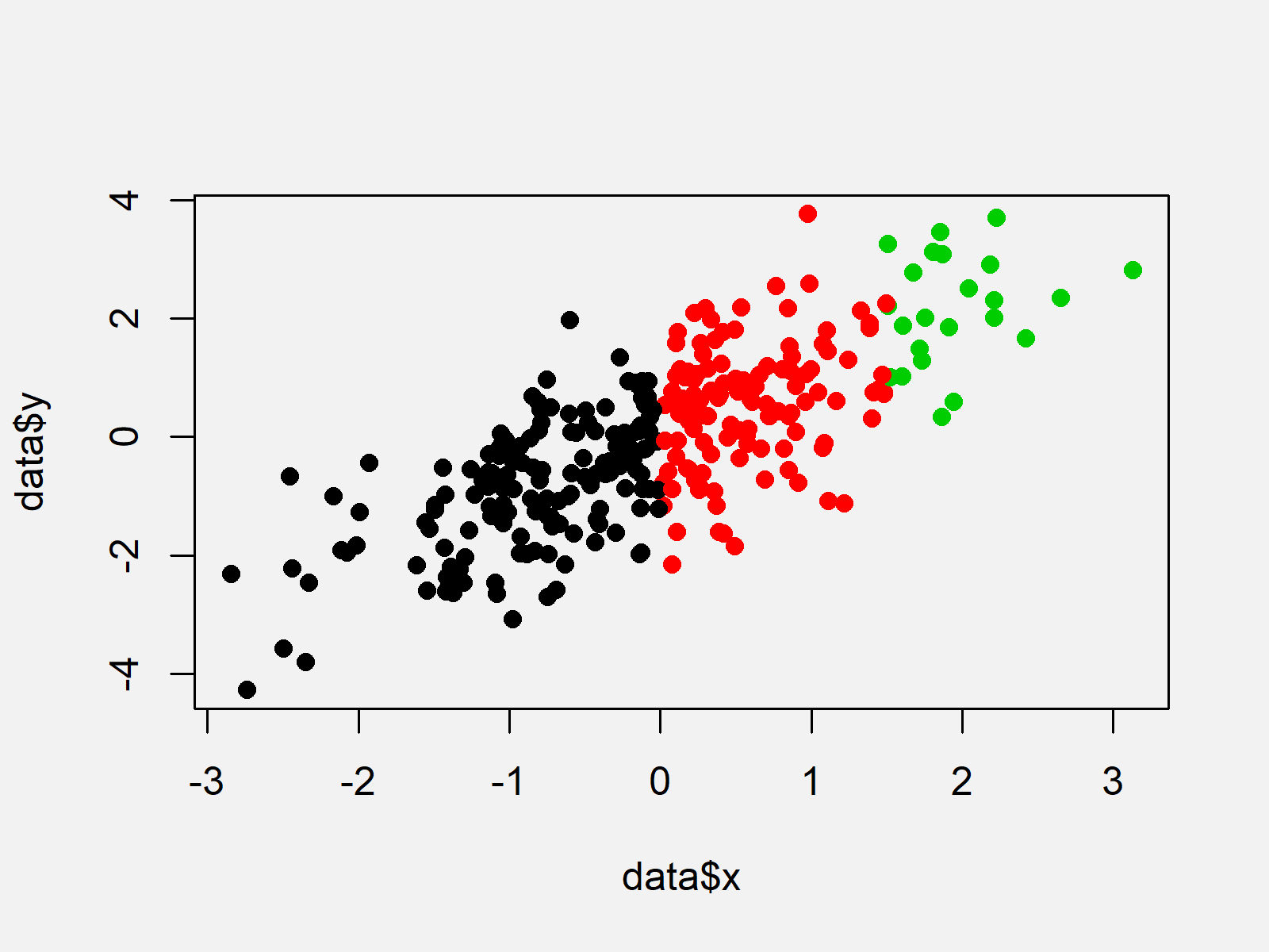
As revealed in Figure 1, the previous R programming code created a graphic with colored points according to the values in our grouping vector.
Example 2: Drawing Scatterplot with Colored Points Using ggplot2 Package
Example 2 explains how to use the ggplot2 package to print a scatterplot with colors.
If we want to use the functions of the ggplot2 add-on package, we first have to install and load ggplot2:
install.packages("ggplot2")        # Install ggplot2 package
library("ggplot2")                 # Load ggplot2 package
Now, we can draw a colored ggplot2 plot as follows:
ggplot(data,                       # Draw ggplot2 plot
       aes(x = x,
           y = y,
           col = as.factor(group))) +
  geom_point()

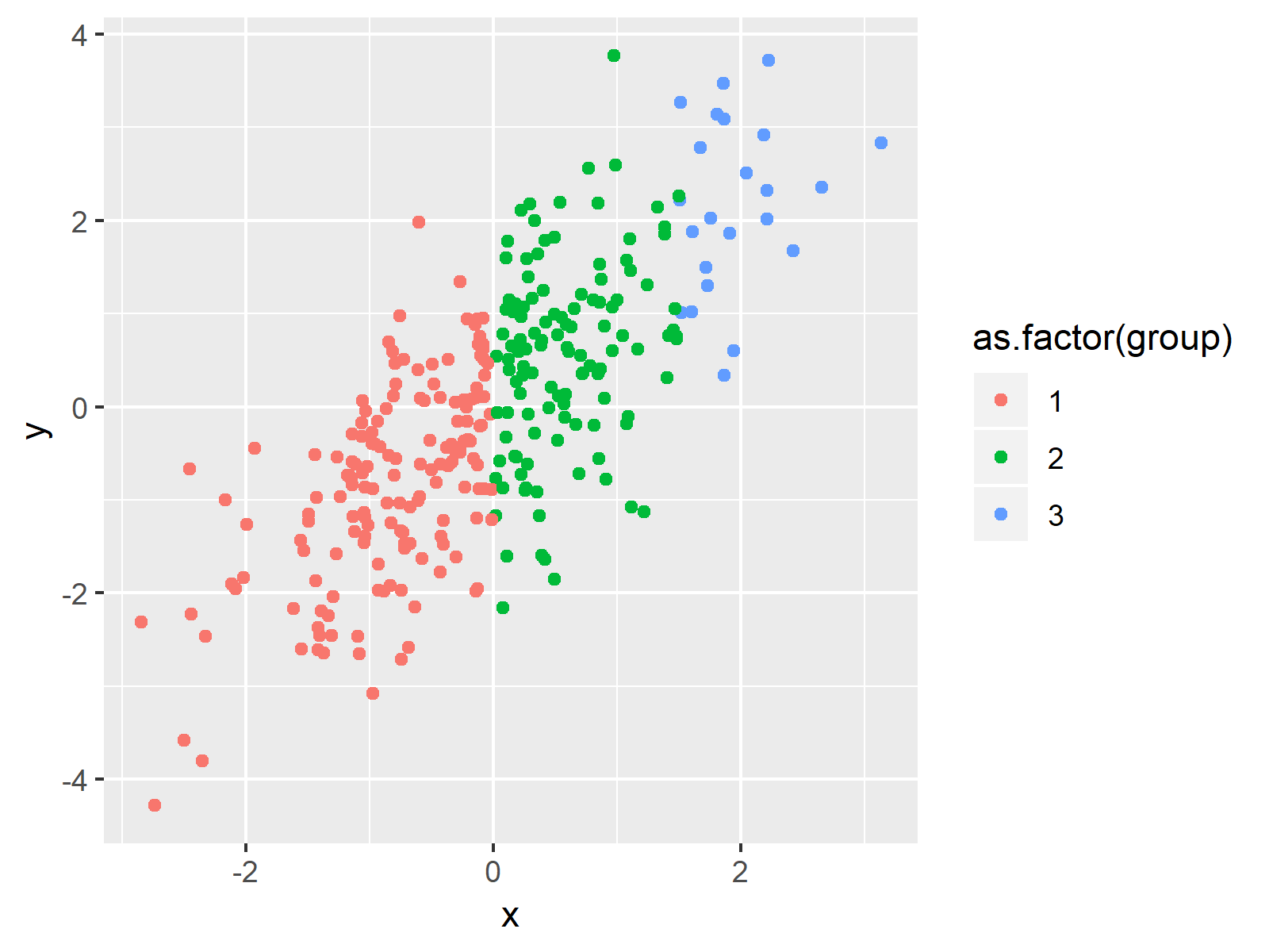
As illustrated in Figure 2, we created a colored scatterplot with the previous code.
Note that we had to convert our grouping column to the factor class within the aes function.
Video, Further Resources & Summary
I have recently published a video on my YouTube channel, which shows the R programming code of this tutorial. You can find the video below:
In addition, you may want to have a look at the related tutorials of this website:
- Add Color Between Two Points of Kernel Density Plot
- Control the Size of the Points in a Scatterplot
- Graphics Overview in R
- Introduction to R
This tutorial illustrated how to color the dots of xy-plots in the R programming language. If you have any further comments and/or questions, don’t hesitate to let me know in the comments section.
Subscribe to the Statistics Globe Newsletter
Get regular updates on the latest tutorials, offers & news at Statistics Globe.
I hate spam & you may opt out anytime: Privacy Policy.
Thank you!
Welcome to the Statistics Globe newsletter. From now on, I’ll send you regular emails about statistics, data science, AI, and programming with R and Python.
I’m Joachim Schork. On this website, I provide statistics tutorials as well as code in Python and R programming.
Statistics Globe Newsletter
Get regular updates on the latest tutorials, offers & news at Statistics Globe. I hate spam & you may opt out anytime: Privacy Policy.
Thank you!
Please check your email inbox and click the confirmation link to complete your subscription. If you don’t see the email within a few minutes, please also check your spam/junk folder.


