Plot Mean & Standard Deviation by Group in R (2 Examples)
In this article, I’ll explain how to draw a plot with mean and standard deviation by category in the R programming language.
The content of the post is structured as follows:
Let’s dive right into the examples!
Exemplifying Data & Add-On Packages
The first step is to create some exemplifying data:
set.seed(35422687)                             # Set random seed
data <- data.frame(value = runif(100),         # Create example data frame
                   group = LETTERS[1:5])
head(data)                                     # Print head of example data frame
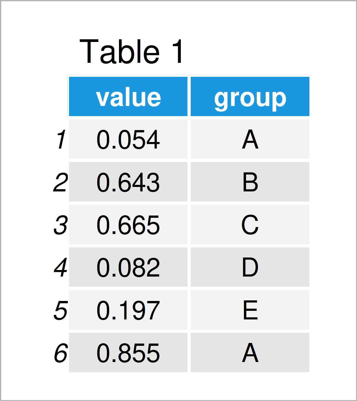
Table 1 shows the first six rows of our example data. Furthermore, it gets visible that the data contains two columns. The first column called value contains random numeric values, and the second column called group contains different categories.
We can now calculate the mean and standard deviation of the numeric values for each category in our data. For this, we first have to import the dplyr package:
install.packages("dplyr")                      # Install & load dplyr
library("dplyr")
Next, we can calculate our metrics as shown below:
data_msd <- data %>%                           # Get mean & standard deviation by group
  group_by(group) %>%
  summarise_at(vars(value),
               list(mean = mean,
                    sd = sd)) %>%
  as.data.frame()
data_msd                                       # Print means & standard deviations
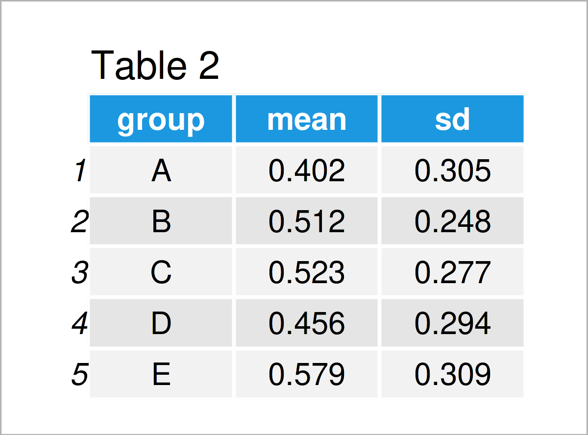
After executing the previous R programming syntax the data frame shown in Table 2 has been constructed. As you can see, this data frame contains one row with means and standard deviations for each of our groups.
Example 1: Draw Mean & Standard Deviation by Group Using Base R
This example demonstrates how to use the basic installation of the R programming language to plot means and standard deviations by category.
For this task, we have to use the plot, segments, and axis functions as shown below:
plot(1:length(unique(data$group)),             # Draw mean values
     data_msd$mean,
     xlab = "Groups",
     ylab = "Mean & Standard Deviation",
     xaxt = "n",
     ylim = c(min(data_msd$mean - data_msd$sd),
              max((data_msd$mean + data_msd$sd))))
segments(x0 = 1:length(unique(data$group)),    # Add standard deviations
         y0 = data_msd$mean - data_msd$sd,
         x1 = 1:length(unique(data$group)),
         y1 = data_msd$mean + data_msd$sd)
axis(side = 1,                                 # Add x-axis labels
     at = 1:length(unique(data$group)),
     labels = data_msd$group)
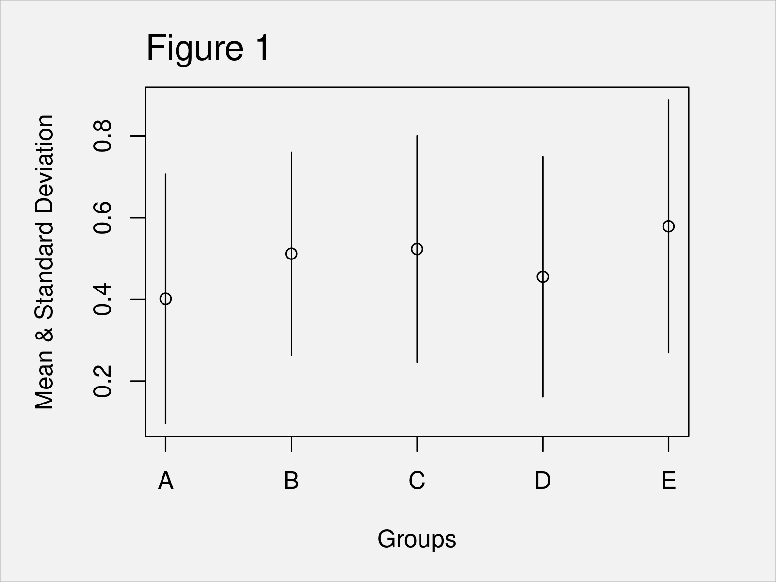
As revealed in Figure 1, the previous R programming code has created a Base R plot showing mean and standard deviation by group.
Example 2: Draw Mean & Standard Deviation by Group Using ggplot2 Package
In Example 2, I’ll demonstrate how to use the ggplot2 package to create a graphic with means and standard deviations for each group of a data frame.
First, we need to install and load the ggplot2 package:
install.packages("ggplot2")                    # Install ggplot2 package
library("ggplot2")                             # Load ggplot2 package
Now, we can apply the ggplot, geom_errorbar, and geom_point functions to create our graph:
ggplot(data_msd,                               # ggplot2 plot with means & standard deviation
       aes(x = group,
           y = mean)) +
  geom_errorbar(aes(ymin = mean - sd,
                    ymax = mean + sd)) +
  geom_point()
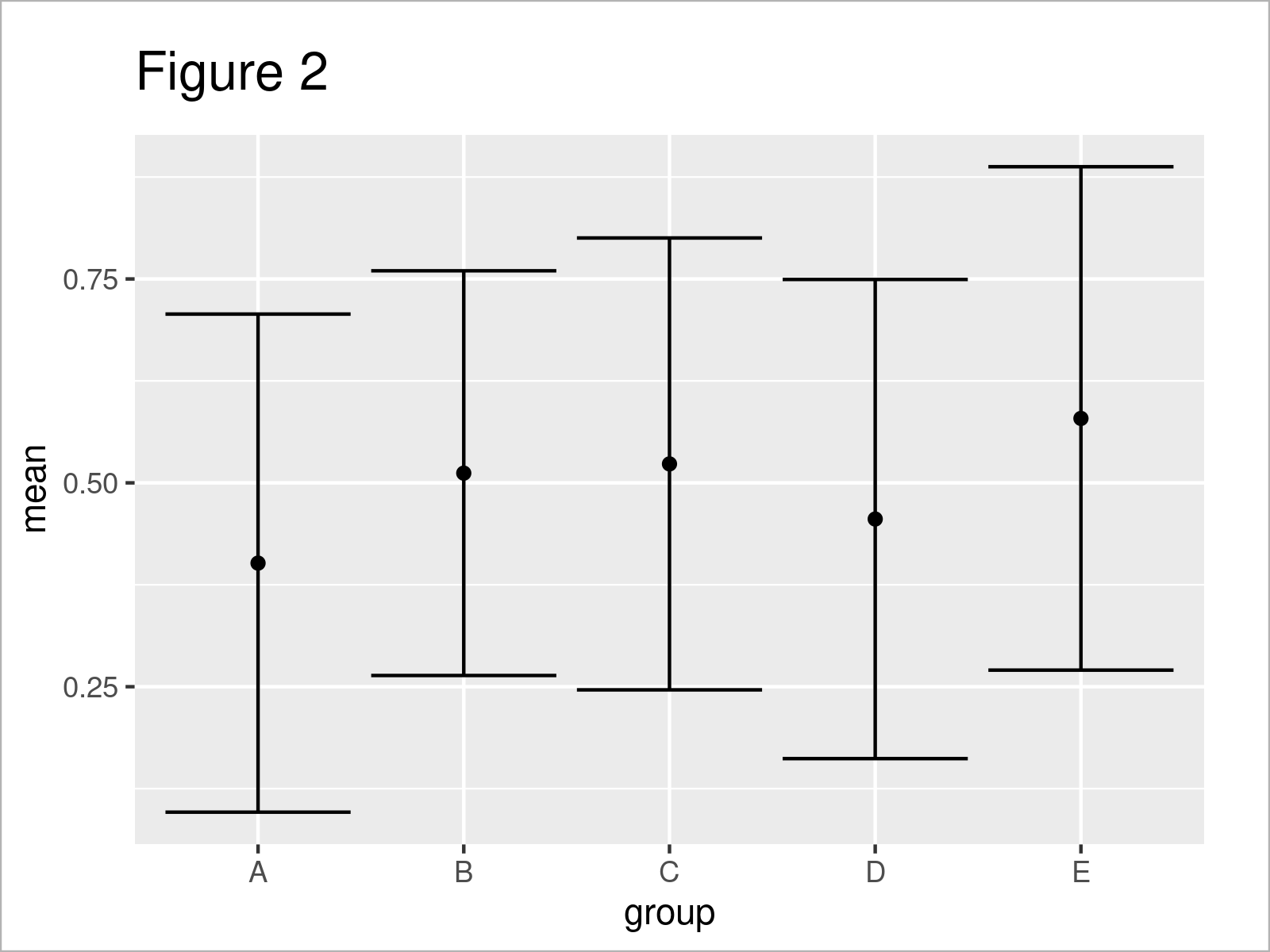
As shown in Figure 2, we have drawn a ggplot2 plot with means and standard deviations by executing the previous code.
Video & Further Resources
I have recently published a video on my YouTube channel, which shows the R programming code of this page. You can find the video below.
Besides the video, you might read some of the related tutorials on my website. I have published numerous tutorials on topics such as groups and descriptive statistics.
- Draw Plot with Confidence Intervals in R
- Draw Error Bars with Connected Mean Points in R
- Add Standard Error Bars to Barchart in R
- Mean by Group in R
- Standard Deviation by Row in R
- Warning Message in cor() : standard deviation is zero
- Standard Deviation in R
- Creating Plots in R
- Introduction to R
You have learned in this article how to create a graphic with means and standard deviations by group in the R programming language. Please let me know in the comments section below, in case you have any further questions or comments.
Subscribe to the Statistics Globe Newsletter
Get regular updates on the latest tutorials, offers & news at Statistics Globe.
I hate spam & you may opt out anytime: Privacy Policy.
Thank you!
Welcome to the Statistics Globe newsletter. From now on, I’ll send you regular emails about statistics, data science, AI, and programming with R and Python.
I’m Joachim Schork. On this website, I provide statistics tutorials as well as code in Python and R programming.
Statistics Globe Newsletter
Get regular updates on the latest tutorials, offers & news at Statistics Globe. I hate spam & you may opt out anytime: Privacy Policy.
Thank you!
Please check your email inbox and click the confirmation link to complete your subscription. If you don’t see the email within a few minutes, please also check your spam/junk folder.


