Draw Error Bars with Connected Mean Points in R (Example)
In this tutorial you’ll learn how to connect the mean points of error bars in R programming.
The article contains this content:
Let’s dive right in.
Constructing Example Data
The data below is used as basement for this tutorial:
data <- data.frame(group = letters[1:5],    # Create example data
                   mean = c(5, 3, 7, 3, 4),
                   upper = c(5.5, 3.3, 7.5, 3.4, 4.6),
                   lower = c(4.5, 2.7, 6.5, 2.6, 3.4))
data                                        # Print example data

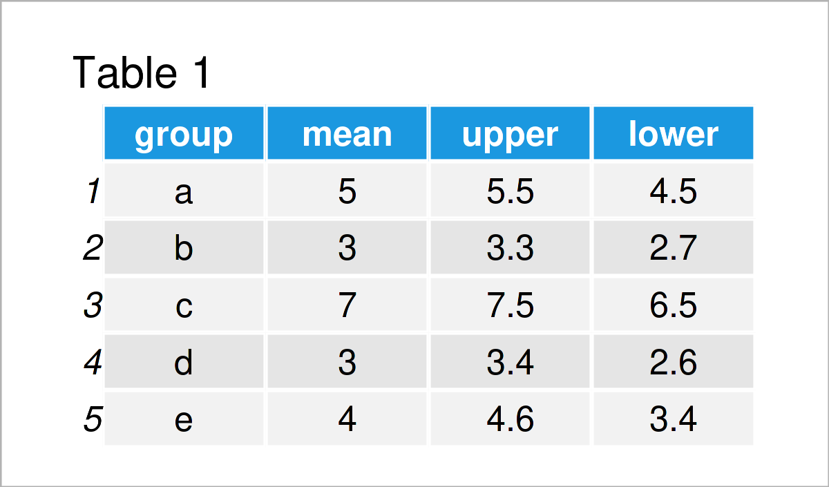
Have a look at the table that got returned after executing the previous R programming syntax. It shows that our example data consists of five rows and the four columns “group”, “mean”, “upper”, and “lower”.
Note that, for the sake of simplicity of this tutorial, I have made up the mean estimates as well as the upper and lower confidence interval limits of this data frame.
Have a look here, in case you want to calculate mean values by group; And have a look here, in case you want to calculate confidence intervals.
However, let’s move on to the creation of our graph!
Example: Create ggplot2 Plot of Error Bars with Connected Mean Points
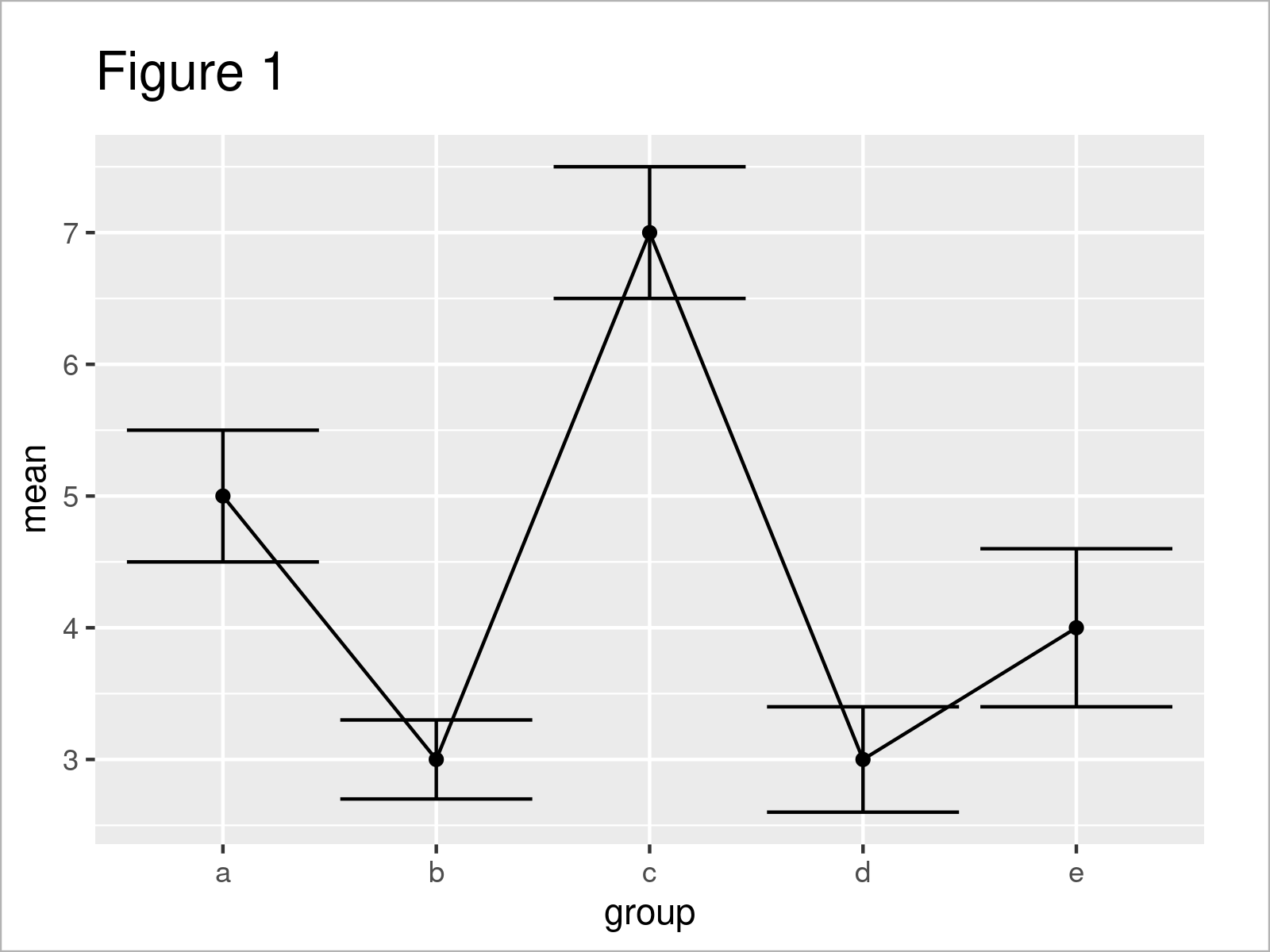
This example demonstrates how to draw a plot with error bars and connected mean values.
In this example, we’ll use the ggplot2 package. If we want to use the functions of the ggplot2 package, we first have to install and load ggplot2:
install.packages("ggplot2")                 # Install & load ggplot2
library("ggplot2")
In the next step, we can draw our plot with error bars and connected mean values.
The following syntax is basically split into four parts:
- The ggplot function defines the name of our data set as well as the columns containing our group indicator and the mean value estimates.
- The geom_errorbar function draws error bars to our plot. Note that we have to specify the lower and upper confidence interval limits within this function.
- The geom_line function connects the mean values of our error bars with lines.
- The geom_point function annotates points indicating the mean values of each error bar.
Let’s do this in practice!
ggplot(data, aes(x = group, y = mean)) +    # Draw error bars with connected lines
  geom_errorbar(aes(ymin = lower, ymax = upper)) +
  geom_line(aes(x = 1:nrow(data), y = mean)) +
  geom_point()

In Figure 1 you can see that we have drawn a ggplot2 plot with standard error bars, mean values, and connecting lines.
Video & Further Resources
In case you need more explanations on the R syntax of this tutorial, I recommend having a look at the following video on the Statistics Globe YouTube channel. I’m explaining the R programming code of this article in the video:
In addition, you may have a look at the other tutorials on my homepage.
- Add Standard Error Bars to Barchart in R
- Add Whiskers to ggplot2 Boxplot in R
- Draw ggplot2 Plot with Lines and Points
- All R Programming Tutorials
In this tutorial, I have demonstrated how to draw a graphic where the mean points of error bars are connected in the R programming language. In case you have additional questions, don’t hesitate to let me know in the comments. Furthermore, please subscribe to my email newsletter to get updates on new tutorials.


