Draw Plot with Confidence Intervals in R (2 Examples)
In this tutorial you’ll learn how to plot a data frame with error bars using ggplot2 and plotrix in the R programming language.
Table of contents:
Let’s just jump right in.
Creating Example Data
As a first step, we’ll need to create some example data.
set.seed(923874)                 # Create example data
data <- round(data.frame(x = 1:10,
                         y = runif(10, 10, 20),
                         lower = runif(10, 0, 10),
                         upper = runif(10, 20, 30)), 2)
data                             # Print example data
#     x     y lower upper
# 1   1 13.67  6.61 20.95
# 2   2 15.96  1.01 25.75
# 3   3 19.27  3.71 20.50
# 4   4 17.33  3.94 24.63
# 5   5 15.26  8.37 21.05
# 6   6 12.95  9.41 28.52
# 7   7 11.38  3.47 24.64
# 8   8 10.70  3.15 26.73
# 9   9 17.00  3.72 25.80
# 10 10 17.82  7.99 26.33
The previous RStudio console output shows the structure of our example data. Our data frame consists of ten rows and four columns.
The variables x and y specify the coordinates of our data points. For instance, those points could represent mean values for certain categories. The variables lower and upper contain the confidence intervals of our data points.
Example 1: Drawing Plot with Confidence Intervals Using ggplot2 Package
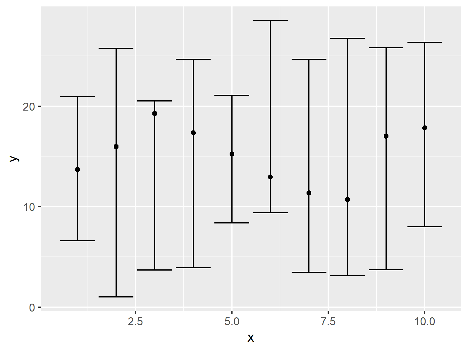
This example illustrates how to plot data with confidence intervals using the ggplot2 package.
First, we need to install and load the ggplot2 add-on package:
install.packages("ggplot2")      # Install & load ggplot2
library("ggplot2")
Now, we can use the geom_point and geom_errorbar functions to draw our graph with confidence intervals in R:
ggplot(data, aes(x, y)) +        # ggplot2 plot with confidence intervals
  geom_point() +
  geom_errorbar(aes(ymin = lower, ymax = upper))

As shown in Figure 1, we created a dotplot with confidence intervals with the previous code.
Example 2: Drawing Plot with Confidence Intervals Using plotrix Package
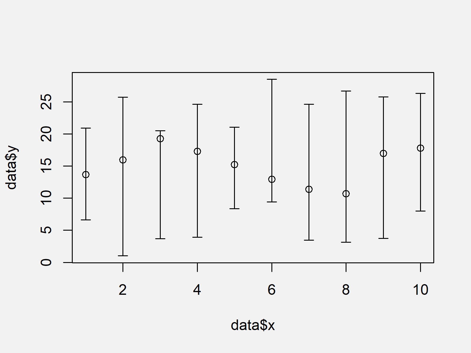
This example explains how to use the plotrix package to draw a confidence interval plot in R.
If we want to use the functions of the plotrix package, we first need to install and load plotrix:
install.packages("plotrix")      # Install plotrix package
library("plotrix")               # Load plotrix
Now, we can apply the plotCI function of the plotrix package as shown below:
plotCI(x = data$x,               # plotrix plot with confidence intervals
       y = data$y,
       li = data$lower,
       ui = data$upper)

As shown in Figure 2, the previous code created an xy-plot with confidence intervals using the plotrix package. The values are the same as in Example 1, but the layout of the graphic is different.
Video, Further Resources & Summary
Would you like to know more about plotting data in R? Then I can recommend having a look at the following video of my YouTube channel. I’m explaining the R codes of this article in the video.
Furthermore, you may have a look at the other articles of https://www.statisticsglobe.com/.
- Draw Time Series Plot with Events Using ggplot2 Package
- Draw Plot of Function Curve
- Graphics in R
- All R Programming Tutorials
You learned in this tutorial how to draw confidence intervals to a scatterplot in the R programming language. In case you have further questions, kindly let me know in the comments section.
Subscribe to the Statistics Globe Newsletter
Get regular updates on the latest tutorials, offers & news at Statistics Globe.
I hate spam & you may opt out anytime: Privacy Policy.
Thank you!
Welcome to the Statistics Globe newsletter. From now on, I’ll send you regular emails about statistics, data science, AI, and programming with R and Python.
I’m Joachim Schork. On this website, I provide statistics tutorials as well as code in Python and R programming.
Statistics Globe Newsletter
Get regular updates on the latest tutorials, offers & news at Statistics Globe. I hate spam & you may opt out anytime: Privacy Policy.
Thank you!
Please check your email inbox and click the confirmation link to complete your subscription. If you don’t see the email within a few minutes, please also check your spam/junk folder.


