Draw Composition of Plots Using the patchwork Package in R (3 Examples)
On this page, I’ll illustrate how to arrange multiple ggplot2 plots in a grid using the patchwork package in R.
The patchwork package is a relatively new package developed by Thomas Lin Pedersen and provides simple functions for the composition of separate ggplot2 plots into the same graph window.
In my opinion, this package makes it much more convenient to control plot layouts and is easier to understand compared to other ways for combining graphics in R such as using the gridExtra package.
Anyway, this is the table of contents of this tutorial:
Let’s get straight to the exemplifying R syntax!
Example Data, Packages & Basic Plots
We’ll use the following data as basement for this R tutorial:
set.seed(982634)                                     # Create example data
x <- rnorm(100)
y <- x + runif(100, 10, 20)
data <- data.frame(x,
                   y,
                   group = LETTERS[1:4])
head(data)                                           # Print head of example data
#             x         y group
# 1 -0.28498592 19.058031     A
# 2 -2.04161712  9.081855     B
# 3 -0.22826686 11.110235     C
# 4 -0.50916995 18.509989     D
# 5  0.06237959 11.708578     A
# 6  1.34967579 17.829645     B
Have a look at the previous output of the RStudio console. It shows that our example data has three columns. The variables x and y are numeric and the variable group is a factor containing four different factor levels.
In this tutorial, we’ll draw a grid of ggplot2 plots. If we want to use the functions of the ggplot2 package, we have to install and load ggplot2:
install.packages("ggplot2")                          # Install & load ggplot2
library("ggplot2")
Furthermore, we need the functions of the patchwork package:
install.packages("patchwork")                        # Install patchwork package
library("patchwork")                                 # Load patchwork package
As next step, we can draw our data in three different ggplot2 plots:
ggp1 <- ggplot(data, aes(x, y, col = group)) +       # Create scatterplot
  geom_point()
ggp1                                                 # Draw scatterplot
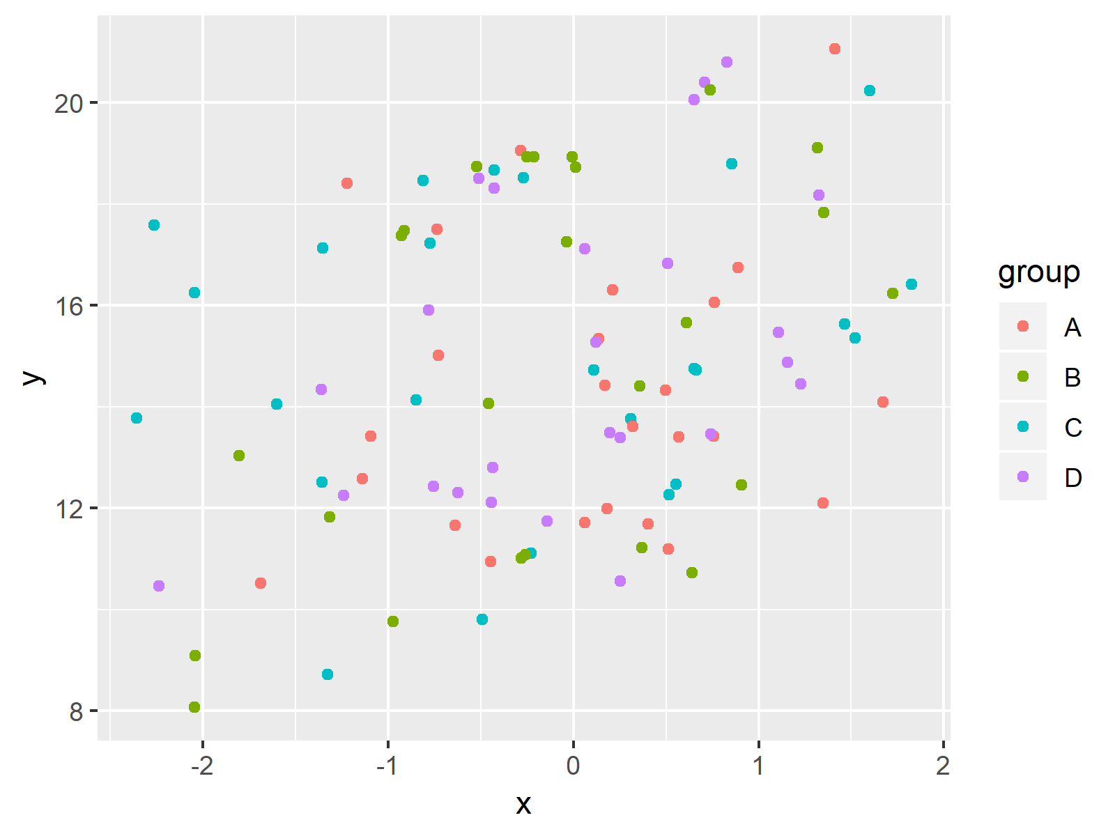
The output of the previously shown R syntax is shown in Figure 1 – A ggplot2 scatterplot.
Let’s create another ggplot2 plot:
ggp2 <- ggplot(data, aes(x, y)) +                    # Create line plot
  geom_line()
ggp2                                                 # Draw line plot
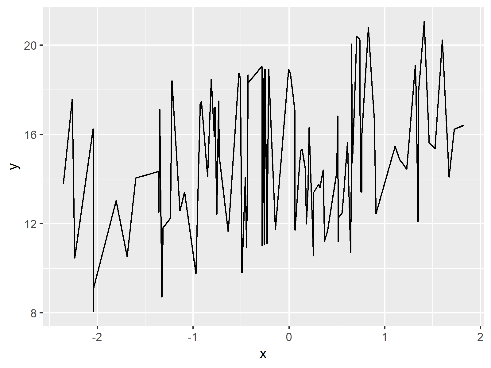
Figure 2 shows the output of the previous code: A ggplot2 line plot.
One last plot:
ggp3 <- ggplot(data, aes(group, y, fill = group)) +  # Create barplot
  geom_bar(stat = "identity")
ggp3                                                 # Draw barplot
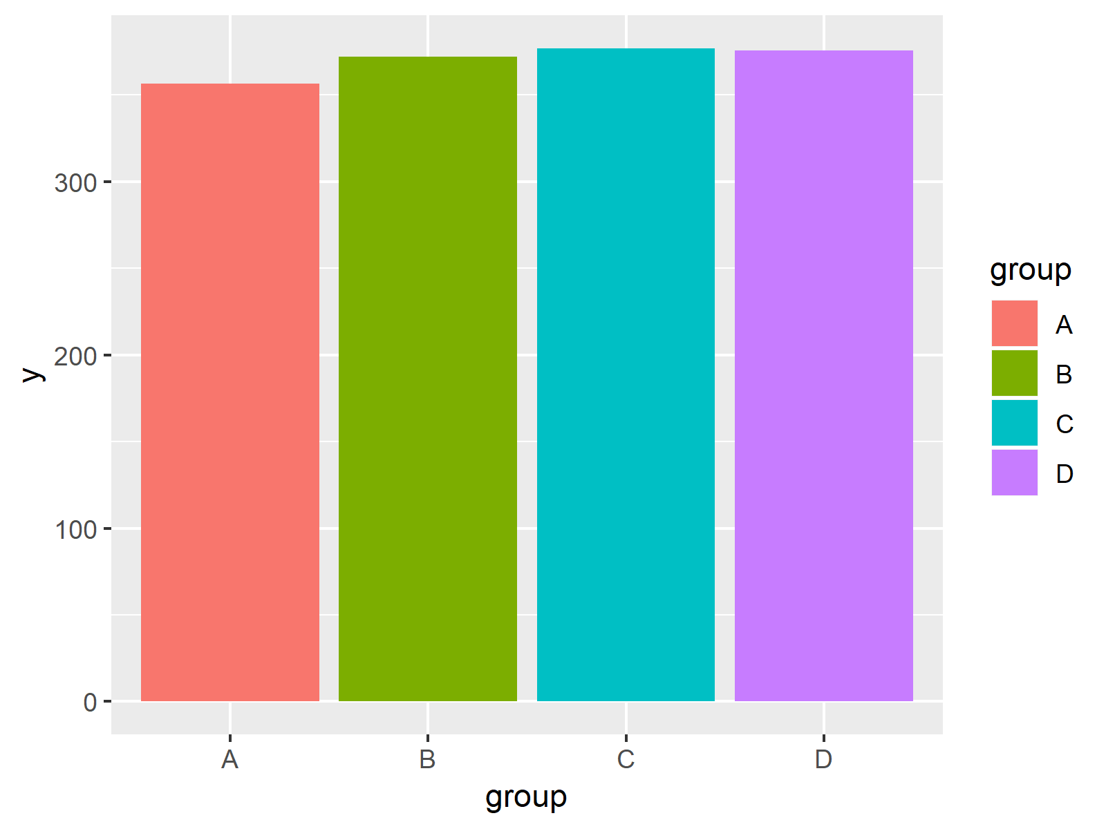
The output of the previously shown R code is shown in Figure 3: A ggplot2 barplot.
Note that our three plots are stored in the plot objects ggp1, ggp2, and ggp3. Let’s create a composition of these plots using the patchwork package!
Example 1: Arrange Multiple Plots in Same Graph Side-by-Side
Example 1 illustrates how to draw our three ggplot2 plots side-by-side in the same graphic.
And here comes the beauty of the patchwork package: We simply have to add our three plot objects as shown below.
ggp_combi_1 <- ggp1 + ggp2 + ggp3                    # Create grid of plots
ggp_combi_1                                          # Draw multiple ggplot2 plots
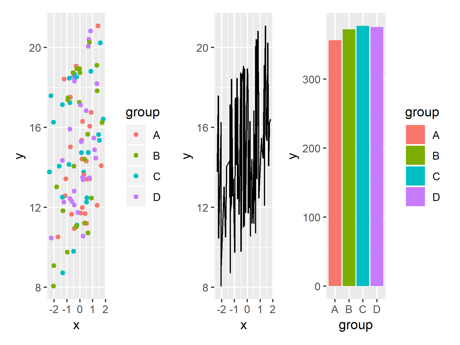
Figure 4 shows the output of the previous syntax – A grid of several ggplot2 plots besides each other in the same row.
Looks great! But that’s just the tip of the iceberg, so keep on reading…
Example 2: Arrange Plots in Multiple Rows & Columns (Different Height)
In Example 2, I’ll illustrate how to use the patchwork package to draw a grid of plots consisting of multiple rows. For this, we simply have to use a slash (i.e. /) at the position where we want to start the new line:
ggp_combi_2 <- ggp1 + ggp2 / ggp3                    # Create grid of plots
ggp_combi_2                                          # Draw multiple ggplot2 plots
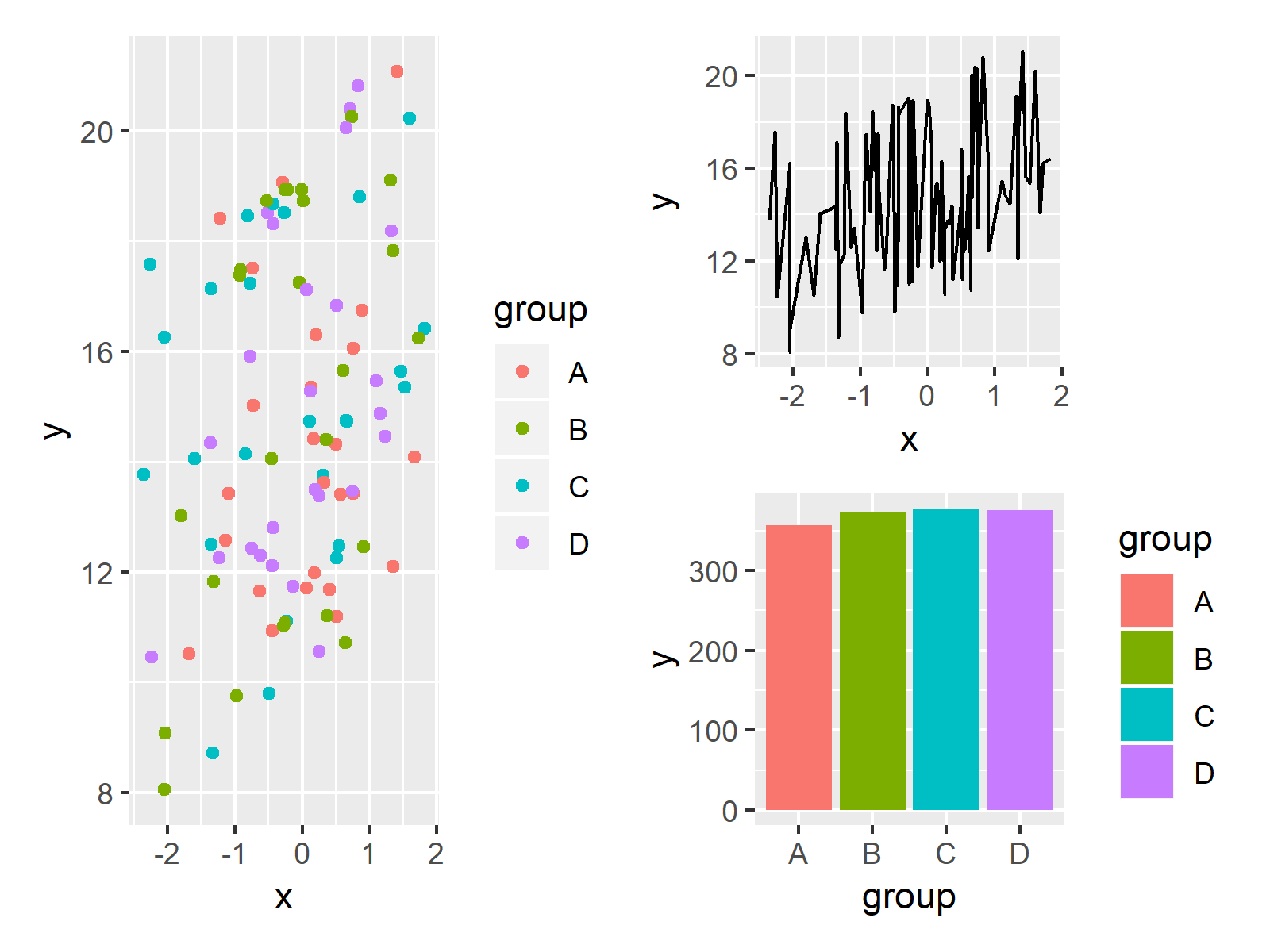
Figure 5 shows the output of the previous R programming code – Our three plots were arranged in two columns and two rows.
Note that the first column only consists of ggp1, since we have specified only a single plot before the plus sign. For this reason, the height of ggp1 was automatically set to be twice as high as the height of ggp2 and ggp3.
Example 3: Arrange Plots in Multiple Rows & Columns (Different Width)
This example explains how to compose our plots so that the plots have a different width. Have a look at the following R code and its output:
ggp_combi_3 <- ggp1 / (ggp2 + ggp3)                  # Create grid of plots
ggp_combi_3                                          # Draw multiple ggplot2 plots
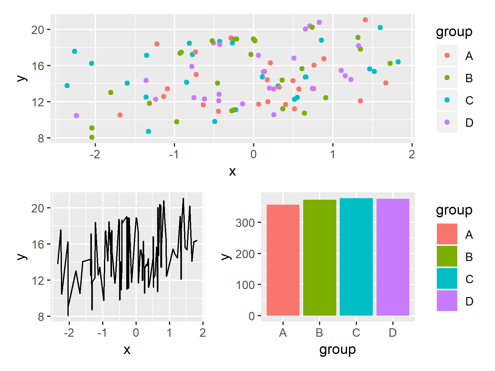
Figure 6 shows the output of the previous R code – Our plots where split into two columns and two rows.
Note that we had to use parentheses to ensure that ggp2 and ggp3 are both located in the second row.
Video & Further Resources
Some time ago I have published a video on my YouTube channel, which shows the R code of this page. You can find the video below:
In addition, I strongly recommend to have a look at the tutorials on the patchwork website. They show additional features of the package that I have not discussed here.
You may also want to read some of the other tutorials of my homepage. I have published numerous tutorials about graphics in R already:
- Draw Multiple ggplot2 Plots Side-by-Side
- Draw Unbalanced Grid of ggplot2 Plots
- Arrange List of ggplot2 Plots in R
- Add Common Legend to Combined ggplot2 Plots
- Draw Multiple lattice Plots in One Window
- patchwork Package in R
- Graphics in R
- R Programming Language
At this point of the tutorial you should know how to control a plot layout in R by using the patchwork package. In case you have any further questions or comments, don’t hesitate to let me know in the comments section.
Subscribe to the Statistics Globe Newsletter
Get regular updates on the latest tutorials, offers & news at Statistics Globe.
I hate spam & you may opt out anytime: Privacy Policy.
Thank you!
Welcome to the Statistics Globe newsletter. From now on, I’ll send you regular emails about statistics, data science, AI, and programming with R and Python.
I’m Joachim Schork. On this website, I provide statistics tutorials as well as code in Python and R programming.
Statistics Globe Newsletter
Get regular updates on the latest tutorials, offers & news at Statistics Globe. I hate spam & you may opt out anytime: Privacy Policy.
Thank you!
Please check your email inbox and click the confirmation link to complete your subscription. If you don’t see the email within a few minutes, please also check your spam/junk folder.


4 Comments. Leave new
Thank you
You are very welcome Anik! Thanks for the comment 🙂
Hi. I have done all. But when I write ggp1, no plot appeared. How can I plot the scatterplot here?
Hey Temur,
Did you get any error or warning messages when executing the code?
Regards,
Joachim