ggplot2 Histogram & Overlaid Density with Frequency Count on Y-Axis in R (Example)
In this tutorial you’ll learn how to create a ggplot2 histogram with overlaid density and count values on the y-axis in R.
The post will consist of this:
You’re here for the answer, so let’s get straight to the example.
Example Data, Add-On Packages & Default Graph
Consider the following example data:
set.seed(489126)              # Create example data
data <- data.frame(x = rnorm(100))
head(data)                    # Head of example data

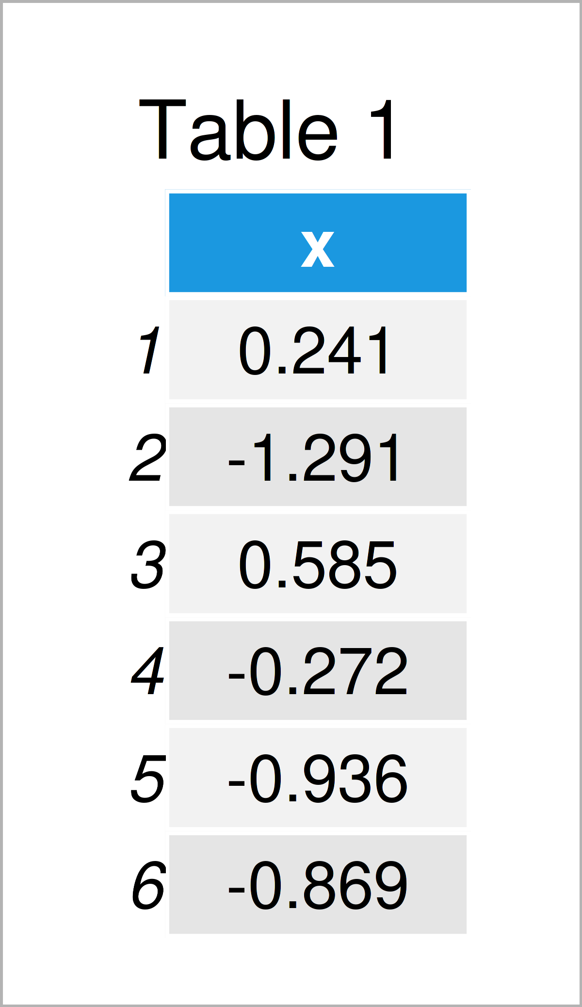
As you can see based on Table 1, our example data is a data frame having one column called “x”.
We also have to install and load the ggplot2 package, in case we want to use the functions that are included in the package:
install.packages("ggplot2")   # Install & load ggplot2 package
library("ggplot2")
Next, we can plot our data:
ggplot(data, aes(x)) +        # Draw ggplot2 plot with hist & density
  geom_histogram() +
  geom_density(aes(y = ..density..), col = 2)

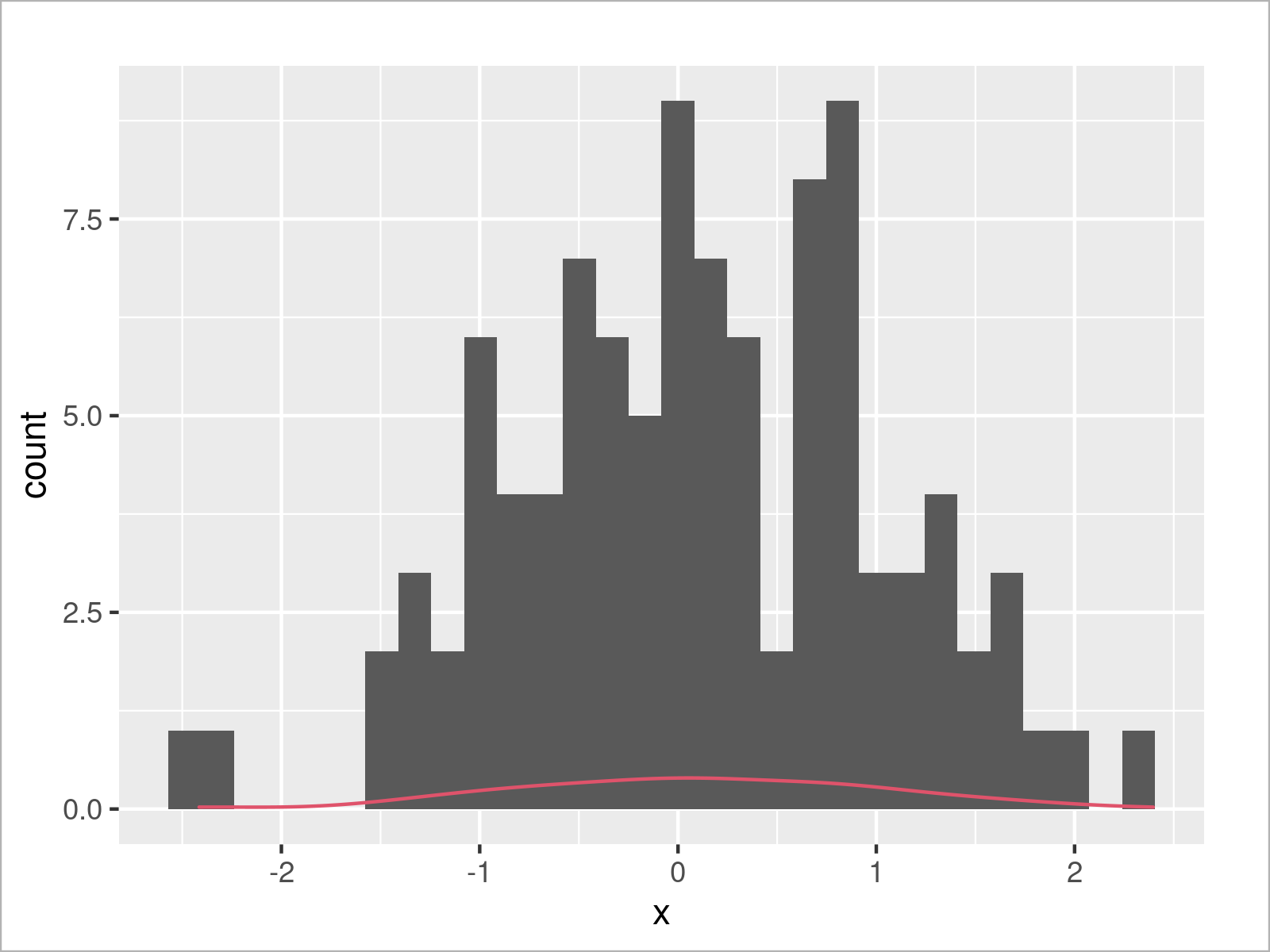
In Figure 1 it is shown that we have managed to create a ggplot2 histogram with overlaid density by executing the previous R code.
However, you can also see that the density is shown relatively low in the plot, i.e. the height of the density is not shown with the same y-axis scale as the histogram.
In the following example, I’ll show how to change that!
Example: Draw Histogram & Density with Count Values on Y-axis
The following R programming code illustrates how to properly overlay a density on top of a histogram.
For this, we have to harmonize the y-axis scale of the two plots (i.e. the histogram and the density). One solution for this would be to show the histogram with a density-y-axis as illustrated in this tutorial.
However, in the present tutorial I’ll explain how to show a histogram with overlaid density and frequency counts on the y-axis.
For this task, we first have to specify a certain binwidth for our histogram. This is important to calculate the height of the density later on.
my_binwidth <- 0.2 # Specify binwidth
Next, we can draw our graph once again. Note that we are changing the density settings in the geom_density function below:
ggplot(data, aes(x)) +        # Draw hist & density with count on y-axis
  geom_histogram(binwidth = my_binwidth) +
  geom_density(aes(y = ..density.. * (nrow(data) * my_binwidth)), col = 2)

As shown in Figure 2, the previous code has created a ggplot2 histogram with overlaid density and frequency counts on the y-axis.
Video & Further Resources
In case you need further info on the R programming codes of this tutorial, you might watch the following video on my YouTube channel. I’m explaining the R programming syntax of this article in the video:
In addition, you may have a look at the related tutorials on my website. You can find a selection of articles about related topics such as ggplot2 and distributions below:
- Overlay Normal Density Curve on Top of ggplot2 Histogram
- Overlay Histogram with Fitted Density Curve in Base R & ggplot2 Package
- Creating Plots in R
- All R Programming Examples
At this point of the page you should have learned how to draw a histogram with overlaid density and count values on the y-axis in the R programming language. In case you have further comments or questions, let me know in the comments section.
Subscribe to the Statistics Globe Newsletter
Get regular updates on the latest tutorials, offers & news at Statistics Globe.
I hate spam & you may opt out anytime: Privacy Policy.
Thank you!
Welcome to the Statistics Globe newsletter. From now on, I’ll send you regular emails about statistics, data science, AI, and programming with R and Python.
I’m Joachim Schork. On this website, I provide statistics tutorials as well as code in Python and R programming.
Statistics Globe Newsletter
Get regular updates on the latest tutorials, offers & news at Statistics Globe. I hate spam & you may opt out anytime: Privacy Policy.
Thank you!
Please check your email inbox and click the confirmation link to complete your subscription. If you don’t see the email within a few minutes, please also check your spam/junk folder.


