Draw Unbalanced Grid of ggplot2 Plots in R (Example)
This page explains how to create a grid of plots with different sizes in the R programming language.
The tutorial contains this content:
Let’s just jump right in…
Example Data
We’ll use the following data frame as example data:
set.seed(963)                                  # Create example data
data <- data.frame(x = rnorm(100),
                   y = rnorm(100))
head(data)                                     # Print first rows of data
#            x           y
# 1 -0.3814289 -1.34755690
# 2  1.0976566  1.70212897
# 3  0.1141007  0.25060268
# 4  1.4211450  0.20545551
# 5  0.1847765 -0.05066872
# 6  1.4850370  0.49485481
Our data consists of 100 rows and two numeric columns x and y.
Furthermore, we need to install and load the ggplot2 package…
install.packages("ggplot2")                    # Install and load ggplot2
library("ggplot2")
…as well as the gridExtra package:
install.packages("gridExtra")                  # Install and load gridExtra
library("gridExtra")
Now, we can draw a plot with the functions of the ggplot2 package as shown below:
ggp <- ggplot(data, aes(x, y)) +               # Create ggplot2 scatterplot
  geom_point()
ggp                                            # Draw plot

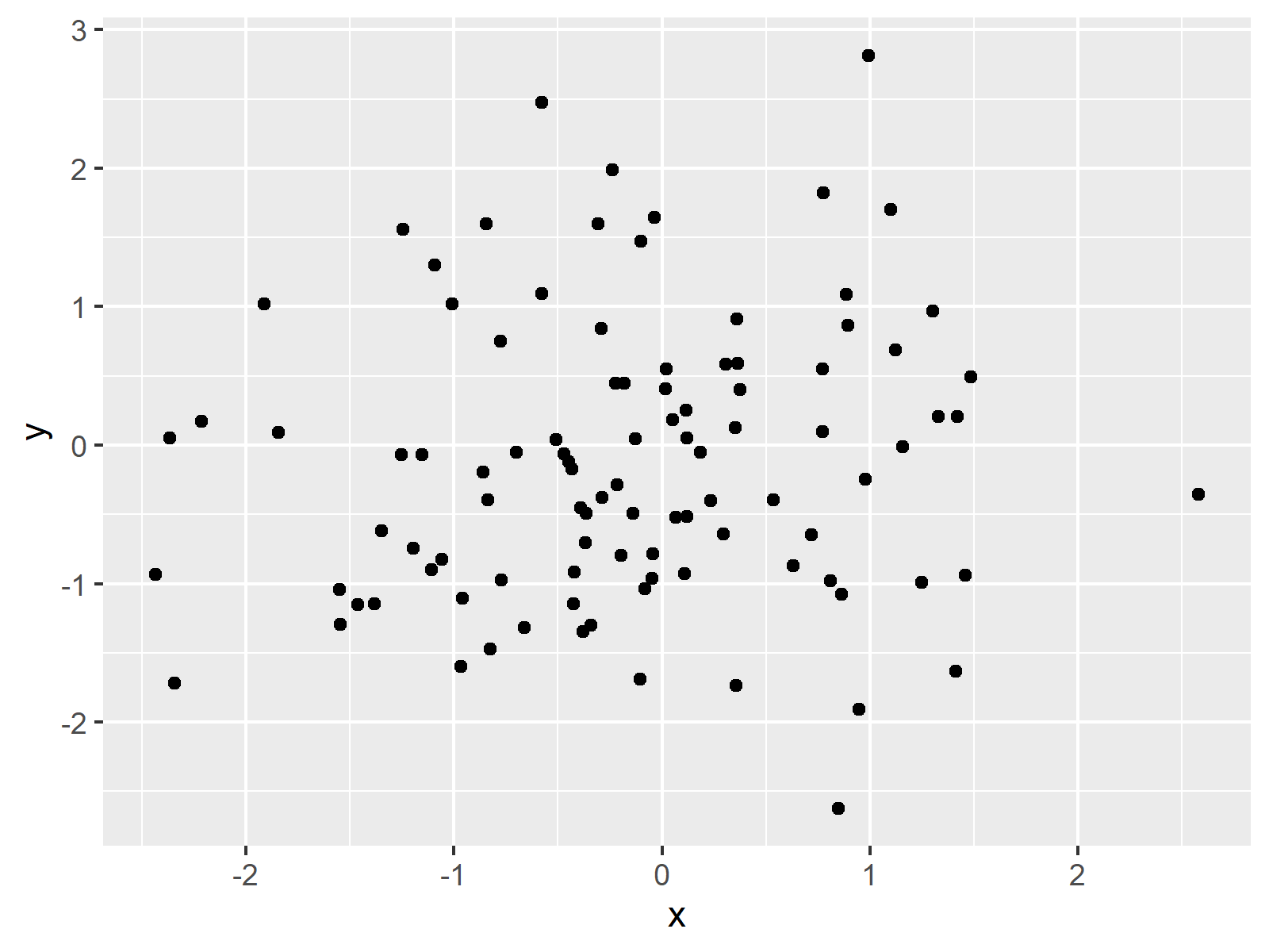
Figure 1: Simple ggplot2 Scatterplot.
Figure 1 visualizes how our example plot looks like: It’s a basic scatterplot.
In the following, I’ll explain how to draw this scatterplot multiple times side-by-side – each time with a different size. So keep on reading…
Example: Draw Multiple Plots with Different Size
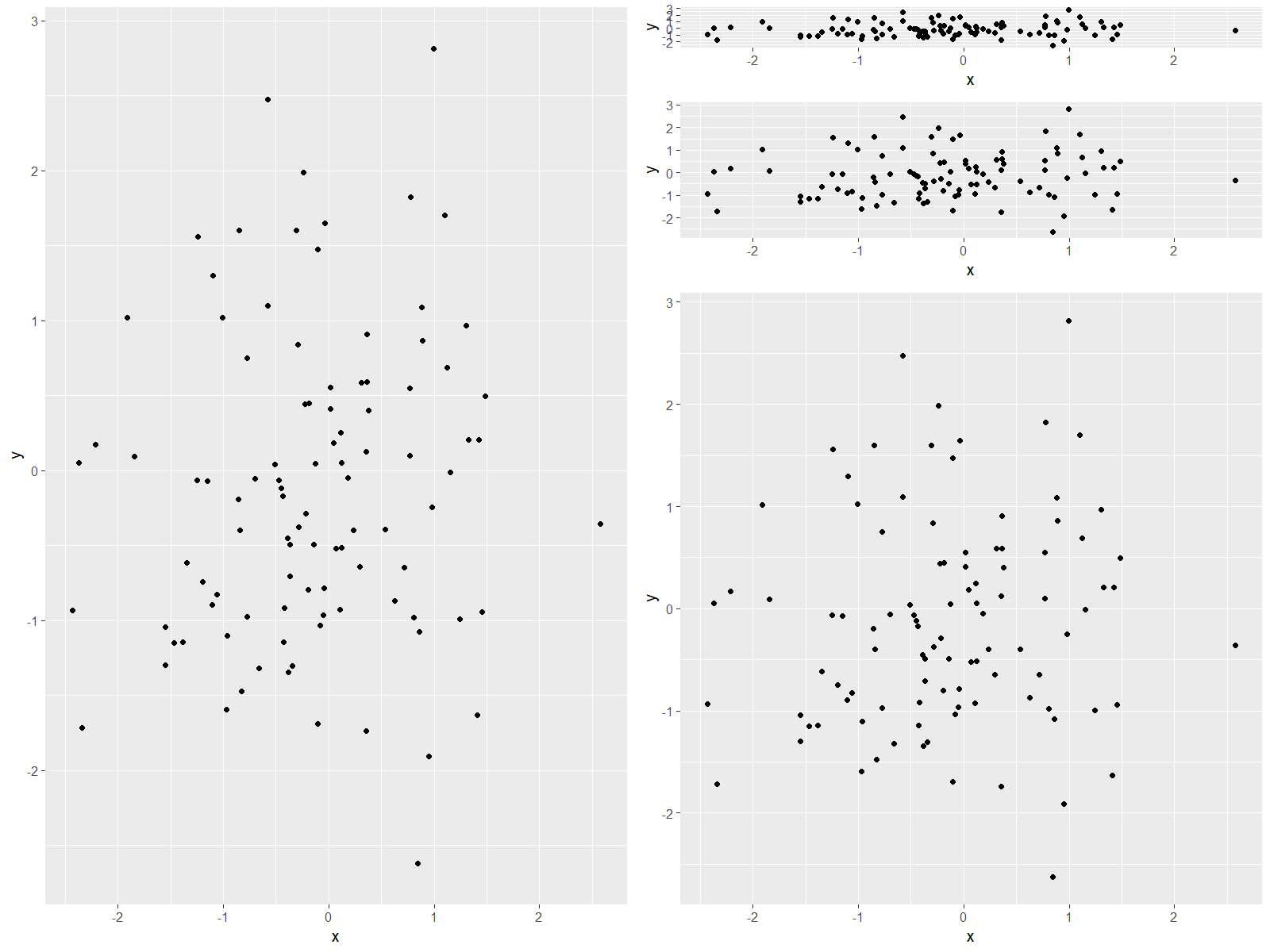
If we want to create a grid of plots with different sizes, we can use the grid.arrange and arrangeGrob functions of the gridExtra package. Within these functions, we can specify the number of columns and rows of our grid as well as the height and width of each graph:
grid.arrange(ggp,                              # Arrange plot in grid
             arrangeGrob(ggp, ggp, ggp,
                         heights = c(0.1, 0.2, 0.7)),
             ncol = 2)

Figure 2: Multiple ggplot2 Plots in an Unbalanced Grid.
Figure 2 shows the output of the previous R code. As you can see, we created a grid consisting of five plots with different sizes.
Video & Further Resources
Would you like to learn more about the plotting of data in grids? Then you might want to have a look at the following video of my YouTube channel. In the video, I illustrate the R code of this tutorial.
In addition, I can recommend to have a look at the related articles of this website. I have released numerous articles already:
- Introduction to the ggplot2 Package
- Add Common Legend to Combined ggplot2 Plots
- R Graphics Gallery
- The R Programming Language
In this tutorial you learned how to obtain an unbalanced layout of graphics in the R programming language. Please let me know in the comments section, in case you have any further questions.
Subscribe to the Statistics Globe Newsletter
Get regular updates on the latest tutorials, offers & news at Statistics Globe.
I hate spam & you may opt out anytime: Privacy Policy.
Thank you!
Welcome to the Statistics Globe newsletter. From now on, I’ll send you regular emails about statistics, data science, AI, and programming with R and Python.
I’m Joachim Schork. On this website, I provide statistics tutorials as well as code in Python and R programming.
Statistics Globe Newsletter
Get regular updates on the latest tutorials, offers & news at Statistics Globe. I hate spam & you may opt out anytime: Privacy Policy.
Thank you!
Please check your email inbox and click the confirmation link to complete your subscription. If you don’t see the email within a few minutes, please also check your spam/junk folder.


