Draw Histogram and/or Density for Each Column of Data Frame in R (3 Examples)
In this article, you’ll learn how to draw a histogram and / or a density plot for every variable of a data frame in R programming.
The tutorial will contain this content:
Let’s jump right to the examples!
Example Data & Add-On Packages
As the first step, we’ll have to create some data that we can use in the examples later on:
set.seed(5289567)                              # Create example data frame
data <- data.frame(x1 = rnorm(100),
                   x2 = runif(100),
                   x3 = rpois(100, 3),
                   x4 = rlogis(100))
head(data)                                     # Print head of example data frame
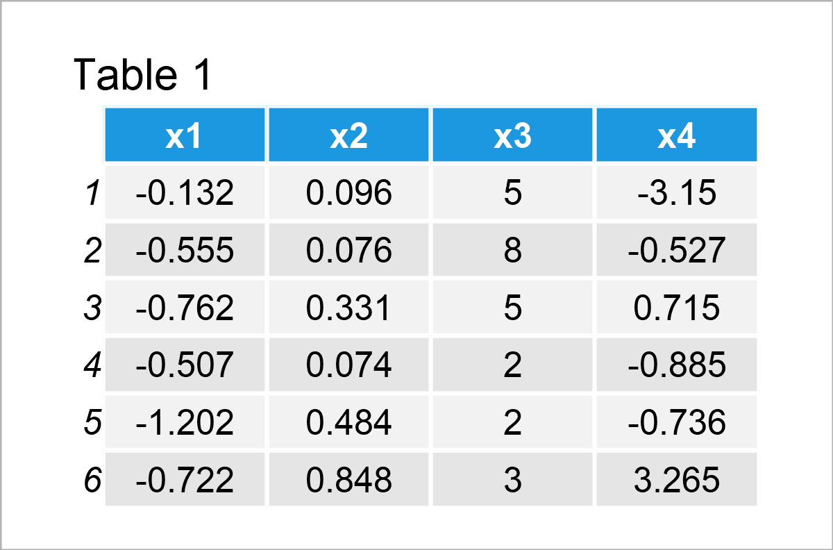
As you can see based on Table 1, our example data is a data frame containing four columns that are named “x1”, “x2”, “x3”, and “x4”. The columns x1, x2, and x4 have the numeric class and the variable x3 is an integer.
In this tutorial, we’ll create our graphics based on the ggplot2 package. We need to install and load the ggplot2 package, to be able to use the corresponding functions:
install.packages("ggplot2")                    # Install ggplot2 package
library("ggplot2")                             # Load ggplot2
For the examples of this tutorial, we’ll also need to reshape our data set from wide to long format.
For this, we also have to install and load the tidyr package:
install.packages("tidyr")                      # Install & load tidyr package
library("tidyr")
Now, we can apply the pivot_longer function to convert our data from wide to long format.
Note that we are also using the as.data.frame function to keep the data.frame class. However, this is an optional step that can be skipped in case you prefer to work with tibbles.
data_long <- data %>%                          # Apply pivot_longer function
  pivot_longer(colnames(data)) %>%
  as.data.frame()
head(data_long)                                # Print head of long data
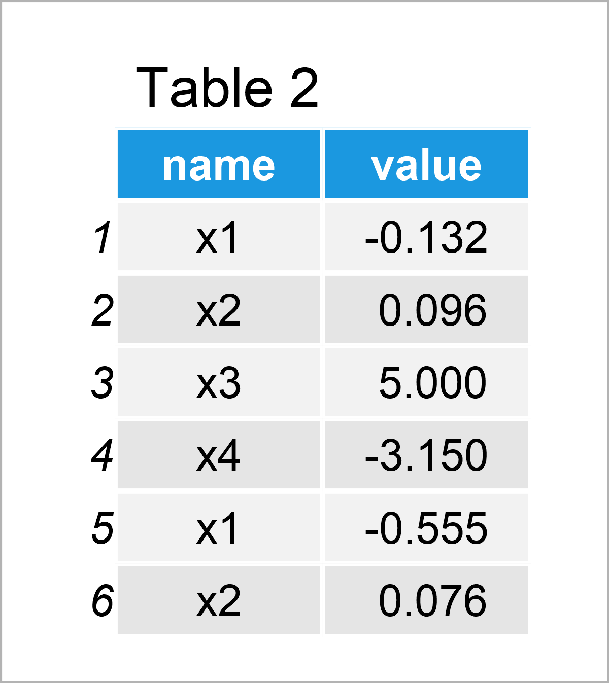
In Table 2 the transformed data frame in long format is shown.
So far so good – Let’s draw our data!
Example 1: Draw Each Column of Data Frame as Histogram
In Example 1, I’ll illustrate how to plot every variable in our data frame in a separate histogram.
Have a look at the following R code:
The ggplot and geom_histogram functions specify that we want to draw a histogram of our data.
The facet_wrap function specifies that we want to draw each column in a different panel.
Note that we are setting the scales argument within the facet_wrap function to be equal to “free”. This creates histograms with different axis limits on the x- and y-axes. In case you want to use the same axis limits for all panels, you may remove the scales argument from the following R code.
Enough talk: Let’s draw our histograms:
ggp1 <- ggplot(data_long, aes(x = value)) +    # Draw each column as histogram
  geom_histogram() +
  facet_wrap(~ name, scales = "free")
ggp1
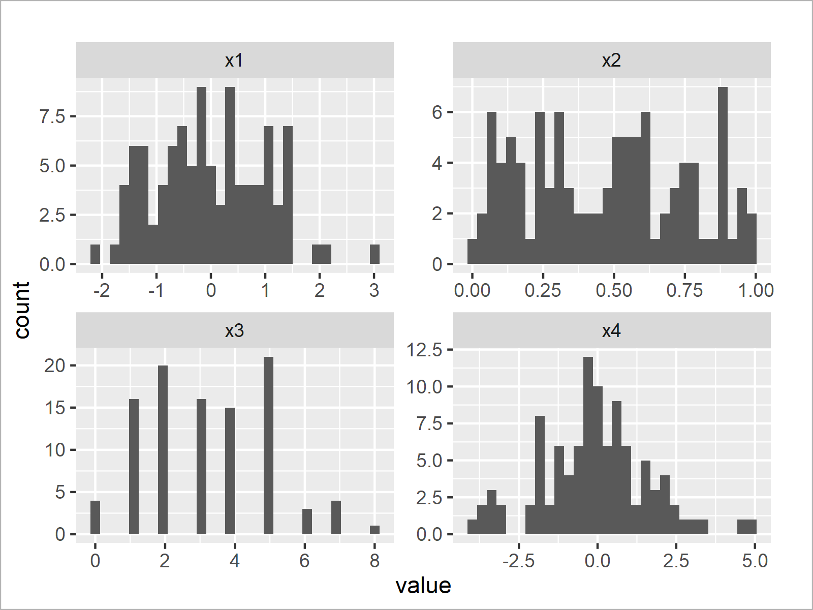
The output of the previous R programming code is shown in Figure 1 – We have created a graphic containing four histograms. Each histogram represents one of the variables in our original data frame.
Example 2: Draw Each Column of Data Frame as Density
This example illustrates how to draw multiple density plots – One density for each of the columns in a data set.
Fortunately, we can basically use the same R syntax as in Example 1. We only have to replace the geom_histogram function by the geom_density function:
ggp2 <- ggplot(data_long, aes(x = value)) +    # Draw each column as density
  geom_density() +
  facet_wrap(~ name, scales = "free")
ggp2
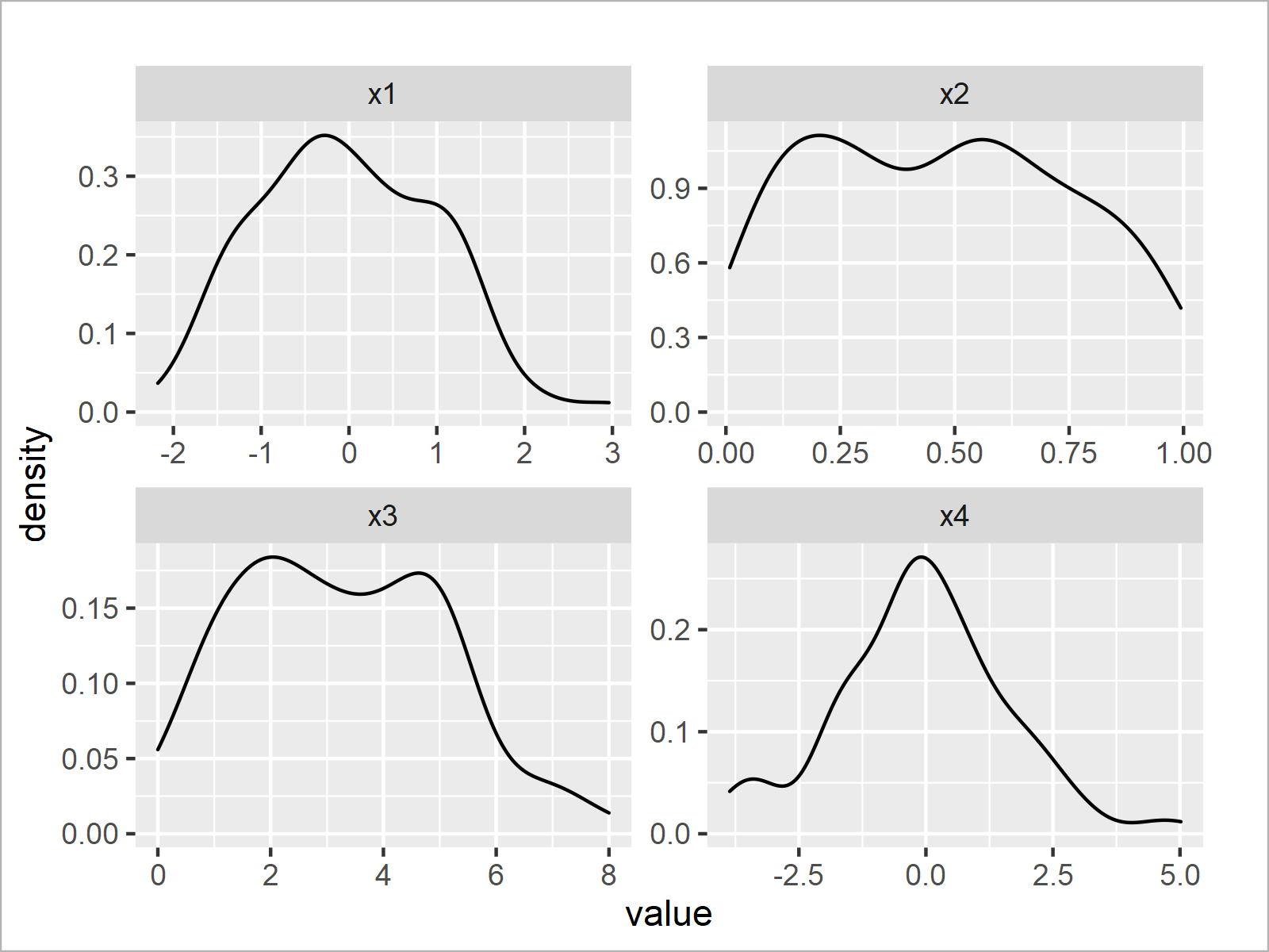
In Figure 2 you can see that we have plotted a density for each column in our data matrix.
Example 3: Draw Each Column of Data Frame as Histogram with Overlaid Density
We can modify our code to combine the two graphs created in examples 1 and 2.
For this, we have to call both the geom_histogram and geom_density functions at the same time.
Note that we are changing the histogram y-axis to show a density instead of counts. This has to be done to harmonize the heights of the histograms and densities – A typical step when a density is drawn on top of a histogram.
Furthermore, we are changing the color and thickness of the density to visualize it a bit better in our graph.
Let’s do this:
ggp3 <- ggplot(data_long, aes(x = value)) +    # Draw histogram & density
  geom_histogram(aes(y = ..density..)) +
  geom_density(col = "#1b98e0", size = 2) +
  facet_wrap(~ name, scales = "free")
ggp3
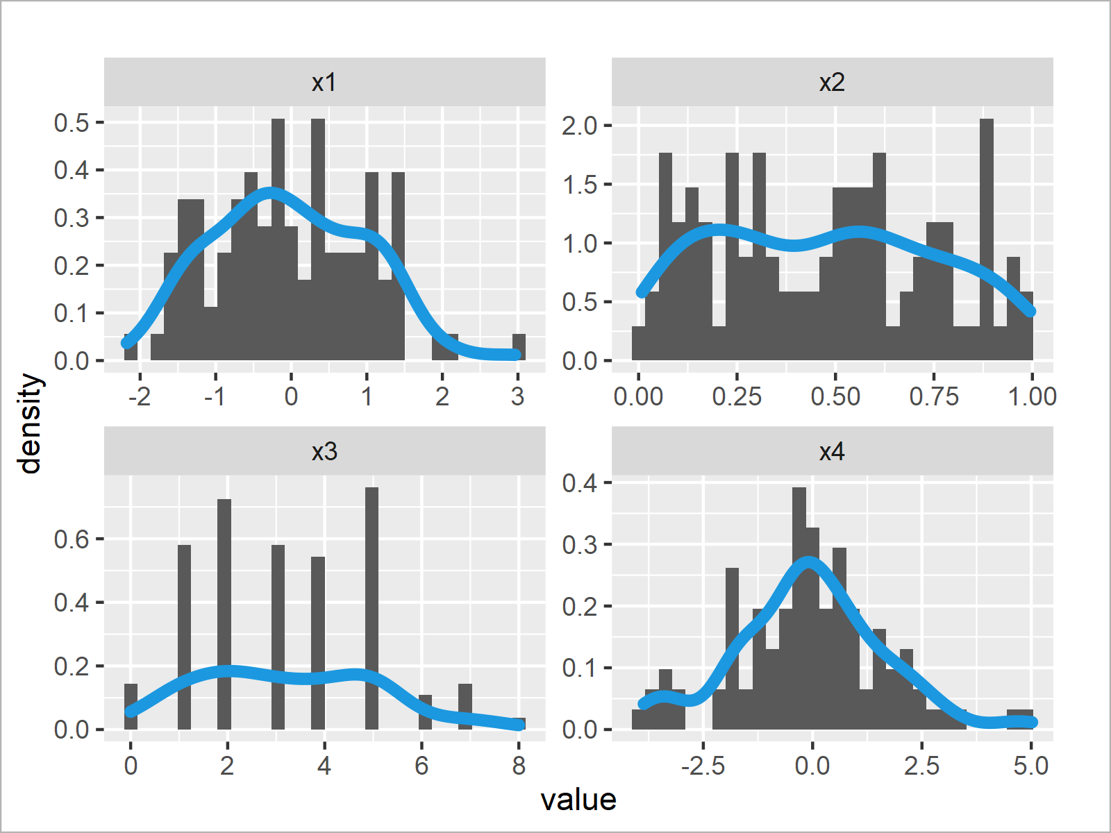
After running the previous syntax the facet plot with histograms and overlaid densities shown in Figure 3 has been plotted.
Video & Further Resources
Do you need further explanations on the topics of this article? Then you may want to watch the following video tutorial which I have published on my YouTube channel. In the video, I illustrate the R syntax of this post.
Furthermore, you could have a look at the other tutorials on this website. Some tutorials are listed below:
- Plot All Columns of Data Frame in R
- ggplot2 Histogram & Overlaid Density with Frequency Count on Y-Axis
- Overlay Normal Density Curve on Top of ggplot2 Histogram
- Combine Base R, ggplot2 & lattice Plots
- Overlay ggplot2 Density Plots in R
- Creating Plots in R
- The R Programming Language
In this R programming tutorial you have learned how to generate a histogram and / or a density plot for every column of a data table. Please note that we could have used a similar syntax to draw other types of plots such as barplots, boxplots, or line plots. Let me know in the comments section, in case you have any additional questions.


