Plot All Columns of Data Frame in R (3 Examples) | How to Draw Each Variable
In this tutorial, I’ll explain how to draw all variables of a data set in a line plot in the R programming language.
Table of contents:
Let’s dive right in!
Creation of Example Data
Let’s first create some example data:
set.seed(987425)                                              # Create example data
data <- data.frame(x = 1:10,
                   y1 = rnorm(10),
                   y2 = runif(10),
                   y3 = rpois(10, 1))
data                                                          # Print example data
#     x          y1        y2 y3
# 1   1 -1.19464442 0.6631678  2
# 2   2 -0.27292005 0.9540095  0
# 3   3 -0.05134384 0.6712889  1
# 4   4  0.45500651 0.1736061  1
# 5   5 -2.07007318 0.2290419  0
# 6   6  0.92083477 0.3240386  0
# 7   7 -0.26656251 0.2139329  0
# 8   8  0.10529478 0.7744575  1
# 9   9 -2.17999010 0.6029383  1
# 10 10 -1.51876252 0.8177035  0
As you can see based on the previous output of the RStudio console, our example data contains ten rows and four columns. The variable x is ranging from 1 to 10 and defines the x-axis for each of the other variables.
Example 1: Drawing Multiple Variables Using Base R
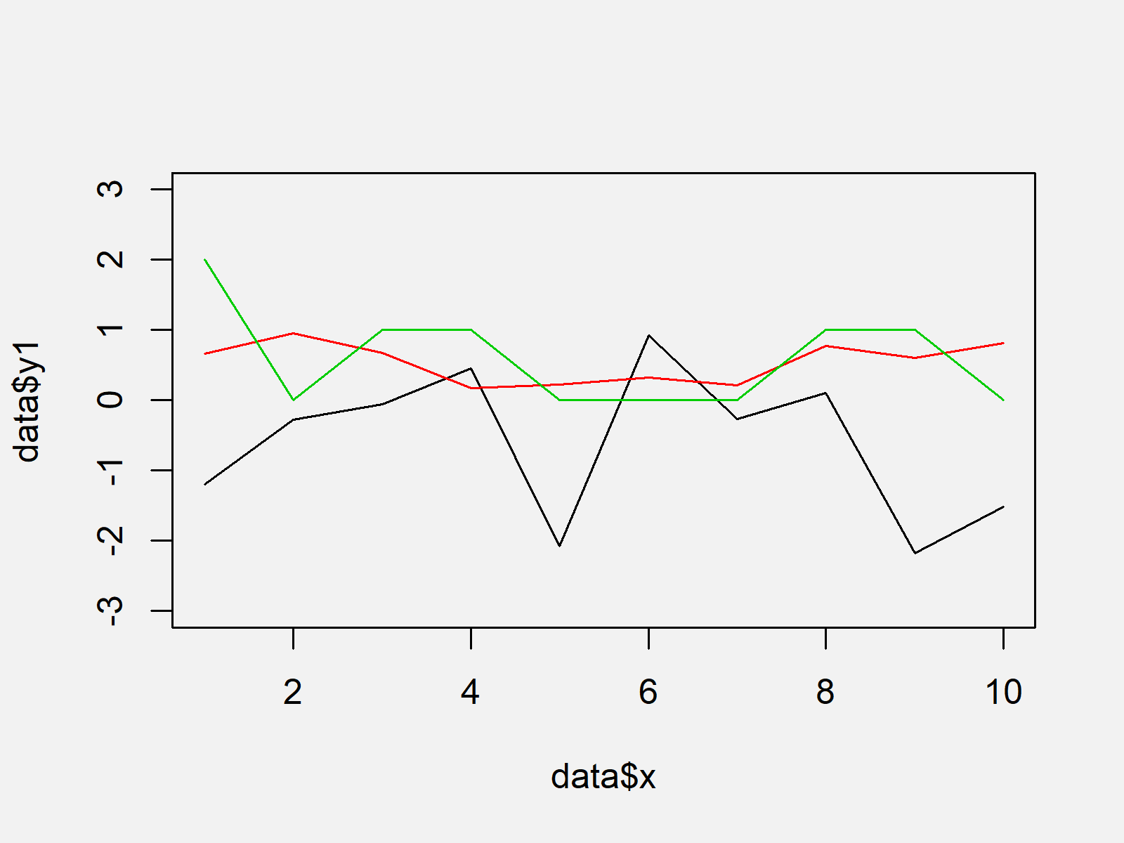
The following code shows how to draw a plot showing multiple columns of a data frame in a line chart using the plot R function of Base R. Have a look at the following R syntax:
plot(data$x, data$y1, type = "l", col = 1, ylim = c(- 3, 3))  # Plot with Base R
lines(data$x, data$y2, type = "l", col = 2)
lines(data$x, data$y3, type = "l", col = 3)

As shown in Figure 1, we created a Base R line plot showing three lines with the previous code.
Example 2: Drawing Multiple Variables Using ggplot2 Package
Example 2 illustrates how to use the ggplot2 package to create a graphic containing the values of all data frame columns. First, we need to reshape our data frame to long format:
data_ggp <- data.frame(x = data$x,                            # Reshape data frame
                       y = c(data$y1, data$y2, data$y3),
                       group = c(rep("y1", nrow(data)),
                                 rep("y2", nrow(data)),
                                 rep("y3", nrow(data))))
head(data_ggp)                                                # Head of reshaped data frame
#   x           y group
# 1 1 -1.19464442    y1
# 2 2 -0.27292005    y1
# 3 3 -0.05134384    y1
# 4 4  0.45500651    y1
# 5 5 -2.07007318    y1
# 6 6  0.92083477    y1
Furthermore, we have to install and load the ggplot2 package, if we want to use the corresponding functions:
install.packages("ggplot2")                                   # Install & load ggplot2
library("ggplot2")
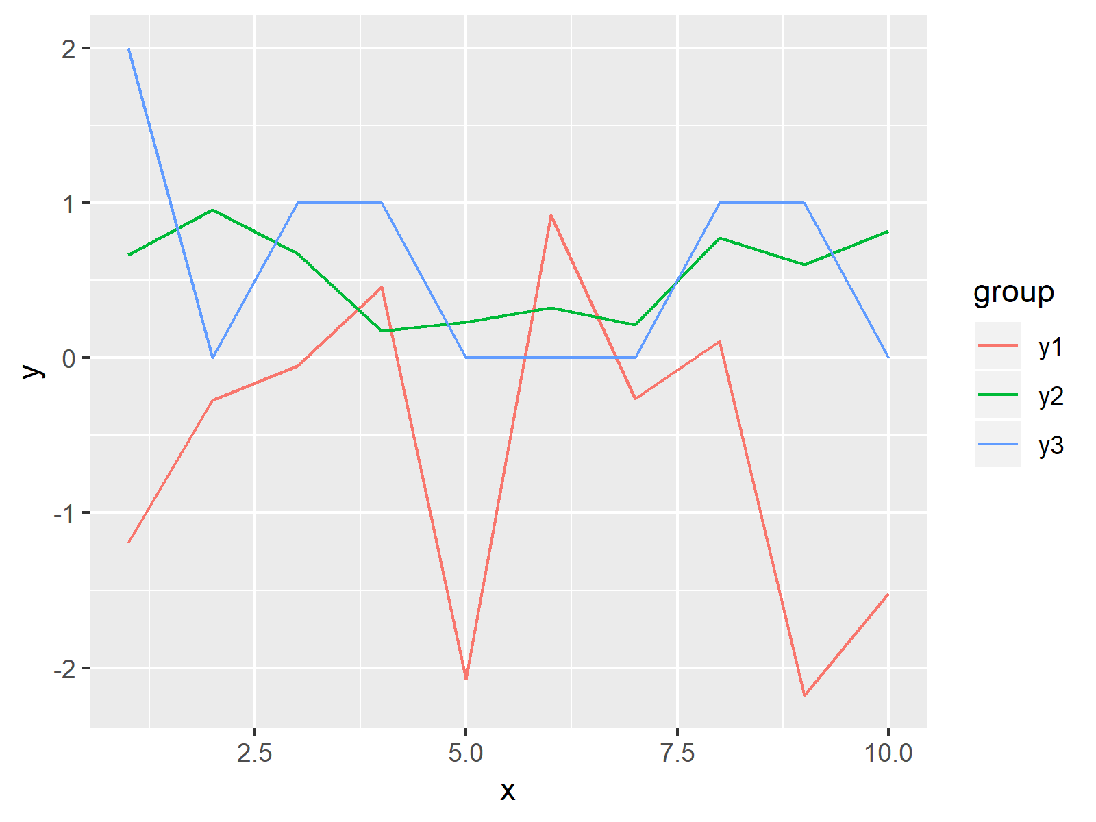
Now, we can draw a ggplot2 line graph with the following R code:
ggp <- ggplot(data_ggp, aes(x, y, col = group)) +             # Create ggplot2 plot
  geom_line()
ggp                                                           # Draw plot

As shown in Figure 2, we plotted a graph showing a different line for each variable with the previous R programming code. On the right side of the plot, we have also created a legend illustrating the different groups of our data.
Example 3: Drawing Multiple Variables in Different Panels with ggplot2 Package
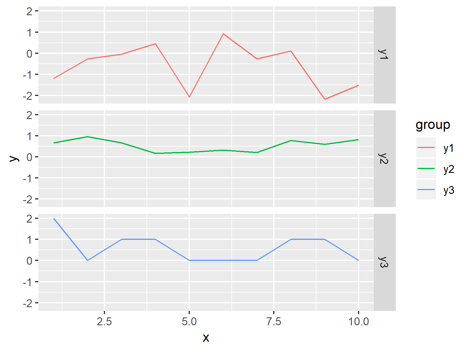
In Example 3, I’ll show how to draw each of our columns in a different panel of a facet plot. For this, we simply need to add the facte_grid function to our previously created graph of Example 2:
ggp + facet_grid(group ~ .) # Draw plot in different panels

As shown in Figure 3, the previous syntax created a facet plot using the ggplot2 package.
Video & Further Resources
Would you like to know more about the plotting of columns? Then you could watch the following video of my YouTube channel. I’m explaining the examples of this article in the video:
In addition, you could have a look at the related articles of this website.
- Plot Line in R
- Reshape Data Frame from Wide to Long Format
- R Graphics Gallery
- The R Programming Language
To summarize: In this R programming tutorial you learned how to draw each column of a data matrix in a graphic. Don’t hesitate to let me know in the comments section below, if you have any additional questions.


14 Comments. Leave new
Hallow. Hope you are doing well. Thanks for the illustration. I have tried to follow the steps to plot a similar graph but am not successful. Below is the kind of data I want to plot, Chainage Vs the other columns.
Kindly take me through the steps. This is my first time in using R.
Regards, and Thanks
Chainage G.L EL HGL
0 1940 1945 1944.971367
134 1940.61 1944.368988 1944.340355
152 1941.38 1944.284225 1944.255592
165 1940.47 1944.223008 1944.194374
229 1940.12 1943.921629 1943.892995
308 1921.55 1943.680259 1943.663921
370 1923.74 1943.490829 1943.474491
376 1925.72 1943.472497 1943.456159
389 1925.57 1943.434553 1943.419002
406 1925.67 1943.387207 1943.372424
447 1925.47 1943.278384 1943.264349
569 1917.79 1942.970171 1942.956865
614 1919.37 1942.862111 1942.849515
631 1921.87 1942.821288 1942.808692
648 1924.02 1942.782541 1942.770635
661 1925.3 1942.754459 1942.743224
1019 1927.97 1942.178456 1942.170282
1191 1923.93 1941.460382 1941.442796
1376 1927.07 1940.738343 1940.72199
1376 1927.07 1940.738343 1940.723179
1422 1927.61 1940.582658 1940.568638
1510 1927.31 1940.284826 1940.270806
1771 1923.24 1939.465804 1939.452883
1913 1925.74 1939.086525 1939.075668
2010 1925.38 1938.82744 1938.816583
2090 1923.64 1938.613761 1938.602904
2228 1923.05 1938.275593 1938.265701
2241 1925.52 1938.243737 1938.233844
2510 1923.53 1936.711852 1936.692537
2717 1928.88 1935.533041 1935.513726
2746 1929.88 1935.367893 1935.348579
Hi Simon,
Thank you, I’m fine and you?
Your data seems to be formatted well for the code of Example 1. You would simply have to replace the name of the data and the names of the columns.
At which point do you get problems?
Regards
Joachim
Try this one, using tidyr (Tidy Messy Data).
df %>% select(2:3,1) %>% # select used for selected the columns
tidyr::gather(“id”, “value”, 1:3) %>% # transforming data into cartesian form
ggplot(aes(Chainage, value, color=id))+ # Ploting chainage vs other columns
geom_point(size=2, alpha = 0.3)+ # Data point size and transperency
geom_line(size=1)+ # line size
scale_y_continuous(trans = “log”) + # used the log for (Y axis) better presentation
theme_minimal() # theme style
Hey Syed,
Thank you for the additional code!
Could you provide some example data to make your code reproducible?
Regards,
Joachim
Hello Joachim,
I am trying to plot a bar chart for the data frame below. This is the first time I use R.
There is actually more data than shown. The collection period ran from Jul/01/21 to Nov/30/21. Is there a way to plot a bar chart for this data frame using ggplot with x-axis is the DateTime column?
Many thanks
Chuck
DateTime A0Z9J8CY_3N_39Ft A2VLJXJQ_12N_18Ft AJGQGG3Q_20N_18Ft A8LGKQ1P_13S_19Ft A5QRV0S1_19S_14Ft AQRMJZYP_6S_26Ft La Casa_AirNow Globeville_AirNow AJ9MZTHB_25_Globeville
7/1/2021 1:00 2.52 1.87 3.72 4.03 3.25 2.95 4.8 5.1 2.18
7/1/2021 2:00 2.12 2.16 3.56 4.56 3.54 2.78 4.2 4.3 2.46
7/1/2021 3:00 2.72 2.19 3.55 3.98 3.74 3.22 3.9 4.6 2.86
7/1/2021 4:00 6.61 5.24 8.14 5.18 4.87 5.28 4.2 9.4 6.63
7/1/2021 5:00 8.38 6.95 12.13 10.45 12.78 9.98 4.5 7.7 6.84
7/1/2021 6:00 6.16 5.72 7.15 8.76 9.79 6.29 4.8 7.3 7.38
Hey Chuck,
Welcome to the R community! 🙂
You may create a barplot of your datetime column and the A0Z9J8CY_3N_39Ft column using the following R code:
Regards,
Joachim
Joachim,
Thank you so much for your quick response. When plotting at each location, it worked. However, when plotting at multi-locations, my code did not work. Please see the code below. I also tried to insert the graph but couldn’t
The x axis did not show any datetime. The y axis did not show the correct scale.
AQ %
gather(key = location, value = aqdata, 2:10)
AQ
# creating graph
bar <- ggplot(AQ,aes(x=DateTime), na.rm=TRUE)+geom_bar(aes(fill=location))+
labs(x = "Date & Time", y = "Air Quality", title = "Air Quality at Multi-Locations")
bar
Hey Chuck,
Please see the updated example below:
Regards,
Joachim
Thank you very much, Joachim. I’ll give it a try and will let you know how it turns out.
Sounds good, let me know in case you have further questions 🙂
Hi,
Thanks for your amazing support. I am having problem with this data to plot as I am new in this field. Can you please help me to figure it out?
Fraction 1 Fraction 2 Fraction 3 Fraction 4 Concentration
0.6276 0.6565 0.6744 0.5078 20
0.5168 0.7521 0.6432 0.3279 10
0.3746 0.6263 0.4668 0.2258 5
0.2574 0.5070 0.3186 0.1665 2.5
0.2019 0.3683 0.2251 0.1529 1.25
0.1512 0.2496 0.1759 0.1485 0.625
0.1504 0.2149 0.1663 0.1591 0.3125
0.1549 0.1462 0.1576 0.1722 0
My data is like this. I want to plot the fractions against concentration. What could be my approach? Note, the data str is numeric. It would be a great help if you could help me with this issue.
Hello Alamgir,
Thank you for your kind words. You can use a scatterplot. See our tutorial: Scatterplot in R. If you like to use a line plot, then you can adapt the code in this tutorial, replacing the x and y values with the variable names that you have.
Best,
Cansu
Hi, my data is like this. Now, I need to take the average value of A,B, and C for “Fraction 1” and D, E, and F for “Fraction 2” and then need to plot these two fractions against the concentration in the same plot using line graph. My questions are
1. How can I calculate the average and plot it?
2. Do I need to plot the SD as well? Is yes, how?
conc. (%) A B C D E F
20.0000 0.7150 0.6014 0.5665 0.5954 0.6863 0.6877
10.0000 0.5245 0.5139 0.5119 0.7416 0.7640 0.7506
5.0000 0.4305 0.3585 0.3347 0.6231 0.5843 0.6716
2.5000 0.2941 0.2592 0.2189 0.4809 0.5117 0.5285
1.2500 0.2257 0.1990 0.1809 0.3375 0.3670 0.4005
0.6250 0.1638 0.1439 0.1460 0.2189 0.2472 0.2827
0.3125 0.1673 0.1372 0.1466 0.2011 0.2051 0.2385
0.0000 0.1565 0.1449 0.1634 0.1556 0.1459 0.1371
Hello Alamgir,
Showing standard error can be reasonable, depending on what you want to show. The standard deviation is appropriate if you want to give a sense of the spread of the individual data points around the mean. But you can also prefer to show standard errors (or confidence intervals) instead if you want to show how accurately you believe your sample mean represents the population mean. Here I share the code showing the standard errors by error bars per average point.
Best,
Cansu