Overlay Histogram with Fitted Density Curve in Base R & ggplot2 Package (2 Examples)
In this tutorial you’ll learn how to fit a density plot to a histogram in the R programming language.
Table of contents:
- Introduction of Example Data
- Example 1: Histogram & Density with Base R
- Example 2: Histogram & Density with ggplot2 Package
- Video, Further Resources & Summary
Let’s just jump right in!
Introduction of Example Data
In the examples of this R programming tutorial, we’ll use the following example data:
set.seed(18462)                                       # Create example data
data <- data.frame(x = round(rnorm(1000, 10, 10)))
head(data)                                            # Print example data
#     x
# 1   6
# 2   7
# 3  14
# 4   4
# 5 -10
# 6  16
As you can see based on the output of the RStudio console, our example data contains only one numeric column. Now, let’s draw these data…
Example 1: Histogram & Density with Base R
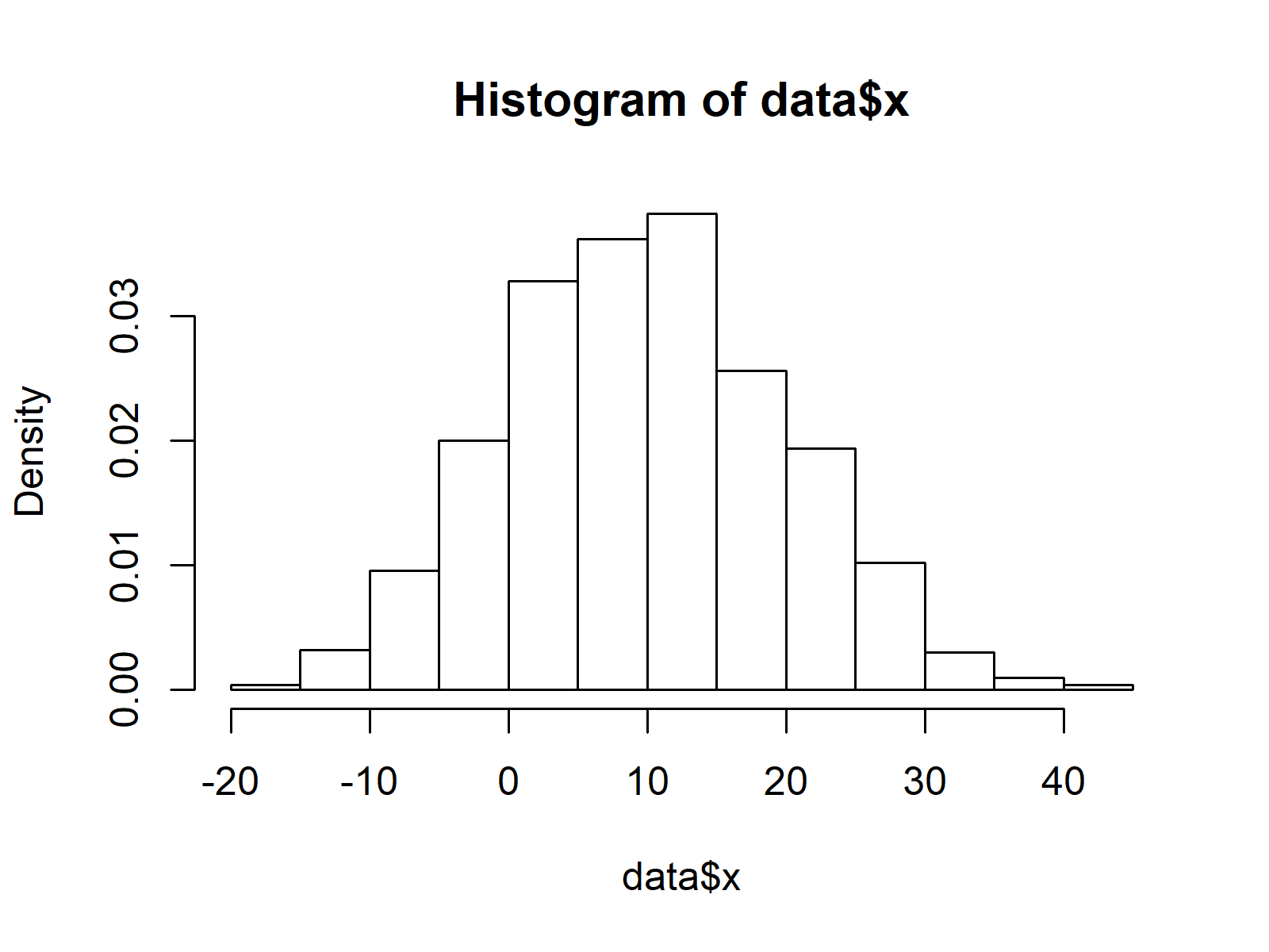
Example 1 explains how to fit a density curve to a histogram with the basic installation of the R programming language. First, we need to use the hist function to draw a histogram:
hist(data$x, prob = TRUE) # Create histogram with Base R

Figure 1: Histogram Created with Base R.
Figure 1 shows the output of the previous R code: A histogram without a density line. If we want to add a kernel density to this graph, we can use a combination of the lines and density functions:
lines(density(data$x), col = "red") # Overlay density curve

Figure 2: Histogram & Overlaid Density Plot Created with Base R.
Figure 2 illustrates the final result of Example 1: A histogram with a fitted density curve created in Base R.
Example 2: Histogram & Density with ggplot2 Package
Example 2 shows how to create a histogram with a fitted density plot based on the ggplot2 add-on package. First, we need to install and load ggplot2 to R:
install.packages("ggplot2")                           # Install & load ggplot2
library("ggplot2")
Now, we can use a combination of the ggplot, geom_histogram, and geom_density functions to create out graphic:
ggplot(data, aes(x)) +                                # ggplot2 histogram & density
  geom_histogram(aes(y = stat(density))) +
  geom_density(col = "red")

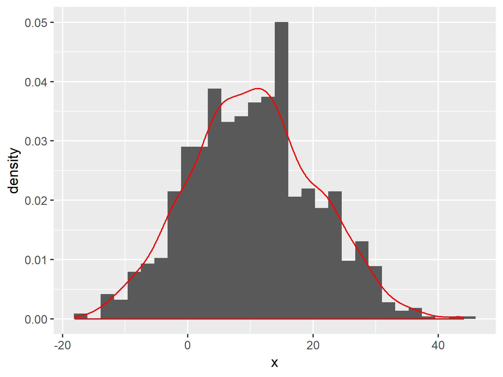
Figure 3: Histogram & Overlaid Density Plot Created with ggplot2 Package.
Figure 3 visualizes our histogram and density line created with the ggplot2 package. Note that the histogram bars of Example 1 and Example 2 look slightly different, since by default the ggplot2 packages uses a different width of the bars compared to Base R.
Video, Further Resources & Summary
Some time ago I have published a video on my YouTube channel, which illustrates the content of this tutorial. You can find the video below:
Furthermore, you might want to have a look at some of the related articles which I have published on my homepage.
- Create Histogram in Base R
- Create Kernel Density Plot in R
- Create ggplot2 Histogram in R
- Draw Multiple Overlaid Histograms with ggplot2 Package
- Draw Multiple Variables as Lines to Same ggplot2 Plot
- R Graphics Gallery
- The R Programming Language
In this tutorial, I illustrated how to combine histograms with probability on the y-axis and density plots in the R programming language. If you have additional questions or comments, let me know in the comments section below.
Subscribe to the Statistics Globe Newsletter
Get regular updates on the latest tutorials, offers & news at Statistics Globe.
I hate spam & you may opt out anytime: Privacy Policy.
Thank you!
Welcome to the Statistics Globe newsletter. From now on, I’ll send you regular emails about statistics, data science, AI, and programming with R and Python.
I’m Joachim Schork. On this website, I provide statistics tutorials as well as code in Python and R programming.
Statistics Globe Newsletter
Get regular updates on the latest tutorials, offers & news at Statistics Globe. I hate spam & you may opt out anytime: Privacy Policy.
Thank you!
Please check your email inbox and click the confirmation link to complete your subscription. If you don’t see the email within a few minutes, please also check your spam/junk folder.


15 Comments. Leave new
Hello Joachim
Thanks for your nice videos. I have the following R script which is for only one .tsv file. I want to tweak it in a way that can plot (Histogram + line) two similar but separate .tsv files with different colours overlaid on each other. Could you please guide?
# read in data
df = read.csv(“your_distribution.tsv”, sep=”\t”)
# filter Ks distribution (0.001 < Ks < 5)
lower_bound = 0.001
upper_bound = 5
df = df[df$Ks lower_bound,]
# perform node-averaging (redo when applying other filters)
dff = aggregate(df$Ks, list(df$Family, df$Node), mean)
# reflect the data around the lower Ks bound to account for boundary effects
ks = c(dff$x, -dff$x + lower_bound)
# plot a histogram and KDE on top
hist(ks, prob=TRUE, xlim=c(0, upper_bound), n=50)
lines(density(ks), xlim=c(0, upper_bound))
Hello Ardy,
Thank you for following us! Would you like to draw two density lines overlaid on each other on a histogram?
Regards,
Cansu
Hello Cansu
Yes that is right.
Regards
Ardy
Hello Ardy,
Here is how to do it in two ways (via graphics and ggplot2 libraries):
Expanding the data frame for this example:
Using R graphics:
Using ggplot2 library:
I hope this answers your question. Let me know if you have any further comments.
Regards,
Cansu
Dear Cansu
Thanks a lot for your help. Sorry I am so new to R. Could you pls let me know how/where to fit these codes in the contest of the following, if possible?
# read in data
df = read.csv(“your_distribution1.tsv”, sep=”\t”)
df = read.csv(“your_distribution2.tsv”, sep=”\t”)
# filter Ks distribution (0.001 < Ks < 5)
lower_bound = 0.001
upper_bound = 5
df = df[df$Ks lower_bound,]
# perform node-averaging (redo when applying other filters)
dff = aggregate(df$Ks, list(df$Family, df$Node), mean)
# reflect the data around the lower Ks bound to account for boundary effects
ks = c(dff$x, -dff$x + lower_bound)
# plot a histogram and KDE on top
hist(ks, prob=TRUE, xlim=c(0, upper_bound), n=50)
lines(density(ks), xlim=c(0, upper_bound))
Sorry I am not sure about term overlay! But better to say overlap two graphs for comparison purpose.
Hello again:)
Could we say that you would like to plot multiple histograms on the same panel? Not fitting multiple curves?
Regards,
Cansu
Yes, that is correct.
You can check our tutorial Draw Multiple Overlaid Histograms with ggplot2 Package in R and this link.
I hope those help!
Regards,
Cansu
Thanks for your excellent website. I tried to draw a histogram with two densities using the following code.
ggplot(data, aes(x)) + # ggplot2 histogram & density
geom_histogram(aes(y = stat(density))) +
geom_density(data=data, aes(x=x, y=stat(density)), col = “red”) +
geom_density(data=data, aes(x=y, y=stat(density)), col = “blue”)
But the code doesn’t work.
I also tried to add a legend to my graph. but I couldn’t. For example.
set.seed(18462) # Create example data
data <- data.frame(x = round(rnorm(1000, 10, 10)))
p <- ggplot(data, aes(x)) + # ggplot2 histogram & density
geom_histogram(aes(y = stat(density))) +
geom_density(col = "red")
pal <- c("Observed"="black","Estimated"="blue")
pal
p <- p + scale_colour_manual(values = pal, limits = names(pal),
guide = guide_legend(reverse = TRUE))
But legend will not appear.
I appreciate your help.
Hello,
Let’s first correct the plot gives error. You need two different data to plot two different density curves. I created 2 sample datasets for that data and data2. Then modify your code as follows:
Please let me know if it works. Then try to add a legend. If it doesn’t work, let me know.
Regards,
Cansu
Thanks for your effort.
I’m sorry for again asking for help. The graph is OK, but I can’t add a legend to the graph.
p <- ggplot(data, aes(x = var1)) +
geom_histogram(aes(y = ..density..), bins = 20, alpha = 0.5, color = "black", fill = "gray") +
geom_density(color = "red", size = 1) +
geom_density(data = data2, aes(x = x), color = "blue", linewidth = 1, linetype = "dashed") +
labs(title = "Histogram and Density Curves", x = "Value", y = "Density")
p<- p + scale_colour_manual(name="Legend", values = c("hist" = "black", "data" = "red", "data2" = "blue"))
p
Looking forward 4 your answer.
Hello,
I have renamed the data for better visualization as follows.
You can use the following script to specify the densities in the legend.
I see that you also want to specify the histogram. I am unsure how necessary it is since the red curve already represents the same data as the histogram. However, you can use something like this.
I hope those solutions help you.
Regards,
Cansu
Thanks Cansu.
I want to be a statistician like you !!!!
I am sure you will be.
Have a good one!
Cansu