Set Axis Limits of ggplot2 Facet Plot in R (4 Examples) | Using facet_wrap & scales
This page shows how to manipulate the axis limits of a ggplot2 facet plot in R programming.
Table of contents:
- Creation of Exemplifying Data
- Example 1: Create Facet Plot with Free Scales
- Example 2: Create Facet Plot with Free X-Axis
- Example 3: Create Facet Plot with Free Y-Axis
- Example 4: Create Facet Plot with Individual Axes
- Video, Further Resources & Summary
Sound good? Here’s how to do it!
Creation of Exemplifying Data
First, we need to create some example data that we can draw as facet plots later on:
set.seed(374658)                             # Create example data
x <- rnorm(1000)
y <- rnorm(1000) + x^3
group <- rbinom(1000, 1, 0.1)
x[group == 1] <- x[group == 1] * 2
y[group == 1] <- y[group == 1] * 2
data <- data.frame(x, y, group)
head(data)                                   # Print first lines of data
#             x          y group
# 1  0.27298625  1.0002430     0
# 2 -2.15253919 -9.7464363     0
# 3  0.01161435 -1.8907440     1
# 4 -0.65622032  0.7712863     0
# 5 -0.44922753  0.6075897     0
# 6  0.09518892  0.3644900     0
As you can see based on the output of the RStudio console, our example data consists of three columns. It contains two numeric columns x and y as well as a group indicator.
If we want to draw data with the ggplot2 package, we need to install and load the package to R:
install.packages("ggplot2")                  # Install & load ggplot2
library("ggplot2")
Now, we can create a facet plot with default specifications as shown in the R code below:
ggp <- ggplot(data, aes(x, y)) +             # Default plot with facet_wrap
  geom_point() +
  facet_wrap(~ group)
ggp                                          # Draw plot in RStudio
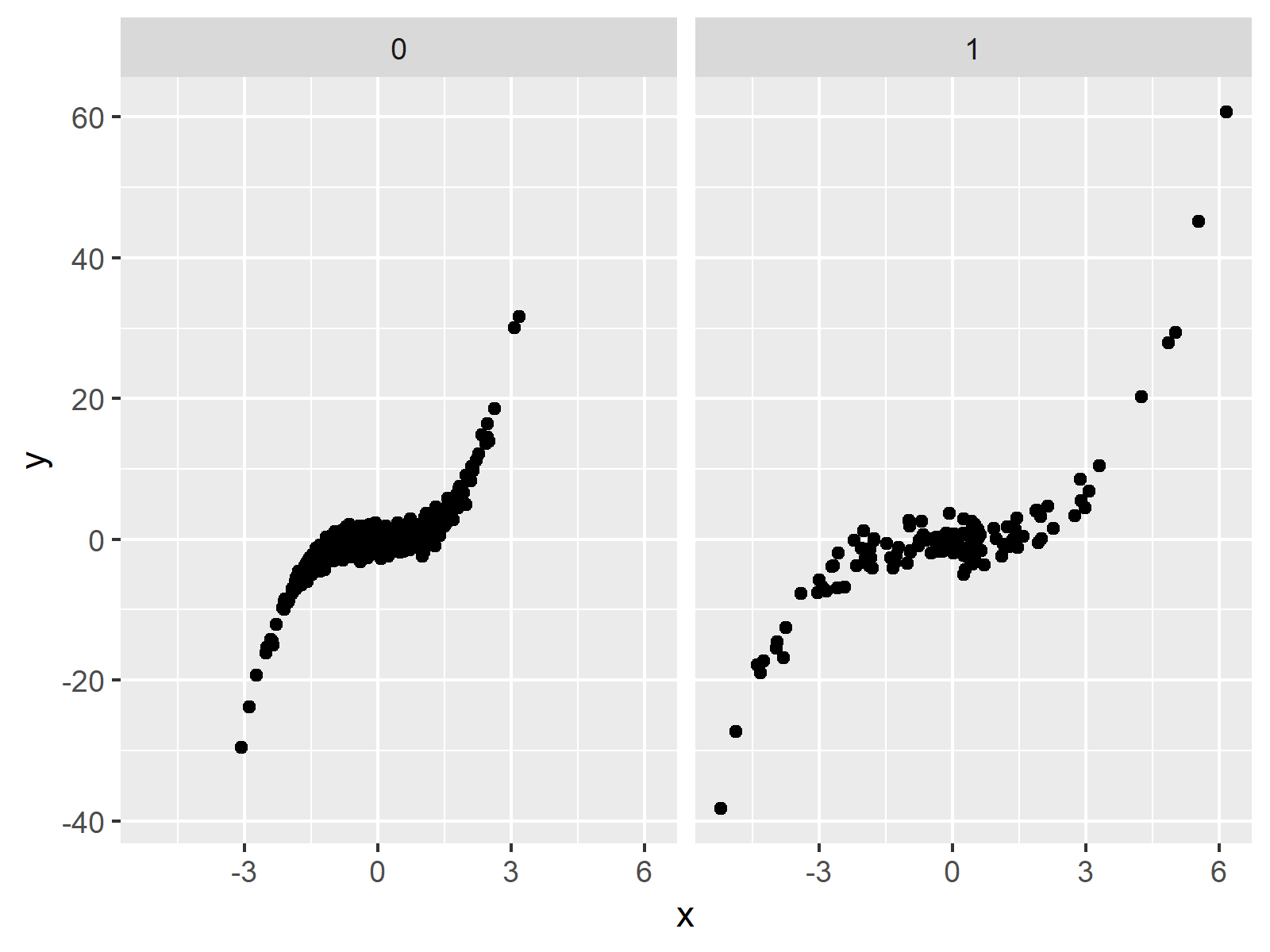
Figure 1: Facet Plot with Default Scales.
Figure 1 shows the output of the previous R syntax: A facet plot consisting of two ggplot2 scatterplots.
In the following examples, I’ll explain how to manipulate the axis scales of the panels of our plot. Keep on reading!
Example 1: Create Facet Plot with Free Scales
As you have seen in the previous plot, by default the x-axis and the y-axis of our panels are set to be the same. Example 1 illustrates how to disentangle the scales of both plots, so that each scale fits the values shown in each panel:
ggp +                                        # Draw plot with free scales
  facet_wrap(~ group, scales = "free")
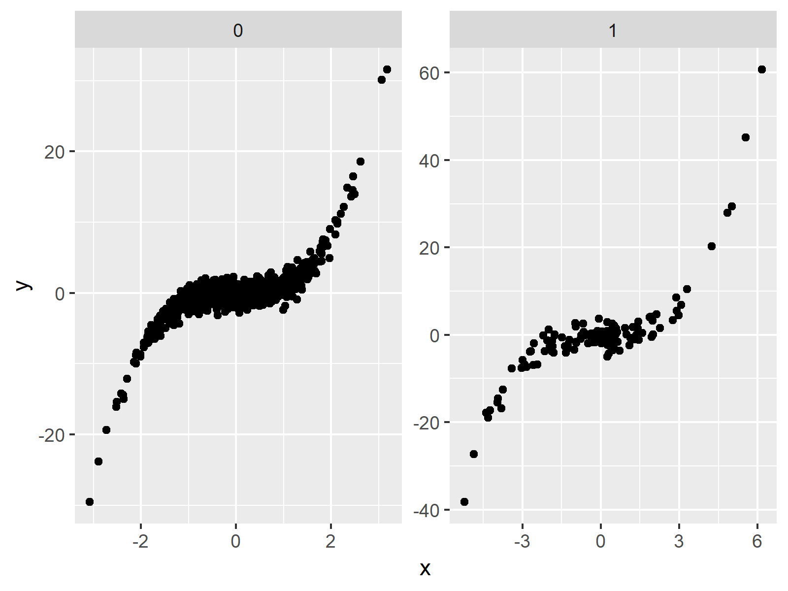
Figure 2: Facet Plot with Free Scales.
In Figure 2 you can see that our new facet graph shows panels with different scales on the x-axis as well as on the y-axis.
Example 2: Create Facet Plot with Free X-Axis
In Example 2, you’ll learn how to keep the y-axis the same for both panels, while the x-axis is free:
ggp +                                        # Draw plot with free x-axis
  facet_wrap(~ group, scales = "free_x")
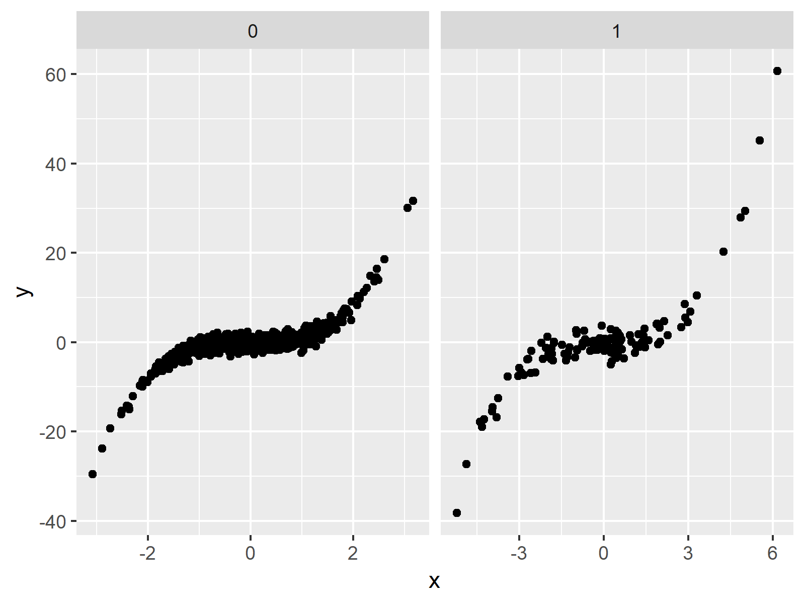
Figure 3: Facet Plot with Free X-Axis.
Example 3: Create Facet Plot with Free Y-Axis
In Example 3, we keep the x-axis at a fixed size and disentangle the y-axes (i.e. the opposite as in Example 2):
ggp +                                        # Draw plot with free y-axis
  facet_wrap(~ group, scales = "free_y")
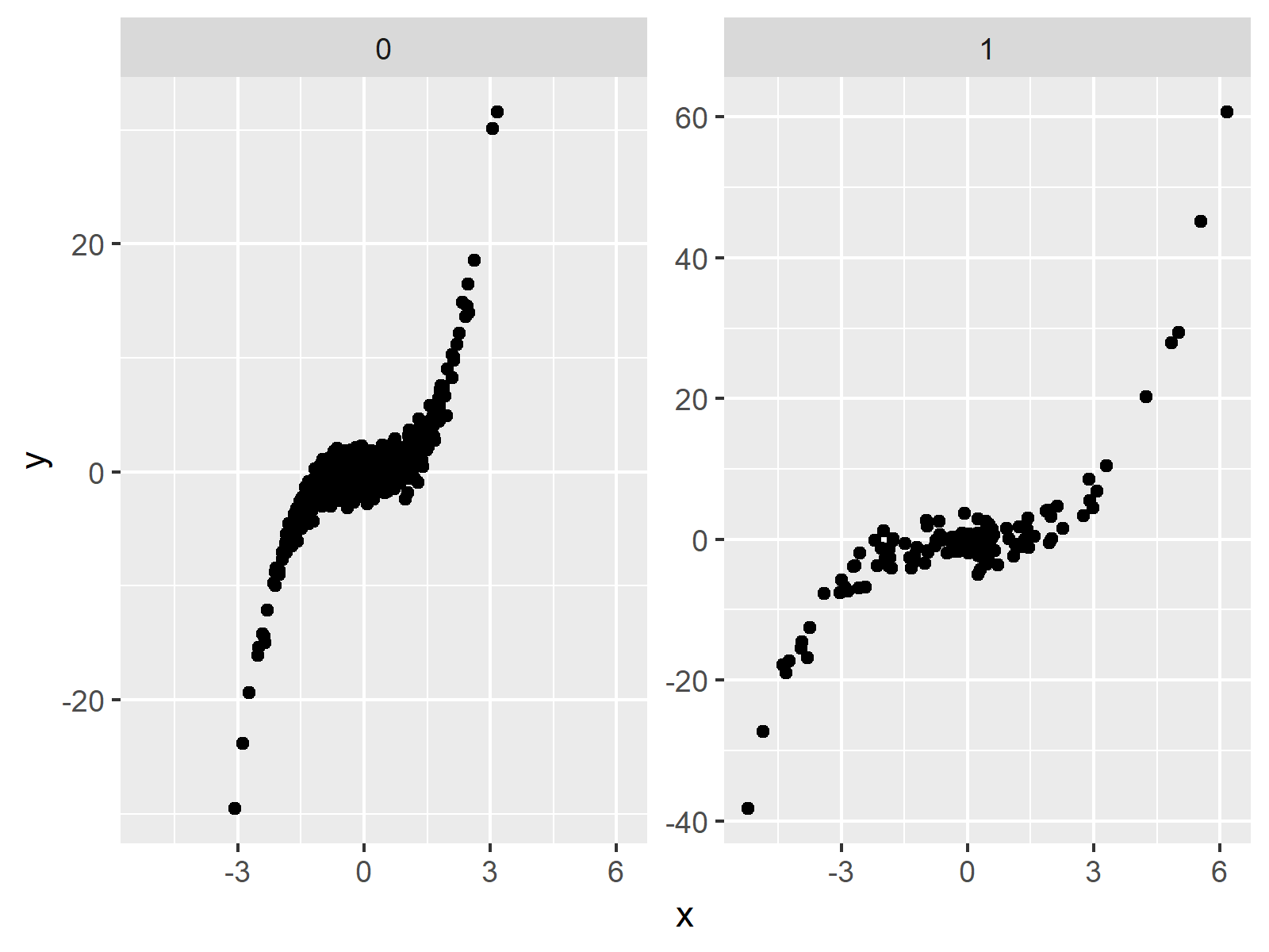
Figure 4: Facet Plot with Free Y-Axis.
Example 4: Create Facet Plot with Individual Axes
In the previous examples, we used the predefined scales that are showing all values of each panel with the least possible empty space. However, you may also choose the axis limits manually by using the coord_cartesian function and the xlim (or ylim) argument.
The following R code creates a facet graphic with free y-axis and an individually specified x-axis:
ggp +                                        # Free y-axis & manual x-axis
  facet_wrap(~ group, scales = "free_y") +
  coord_cartesian(xlim = c(- 10, 10))
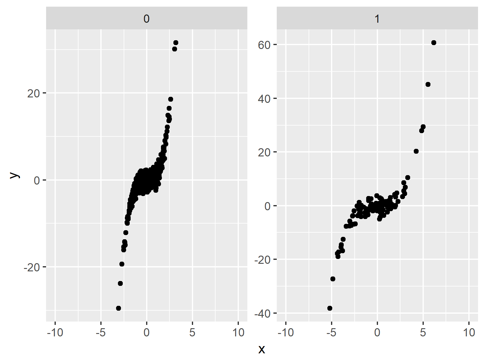
Figure 5: Facet Plot with Manual X-Axis.
Video, Further Resources & Summary
If you need further info on the R programming syntax of this article, you could watch the following video of my YouTube channel. I’m explaining the R syntax of this article in the video.
Furthermore, you may want to have a look at the related tutorials on this website:
- Set Axis Limits in ggplot2 R Plot
- Change Font Size of ggplot2 Facet Grid Labels
- R Graphics Gallery
- The R Programming Language
To summarize: You learned in this article how to modify and change the axis limits of different panels in a ggplot2 facet plot in the R programming language. Please tell me about it in the comments, in case you have additional comments or questions.
Subscribe to the Statistics Globe Newsletter
Get regular updates on the latest tutorials, offers & news at Statistics Globe.
I hate spam & you may opt out anytime: Privacy Policy.
Thank you!
Welcome to the Statistics Globe newsletter. From now on, I’ll send you regular emails about statistics, data science, AI, and programming with R and Python.
I’m Joachim Schork. On this website, I provide statistics tutorials as well as code in Python and R programming.
Statistics Globe Newsletter
Get regular updates on the latest tutorials, offers & news at Statistics Globe. I hate spam & you may opt out anytime: Privacy Policy.
Thank you!
Please check your email inbox and click the confirmation link to complete your subscription. If you don’t see the email within a few minutes, please also check your spam/junk folder.


6 Comments. Leave new
Very nice explanation! How would you specify the limits of all three axes? For example if you wanted to set the y limit on one plot to (-10,20) and the set the other one to (-10,10)?
Hi Cara,
Thank you for the kind words! Glad you like the tutorial.
Regarding your question: To modify each scale individually is possible, but a bit tricky. You can have a look at this thread on Stack Overflow for a discussion about this topic: https://stackoverflow.com/questions/51735481/ggplot2-change-axis-limits-for-each-individual-facet-panel I recommend the answer of Uwe that you can find in this thread.
I hope that helps!
Joachim
I found this tutorial helpful. Thank you. Also, thanks for the referral regarding the question about different y-axis scales.
Hey Adam,
Thank you very much for the kind feedback! I’m happy to hear that you find my tutorials helpful!
Regards,
Joachim
I found what I needed from this post, thank you very much.
Regars
Mehrshad
Hi Mehrshad,
Thank you very much for the positive feedback! Great to hear that you found what you’ve been looking for.
Regards,
Matthias