ggplot2 Warning – geom_path: Each group consists of only one observation. Do you need to adjust the group aesthetic?
In this article you’ll learn how to handle the warning message “geom_path: Each group consists of only one observation. Do you need to adjust the group aesthetic?” in R programming.
The table of content is structured as follows:
Let’s get started…
Example Data
Consider the following example data:
data <- data.frame(x = LETTERS[1:5],    # Example data
                   y = c(3, 1, 6, 3, 5))
data                                    # Print data
#   x y
# 1 A 3
# 2 B 1
# 3 C 6
# 4 D 3
# 5 E 5
Have a look at the previous RStudio console output. It shows that our example data has two columns x and y. The variable x is a factor and the variable y has the numeric class.
Example 1: Reproducing Warning – geom_path: Each group consists of only one observation. Do you need to adjust the group aesthetic?
The following R syntax shows how to replicate the warning message “geom_path: Each group consists of only one observation. Do you need to adjust the group aesthetic?”.
This warning appears when drawing plots with the ggplot2 package. Therefore, we first need to install and load the ggplot2 package, if we want to use the corresponding functions:
install.packages("ggplot2")             # Install ggplot2 package
library("ggplot2")                      # Load ggplot2
Now, we may try to create a ggplot2 line plot as shown below:
ggplot(data, aes(x, y)) +               # Trying to draw line plot
  geom_point() +
  geom_line()
# geom_path: Each group consists of only one observation. Do you need to adjust the group aesthetic?

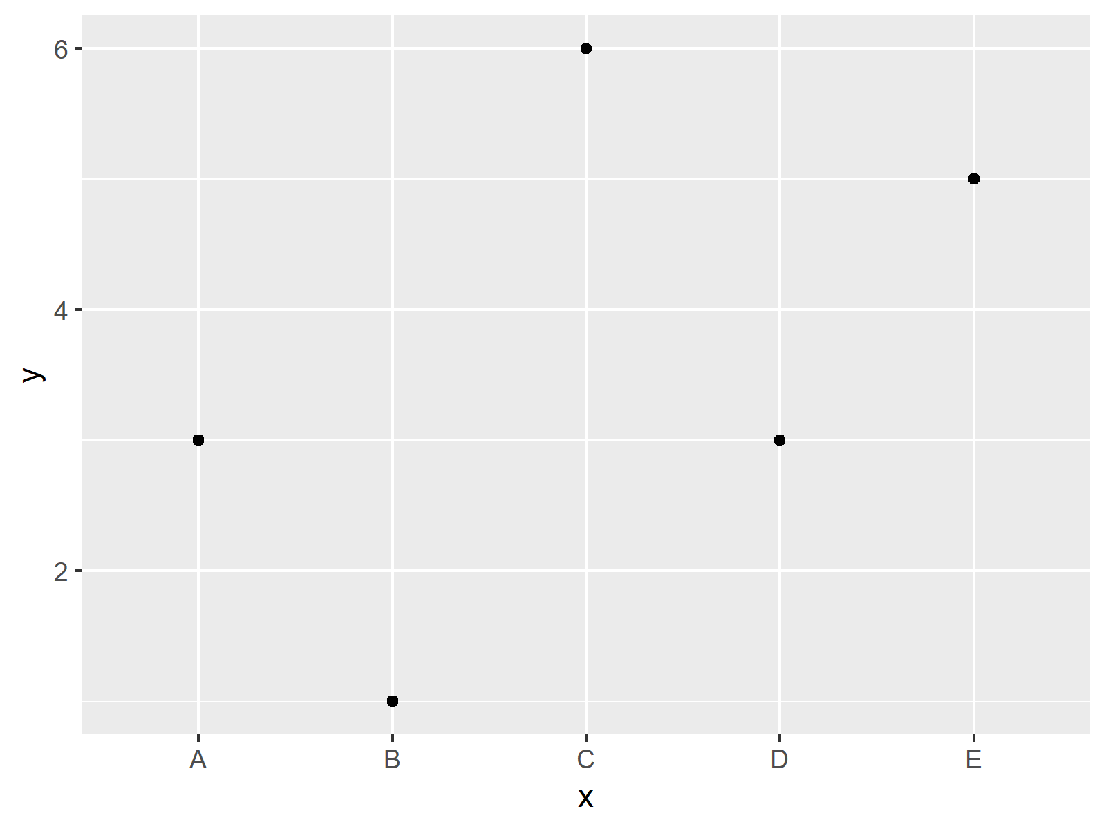
As shown in Figure 1, the previous syntax created a scatterplot instead of a line plot. Furthermore, we received the warning message “geom_path: Each group consists of only one observation. Do you need to adjust the group aesthetic?”.
Example 2: Fixing Warning – geom_path: Each group consists of only one observation. Do you need to adjust the group aesthetic?
The following R programming code shows how to fix the geom_path warning message that we have seen in Example 1. For this, we need to specify the group argument within the aes function to be equal to 1:
ggplot(data, aes(x, y, group = 1)) +    # Specifying group = 1
  geom_point() +
  geom_line()

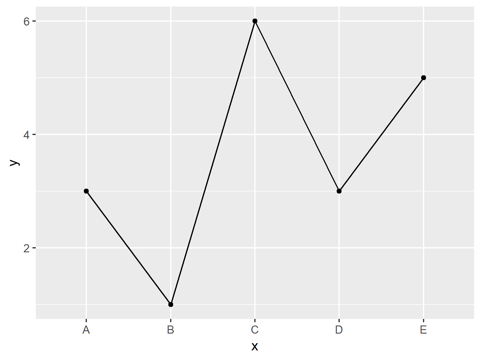
Figure 2 shows the output of the previous R code – A line chart created by the ggplot2 package. Looks good!
Video, Further Resources & Summary
Would you like to know more about the ggplot2 package? Then you may have a look at the following video of my YouTube channel. I explain how to use the ggplot2 package in the video:
Besides the video, you might read the related tutorials of my website. I have published several articles about similar topics, such as drawing numeric values with the ggplot2 package already:
- Plot Line in R
- Scatterplot in R
- Draw ggplot2 Plot with Two Y-Axes
- Set ggplot2 Axis Limit Only on One Side
- Plotting Data in R
- Introduction to R Programming
Summary: In this tutorial, I illustrated how to handle the warning “geom_path: Each group consists of only one observation. Do you need to adjust the group aesthetic?” in R programming. Please tell me about it in the comments section below, in case you have any further comments and/or questions.


12 Comments. Leave new
I use excel data, which I import as .xlsx. When I apply the Group = 1 call, the error message does disappear, but also my first x-data point suddenly moves to behind the last x-data point. So my data is:
Frequency cells
5 kHz 14
10 kHz 18
20 kHz 17
30 kHz 19
40 kHz 18
So 5 rows and two columns. In the graph, the 5 kHz – 14 cells data point is plotted behind the 40 kHz, which is not what I want. Why is this?
Thanks!
Hey Olivier,
I assume that this is because ggplot2 automatically orders your data alphabetically. You can reorder your data by releveling the factor levels of your data. Below, you can find a few tutorials that how to do this:
https://statisticsglobe.com/ordered-bars-in-ggplot2-barchart-in-r
https://statisticsglobe.com/reorder-facets-in-ggplot2-plot-in-r
https://statisticsglobe.com/change-display-order-of-ggplot2-plot-legend-in-r
I hope this helps!
Joachim
Hello
The fix is very easy, thanks for your excellent blog! You save me
Regards
Hey Oscar,
Thanks a lot for the very nice feedback! Glad to hear that it helped!
Joachim
Hello! This trick saved my Time series analysis and my ARMA-GARCH model plots!!
Thanks a lot 🙂
Best
This is great to hear, thanks a lot for the kind comment! 🙂
Wow! This worked. I still don’t understand why. There is no column name “group” in the dataset. Explain, please.
Hey Ayanna,
Glad it helped! For more information why group = 1 is needed, I recommend having a look at this thread on Stack Overflow.
Regards,
Joachim
How do I fix this when plotting multiple lines on the same plot?
Hello Mike,
If your x axis consists of integer numbers, a simple data type conversion would help you to plot multiple lines without any error. See our tutorial How to Convert a Factor to Numeric in R. If it is letters like in this tutorial, I think the best way is to define a grouping variable to specify the mapping. See my sample script below.
Regards,
Cansu
hello i want to know about sankey diagram with 4 columns but i want the color to be constant from source till last node can you help
Hello Aisha,
I am not familiar with that type of graph. However, I found this source talking about customizing colors in Sankey diagrams. Maybe it helps a bit.
Best,
Cansu