Draw ggplot2 Plot with Two Y-Axes in R (Example) | Different Scale on Each Side
In this R programming tutorial you’ll learn how to return a ggplot2 graph with 2 y-axes and different scales on each side.
Table of contents:
Let’s get started…
Creation of Example Data
We’ll use the following data as basement for this R tutorial.
set.seed(93756)                  # Create example data
x <- rnorm(50)
y <- x + 0.3 * rnorm(50)
data <- data.frame(x, y)
head(data)                       # Head of example data
#            x          y
# 1 -0.6203384 -0.6489154
# 2 -0.7203421 -0.7941812
# 3  2.1730194  2.3723400
# 4  0.2500335 -0.1291261
# 5  0.1308206  0.0727594
# 6 -1.6816844 -2.1235243
The previous output of the RStudio console shows that our example data consists of two numeric columns x and y.
Example: Drawing ggplot2 Plot with Two Y-Axes Using sec_axis() Function
In this Example, I’ll show how to print a ggplot2 graphic that has two y-axes with different scales on each side of the plot.
First, we have to install and load the ggplot2 add-on package:
install.packages("ggplot2")      # Install & load ggplot2 package
library("ggplot2")
Now, we can use the scale_y_continuous & sec_axis axis functions to draw a ggplot2 plot with two y-axes as shown below:
ggplot(data, aes(x, y)) +        # Create ggplot2 plot
  geom_point() +
  scale_y_continuous(
    "Kilometers",
    sec.axis = sec_axis(~ . * 1000, name = "Meters")
  )

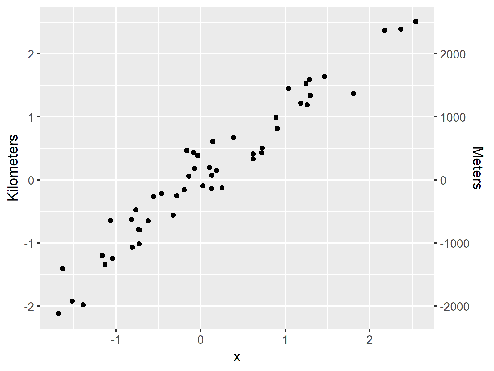
As shown in Figure 1, the previously shown R syntax created a ggplot2 scatterplot.
This plot has two y-axes. The y-axis on the left side of the plot shows the scale in the metric kilometers and on the right side the scale is shown in meters.
Within the sec_axis we had to specify the conversion formula for kilometers and meters (i.e. 1000 meters = 1 kilometer).
Note that in the past there was a longer discussion on Stack Overflow, if features supporting two y-axes should be available for ggplot2 plots in R. In case you are interested in this discussion, you may check out this thread.
Video & Further Resources
Have a look at the following video of the Statistics Globe YouTube channel. I’m explaining how to draw double ggplot2 axes using the R syntax of this tutorial in the video.
In addition, you could read some of the related articles of this website:
- ggplot2 Package in R – Tutorial & Examples
- Plot All Columns of Data Frame
- Draw Plot with Two Y-Axes in Base R
- Plots in R
- Introduction to R Programming
In summary: You learned in this tutorial how to draw a plot with two y-axes using the ggplot2 package in the R programming language. Don’t hesitate to tell me about it in the comments section below, if you have additional questions on dual y-axes or any other topic.
Subscribe to the Statistics Globe Newsletter
Get regular updates on the latest tutorials, offers & news at Statistics Globe.
I hate spam & you may opt out anytime: Privacy Policy.
Thank you!
Welcome to the Statistics Globe newsletter. From now on, I’ll send you regular emails about statistics, data science, AI, and programming with R and Python.
I’m Joachim Schork. On this website, I provide statistics tutorials as well as code in Python and R programming.
Statistics Globe Newsletter
Get regular updates on the latest tutorials, offers & news at Statistics Globe. I hate spam & you may opt out anytime: Privacy Policy.
Thank you!
Please check your email inbox and click the confirmation link to complete your subscription. If you don’t see the email within a few minutes, please also check your spam/junk folder.


8 Comments. Leave new
this kind of two axises represents the same information but difference scales, it is an alternative. In some cases,we want to present two variables in two Y axis respectively, it may be different.
Hey Qiao,
Does this tutorial help? https://statisticsglobe.com/r-draw-plot-with-two-y-axes
It explains how to manually specify two y-axis using Base R.
Regards,
Joachim
Yes, it is very very nice 🙂
Thank you very much Lulukapupu! Glad you enjoyed the tutorial! 🙂
I learn a lot of things here, could you please help me with how to plot the bar chat?
my data is :
Month Precipitation_mm Min_temperature _◦C Max_temperature_◦C
Jan 278.53 21.51 30.43
Feb 252.62 21.49 30.61
Mar 293.64 21.62 30.87
Apr 288.77 21.81 31.11
May 242.17 21.74 31.13
Jun 197.26 21.35 30.8
Jul 171.72 20.97 30.62
Aug 166.9 20.95 30.84
Sep 174.87 21.09 31.02
Oct 222.3 21.39 31.34
Nov 269.04 21.56 31.16
Dec 299.19 21.7 30.77
Thank you so much
Hey Icha,
Thank you very much for the kind feedback! Glad my tutorials are useful for you!
Did you already have a look at this tutorial? It explains how to create barplots from scratch.
Regards,
Joachim
Dear Joachim,
Thanks for this tutorial, is there any way to have two different Y-axis units using ggplot2 with a boxplot? I can get the Y-axis but it comes as the same information as the other Y axis. For example, I want Y1 axis to only have data up to 2000 but Y2 axis up to 8000.
Warm Regards,
Bir Bikram Biswasray
Hey,
Thanks for the kind comment. Are you looking for something like this?
Regards,
Joachim