Set ggplot2 Axis Limit Only on One Side in R (Example)
In this R programming tutorial you’ll learn how to define only the lower or upper bound of a ggplot2 axis limit.
The tutorial is structured as follows:
So now the part you have been waiting for – the example:
Example Data, Add-On Packages & Default Plot
First, we’ll have to construct some data that we can use in the following examples:
set.seed(79834632)                  # Example data
data <- data.frame(x = rnorm(10000),
                   y = rnorm(10000))
head(data)                          # First 6 rows of data
#            x          y
# 1 -0.5599088 -0.39547023
# 2  0.8336858 -0.05931676
# 3  1.1960331 -1.20908210
# 4  1.3858744  0.10956087
# 5 -1.4032930  2.32057966
# 6  0.3642668 -0.39761741
The previous output of the RStudio console shows the structure of our exemplifying data: It’s a data frame with two numeric columns.
If we want to plot our data with the ggplot2 package, we also need to install and load ggplot2:
install.packages("ggplot2")         # Install ggplot2 package
library("ggplot2")                  # Load ggplot2
Now, we can draw a plot of our data as shown below:
ggp <- ggplot(data, aes(x, y)) +    # Basic ggplot2 scatterplot
  geom_point()
ggp                                 # Draw plot

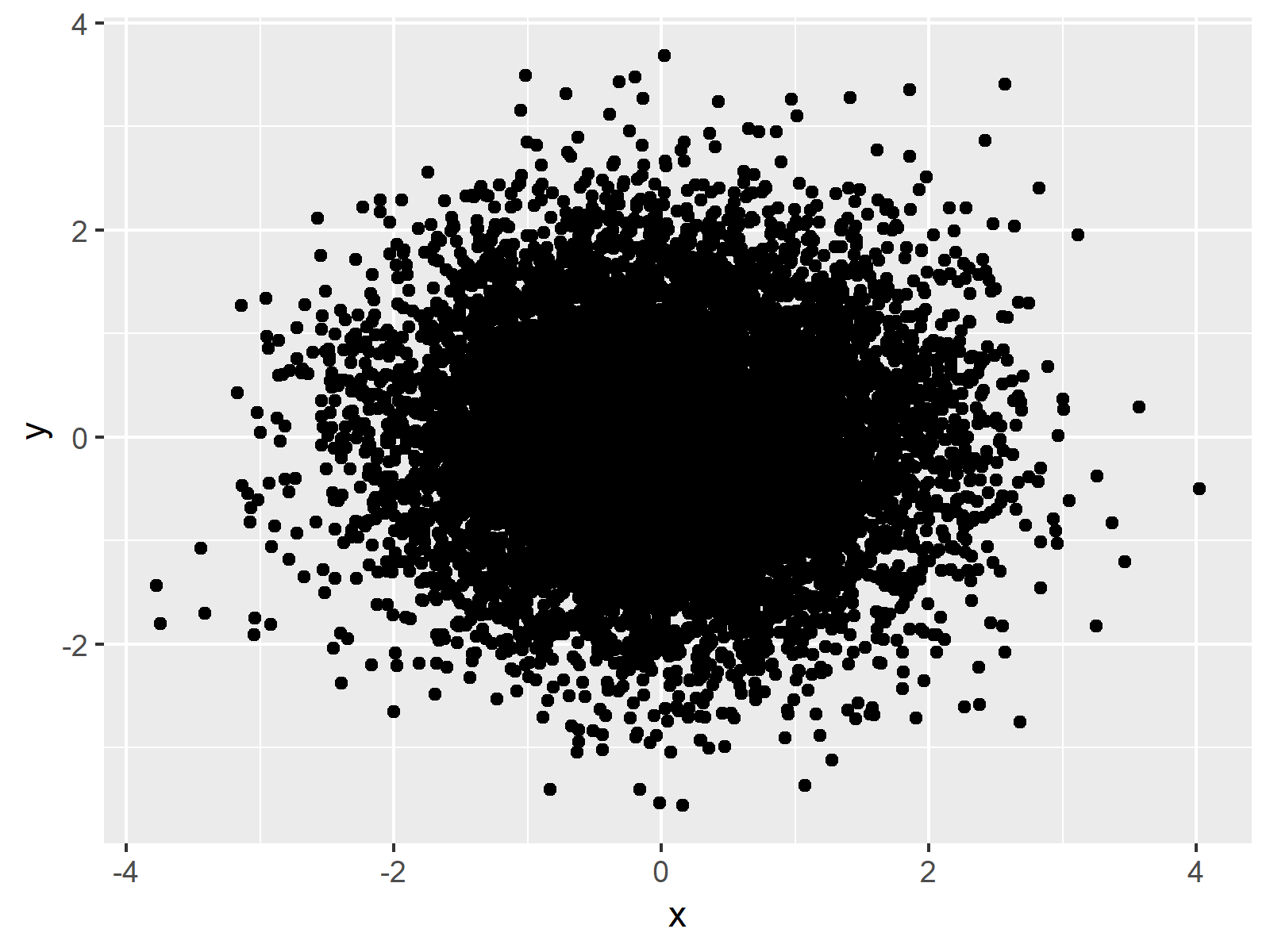
As revealed in Figure 1, the previous syntax created a basic ggplot2 plot with default axis limits.
Example: Change Only One Axis Limit Using scale_y_continuous
In another R programming tutorial, I’ve shown how to set both axis limits of the x- and y-axes of a ggplot2 plot. However, sometimes it may be preferable to adjust only one side of an axis and keep the default value for the other side. The following R syntax therefore illustrates how to change only one side of the bound of a ggplot2 axis, i.e. the higher limit of the y-axis. Have a look at the following R code:
ggp +                               # Modify scales manually
  scale_y_continuous(limits = c(0, NA))

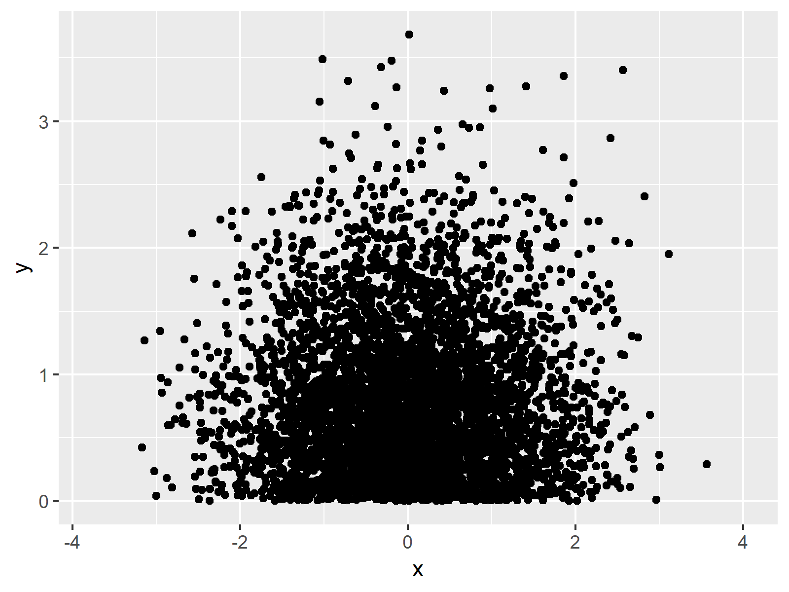
The output of the previous R syntax is visualized in Figure 2 – As you can see, we have created a plot with a lower y-axis limit of 0. Note that this removes many data points from our plot.
Video, Further Resources & Summary
Have a look at the following video of my YouTube channel. In the video, I’m explaining the R syntax of this tutorial:
In addition, you could have a look at the related posts of this website:
- Set Axis Limits in ggplot2 R Plot
- Set Axis Limits of ggplot2 Facet Plot
- Adjust Space Between ggplot2 Axis Labels and Plot Area
- Draw Vertical Line to X-Axis of Class Date in ggplot2 Plot
- R Graphics Gallery
- The R Programming Language
In summary: At this point you should have learned how to set lower or higher axis limit only in R programming. If you have further questions, let me know in the comments below.
Subscribe to the Statistics Globe Newsletter
Get regular updates on the latest tutorials, offers & news at Statistics Globe.
I hate spam & you may opt out anytime: Privacy Policy.
Thank you!
Welcome to the Statistics Globe newsletter. From now on, I’ll send you regular emails about statistics, data science, AI, and programming with R and Python.
I’m Joachim Schork. On this website, I provide statistics tutorials as well as code in Python and R programming.
Statistics Globe Newsletter
Get regular updates on the latest tutorials, offers & news at Statistics Globe. I hate spam & you may opt out anytime: Privacy Policy.
Thank you!
Please check your email inbox and click the confirmation link to complete your subscription. If you don’t see the email within a few minutes, please also check your spam/junk folder.


