Force Plot Axes to be Square Shaped in R (2 Examples)
In this R programming tutorial you’ll learn how to create square shaped axes in a plot.
The article consists of the following content:
Let’s jump right to the R code.
Construction of Exemplifying Data
Let’s first construct some example data in R:
data <- data.frame(x = 1:6,         # Create example data
                   y = 1:3)
data                                # Print example data
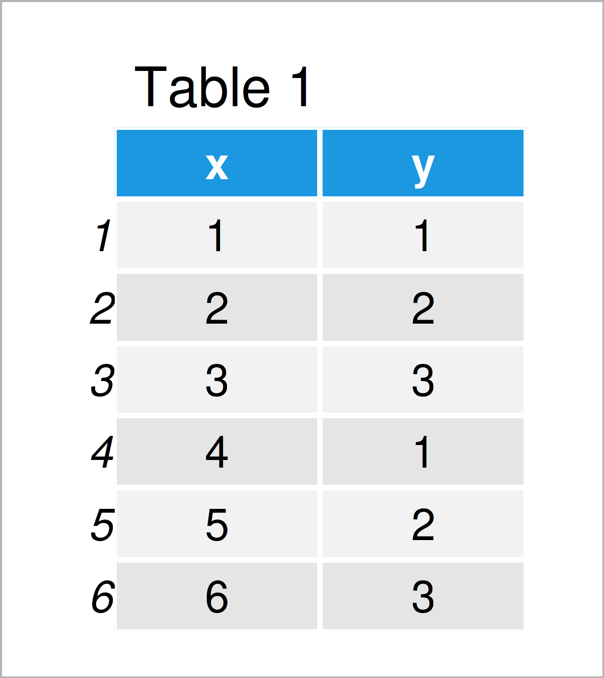
Table 1 reveals that our example data has six rows and two variables.
Example 1: Make Base R Plot Axes Squared
Example 1 illustrates how to draw a Base R plot with squared axes.
Let’s first create a graphic with default axis specifications
plot(data$x,                        # Base R plot with default axes
     data$y)
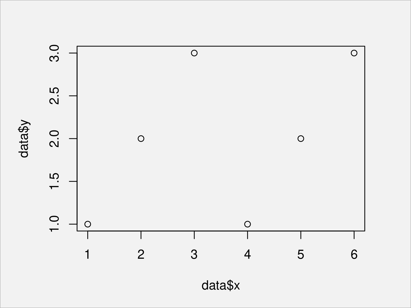
In Figure 1 it is shown that we have created a scatterplot with unequal x- and y- axes by executing the previous code.
If we want to make our plot squared, we can set the asp argument (i.e. the aspect ratio) of our graph to be equal to 1:
plot(data$x,                        # Aspect ratio of 1
     data$y,
     asp = 1)
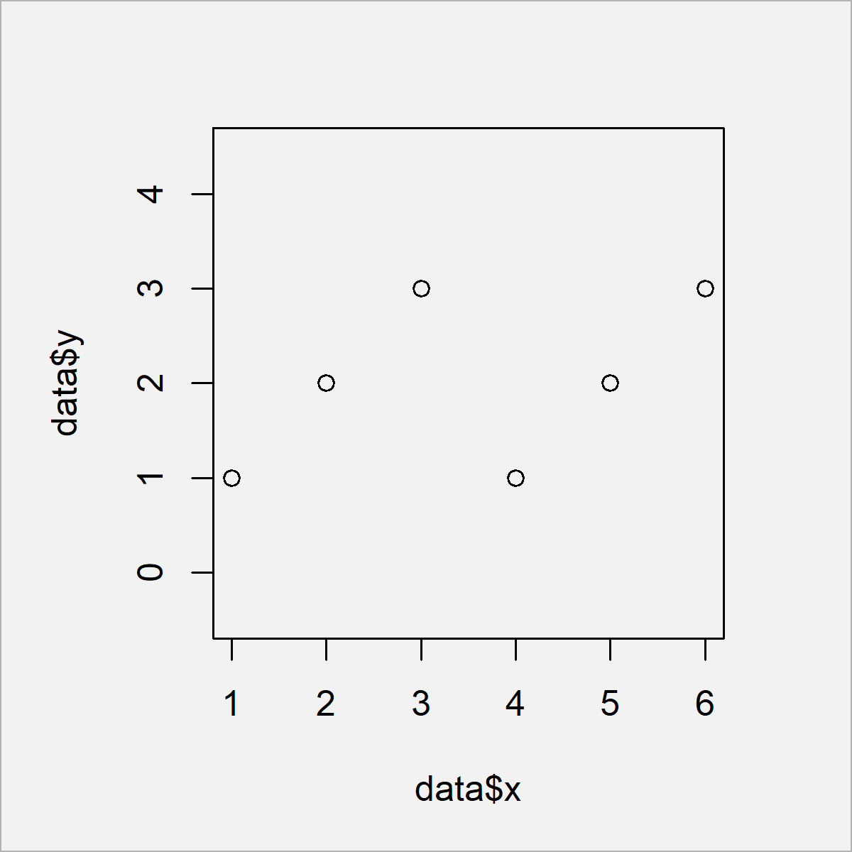
The output of the previous R code is shown in Figure 2 – We have created a Base R scatterplot with squared shape. Note that the axis limits of this plot are still different, i.e. the lowest and highest axis values differ on the x- and y-axes.
If we want to harmonize the x- and y-axes limits, we can use the min, max, and unlist functions in combination with the xlim and ylim arguments of the plot function as shown below:
plot(data$x,                        # Manually change xlim & ylim
     data$y,
     xlim = c(min(unlist(data)),
              max(unlist(data))),
     ylim = c(min(unlist(data)),
              max(unlist(data))))
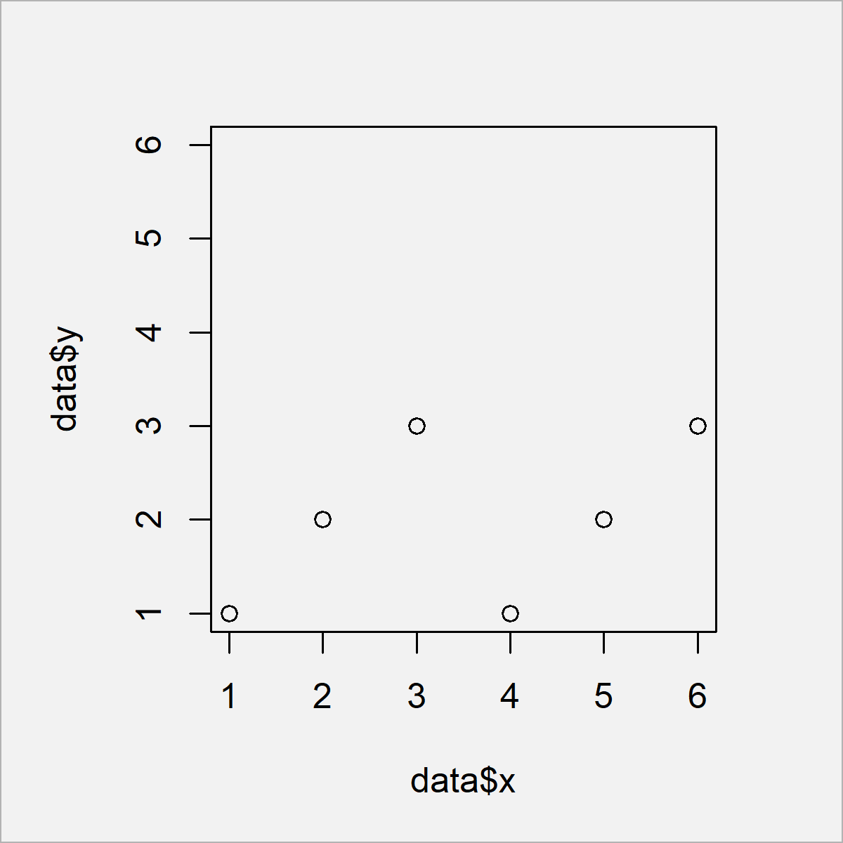
In Figure 3 it is shown that we have created a scatterplot with the same axis limits on the x- and y-axes.
Example 2: Make ggplot2 Plot Axes Squared
The following R programming syntax explains how to draw a ggplot2 plot with squared shape.
First, we have to install and load the ggplot2 package:
install.packages("ggplot2")         # Install ggplot2 package
library("ggplot2")                  # Load ggplot2
Next, we can draw a ggplot2 scatterplot with default axis limits as shown in the following R code:
ggp <- ggplot(data, aes(x, y)) +    # ggplot2 plot with default axes
  geom_point()
ggp
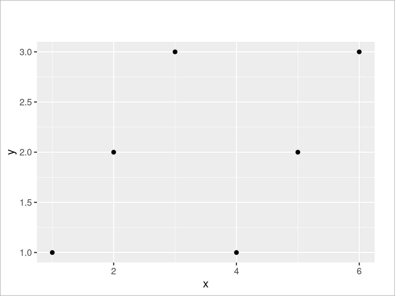
By executing the previous R programming syntax we have created Figure 4, i.e. a ggplot2 xyplot with default axes.
If we want to draw a squared ggplot2 plot, we can use the theme function as well as the aspect.ratio argument as shown below:
ggp +                               # Aspect ratio of 1
  theme(aspect.ratio = 1)
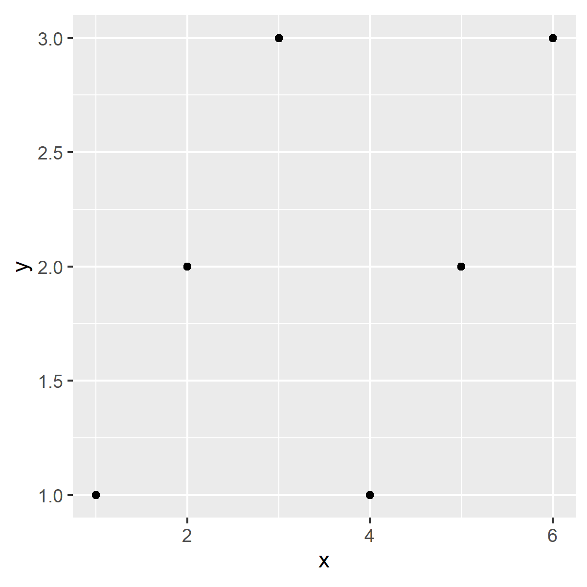
As visualized in Figure 5, we have created a squared scatterplot by executing the previous R programming code.
Note that the width of the range of the x- and y-axes is still different. This is a difference compared to Base R. In case of Base R, the axis limits are changed to make the plot squared; In case of ggplot2, the smaller axis range is visually stretched, but the axis limits are kept the same.
However, we can also equalize the axis limits of a ggplot2 graph using the xlim and ylim functions as shown below:
ggp +                               # Manually change xlim & ylim
  xlim(c(min(unlist(data)),
         max(unlist(data)))) +
  ylim(c(min(unlist(data)),
         max(unlist(data))))
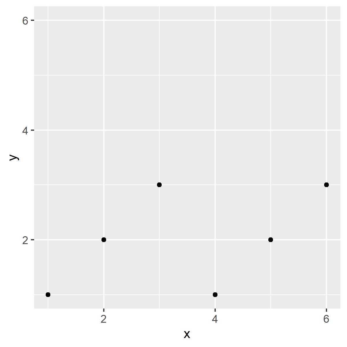
Figure 6 shows the output of the previous R code – A ggplot2 scatterplot with equal axis limits on the x- and y-axes.
Video & Further Resources
Do you need more info on the examples of this tutorial? Then I recommend watching the following video on my YouTube channel. In the video, I’m explaining the content of this tutorial in RStudio.
Furthermore, you could read the related tutorials on https://statisticsglobe.com/. Some articles are listed below.
- Fix Aspect Ratio in ggplot2 Plot in R
- Set Aspect Ratio of Base R Scatterplot & Barplot
- Add Axes to Plot Using axis Function
- Set Origin of ggplot2 Plot Axes to Zero
- Force Plot Axes to Start at Zero
- Creating Plots in R
- R Programming Overview
This article has illustrated how to draw a graphic with square shaped axes in the R programming language. Note that we have changed the axes of a scatterplot in the present tutorial. However, it would also be possible to change the axis limits of other types of plots such as barplots, histograms, boxplots, line plot, and heatmaps. If you have any additional questions, tell me about it in the comments section.


2 Comments. Leave new
How to add a regression line with CI in this plot?
Hello Mahan,
You can use the solution in our tutorial: Add Regression Line to ggplot2 Plot in R.
Regards,
Cansu