Set Origin of ggplot2 Plot Axes to Zero in R (Example)
In this tutorial you’ll learn how to force the axes of a ggplot2 plot to start at zero in the R programming language.
Table of contents:
If you want to learn more about these topics, keep reading.
Example Data, Add-On Packages & Basic Graphic
Consider the following example data:
data <- data.frame(x = 1:6,         # Create example data
                   y = 1:6)
data                                # Print example data
#   x y
# 1 1 1
# 2 2 2
# 3 3 3
# 4 4 4
# 5 5 5
# 6 6 6
Have a look at the previous output of the RStudio console. It shows that our example data has six rows and two numeric columns.
We also need to install and load the ggplot2 add-on package, if we want to use the corresponding functions and commands:
install.packages("ggplot2")         # Install ggplot2 package
library("ggplot2")                  # Load ggplot2
Now, we can draw a graph of our data as shown below.
ggp <- ggplot(data, aes(x, y)) +    # ggplot2 plot with default axis
  geom_point()
ggp                                 # Draw default ggplot2 plot

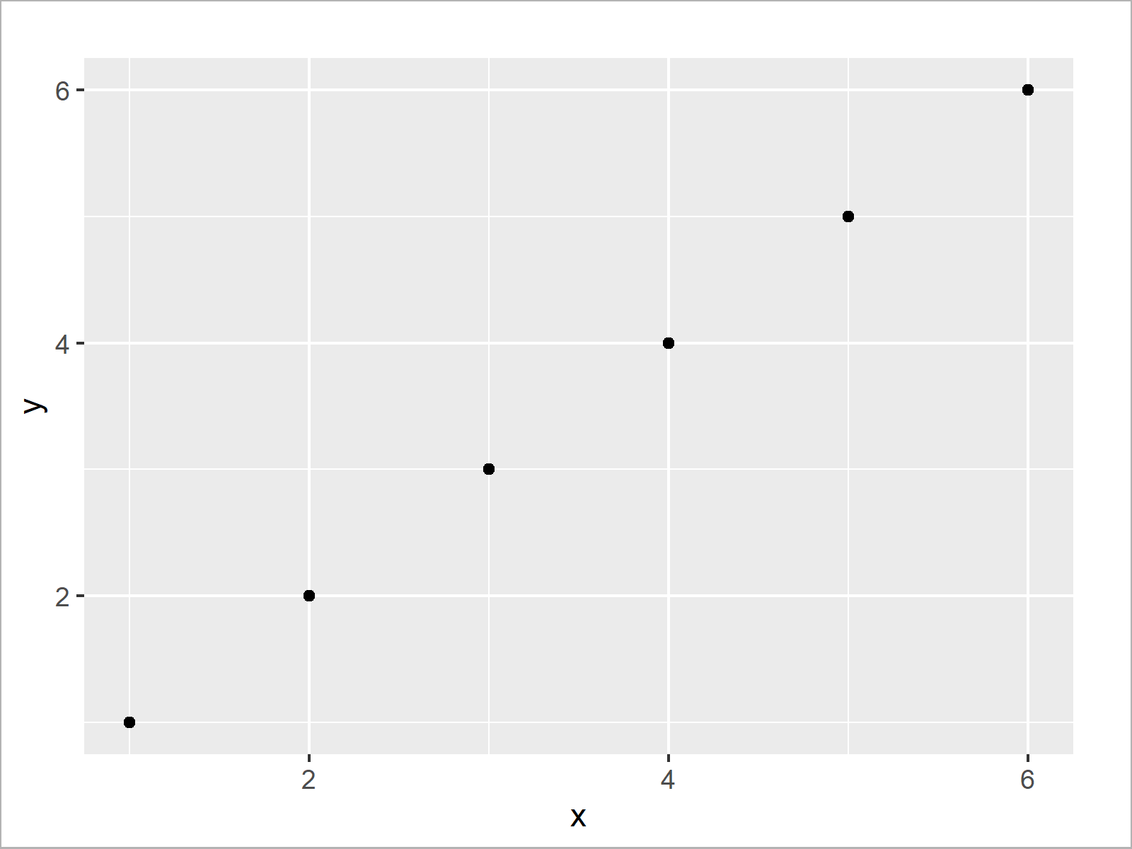
Figure 1 shows the output of the previous code: A ggplot2 scatterplot with default axis ranges. As you can see, the x- and y-axes do not start at zero.
Example: Set Origin of ggplot2 Plot Axes to Zero
This example explains how to force the origin of a ggplot2 graph axis to start at zero.
For this, we can use the scale_x_continuous and scale_y_continuous functions as shown below:
ggp +                               # Set origin of axes to zero
  scale_x_continuous(expand = c(0, 0), limits = c(0, 7)) +
  scale_y_continuous(expand = c(0, 0), limits = c(0, 7))

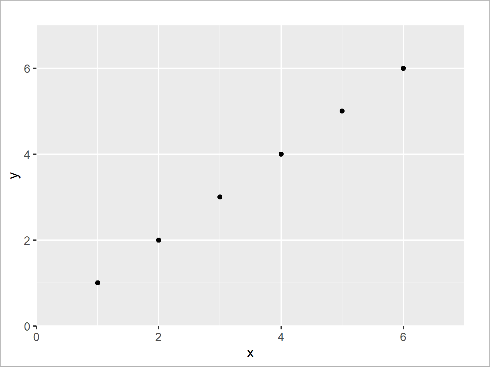
As shown in Figure 2, the previous syntax created a ggplot2 graph with axis ranges starting at zero.
In this tutorial we have set the axis origins of a ggplot2 scatterplot to zero. However, please note that we could apply the same type of code to other graphics such as histograms, density plots, or boxplots.
Video & Further Resources
Do you need further information on the examples of this tutorial? Then you could watch the following video of my YouTube channel. I show the R programming code of this tutorial in the video.
Furthermore, I can recommend having a look at the related articles on this website. I have published numerous articles about similar topics such as plot axes, graphics in R, and ggplot2.
- Set Axis Limits of ggplot2 Facet Plot
- Set Axis Limits in ggplot2 R Plot
- Set Area Margins of ggplot2 Plot
- Plots in R
- R Programming Language
- Introduction to the ggplot2 Package
At this point you should have learned how to set the lower axis limit to zero in the R programming language. Don’t hesitate to tell me about it in the comments, in case you have additional questions.
Subscribe to the Statistics Globe Newsletter
Get regular updates on the latest tutorials, offers & news at Statistics Globe.
I hate spam & you may opt out anytime: Privacy Policy.
Thank you!
Welcome to the Statistics Globe newsletter. From now on, I’ll send you regular emails about statistics, data science, AI, and programming with R and Python.
I’m Joachim Schork. On this website, I provide statistics tutorials as well as code in Python and R programming.
Statistics Globe Newsletter
Get regular updates on the latest tutorials, offers & news at Statistics Globe. I hate spam & you may opt out anytime: Privacy Policy.
Thank you!
Please check your email inbox and click the confirmation link to complete your subscription. If you don’t see the email within a few minutes, please also check your spam/junk folder.


