Add Axes to Plot Using axis Function in R (4 Examples)
In this tutorial, I’ll show how to create user-defined axis ticks using the axis() function in the R programming language.
The tutorial contains the following information:
Let’s dive into it.
Example 1: Draw Plot with Default Axis Ticks
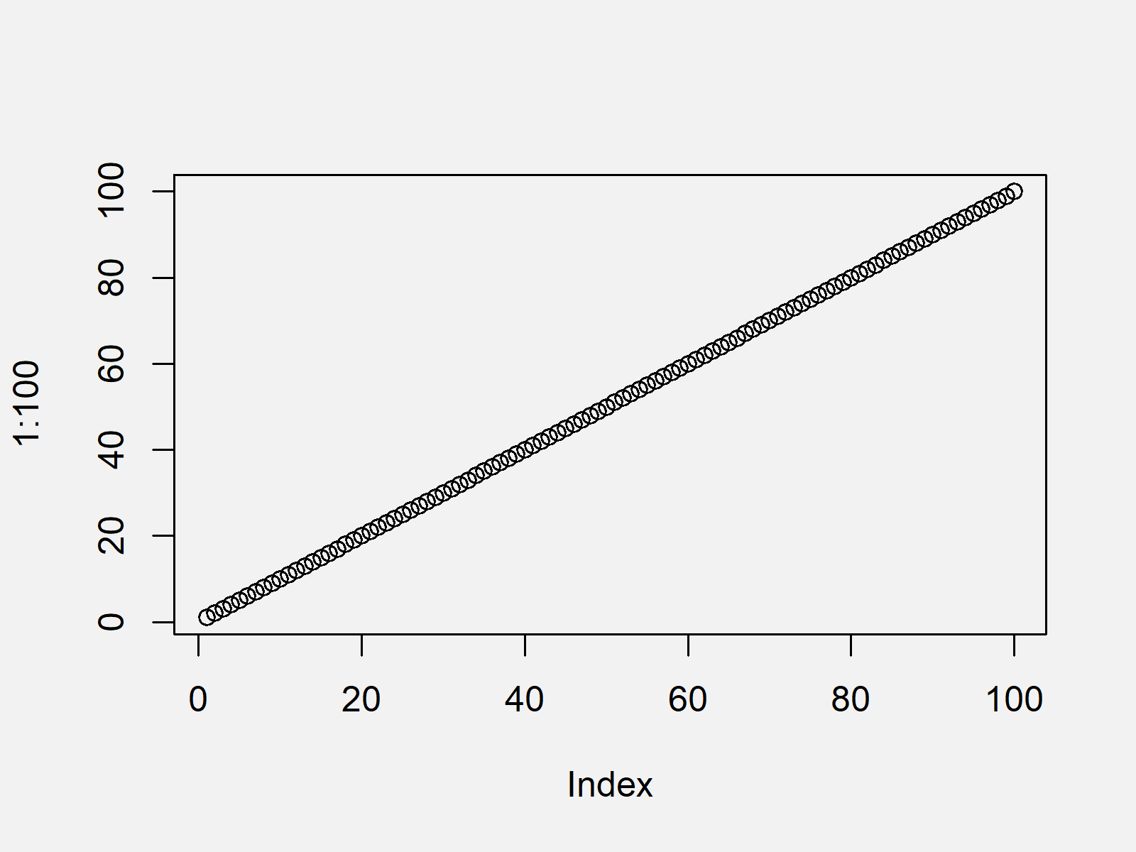
Example 1 shows how to draw a graphic with default axis specifications using the plot() function in R.
plot(1:100) # Default plot

As shown in Figure 1, the previous syntax drew a scatterplot with default axis values. Please note that the R codes of this tutorial could also be applied to other Base R graphics such as barplots, histograms, boxplots or line charts.
Example 2: Draw Plot with Manually Specified Axis Ticks
The R programming code below illustrates how to use the axis() function to draw user-defined axis labels. First, we have to create a graph without any axis values:
plot(1:100,           # Plot without axes
     xaxt = "n",
     yaxt = "n")
Now, we can use the axis function to add axis values to the x-axis (i.e. side 1)…
axis(side = 1,        # Draw x-axis
     c(0, 25, 50, 75, 100))
…and to the y-axis (i.e. side 2):
axis(side = 2,        # Draw y-axis
     c(10, 50, 90))

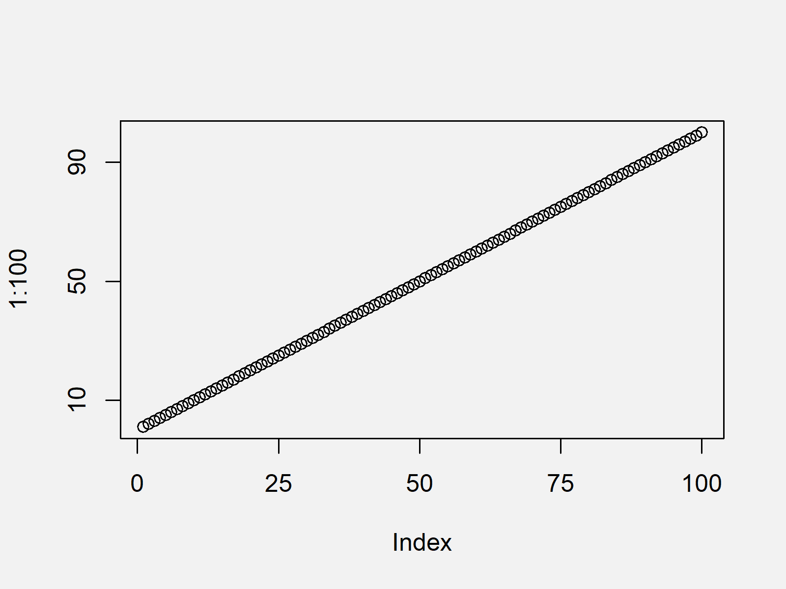
Figure 2 shows the output of the previous R syntax: An xy-plot with manually specified x- and y-axes.
Example 3: Draw Plot with Axis Ticks on Top & Right Side
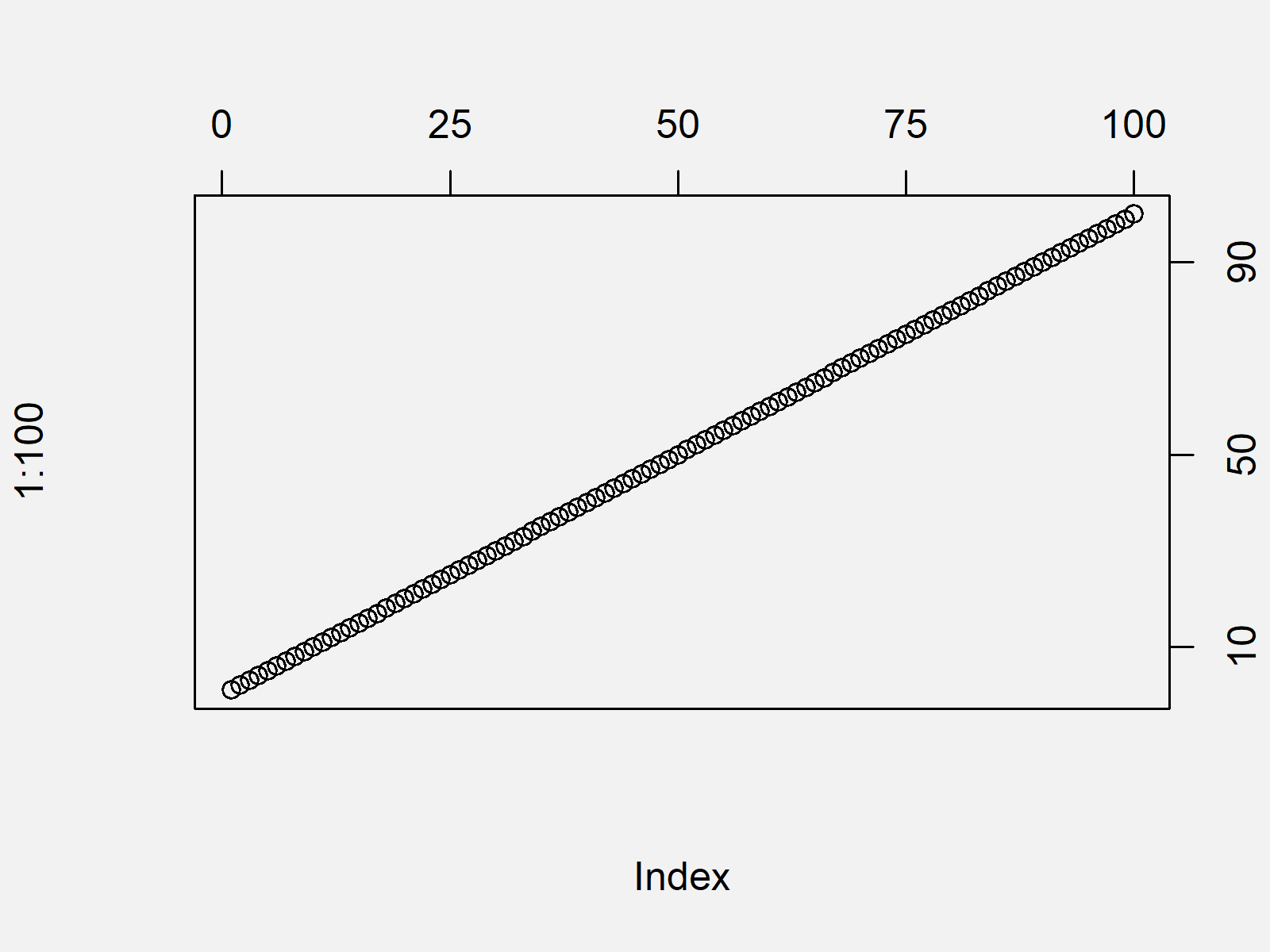
In this Example, I’ll explain how to print a plot with axes ticks on the top and at the right side of the plot. For this task, we can basically use the same R code as in the previous example. The only thing we have to change are the sides at which we want to add the axis ticks (i.e. 3 and 4 instead of 1 and 2):
plot(1:100,           # Plot without axes
     xaxt = "n",
     yaxt = "n")
axis(side = 3,        # Add axis on top
     c(0, 25, 50, 75, 100))
axis(side = 4,        # Add axis on right side
     c(10, 50, 90))

The output of the previous R code is shown in Figure 3 – A Base R graphic with axes values above and on the right side of the plot.
Example 4: Draw Plot with Axis Ticks, but without Border
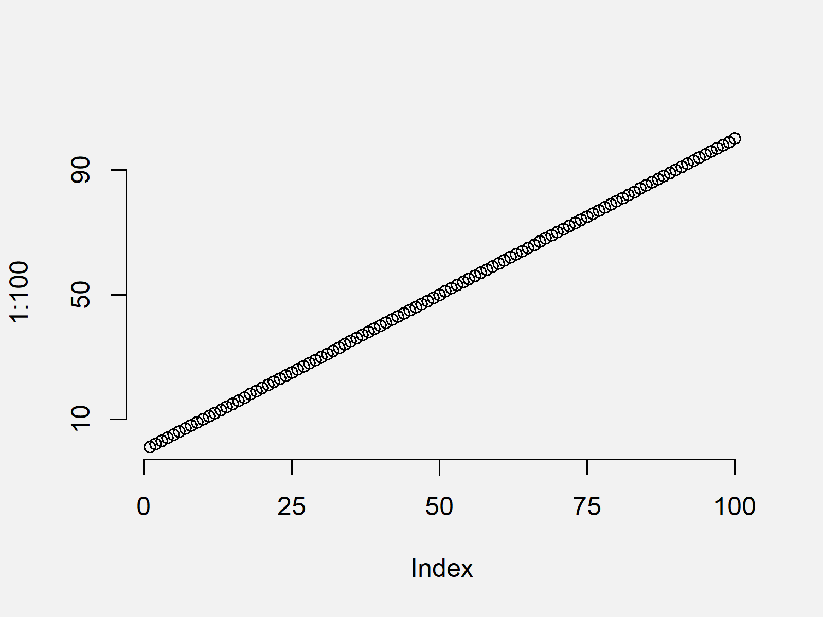
The following R programming syntax explains how to create a graph with manually modified axis ticks, but without plot borders. For this task, we have to specify the axes argument within the plot function to be equal to FALSE. Afterwards, we can manually add the axes using the axis function:
plot(1:100,           # Plot without axes and borders
     axes = FALSE)
axis(side = 1,        # Add x-axis
     c(0, 25, 50, 75, 100))
axis(side = 2,        # Add y-axis
     c(10, 50, 90))

The output of the previous R programming syntax is shown in Figure 4: A plot without borders and user-defined axis ticks.
Video & Further Resources
Do you need further explanations on the adjustment of plot axes and the R syntax of this article? Then you may want to watch the following video of my YouTube channel. I’m explaining how to change axis labels of Base R plots in the video:
In addition, you might want to read some of the other tutorials of this homepage:
- Change Spacing of Axis Tick Marks in Base R Plot
- How to Change & Customize Ticks
- Remove Axis Values of Plot in Base R
- Rotate Axis Labels of Base R Plot
- Display Only Integer Values on ggplot2 Axis
- Change Y-Axis to Percentage Points in ggplot2 Barplot
- R Graphics Gallery
- R Functions List (+ Examples)
- The R Programming Language
Summary: In this tutorial you learned how to apply the axis function in the R programming language. In case you have further questions, let me know in the comments below. Furthermore, please subscribe to my email newsletter to get regular updates on the newest articles.


