Connect Lines Across Missing Values in ggplot2 Line Plot in R (Example)
In this tutorial you’ll learn how to avoid a gap in ggplot2 line plots with NA values in the R programming language.
The post is structured as follows:
Let’s dive into it.
Example Data, Packages & Default Plot
Let’s first construct some example data:
data <- data.frame(x = 1:10,           # Create example data frame
                   y = c(3, 1, NA, 5, 5, NA, NA, 4, 3, 6))
data                                   # Print example data frame
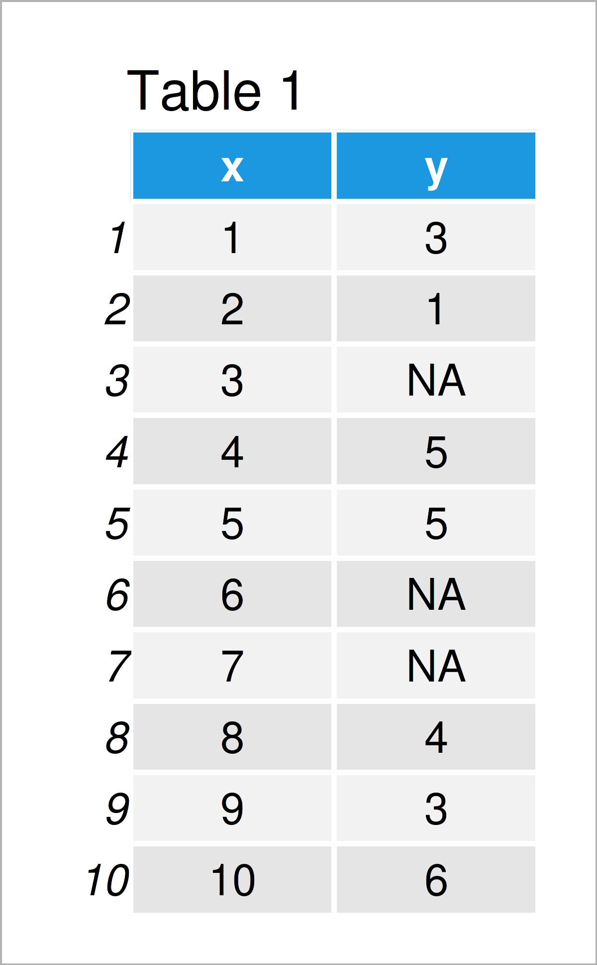
Table 1 visualizes the RStudio console output and shows that the example data is composed of ten rows and two columns.
To be able to use the functions of the ggplot2 package, we also have to install and load ggplot2:
install.packages("ggplot2")            # Install & load ggplot2 package
library("ggplot2")
As a next step, we can draw our data:
ggplot(data, aes(x, y)) +              # Draw ggplot2 plot with missings
  geom_line()
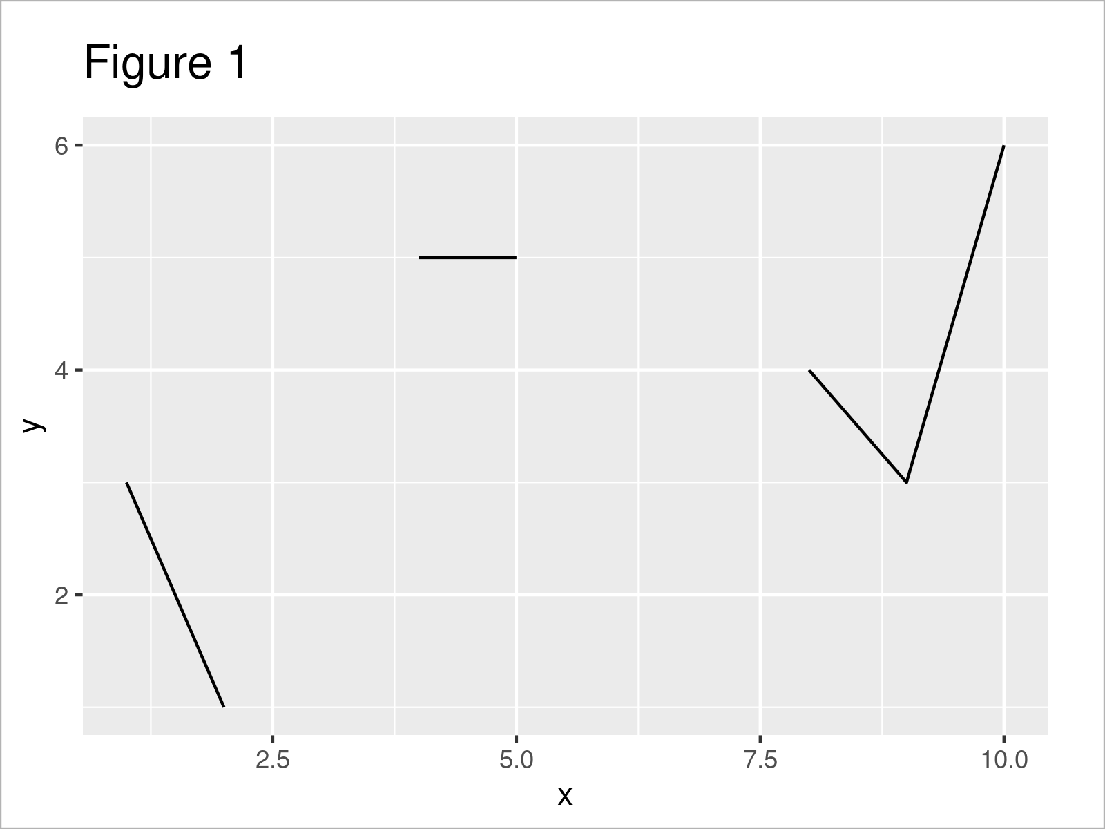
As shown in Figure 1, the previously shown R programming code has created a ggplot2 line plot. As you can see, there are several gaps between the lines. These gaps occur due to the NA values in our data frame.
Let’s connect our line!
Example: Avoid Gap for NA Values when Drawing a ggplot2 Plot
This example illustrates how to connect the lines in a ggplot2 line plot with missing data.
For this task, we first have to drop the NAs from our data frame:
data_comp <- data[!is.na(data$y), ]    # Remove missing values
data_comp                              # Print updated data frame
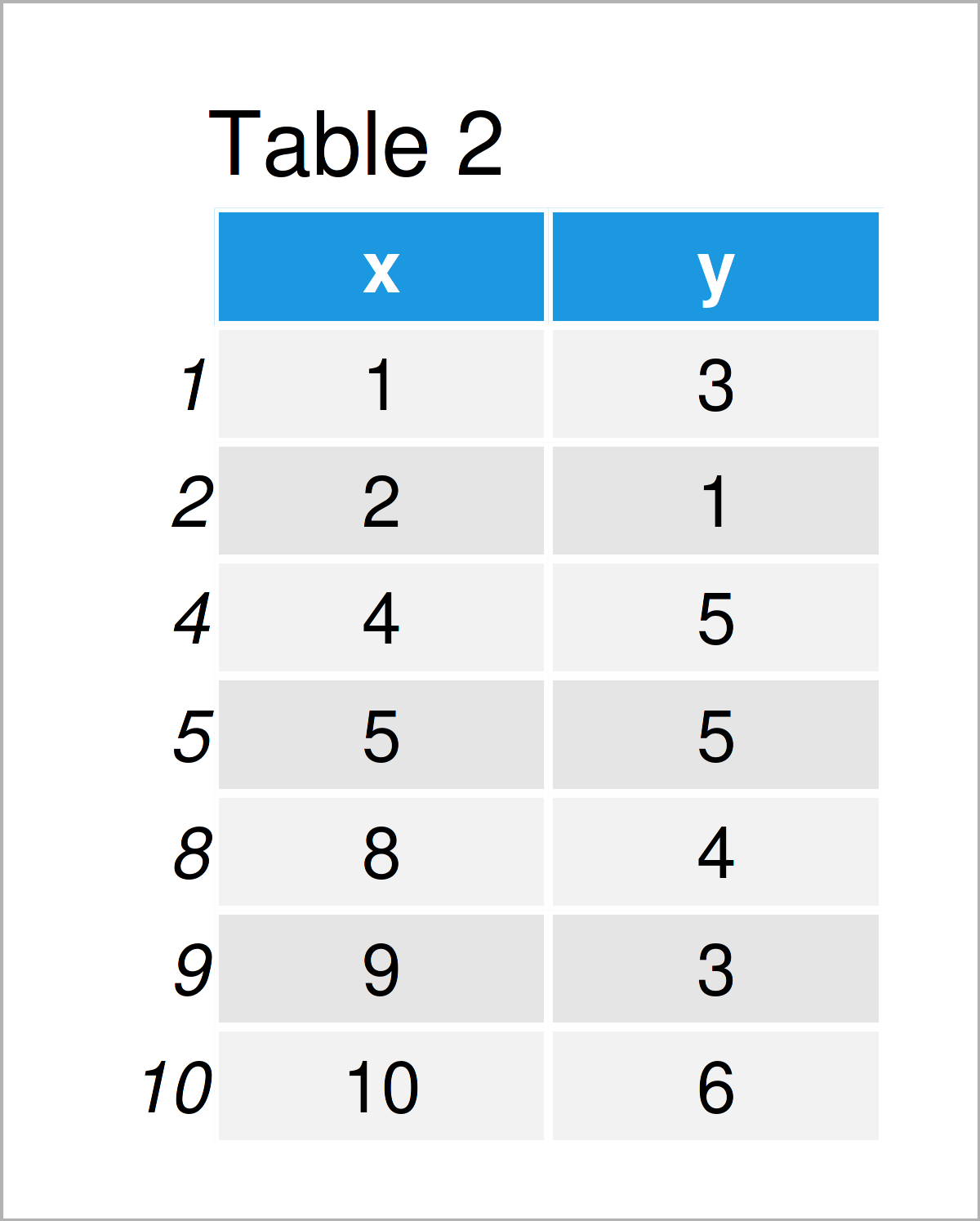
As shown in Table 2, we have created a new data frame containing no NA values by running the previous R programming syntax.
Next, we can draw a new ggplot2 line plot based on our complete data set:
ggplot(data_comp, aes(x, y)) +         # Draw ggplot2 plot without missings
  geom_line()
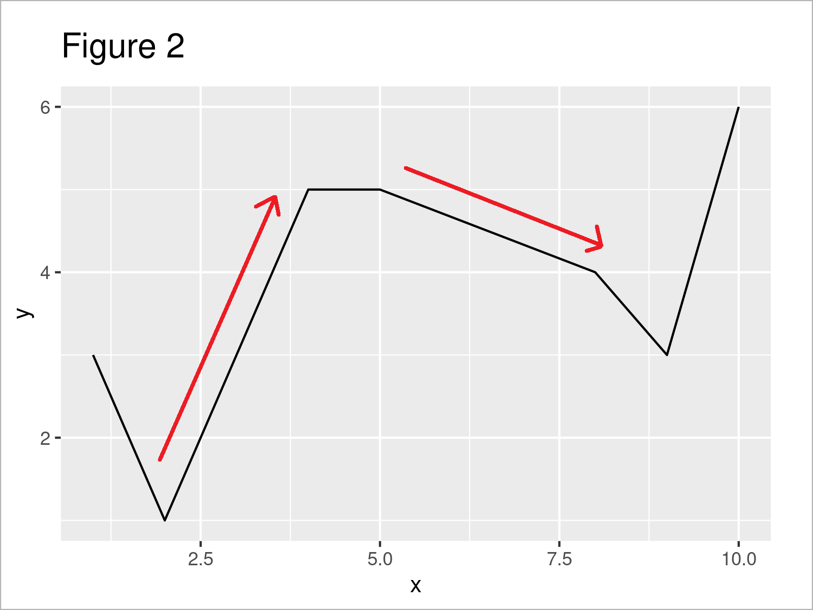
In Figure 2 you can see that we have created a new ggplot2 line plot where the gaps due to the missing values have been connected (indicated by the red arrows).
Video, Further Resources & Summary
If you need more explanations on the examples of this tutorial, you may want to have a look at the following video on the Statistics Globe YouTube channel. In the video, I’m explaining the R programming syntax of this article.
Besides the video, you could have a look at the related articles on my website:
- Add Regression Line to ggplot2 Plot
- Extract stat_smooth Regression Line Fit from ggplot2 Plot
- Cut Off Highest Values from ggplot2 Plot
- Align Text to Line in ggplot2 Plot
- Draw ggplot2 Plot with Lines and Points
- Add Different Line to Each Facet of ggplot2 Plot
- Graphics Gallery in R
- Introduction to R
In summary: At this point you should have learned how to connect the lines in a line plot with missing values in R. If you have any further questions, please let me know in the comments section. Furthermore, don’t forget to subscribe to my email newsletter to get updates on new articles.


