Cut Off Highest Values from ggplot2 Plot in R (2 Examples)
In this R tutorial you’ll learn how to display only the lower 95% of a density or histogram.
Table of contents:
So now the part you have been waiting for – the examples:
Creation of Example Data
The first step is to create some example data:
set.seed(357948)                                      # Create example data
data <- data.frame(x = rnorm(250))
head(data)                                            # Print head of example data
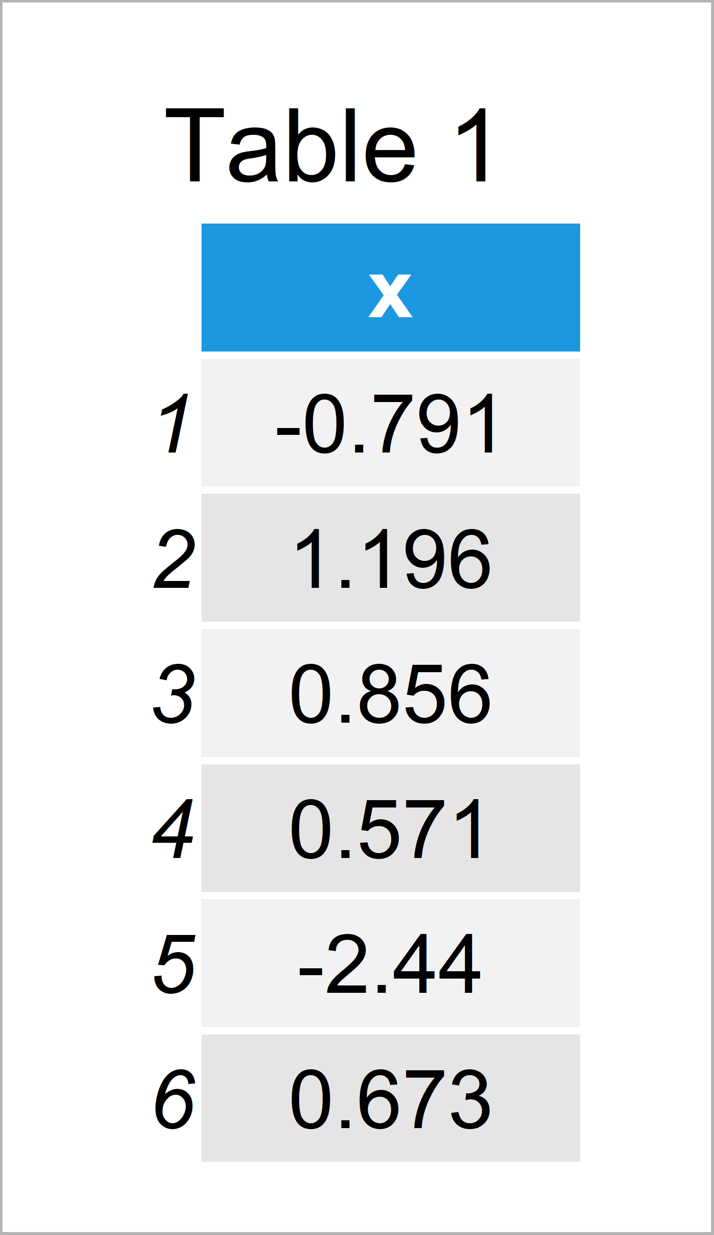
Table 1 shows the head of our example data – Furthermore, it gets visible that our data is constituted of one variable with the names “x”.
Example 1: Add 95% Line to ggplot2 Plot
The following R syntax demonstrates how to draw a red line at the 95% highest value to a graph.
For this, we first need to define the value of this cut-off point:
cut_95 <- sort(data$x)[round(length(data$x) * 0.95)]  # Create cut-off value
cut_95                                                # Print cut-off value
# [1] 1.667292
Based on the previous calculation we can see that 95% of our values are below the cut-off value 1.667292, and 5% are larger than this value.
Next, we can visualize this cut-off value as a red line to a graphic.
In this example, we use the ggplot2 package to draw our data. We first have to install and load the ggplot2 package, in order to use the corresponding functions and commands:
install.packages("ggplot2")                           # Install & load ggplot2
library("ggplot2")
Next, we can use the following R code to draw our data. Note that we are using the geom_vline function to add a vertical red line to our ggplot2 plot.
ggplot(data, aes(x)) +                                # Draw density with 95% line
  geom_density() +
  geom_vline(xintercept = cut_95, col = "red")
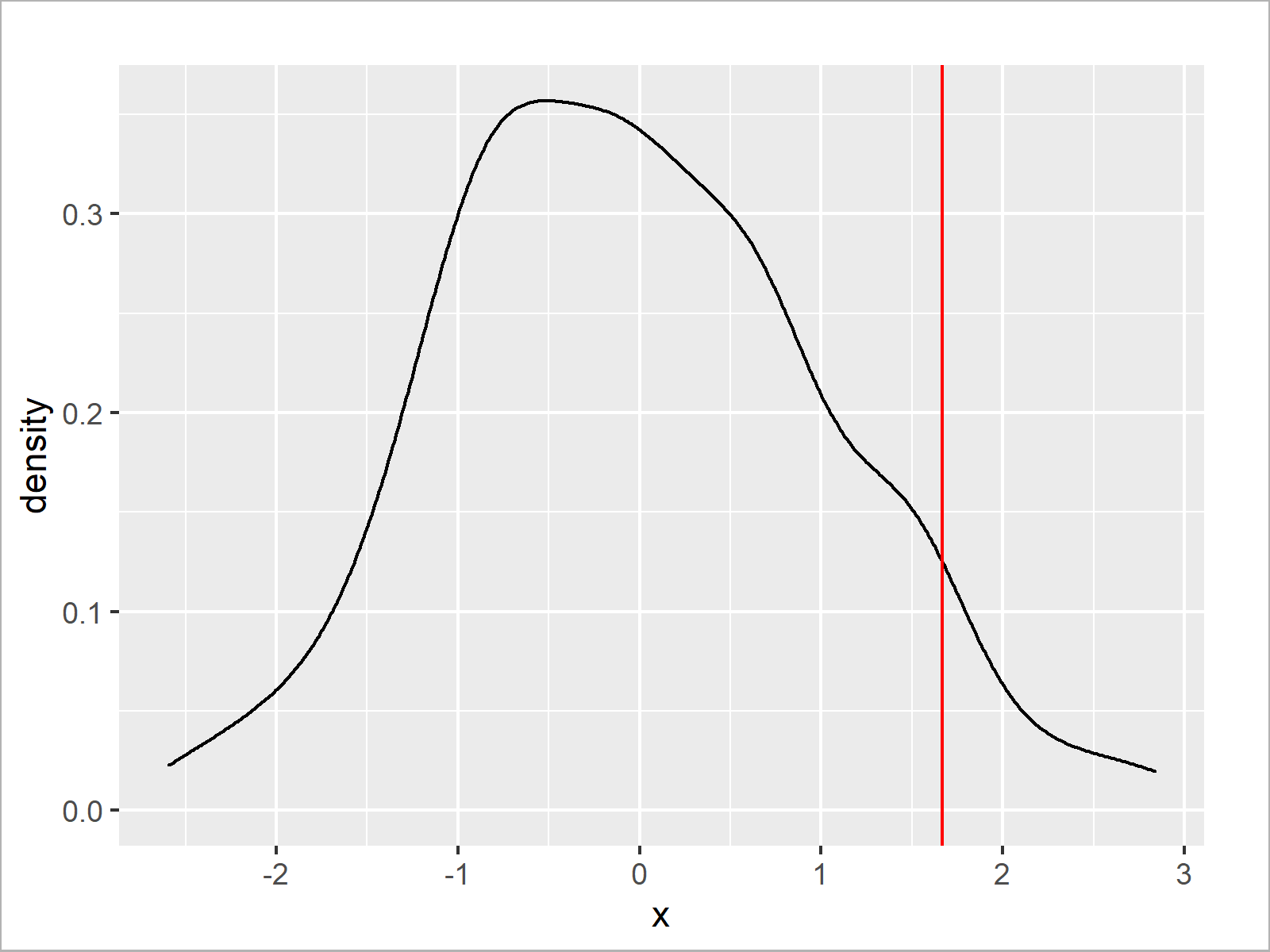
The output of the previous syntax is illustrated in Figure 1: We have created a ggplot2 density plot with a red line indicating the 95% cut-off that we have computed before.
We can use basically the same R code to draw our data in a histogram. All we have to do is to exchange the geom_density function by the geom_histogram function:
ggplot(data, aes(x)) +                                # Draw histogram with 95% line
  geom_histogram() +
  geom_vline(xintercept = cut_95, col = "red")
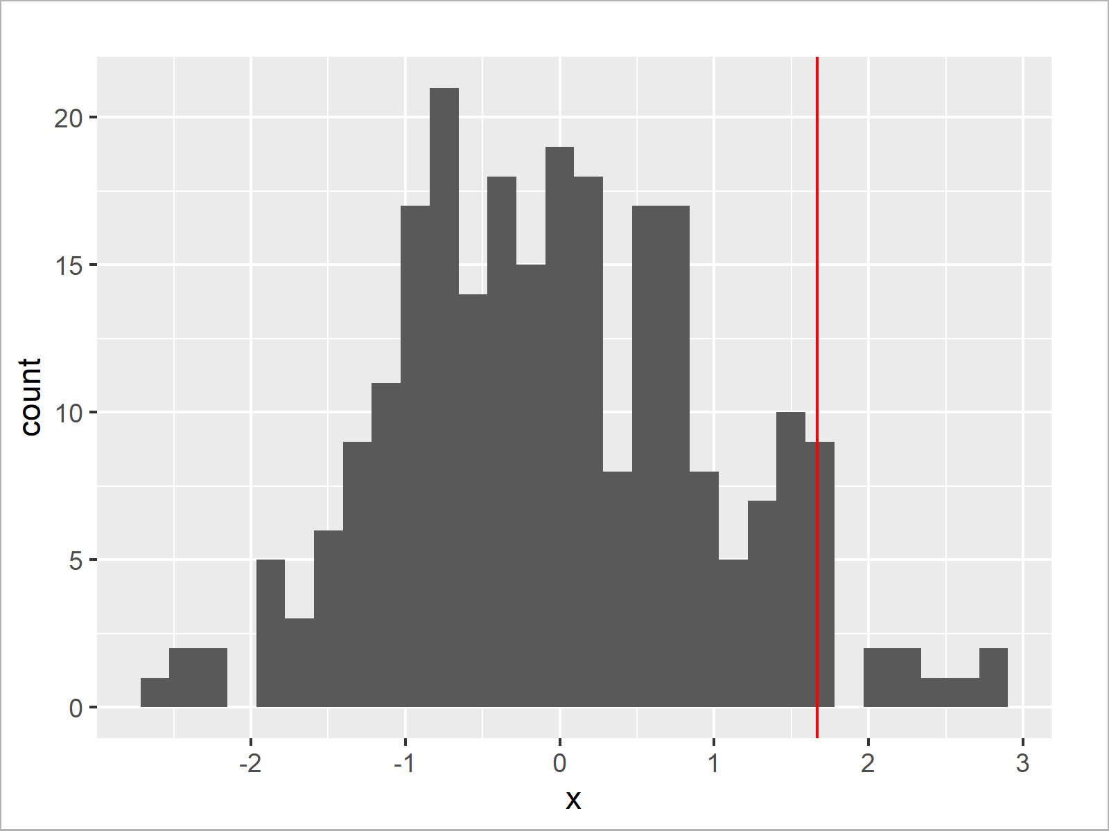
As shown in Figure 2, we have created a ggplot2 histogram with a vertical line at the 95% cut-off value.
Example 2: Remove Highest 5% of Values from ggplot2 Plot
In Example 1, we have drawn a red line at our cut-off value. Example 2 explains how to remove all values on the right side of our cut-off line entirely.
For this, we first have to create a data frame subset that contains only the lower 95% of our values:
data_95 <- data[data$x <= cut_95, , drop = FALSE] # Remove highest 5%
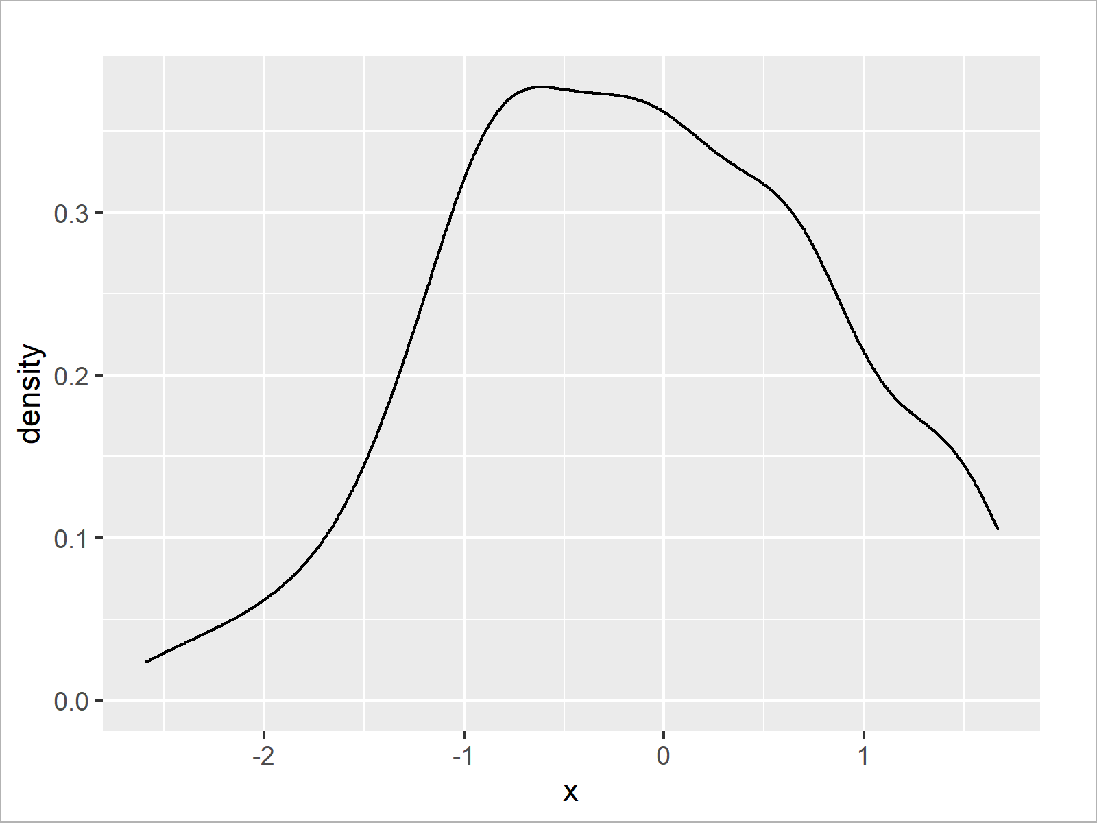
Next, we can draw the lower 95% of our data in a density:
ggplot(data_95, aes(x)) +                             # Draw density of lower 95%
  geom_density()
Alternatively, we could draw our data frame subset in a histogram:
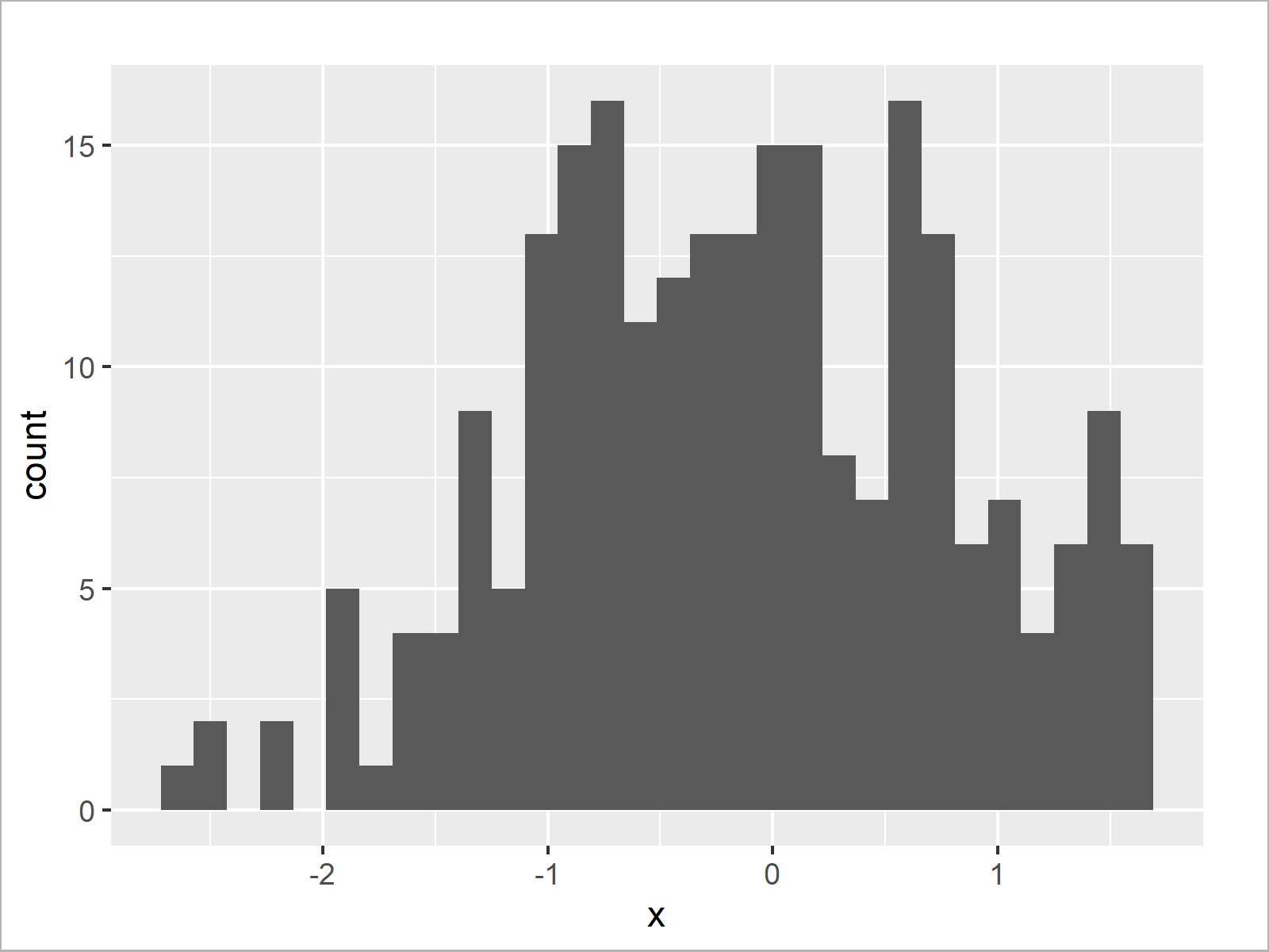
ggplot(data_95, aes(x)) +                             # Draw histogram of lower 95%
  geom_histogram()
Video, Further Resources & Summary
If you need further information on the R programming code of this article, you might have a look at the following video on my YouTube channel. In the video, I’m explaining the R programming syntax of this article.
Furthermore, you may want to read the other articles of my homepage. You can find some tutorials on topics such as groups, labels, and ggplot2 below.
- Ignore Outliers in ggplot2 Boxplot in R
- Remove Outliers from Data Set in R
- Select Top N Highest Values by Group
- Graphics in R
- All R Programming Examples
Summary: You have learned in this tutorial how to show only the x highest or lowest values in a ggplot2 graphic in the R programming language. If you have additional comments or questions, please let me know in the comments.
Subscribe to the Statistics Globe Newsletter
Get regular updates on the latest tutorials, offers & news at Statistics Globe.
I hate spam & you may opt out anytime: Privacy Policy.
Thank you!
Welcome to the Statistics Globe newsletter. From now on, I’ll send you regular emails about statistics, data science, AI, and programming with R and Python.
I’m Joachim Schork. On this website, I provide statistics tutorials as well as code in Python and R programming.
Statistics Globe Newsletter
Get regular updates on the latest tutorials, offers & news at Statistics Globe. I hate spam & you may opt out anytime: Privacy Policy.
Thank you!
Please check your email inbox and click the confirmation link to complete your subscription. If you don’t see the email within a few minutes, please also check your spam/junk folder.



2 Comments. Leave new
The code makes me so happy and it is a joy to read and practice, it will be nice if all the articles and videos are made available as a large single zip file. thanks. You can write a great book on R
Hey Duleep,
Thanks a lot for this awesome feedback, glad to hear that you enjoy reading my tutorials!
I have not planned to make the content available as zip-file (this would be a HUGE file), but you can always access it for free on the website and the YouTube channel.
Regards
Joachim