Extract stat_smooth Regression Line Fit from ggplot2 Plot in R (Example)
In this article, I’ll explain how to get the line fit coordinates of a ggplot2 plot in the R programming language.
The tutorial consists of this content:
If you want to know more about these contents, keep reading…
Example Data, Packages & Default Graph
The first step is to create some data that we can use in the examples below:
set.seed(23876382)                          # Create example data
x <- rnorm(100)
y <- x + rnorm(100)
data <- data.frame(x, y)
head(data)                                  # Head of example data

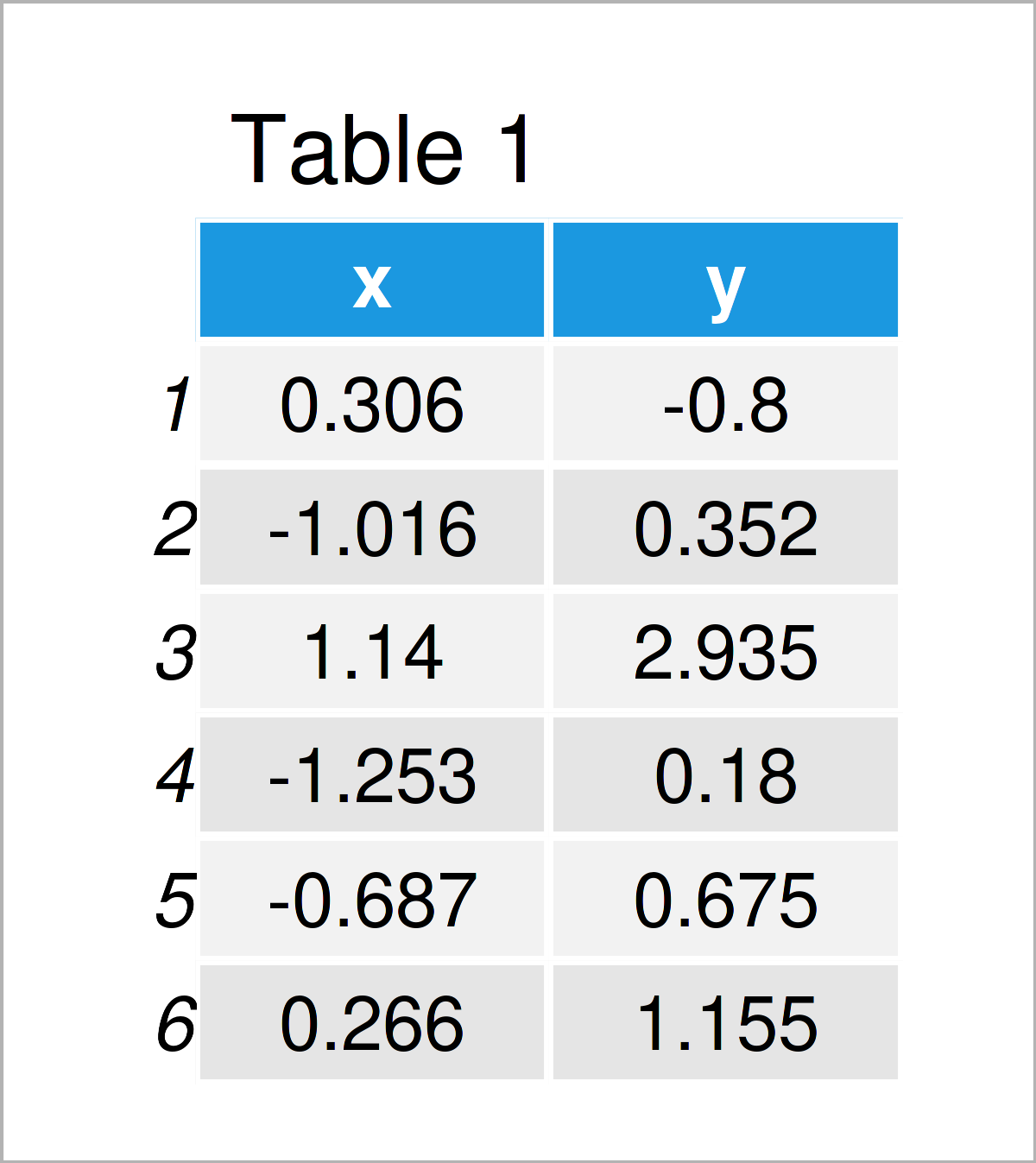
Table 1 illustrates that our example data has two numerical columns called “x” and “y”.
In order to use the functions of the ggplot2 package, we also need to install and load ggplot2:
install.packages("ggplot2")                 # Install & load ggplot2 package
library("ggplot2")
Next, we can create a graphic of the data:
ggp <- ggplot(data, aes(x, y)) +            # Draw ggplot2 plot with stat_smooth line
  geom_point() +
  stat_smooth()
ggp

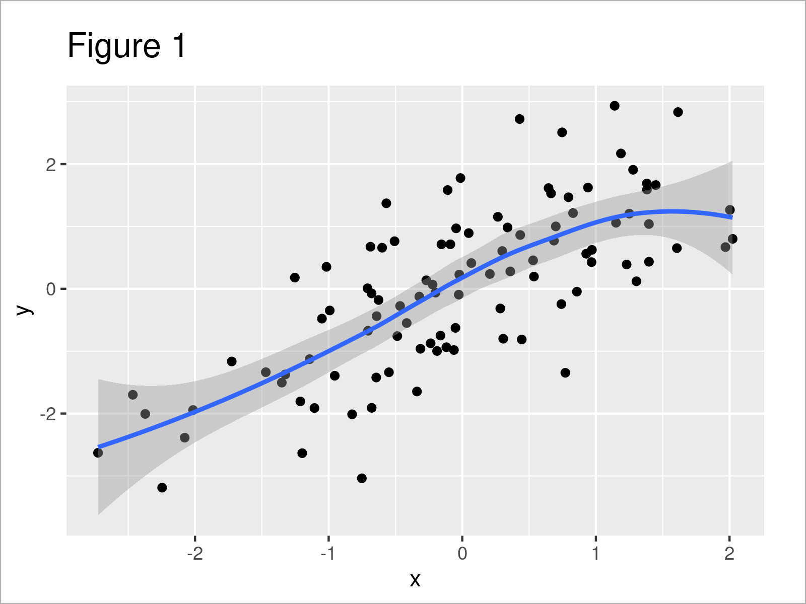
As shown in Figure 1, the previous R syntax has plotted a ggplot2 scatterplot with a line created by the stat_smooth function.
Note: In this tutorial, we have used the default specification of the stat_smooth function (i.e. method = ‘loess’ and formula ‘y ~ x’). However, the following R code could also be applied in case we would have used another method such as linear regression model (method = “lm”) or a generalized linear model (method = “glm”). Furthermore, we could also use the geom_smooth function instead of stat_smooth.
However, let’s move on to the example code…
Example: Extract stat_smooth Regression Line Fit from ggplot2 Plot Using ggplot_build() Function
This example shows how to get the x- and y-coordinates of a stat_smooth line in a ggplot2 plot.
For this task, we can apply the ggplot_build function as shown below:
ggp_data <- ggplot_build(ggp)$data[[2]]     # Extract information about plot
head(ggp_data)                              # Head of information data
#           x         y      ymin      ymax        se flipped_aes PANEL group  colour   fill size linetype weight alpha
# 1 -2.726269 -2.539296 -3.631610 -1.446982 0.5501666       FALSE     1    -1 #3366FF grey60    1        1      1   0.4
# 2 -2.666148 -2.496717 -3.515914 -1.477519 0.5133401       FALSE     1    -1 #3366FF grey60    1        1      1   0.4
# 3 -2.606028 -2.453355 -3.403513 -1.503196 0.4785674       FALSE     1    -1 #3366FF grey60    1        1      1   0.4
# 4 -2.545908 -2.409207 -3.294451 -1.523964 0.4458714       FALSE     1    -1 #3366FF grey60    1        1      1   0.4
# 5 -2.485787 -2.364273 -3.188773 -1.539772 0.4152770       FALSE     1    -1 #3366FF grey60    1        1      1   0.4
# 6 -2.425667 -2.318549 -3.086530 -1.550568 0.3868098       FALSE     1    -1 #3366FF grey60    1        1      1   0.4
As you can see based on the previous RStudio console output, the ggplot_build function has created a data set containing different information about our plot.
In our case, we are interested in the x and y columns of this output, since those two columns contain the x- and y-coordinates of our stat_smooth line.
We can double-check that by drawing the values in the variables x and y in a line plot:
ggp_fit <- ggplot(ggp_data, aes(x, y)) +    # Redraw stat_smooth line
  geom_line()
ggp_fit

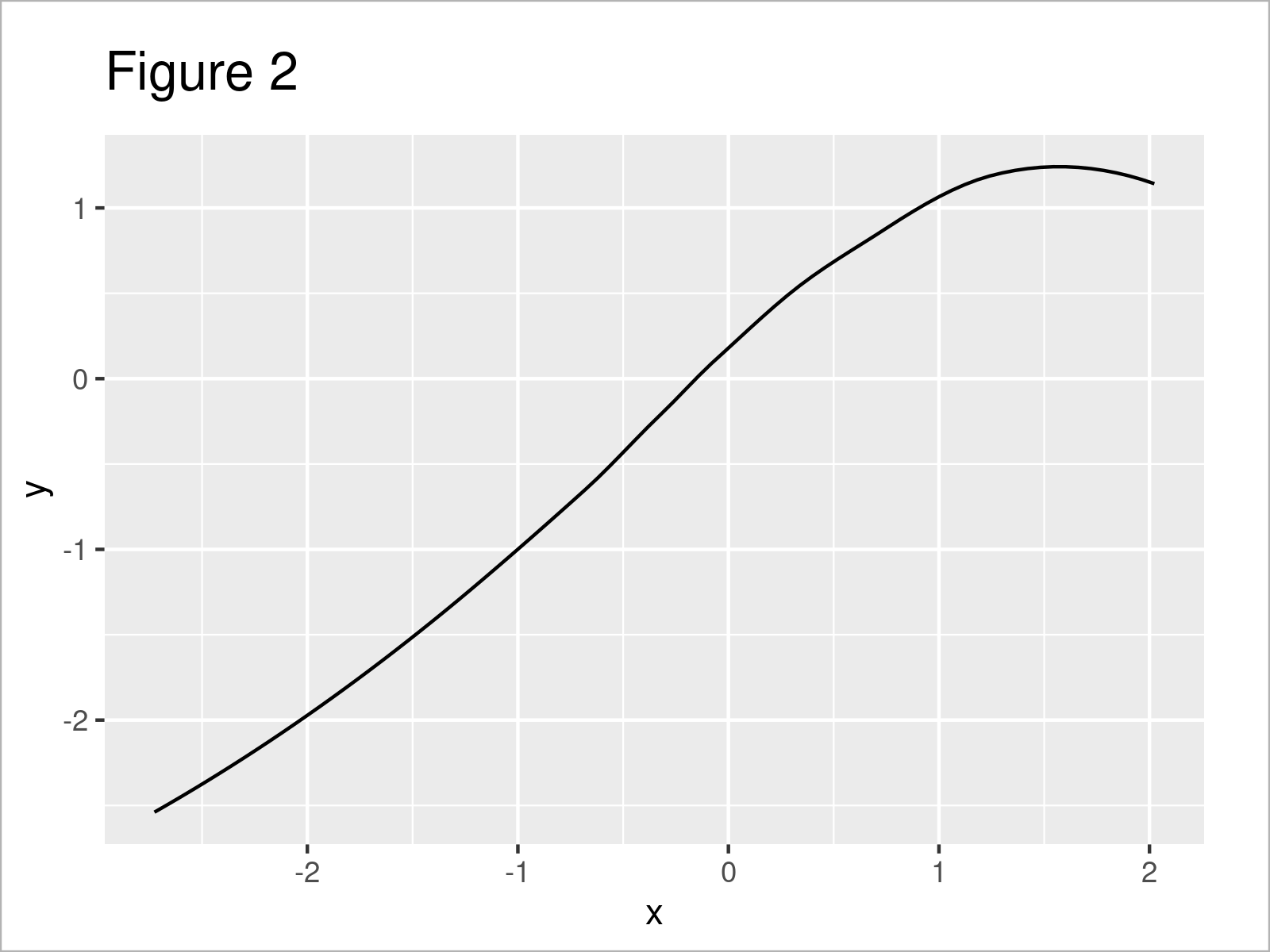
By executing the previous R programming syntax we have created Figure 2, i.e. a ggplot2 line plot showing only the stat_smooth line of our original plot.
Note that the axis limits of Figure 2 are different compared to Figure 1 – That’s why the stat_smooth line may look a little different.
Video & Further Resources
If you need further info on the examples of this page, you might watch the following video on the Statistics Globe YouTube channel. I’m explaining the R programming codes of this tutorial in the video.
In addition, you may read the related articles on this website. I have published numerous other articles already.
- Extract Regression Coefficients of Linear Model
- Extract Fitted Values from Regression Model in R
- Add Regression Line to ggplot2 Plot in R
- Draw Vertical Line to X-Axis of Class Date in ggplot2 Plot
- Control Line Color & Type in ggplot2 Plot Legend
- Change Line Width in ggplot2 Plot
- Add Labels at Ends of Lines in ggplot2 Line Plot
- Add Label to Straight Line in ggplot2 Plot
- Creating Plots in R
- R Programming Tutorials
In this tutorial you have learned how to extract the fitted values shown in a regression line in R programming. In case you have further questions, tell me about it in the comments section.
Subscribe to the Statistics Globe Newsletter
Get regular updates on the latest tutorials, offers & news at Statistics Globe.
I hate spam & you may opt out anytime: Privacy Policy.
Thank you!
Welcome to the Statistics Globe newsletter. From now on, I’ll send you regular emails about statistics, data science, AI, and programming with R and Python.
I’m Joachim Schork. On this website, I provide statistics tutorials as well as code in Python and R programming.
Statistics Globe Newsletter
Get regular updates on the latest tutorials, offers & news at Statistics Globe. I hate spam & you may opt out anytime: Privacy Policy.
Thank you!
Please check your email inbox and click the confirmation link to complete your subscription. If you don’t see the email within a few minutes, please also check your spam/junk folder.


