Change Number of Decimal Places on Axis Tick Labels of Plot in R (2 Examples)
In this article, I’ll explain how to modify the number of decimals on the axis tick labels of a plot in the R programming language.
The content of the article looks as follows:
Let’s dive into it…
Creation of Example Data
Have a look at the following example data.
data <- data.frame(x = seq(0.5, 1, 0.1),    # Create example data frame
                   y = c(5, 2, 9, 7, 5, 9))
data                                        # Print example data frame
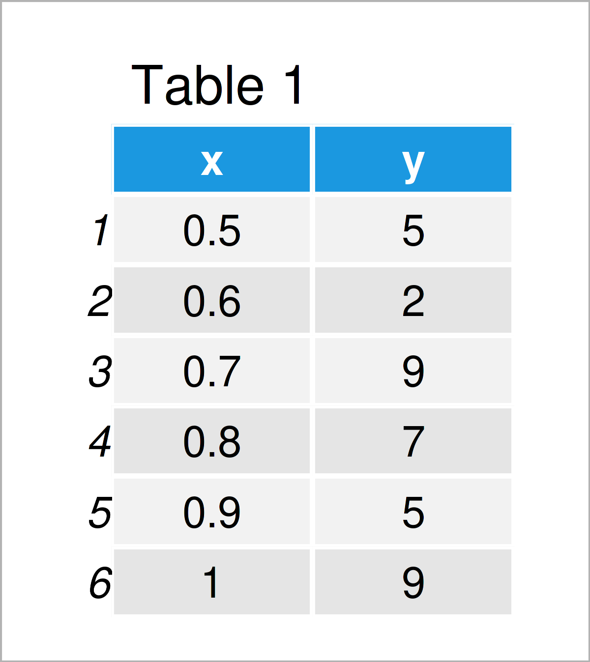
Table 1 shows the structure of our example data: It contains six rows and two numerical variables.
Example 1: Change Number of Axis Label Decimals in Base R Plot
In Example 1, I’ll explain how to adjust the decimal places on axis tick labels of a Base R graphic.
Let’s first draw a Base R plot with default axis settings:
plot(data) # Draw Base R plot with default decimals
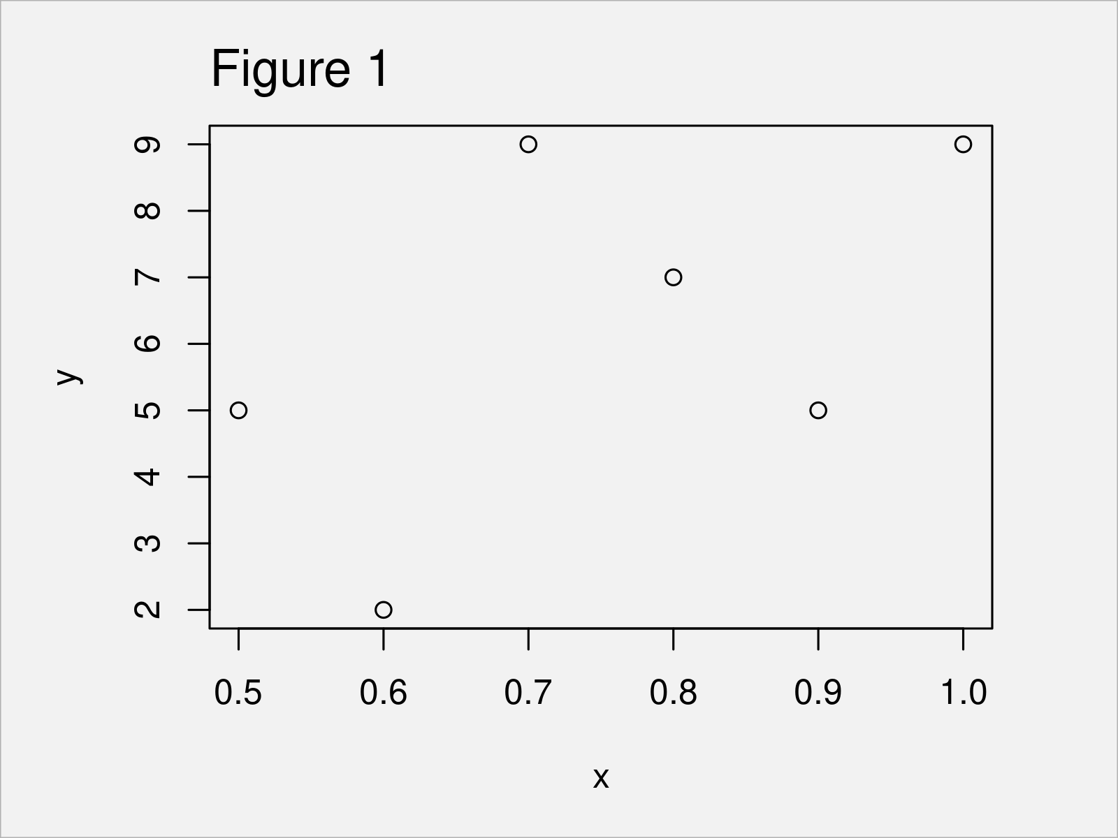
As shown in Figure 1, we have plotted a Base R scatterplot with only one decimal place on the x-axis by running the previous R syntax.
If we want to change the number of decimal places, we first have to specify the axis positions at which the new labels should be added:
my_label_positions <- seq(min(data$x),      # Specify axis positions of labels
                          max(data$x),
                          length = 6)
my_label_positions                          # Print axis positions of labels
# [1] 0.5 0.6 0.7 0.8 0.9 1.0
Next, we can use the sprintf function to create a character vector containing our axis tick labels with a different number of decimal places:
my_labels <- sprintf(my_label_positions,    # Specify axis labels
                     fmt = '%#.3f')
my_labels                                   # Print axis labels
# [1] "0.500" "0.600" "0.700" "0.800" "0.900" "1.000"
Finally, we can use the axis function to manually add our new axis tick labels to our plot:
plot(data,                                  # Draw Base R plot without x-axis
     xaxt = "n")
axis(1,                                     # Manually add axis tick labels
     at = my_label_positions,
     labels = my_labels)
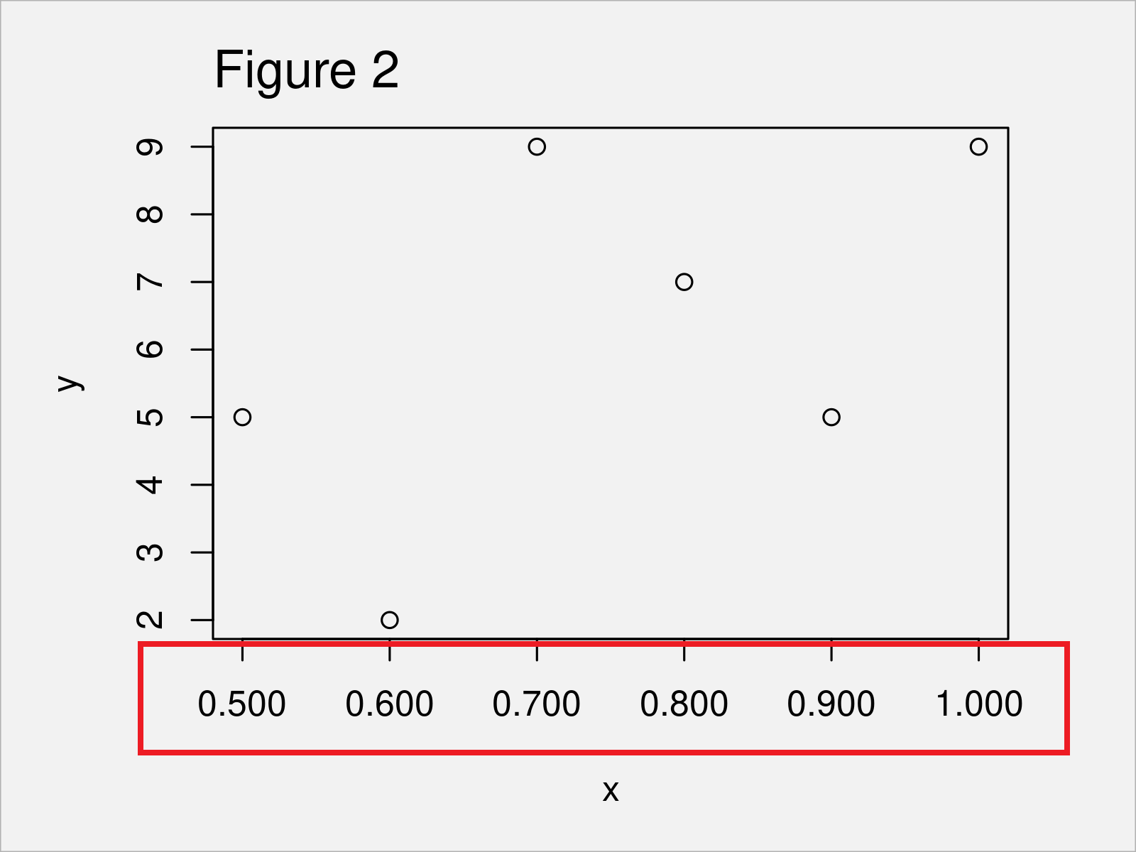
After running the previous R syntax the Base R scatterplot with manually specified decimal places on the x-axis shown in Figure 2 has been created.
Example 2: Change Number of Axis Label Decimals in ggplot2 Plot
In Example 2, I’ll explain how to change the number of decimals in ggplot2 graphs.
First, we need to install and load the ggplot2 package:
install.packages("ggplot2")                 # Install ggplot2 package
library("ggplot2")                          # Load ggplot2 package
In the next step, we can create a default ggplot2 plot as shown below:
ggp <- ggplot(data, aes(x, y)) +            # Create ggplot2 plot with default decimals
  geom_point()
ggp                                         # Draw ggplot2 plot with default decimals
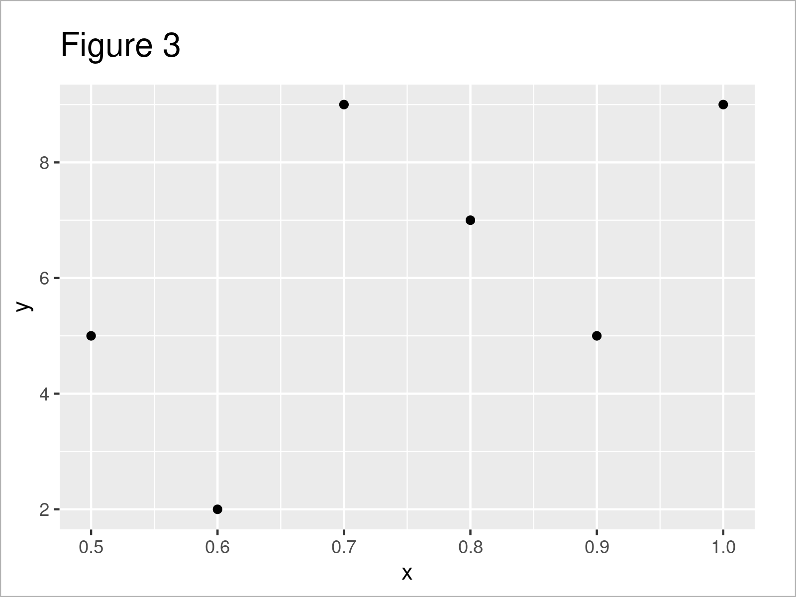
As shown in Figure 3, the previous R code has created a ggplot2 scatterplot with a default number of digits after the decimal point.
In order to modify the decimal places on our axis labels, we need to install and load the scales package.
install.packages("scales")                  # Install scales package
library("scales")                           # Load scales
Now, we can apply the number_format function and the to specify the accuracy argument to specify a certain accuracy of our axis tick labels.
Note that the following R syntax uses the scale_x_continuous function to change the x-axis values. If we would like to adjust the y-axis, we would have to use the scale_y_continuous function instead.
However, let’s draw our graphic:
ggp +                                       # Modify decimal places on ggplot2 plot axis
  scale_x_continuous(labels = number_format(accuracy = 0.001))
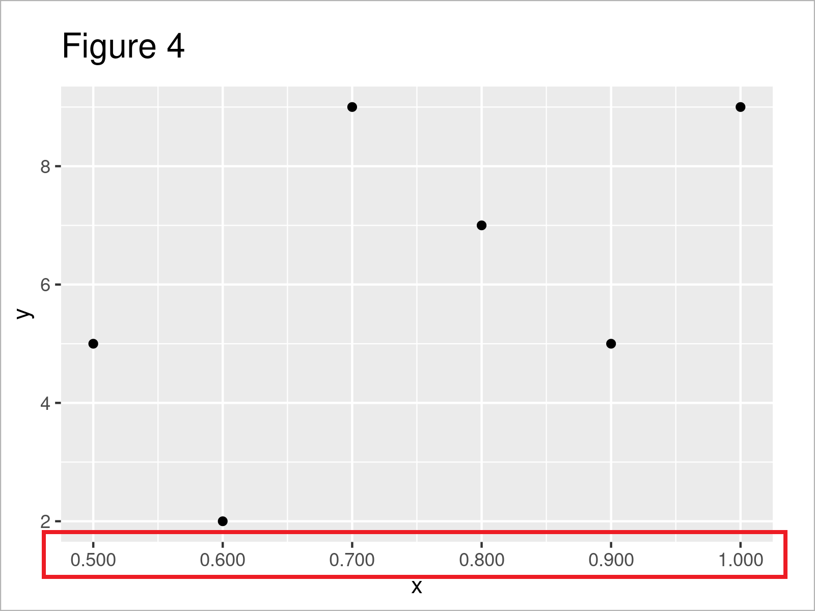
Figure 4 reveals the output of the previous code – A ggplot2 scatterplot with more decimal places on the x-axis.
Video & Further Resources
Have a look at the following video on my YouTube channel. I’m explaining the R programming codes of this article in the video:
In addition, you might read the other tutorials on my homepage. A selection of tutorials is shown below.
- Change Formatting of Numbers of ggplot2 Plot Axis
- Add X & Y Axis Labels to ggplot2 Plot
- Change Labels of ggplot2 Facet Plot
- Wrap Long Axis Labels of ggplot2 Plot into Multiple Lines
- Draw Plot with Actual Values as Axis Ticks & Labels
- Rotate Axis Labels of Base R Plot
- R Graphics Gallery
- All R Programming Examples
You have learned on this page how to change the number of decimal places on the axis tick labels of a plot in the R programming language. If you have additional comments or questions, let me know in the comments section.
Subscribe to the Statistics Globe Newsletter
Get regular updates on the latest tutorials, offers & news at Statistics Globe.
I hate spam & you may opt out anytime: Privacy Policy.
Thank you!
Please check your email inbox and click the confirmation link to complete your subscription. If you don’t see the email within a few minutes, please also check your spam/junk folder.
I’m Joachim Schork. On this website, I provide statistics tutorials as well as code in Python and R programming.
Statistics Globe Newsletter
Get regular updates on the latest tutorials, offers & news at Statistics Globe. I hate spam & you may opt out anytime: Privacy Policy.
Thank you!
Please check your email inbox and click the confirmation link to complete your subscription. If you don’t see the email within a few minutes, please also check your spam/junk folder.


