Wrap Long Axis Labels of ggplot2 Plot into Multiple Lines in R (Example)
In this R tutorial you’ll learn how to automatically wrap long axis labels of a ggplot2 graphic.
Table of contents:
Here’s the step-by-step process:
Example Data, Add-On Packages & Basic Graphic
At first, we need to construct some example data:
data <- data.frame(x = c("short",    # Create example data
                         "that's a bit longer",
                         "very very very very very very very looooong label"),
                   y = 1:3)
data                                 # Print example data
#                                                   x y
# 1                                             short 1
# 2                               that's a bit longer 2
# 3 very very very very very very very looooong label 3
As you can see based on the previous output of the RStudio console, our example data is a data frame constituted of three rows and the two columns “x” and “y”. The variable x is a character and the variable y has the integer class.
We also need to install and load the ggplot2 package to RStudio, to be able to use the functions that are included in the package:
install.packages("ggplot2")          # Install ggplot2 package
library("ggplot2")                   # Load ggplot2 package
Now, we can plot our data as follows:
ggp <- ggplot(data, aes(x, y)) +     # Create ggplot2 barplot
  geom_bar(stat = "identity")
ggp                                  # Print ggplot2 barplot

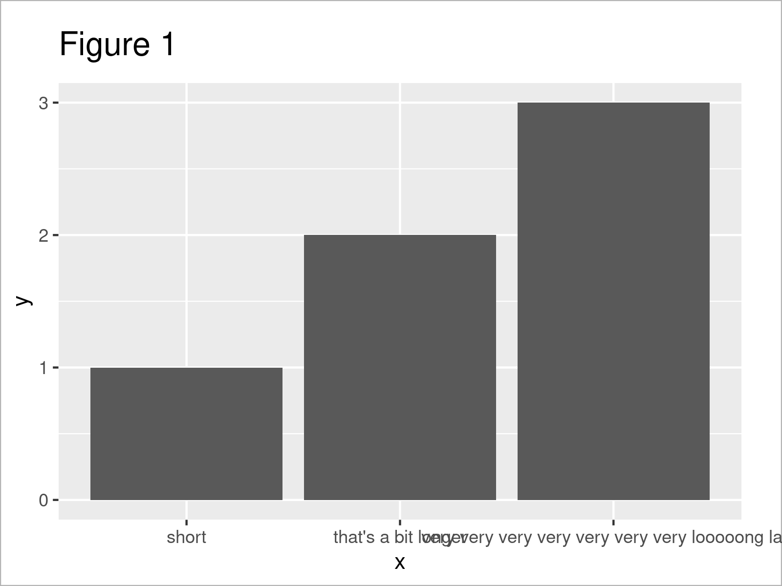
By executing the previous syntax we have created Figure 1, i.e. a ggplot2 barchart with default axis labels. As you can see, the axis labels are very long and are partly overlapping each other.
Example: Set Maximum Width of ggplot2 Plot Labels Using str_wrap Function of stringr() Package
The following R programming code demonstrates how to wrap the axis labels of a ggplot2 plot so that they have a maximum width.
For this, we first have to install and load the stringr package.
install.packages("stringr")          # Install stringr package
library("stringr")                   # Load stringr
Now, we can use the str_wrap function of the stringr package to auto wrap the labels of our data to a certain width.
In the following code, we shorten the labels to a maximum width of 10 characters. Whenever this length is exceeded, the label gets broken into a new line.
Have a look at the following R code:
ggp +                                # Modify labels of ggplot2 barplot
  scale_x_discrete(labels = function(x) str_wrap(x, width = 10))

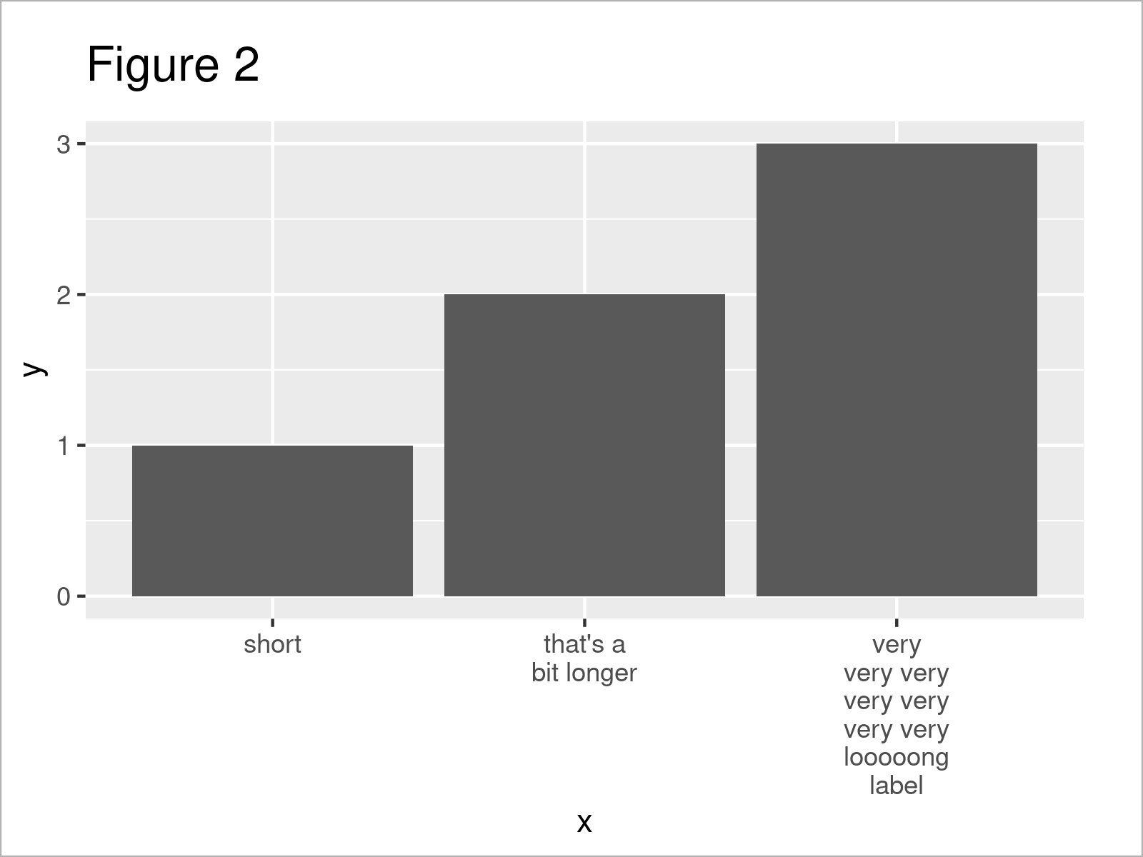
After executing the previously shown R programming syntax the ggplot2 barplot with multi-line labels shown in Figure 2 has been plotted. As you can see, the labels are properly formatted and are not overlapping anymore.
Looks good!
Video, Further Resources & Summary
Some time ago I have released a video on my YouTube channel, which shows the R programming code of this article. Please find the video below:
Furthermore, you may read the related tutorials which I have published on https://www.statisticsglobe.com/.
- Change Formatting of Numbers of ggplot2 Plot Axis
- Rotate Axis Labels of Base R Plot
- Zoom into ggplot2 Plot without Removing Data in R
- Modify Scientific Notation on ggplot2 Plot Axis
- Set Axis Limits of ggplot2 Facet Plot
- Graphics Overview in R
- R Programming Examples
To summarize: You have learned in this article how to automatically wrap too long axis labels of a ggplot2 plot across multiple lines in R programming. If you have further questions and/or comments, let me know in the comments.


4 Comments. Leave new
Hi!
I am working on survey data and the data itself will determine the labels I need on my graph axis. How do I get ggplot to extract those specific labels and then wrap them? I hope my question makes sense! This is my code so far:
ggplot(data=fulldata, aes(y=Health_Months)) +
geom_bar(stat=”count”,fill=”#69b3a2″) +
labs(title=”Household health for the past 12 months”,subtitle=”All households in the pre-test survey”, y=”Frequency”, x = NULL)
Hey Christine,
Could you illustrate how your data is structured in some more detail? What kind of values are contained in the variable Health_Months, and what are the labels that should be shown on your x-axis?
Regards,
Joachim
hello
How if the axis label or y axis label (X, Y) is very very long
How do i wrap it
Helo Jesmin!
In ggplot2 for R, if you have a very long axis title, you can use the element_text() function along with the lineheight parameter to control the spacing between wrapped lines, and label_wrap_gen() to wrap text at a specified width. See the following R code.
Best,
Cansu