Change Labels of ggplot2 Facet Plot in R (Example)
This article illustrates how to modify the facet labels of a ggplot2 facet plot in the R programming language.
Table of contents:
Let’s do this…
Example Data, Add-On Packages & Default Plot
First, we’ll need to create some example data:
data <- data.frame(x = 1:9,                                   # Create example data
                   y = 1:9,
                   group = LETTERS[1:3])
data                                                          # Print example data
#   x y group
# 1 1 1     A
# 2 2 2     B
# 3 3 3     C
# 4 4 4     A
# 5 5 5     B
# 6 6 6     C
# 7 7 7     A
# 8 8 8     B
# 9 9 9     C
Have a look at the previous output of the RStudio console. It shows that the example data has nine rows and three columns. The variables x and y contain numeric values and the variable group consists of a group indicator.
If we want to draw our data with the ggplot2 package, we also have to install and load ggplot2:
install.packages("ggplot2")                                   # Install ggplot2 package
library("ggplot2")                                            # Load ggplot2 package
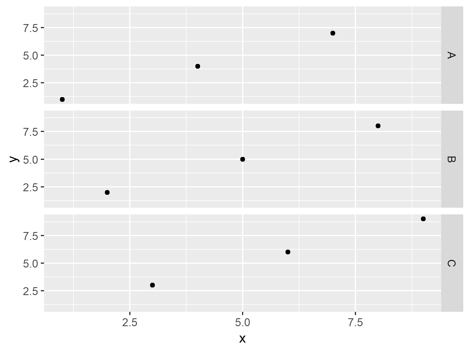
Now, we can plot our data as shown below:
ggplot(data, aes(x, y)) +                                     # Draw ggplot2 facet plot
  geom_point() +
  facet_grid(group ~ .)

The output of the previous syntax is shown in Figure 1: A ggplot2 facet plot in R.
Example: Renaming Labels of ggplot2 Facet Plot Using levels() Function
The following code illustrates how to replace facet labels of a ggplot2 graph by changing the factor levels of our grouping column.
Let’s do this:
data_new <- data                                              # Replicate data
levels(data_new$group) <- c("Label 1", "Label 2", "Label 3")  # Change levels of group
We have created a new data frame called data_new that contains different factor levels.
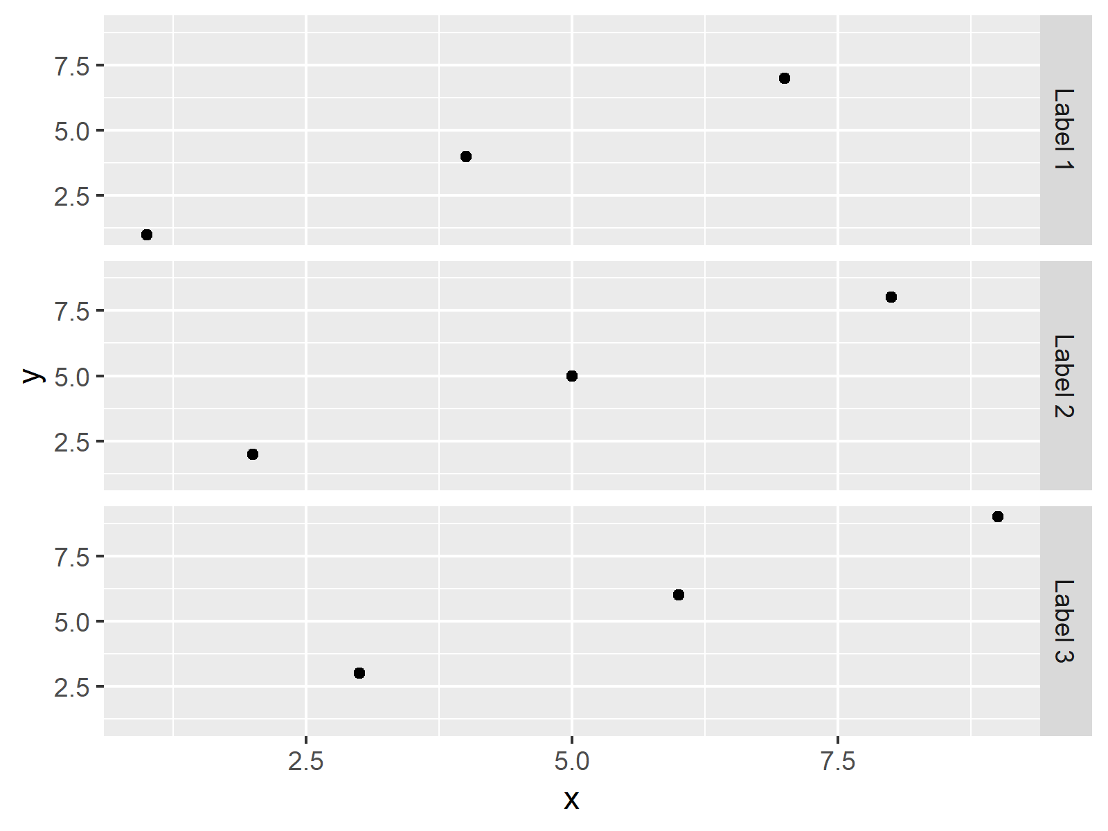
Now, we can apply basically the same ggplot2 code as before to our new data frame. Within the facet_grid function we specify the new levels of our group:
ggplot(data_new, aes(x, y)) +                                 # ggplot2 facet plot with new labels
  geom_point() +
  facet_grid(levels(group) ~ .)

Figure 2 shows the output of the previous R code – A facet plot with different labels.
Note that there are alternative solutions for changing facet plot labels available. Some people criticize that the code shown in this example is not the best way to adjust facet plot labels, since we have to change our input data. Have a look at this thread on Stack Overflow, in case you are interested in other ways on how to replace facet plot labels.
Video, Further Resources & Summary
I have recently released a video on my YouTube channel, which shows the R programming syntax of this article. Please find the video below.
In addition, you might have a look at the related articles of this website:
- Reorder Facets in ggplot2 Plot
- Change Font Size of ggplot2 Facet Grid Labels
- Remove Axis Labels & Ticks of ggplot2 Plot (R Example)
- Plots in R
- R Programming Examples
Summary: In this R tutorial you learned how to change labels of facet plots. If you have additional questions, please tell me about it in the comments section below.


