Change Formatting of Numbers of ggplot2 Plot Axis in R (Example)
In this tutorial you’ll learn how to modify the formatting of axis values in a ggplot2 graph in R programming.
The tutorial is structured as follows:
- Creation of Exemplifying Data
- Example 1: Disable Scientific Notation of ggplot2 Axis
- Example 2: Exchange Decimal Point / Comma of ggplot2 Axis
- Video & Further Resources
Here’s the step-by-step process.
Creation of Exemplifying Data
In this R tutorial, I’ll show two examples for the formatting of axis numbers in a ggplot2 plot. Both of these examples will be based on the following example data:
set.seed(1489)                             # Set seed
data <- data.frame(x = runif(1000,         # Create example data
                             100000000,
                             200000000),
                   y = rnorm(1000))
Our example data is a data.frame consisting of 1000 rows and two columns x and y. Both variables contain random numeric values.
For this tutorial, we’ll also have to install and load the ggplot2 and scales packages. The ggplot2 package is needed in order to plot our data and the scales package is needed to change the numbers of our plot axes.
install.packages("ggplot2")                # Install and load packages
library("ggplot2")

install.packages("scales")
library("scales")
Now, we can draw a scatterplot with the ggplot2 package as follows:
ggp <- ggplot(data, aes(x, y)) +           # Create basic ggplot2 plot
  geom_point()
ggp

Figure 1: Default ggplot2 Scatterplot.
Figure 1 shows the output of the previous R code: A graphic with x-axis values formatted in scientific notation. In the following, you’ll learn how to modify these axis numbers…
Example 1: Disable Scientific Notation of ggplot2 Axis
Example 1 shows how to disable scientific notation in a ggplot2 plot in R. Have a look at the following R syntax and the resulting graph:
ggp +                                      # Modify formatting of axis
  scale_x_continuous(labels = comma)

Figure 2: Disable Scientific Notation of ggplot2 Plot Axis.
As you can see in Figure 2, we removed the scientific notation of the x-axis. The numbers are fully shown and after every third digit you can see a comma. We did that by applying the scale_x_continuous function in combination with the comma function of the scales package.
Example 2: Exchange Decimal Point / Comma of ggplot2 Axis
Let’s assume that we want to change the decimal rule from point to comma (this is typically done in Europe). Then we can use the comma_format function of the scales package as shown below:
ggp +                                      # Change decimal comma / point
  scale_x_continuous(labels = comma_format(big.mark = ".",
                                           decimal.mark = ","))

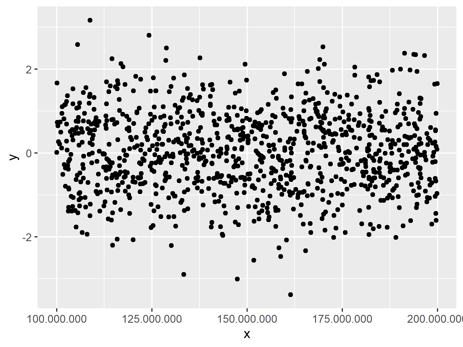
Figure 3: Replace Comma with Point in ggplot2 Plot Axis.
Figure 3 shows our updated graph with commas instead of points.
Video & Further Resources
Do you want to know more about plotting data in R? Then you might want to have a look at the following video of my YouTube channel. In the video, I illustrate the examples of this tutorial in RStudio.
In addition, you may have a look at the other tutorials on https://www.statisticsglobe.com/. Some tutorials about graphics in R can be found here.
- Adjust Space Between ggplot2 Axis Labels and Plot Area in R
- Rotate ggplot2 Axis Labels
- Add X & Y Axis Labels to ggplot2 Plot
- Remove Axis Labels & Ticks of ggplot2 Plot
- Set Axis Limits in ggplot2 R Plot
- Disable Scientific Notation in R
- R Graphics Gallery
- The R Programming Language
You learned in this article how to customize axis tick marks in a ggplot2 image in R. If you have additional questions, let me know in the comments.
Subscribe to the Statistics Globe Newsletter
Get regular updates on the latest tutorials, offers & news at Statistics Globe.
I hate spam & you may opt out anytime: Privacy Policy.
Thank you!
Welcome to the Statistics Globe newsletter. From now on, I’ll send you regular emails about statistics, data science, AI, and programming with R and Python.
I’m Joachim Schork. On this website, I provide statistics tutorials as well as code in Python and R programming.
Statistics Globe Newsletter
Get regular updates on the latest tutorials, offers & news at Statistics Globe. I hate spam & you may opt out anytime: Privacy Policy.
Thank you!
Please check your email inbox and click the confirmation link to complete your subscription. If you don’t see the email within a few minutes, please also check your spam/junk folder.


