Plot Predicted vs. Actual Values in R (2 Examples)
In this post you’ll learn how to draw a plot of predicted vs. observed values in the R programming language.
The article consists of these contents:
So without further ado, let’s dive into it.
Creation of Example Data
Consider the following example data.
set.seed(469827)                                     # Create example data
x <- rnorm(1000)
y <- rnorm(1000) + x
data <- data.frame(x, y)
head(data)                                           # Print head of example data

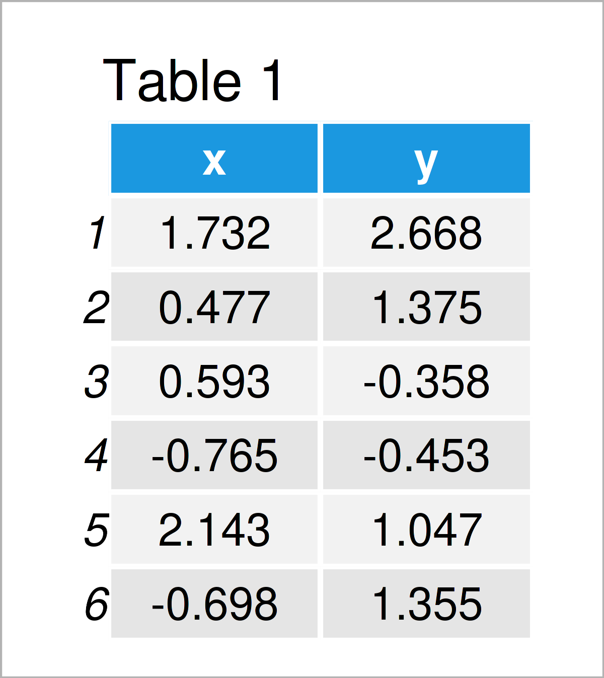
Have a look at the table that got returned after executing the previous R code. It shows the top six rows of our exemplifying data, and that our data has the two numerical columns “x” and “y”.
We can now estimate a linear regression model using the lm function as shown below:
my_mod <- lm(y ~ x, data) # Estimate linear regression model
The previous R code has created a model object called my_mod. We will use this model to create predicted vs. actual values plots in the following examples.
So keep on reading!
Example 1: Draw Predicted vs. Observed Using Base R
This example demonstrates how to plot fitted vs. actual values using the basic installation of the R programming language.
For this, we can use the plot(), predict(), and abline() functions as shown below:
plot(predict(my_mod),                                # Draw plot using Base R
     data$y,
     xlab = "Predicted Values",
     ylab = "Observed Values")
abline(a = 0,                                        # Add straight line
       b = 1,
       col = "red",
       lwd = 2)

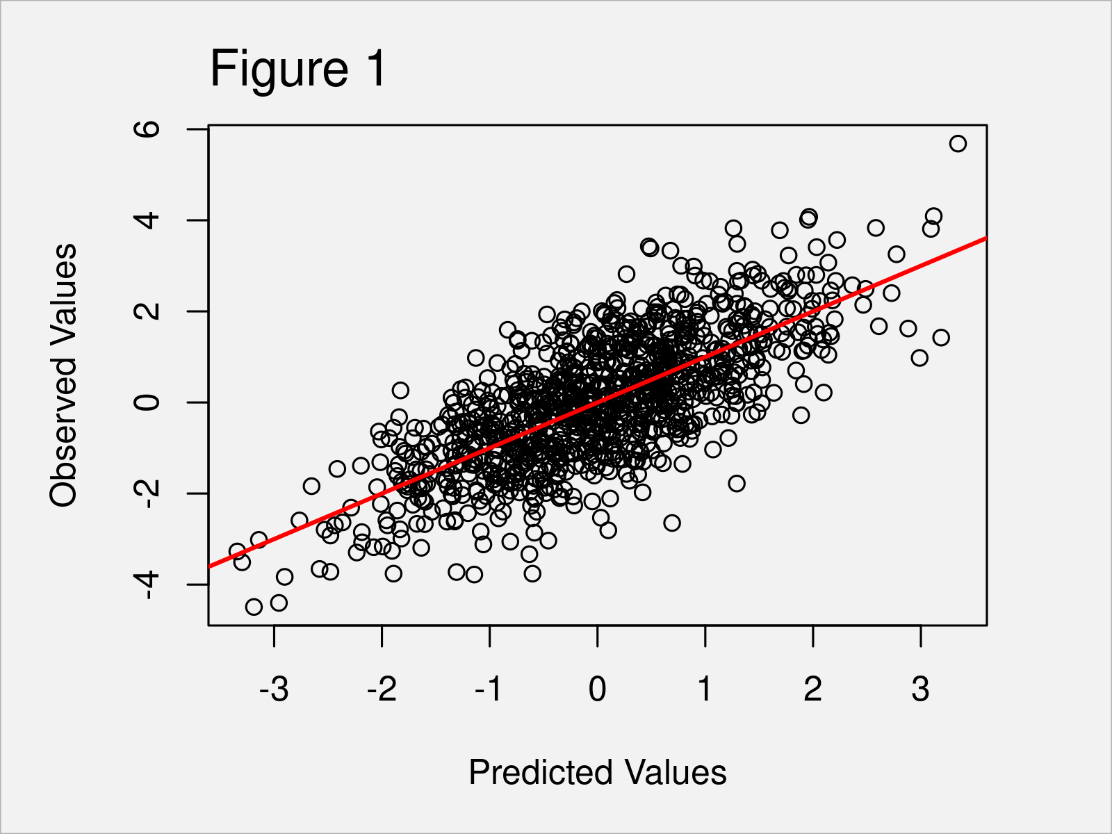
As shown in Figure 1, we have created a Base R scatterplot that shows predicted vs. actual values. The red line illustrates the slope of our values.
Example 2: Draw Predicted vs. Observed Using ggplot2 Package
In this example, I’ll demonstrate how to use the ggplot2 package to draw an xy-plot of predicted vs. actual values.
First, we have to install and load the ggplot2 package:
install.packages("ggplot2")                          # Install & load ggplot2 package
library("ggplot2")
In the next step, we have to store our predicted and observed values in a new data frame:
data_mod <- data.frame(Predicted = predict(my_mod),  # Create data for ggplot2
                       Observed = data$y)
Now, we can use this data frame as basis for the creation of our predicted vs. actual values graph:
ggplot(data_mod,                                     # Draw plot using ggplot2 package
       aes(x = Predicted,
           y = Observed)) +
  geom_point() +
  geom_abline(intercept = 0,
              slope = 1,
              color = "red",
              size = 2)

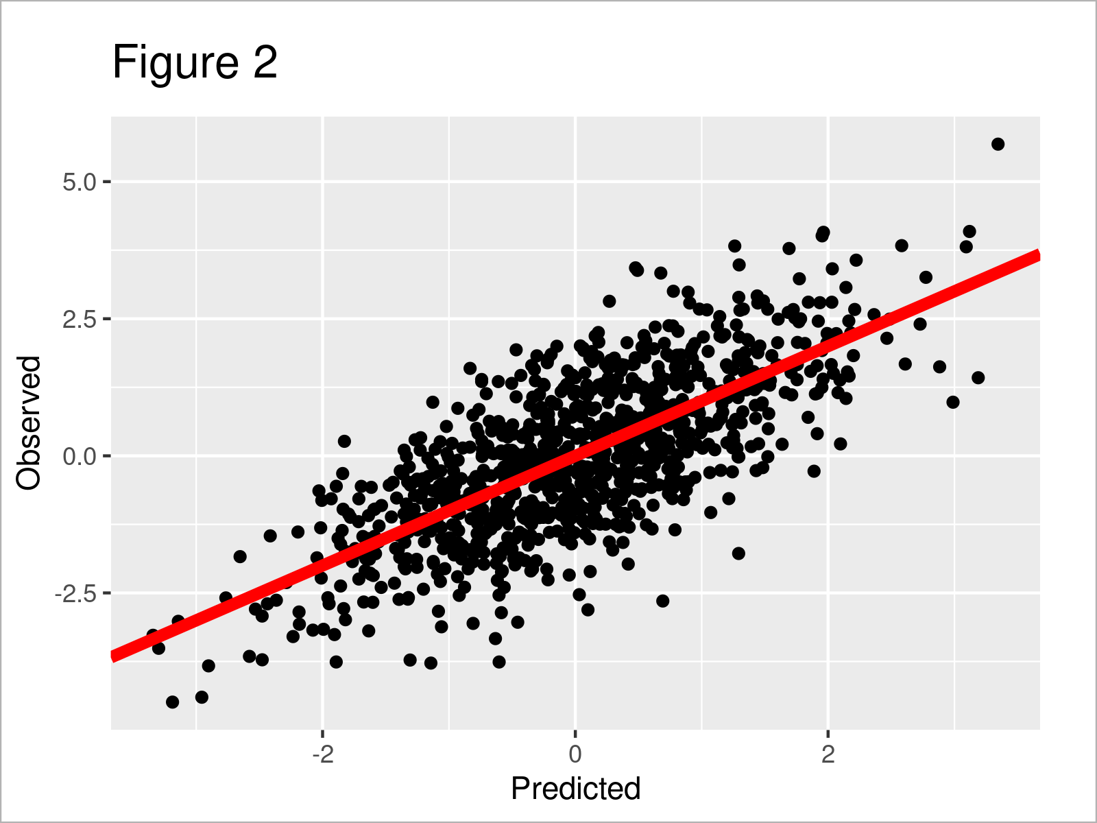
As shown in Figure 2, we have created another fitted vs. actual values graphic. However, this time we have used the ggplot2 package to draw our data.
Video, Further Resources & Summary
In case you need further info on the topics of this tutorial, you could have a look at the following video on my YouTube channel. I’m demonstrating the content of this article in the video:
Furthermore, you could have a look at the other tutorials on my homepage. Some tutorials are listed below.
Summary: In this tutorial you have learned how to create a scatterplot of predicted vs. observed values in R programming. Tell me about it in the comments section below, in case you have any additional questions.


2 Comments. Leave new
GREAT VIDEO. THANK YOU FOR SHARING. One Question: What actually are predicted values and how does this information help in understanding and reporting results of a test?
Hey Shaphan,
Thanks a lot for the kind words, glad you like it! 🙂
Please have a look here for more details on predicted values.
Regards,
Joachim