Draw Plot with Actual Values as Axis Ticks & Labels in R (2 Examples)
In this article, I’ll show how to use the real values of a plot as axis ticks in the R programming language.
Table of contents:
It’s time to dive into the examples…
Creating Example Data
We use the following data as basement for this R programming tutorial:
x <- 1:10                          # Example data
y <- 1:10
Our example data are two simple numeric vectors ranging from 1 to 10.
As next step, we can draw our data:
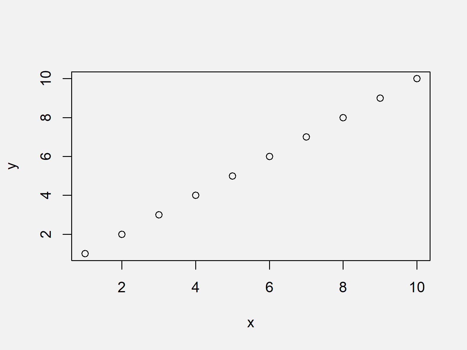
plot(x, y) # Plot with default specifications

Figure 1 shows the output of the previous syntax: A scatterplot with default axes.
Example 1: Drawing Plot with User-Defined Axis Using axis Function & at Argument
Example 1 illustrates how to modify axis values using the axis function in R.
For this, we first need to specify the xaxt argument of the plot function to be equal to “n”.
Then, we have to specify within the axis function at which position we want to draw our axis (1 stands for the x-axis) and at which values the axis ticks and labels should be shown (i.e. at = x).
plot(x, y, xaxt = "n")             # Draw plot without axis
axis(1, at = x)                    # Applying axis function

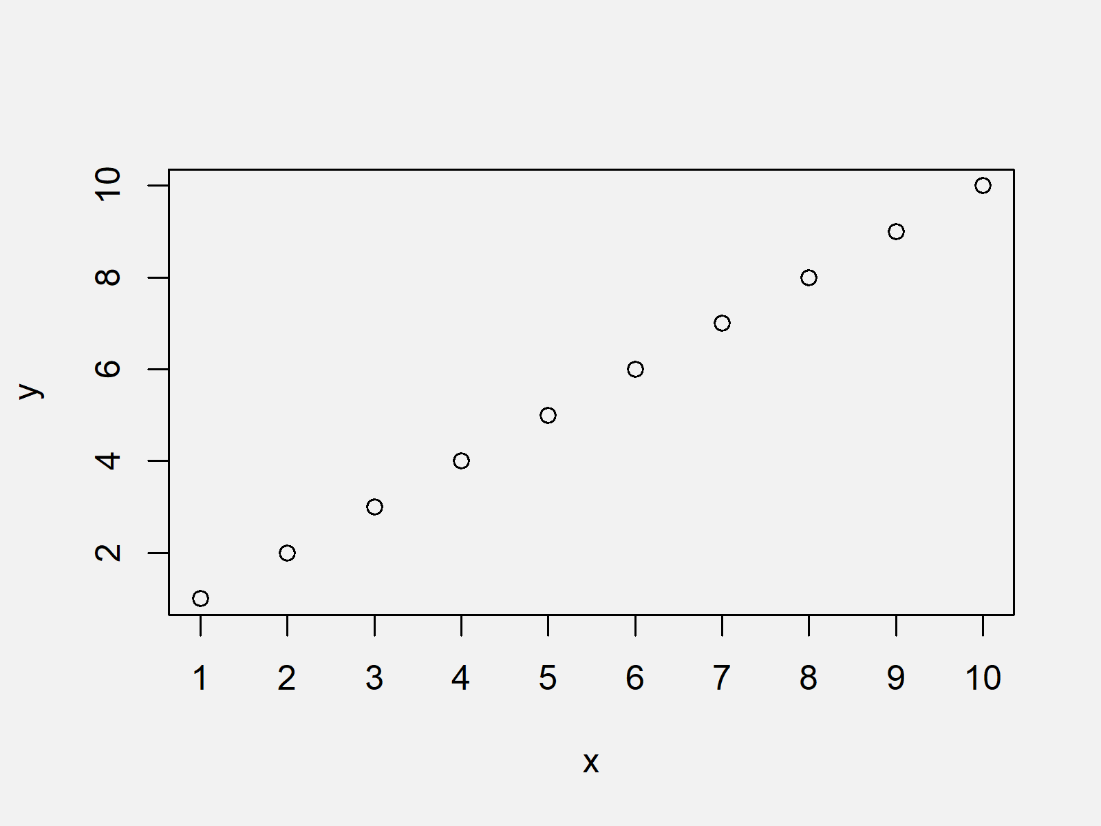
The output of the previous R programming code is shown in Figure 2 – It shows a graph with manually specified x-axis ticks and labels that are equal to the actual numbers in our data.
Example 2: Drawing Plot with User-Defined Axis Using axis Function & xaxp Argument
This Example shows an alternative to the R code of Example 1 that leads to the same output. In this example, we are using the xaxp argument of the axis function instead of the at argument:
plot(x, y, xaxt = "n")             # Draw plot without axis
axis(1, xaxp = c(1, 10, 9))        # Applying axis function

Figure 3 shows the output of the previously shown R programming syntax – The same graphic as in Example 1.
Video & Further Resources
Have a look at the following video which I have published on my YouTube channel. In the video, I show the topics of this article:
In addition, you might want to read the other articles of this website. I have released numerous other articles on topics such as ggplot2, graphics in r, and labels.
- Remove Axis Values of Plot in Base R
- Remove Axis Labels & Ticks of ggplot2 Plot (R Example)
- Graphics Gallery in R
- R Programming Tutorials
Summary: On this page you learned how to specify axis ticks based on the actual data points shown in the plot in R. In case you have further questions, let me know in the comments section.
Subscribe to the Statistics Globe Newsletter
Get regular updates on the latest tutorials, offers & news at Statistics Globe.
I hate spam & you may opt out anytime: Privacy Policy.
Thank you!
Welcome to the Statistics Globe newsletter. From now on, I’ll send you regular emails about statistics, data science, AI, and programming with R and Python.
I’m Joachim Schork. On this website, I provide statistics tutorials as well as code in Python and R programming.
Statistics Globe Newsletter
Get regular updates on the latest tutorials, offers & news at Statistics Globe. I hate spam & you may opt out anytime: Privacy Policy.
Thank you!
Please check your email inbox and click the confirmation link to complete your subscription. If you don’t see the email within a few minutes, please also check your spam/junk folder.


