Draw PCA Scatterplot & Biplot Using sklearn & Matplotlib in Python
On this page, you’ll learn how to create scatterplots and biplots of a Principal Component Analysis (PCA) in the Python programming language.
The table of content is structured as shown below:
Let’s start!
Example Data and Add-On Libraries
To explain how to draw a scatterplot and a biplot of a PCA in Python, we need to use some libraries which will help us with data loading, model building, and data visualization. Please load them before we start.
import pandas as pd
import matplotlib.pyplot as plt
from sklearn.preprocessing import StandardScaler
from sklearn import decomposition
from sklearn.decomposition import PCA
from sklearn.datasets import load_wine
For this tutorial, we will use the wine dataset of the scikit-learn library. This dataset is composed of 178 rows and 13 columns, and a classification target array referring to the type of wine by the values of 0, 1 and 2. To import it, please follow the next step.
wine = load_wine()
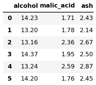
After loading the wine data, we will convert it into a pandas DataFrame, in which the columns are named by the feature names of the wine dataset, using the pd.DataFrame() function. Then, we will display the first six rows of the first three columns calling the head() and the iloc[] methods.
df = pd.DataFrame(wine.data,
                  columns=wine.feature_names)
df.iloc[:, 0:3].head(6)

It is also useful to define our target variable separately to color the plots in the examples. We named it target as follows.
target = pd.Series(wine.target,
                       name = "Class")
All are set regarding loading and storing the data. So now, we can skip to the PCA!
Scale Data and Perform PCA
Before performing the PCA, the data should be scaled as follows.
scaler = StandardScaler()

scaler.fit(df)

wine_scaled = scaler.transform(df)
Next, we should define the number of components that we want to create in the PCA, see the pca object below. Then we wil perform the PCA via fit_transform() method, which forms the principal components as many as the defined number.
pca = PCA(n_components=2)
PC = pca.fit_transform(wine_scaled)
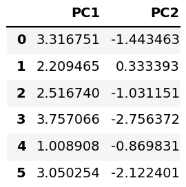
The analysis was performed. Now, let’s see our principal components’ values on a DataFrame!
pca_wine = pd.DataFrame(data = PC,
               columns = ['PC1', 'PC2'])

pca_wine.head(6)

Next, we’ll visualize the data above using the Matplotlib library, which is widely used for data visualizations in Python.
Example 1: Visualize PCA as Scatterplot
In this example, we will plot the previously shown component scores using the scatter() function of Matplotlib.
fig, ax = plt.subplots(figsize=(14, 9))
ax.scatter(x=pca_wine['PC1'],
           y=pca_wine['PC2'],
           c=target,
           s=50,
           cmap='cool')

ax.set_xlabel('PC1',
              fontsize = 20)
ax.set_ylabel('PC2',
              fontsize = 20)
ax.set_title('Figure 1',
             fontsize=20)

plt.figure()
Note that we have parsed pca_wine['PC1'] and pca_wine['PC2'] to the scatter() function as x- and y-axis variables. Also, we have colored the data by the target variable specifying the c argument. Besides, a color map 'cool' was defined, and the size of scatter points was set to 50 using the s argument.
Alternatively, we can add the loading vectors on our scatterplot to create a biplot. Let’s see how to do it in the following example!
Example 2: Visualize PCA as Biplot
In this example, we will add labeled loading vectors on our scatterplot using the arrow() and text() functions of Matplotlib.
Before creating the plot, we will define the principal component values and their scaling factors separately. Scaling is an important step in the context of biplots due to the fact that the loadings and component scores have different scales.
xs = PC[:,0]
ys = PC[:,1]
scalex = 1.0/(xs.max() - xs.min())
scaley = 1.0/(ys.max() - ys.min())
Now we can use the created variables to plot our biplot as follows.
fig, ax = plt.subplots(figsize=(14, 9))

for i, feature in enumerate(wine.feature_names):
    ax.arrow(0, 0, pca.components_[0, i],
             pca.components_[1, i],
             head_width=0.03,
             head_length=0.03)
    ax.text(pca.components_[0, i] * 1.15,
            pca.components_[1, i] * 1.15,
            feature, fontsize = 18)

scatter = ax.scatter(xs * scalex,ys * scaley,
                     c=target,
                     s=50,
                     cmap='cool')

ax.set_xlabel('PC1', fontsize=20)
ax.set_ylabel('PC2', fontsize=20)
ax.set_title('Figure 2', fontsize=20)

legend1 = ax.legend(*scatter.legend_elements(),
                    loc="lower left", title="Wine Target")
ax.add_artist(legend1)
plt.figure()
Note that we have iterated through the feature names to plot the loading vectors starting from the origin (0,0) via the arrow() function. Please be aware that pca.components_ keeps the loading values of the pca object.
We have also customized the arrow size by the head_width and head_length arguments. Furthermore, the feature names were labeled for each vector using the text() function in the same for loop. Finally, a legend called legend1 was defined to show color-target matches. See the image below for the final output.
If you want to see other examples of drawing scatterplots and biplots of PCA, you can check our tutorials: Scatterplot of PCA in Python and Draw Biplot of PCA in Python. See you in the next tutorial!
Video, Further Resources & Summary
Do you need more explanations on how to apply a Principal Component Analysis (PCA) in Python? Then you should have a look at the following YouTube video of the Statistics Globe YouTube channel.
If you want to learn more, you could take a look at some other tutorials available on Statistics Globe:
- What is PCA?
- PCA Using Correlation & Covariance Matrix
- Choose Optimal Number of Components for PCA
- Principal Component Analysis in Python
- Biplot for PCA Explained
- Scatterplot of PCA in Python
- Draw Biplot of PCA in Python
In this post, you had the opportunity to learn how to create an autoplot in Python. In case you have further questions, you may leave a comment.
Subscribe to the Statistics Globe Newsletter
Get regular updates on the latest tutorials, offers & news at Statistics Globe.
I hate spam & you may opt out anytime: Privacy Policy.
Thank you!
Welcome to the Statistics Globe newsletter. From now on, I’ll send you regular emails about statistics, data science, AI, and programming with R and Python.
I’m Joachim Schork. On this website, I provide statistics tutorials as well as code in Python and R programming.
Statistics Globe Newsletter
Get regular updates on the latest tutorials, offers & news at Statistics Globe. I hate spam & you may opt out anytime: Privacy Policy.
Thank you!
Please check your email inbox and click the confirmation link to complete your subscription. If you don’t see the email within a few minutes, please also check your spam/junk folder.


