How to Use the ggplotly Function in R (2 Examples)
Hello again! Welcome to another interesting tutorial from Statistics Globe. In this one, you’ll learn how to use the ggplotly function of the plotly package to convert a static ggplot2 graph into an interactive one in the R programming language.
First, though, here is an overview of this tutorial:
Let’s get into it!
Install and Load plotly & ggplot2
In order to demonstrate the power of the ggplotly function, we will need to install both plotly and the popular ggplot2 library, which is the foremost graphics library in R programming.
So, in either your R Studio IDE or in any other preferred code editor that can run R, run the line of code below to install both plotly and ggplot2:
install.packages(c("plotly", "ggplot2"))
Having installed both packages, we will need to load them into our R programming environment. Therefore, run the lines of code below to do so:
library(plotly)
library(ggplot2)
Static ggplot2 Graph to Interactive plotly Graph (Line Plot Example)
In this example, we will build a data frame of sales values over time. Run the code below to do so:
df <- data.frame(
  Sales = c(3500,2510,4750,5820,7200,6350,9753,8200),
  Year = c(2014,2015,2016,2017,2018,2019,2020,2021)
)
print it out, if you like:
print(df)
#  Sales Year
#1  3500 2014
#2  2510 2015
#3  4750 2016
#4  5820 2017
#5  7200 2018
#6  6350 2019
#7  9753 2020
#8  8200 2021
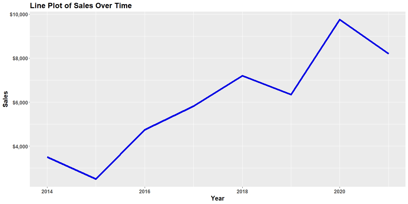
Next, we are going to build a static line plot using ggplot2. Run the code below:
ggline <-  ggplot(df) + aes(x = Year, y = Sales) +
           geom_line(linewidth = 2, color = "blue") +
           labs(title = "Line Plot of Sales Over Time") +
           theme(plot.title = element_text(face = "bold", size = 18),
                  axis.title = element_text(face = "bold", size = 15),
                  axis.text = element_text(face = "bold", size = 12),
                  legend.title = element_text(face = "bold")) +
           scale_y_continuous(labels = scales::label_dollar())

ggline

Let’s now convert the static line plot into an interactive plotly graph using the ggplotly function:
ggplotly(ggline)
Now, you can hover over the plot to see the plotted data.
Static ggplot2 Graph to Interactive plotly Graph (Bar Plot Example)
In this example, we will build a data frame of cars and their prices. Run the code below to do so:
df <- data.frame(
  Cars = c("Mazda", "Toyota", "Bentley", "Mercedes", "Ford", "GMC"),
  Price = c(6500,8570,10500,5500,7700,9200)
)
Print it out, if you like:
print(df)
#      Cars Price
#1    Mazda  6500
#2   Toyota  8570
#3  Bentley 10500
#4 Mercedes  5500
#5     Ford  7700
#6      GMC  9200
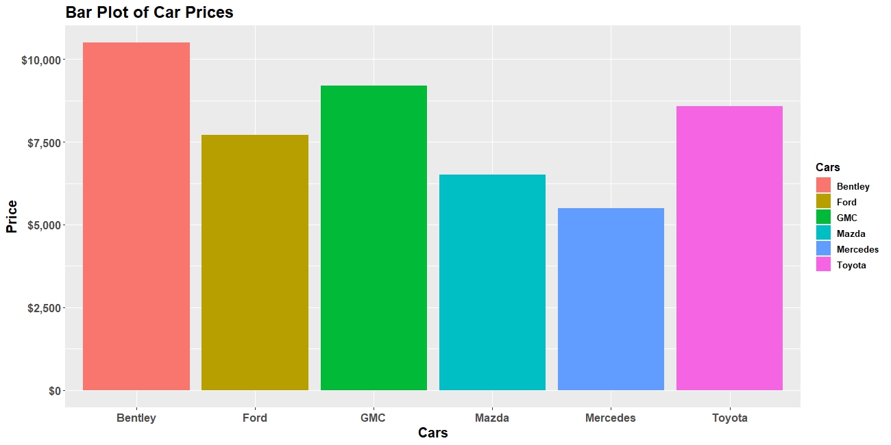
Next, we are going to build a static bar plot using ggplot2. Run the code below:
ggbar <- ggplot(df) + aes(x = Cars, y = Price, fill = Cars) +
         geom_bar(stat = "identity") +
         labs(title = "Bar Plot of Car Prices") +
         theme(plot.title = element_text(face = "bold", size = 18),
               axis.title = element_text(face = "bold", size = 15),
               axis.text = element_text(face = "bold", size = 12),
               legend.title = element_text(face = "bold", size = 12),
               legend.text = element_text(face = "bold", size = 10))+
         scale_y_continuous(labels = scales::label_dollar())

ggbar

Let’s now convert the static bar plot into an interactive plotly graph using the ggplotly function:
ggplotly(ggbar, tooltip = c("x", "y"))
Now, you can hover over the plot to see the plotted data. You can also toggle each legend key off and on.
Also, in the ggplotly() function, we specified that we wanted only the X and Y variables in the plot’s tooltips because by default, ggplotly would include the X variable twice in the tooltip due to coloring by the X variable.
That is how to use the ggplotly function of the plotly package to convert a static ggplot2 graph into an interactive plotly graph.
Video, Further Resources & Summary
Do you need more explanations on how to use the ggplotly function in R? Then you should have a look at the following YouTube video of the Statistics Globe YouTube channel.
In the video, we explain in some more detail how to use the ggplotly function in R.
The YouTube video will be added soon.
If you enjoyed reading this tutorial, then make sure to check out other interesting plotly in R programming tutorials on Statistics Globe, such as these:
- Visualize Data Frame in plotly Graph in R (Example)
- Layout & Style of plotly Graph in R (Example)
- Transparent plotly Graph Background Color in R (Example)
- Change plotly Axis Labels in R (Example)
- Learn R Programming
This post has shown how to use the ggplotly function in R. In case you have further questions, you may leave a comment below.
This page was created in collaboration with Ifeanyi Idiaye. You might check out Ifeanyi’s personal author page to read more about his academic background and the other articles he has written for the Statistics Globe website.


