Zoom into ggplot2 Plot without Removing Data in R (Example)
In this R tutorial you’ll learn how to set axis limits of a ggplot2 plot without removing data points.
The post looks as follows:
Here’s the step-by-step process…
Example Data, Add-On Packages & Basic Plot
As a first step, let’s define some example data:
data <- data.frame(x = 1:4,                        # Create example data
                   y = 1:8,
                   group = rep(letters[1:4], 2))
data                                               # Print example data
#   x y group
# 1 1 1     a
# 2 2 2     b
# 3 3 3     c
# 4 4 4     d
# 5 1 5     a
# 6 2 6     b
# 7 3 7     c
# 8 4 8     d
The previous output of the RStudio console shows that our example data has three columns. The variables x and y are numeric and the variable group defines the groups of our data points.
If we want to create a graphic of the data with the ggplot2 package, we also have to install and load ggplot2:
install.packages("ggplot2")                        # Install ggplot2 package
library("ggplot2")                                 # Load ggplot2 package
Now, we can plot our data as shown below:
ggp <- ggplot(data, aes(x, y, group = group)) +    # Create ggplot2 plot without zoom
  geom_line()
ggp                                                # Draw plot

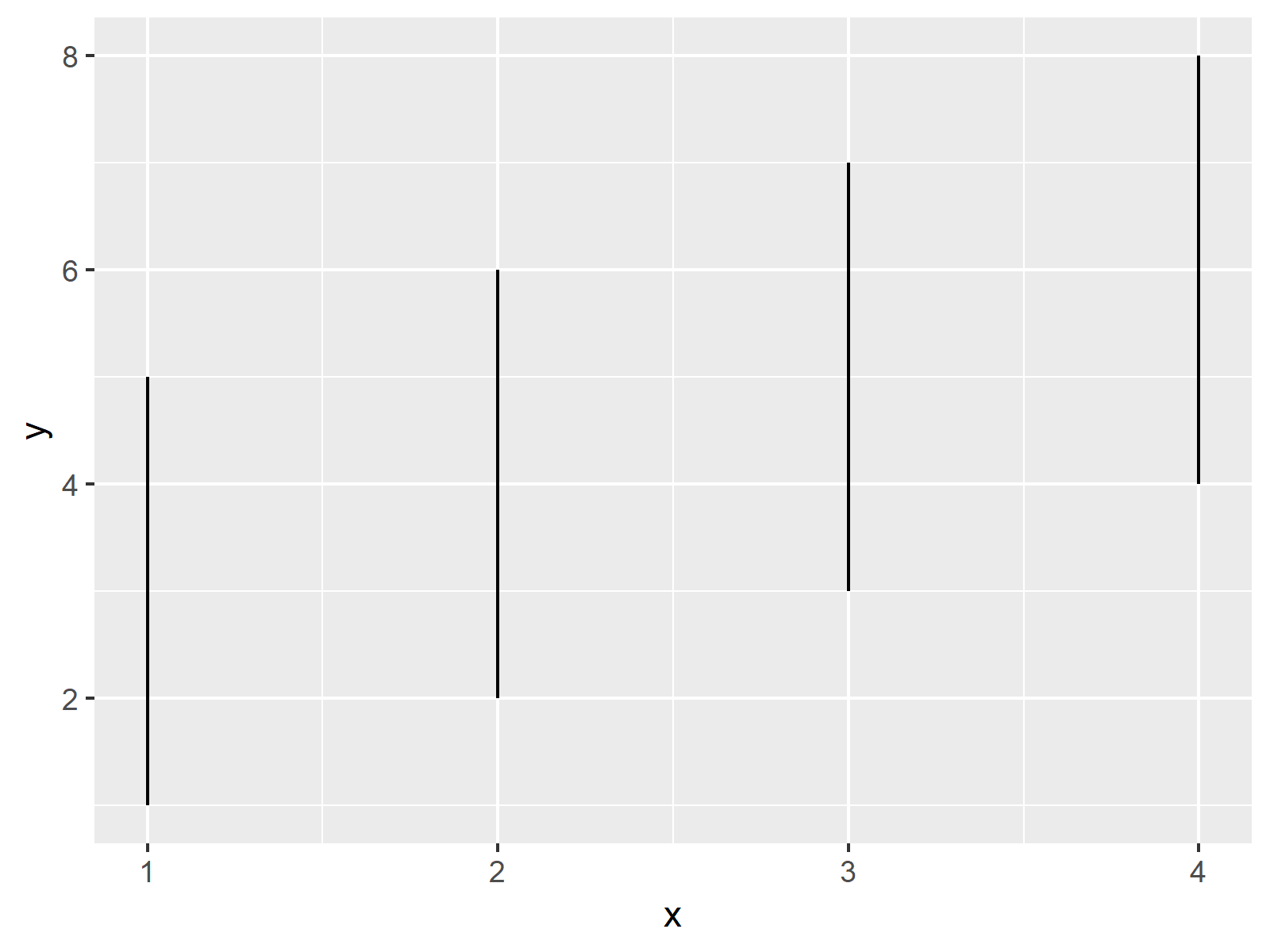
The output of the previous R programming syntax is shown in Figure 1 – A basic ggplot2 line plot without any zoom.
Let’s try to zoom in with the next part of the code:
ggp +                                              # Zoom in & cut off values
  ylim(3, 10)
# Warning:
# Removed 2 rows containing missing values (geom_path).

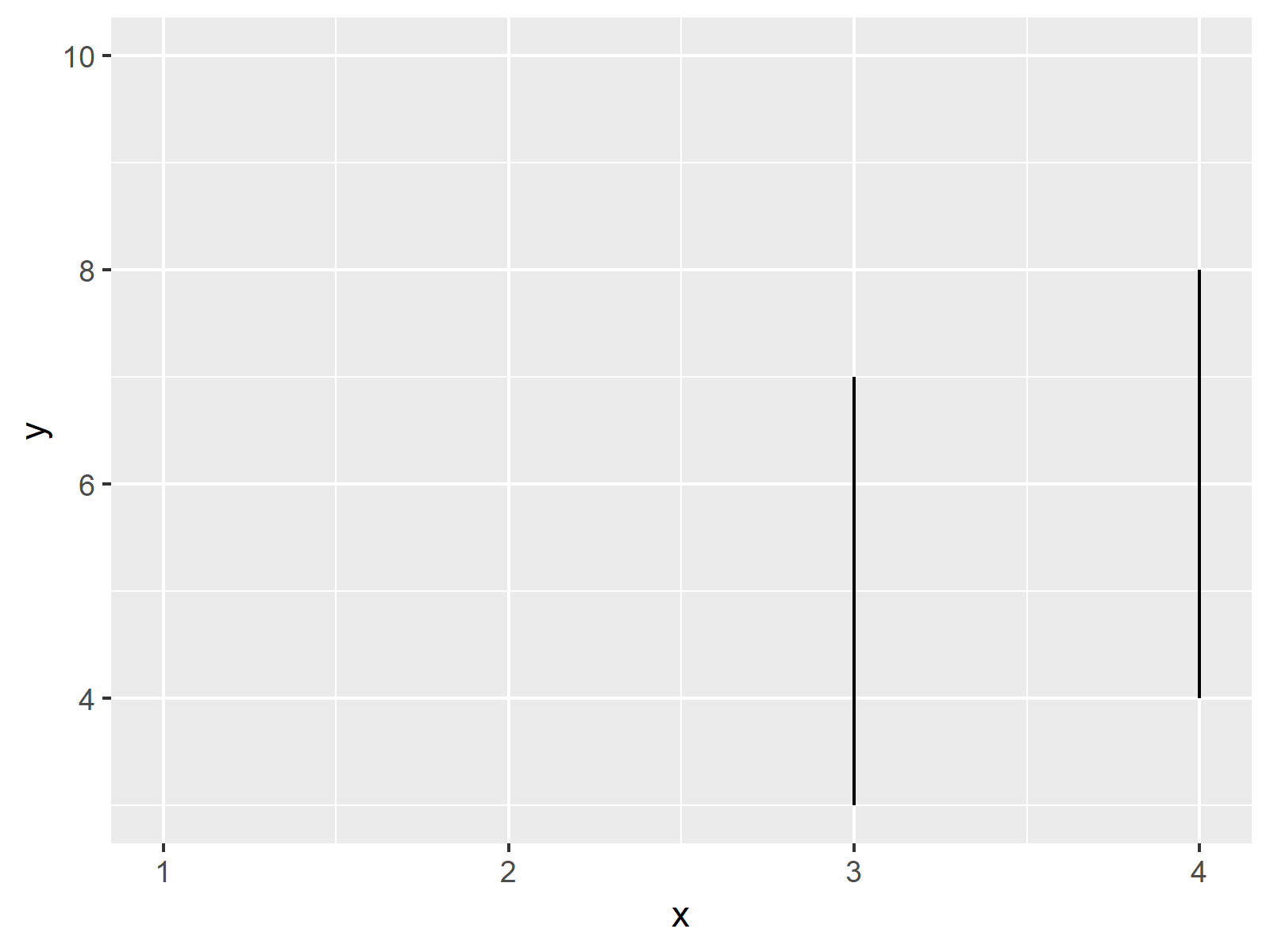
The RStudio console returns a warning message: Removed 2 rows containing missing values (geom_path). Furthermore, some lines of our data are removed entirely from our second graph, even though they should be shown in the zoomed plot…
Example: Zoom In without Cutting Off Data
This Example illustrates how to zoom in properly, without losing any data points. For this task, we have to use the coord_cartesian argument. Within the coord_cartesian argument, we are defining the axis limits of our ggplot2 plot:
ggp +                                              # Zoom without cutting values
  coord_cartesian(ylim = c(3, 10))

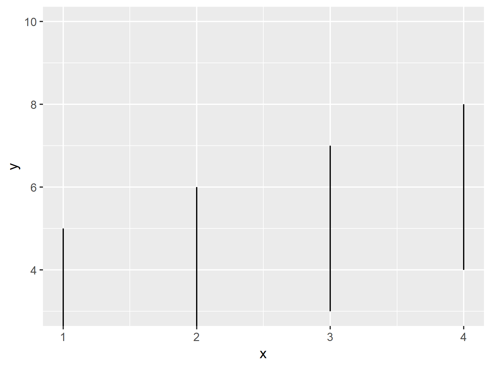
As you can see based on our third plot, this time we haven’t lost any lines of our data, i.e. the first and the second line are still shown.
Video, Further Resources & Summary
Do you need further explanations on the R programming syntax of this article? Then you could watch the following video of the Statistics Globe YouTube channel. I’m explaining the content of this page in the video:
In addition, you could read the other R programming tutorials on this homepage. I have published numerous articles already:
- Set Axis Limits in ggplot2 R Plot
- Set Axis Limits of ggplot2 Facet Plot in R
- R Graphics Gallery
- The R Programming Language
In this tutorial, I explained how to zoom into the area of a plot without deleting data in R.
In the present tutorial, we have used a line plot to show how to avoid that the rescaling of a ggplot2 axis causes data to disappear. However, the same logic could be applied to other types of plots such as barplots, boxplots, histograms, and so on.
In case you have any additional comments and/or questions, let me know in the comments below.
Subscribe to the Statistics Globe Newsletter
Get regular updates on the latest tutorials, offers & news at Statistics Globe.
I hate spam & you may opt out anytime: Privacy Policy.
Thank you!
Welcome to the Statistics Globe newsletter. From now on, I’ll send you regular emails about statistics, data science, AI, and programming with R and Python.
I’m Joachim Schork. On this website, I provide statistics tutorials as well as code in Python and R programming.
Statistics Globe Newsletter
Get regular updates on the latest tutorials, offers & news at Statistics Globe. I hate spam & you may opt out anytime: Privacy Policy.
Thank you!
Please check your email inbox and click the confirmation link to complete your subscription. If you don’t see the email within a few minutes, please also check your spam/junk folder.


