Modify Scientific Notation on ggplot2 Plot Axis in R (2 Examples)
In this R programming tutorial you’ll learn how to change the scientific notation on the axis of a ggplot2 plot.
The page contains these topics:
It’s time to dive into the examples.
Example Data, Packages & Default Plot
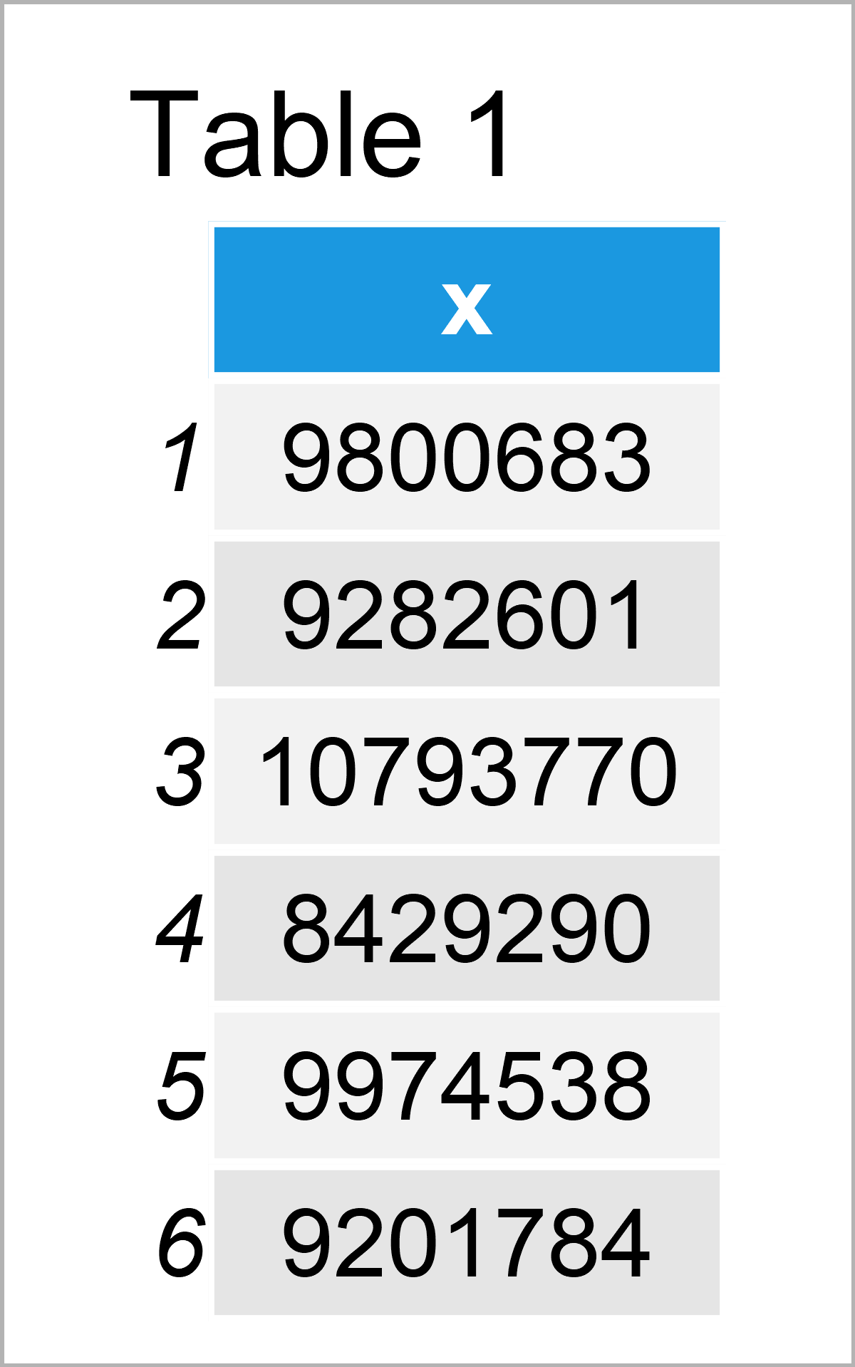
Have a look at the example data below:
set.seed(354678)                     # Create random example data
data <- data.frame(x = rnorm(1000, 10000000, 1000000))
head(data)                           # Head of example data

The previous table shows that our example data is constructed of one numerical column called “x”.
In case we want to draw our data using the functions of the ggplot2 package, we also have to install and load ggplot2:
install.packages("ggplot2")          # Install ggplot2 package
library("ggplot2")                   # Load ggplot2 package
Now, we can draw our data as shown below.
ggp <- ggplot(data, aes(x = x)) +    # Create ggplot2 plot with default axes
  geom_density()
ggp                                  # Draw ggplot2 plot with default axes

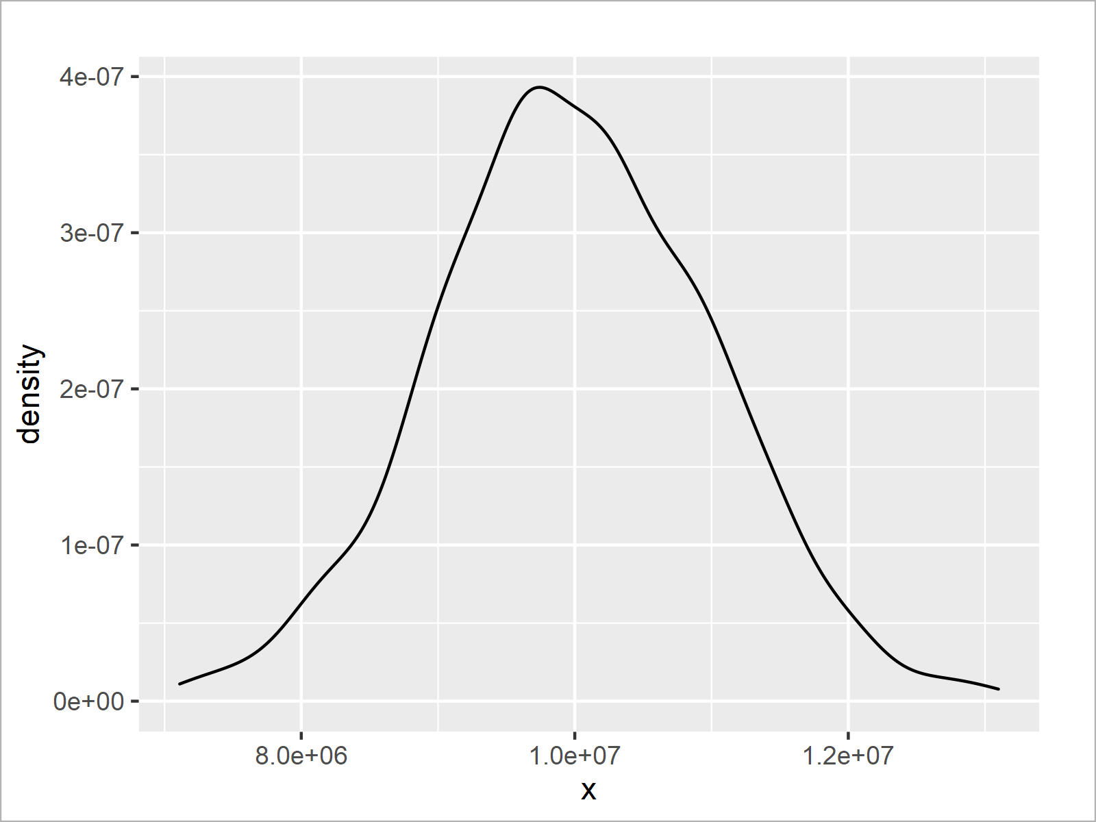
In Figure 1 you can see that we have plotted a ggplot2 density plot with default specifications of the axis tick marks.
As you can see, the values on the axes are represented with scientific notation.
The first value on the x-axis is represented with e+06 and the remaining values are represented with e+07.
The following examples illustrate how to change this notification – so keep on reading!
Example 1: Change Axis Labels of ggplot2 Plot Using Scales Package
This example explains how to use the same exponent when displaying axis tick marks with scientific notification.
First, we need to install and load the scales package:
install.packages("scales")           # Install & load scales
library("scales")
In the next step, we can use the scale_x_continuous function in combination with the unit_format function of the scales package as shown below:
ggp +                                # Modify axes using scales package
  scale_x_continuous(labels = unit_format(unit = "e+06", scale = 1 / 1e+06, digits = 2))

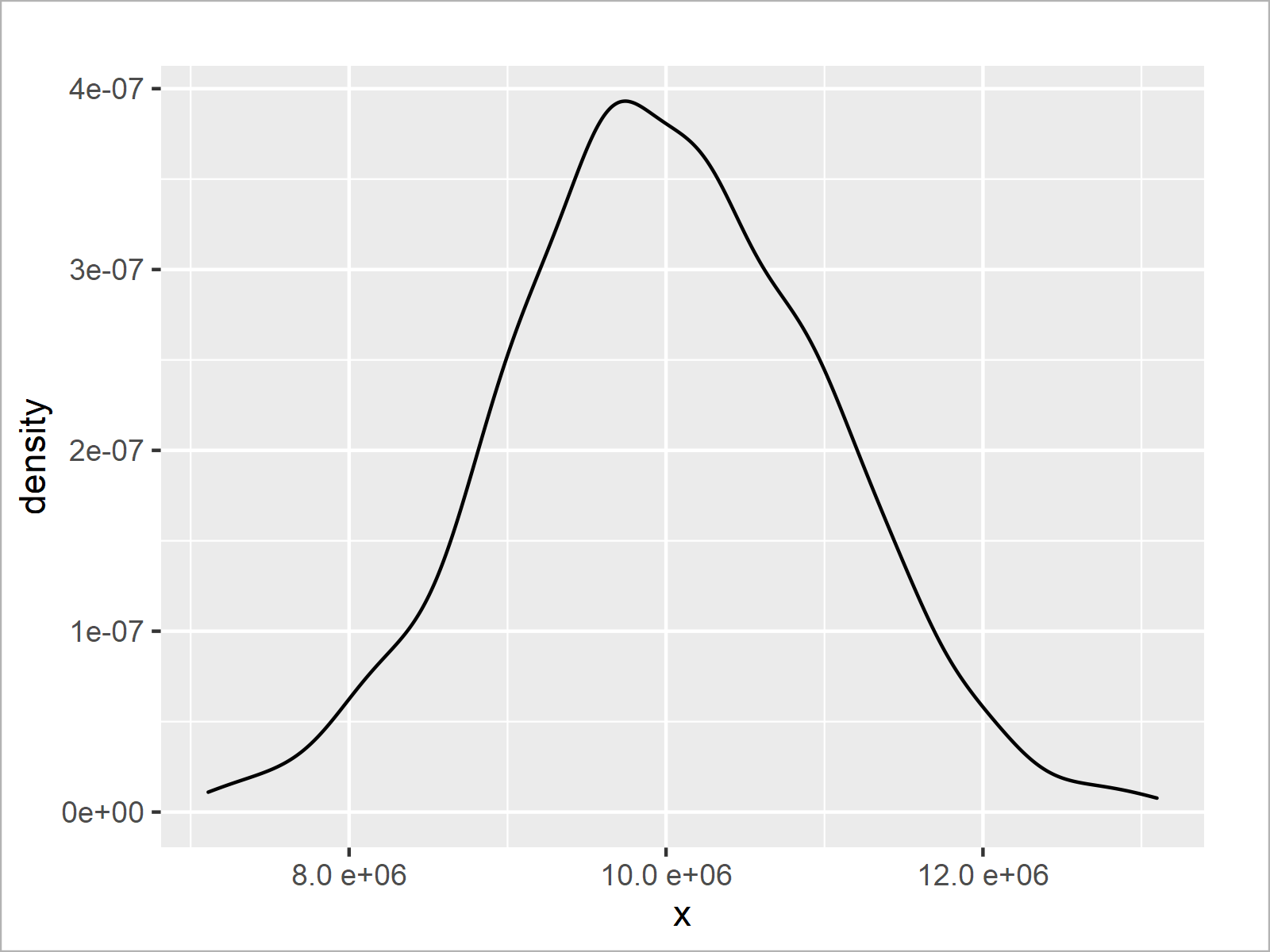
After executing the previous R programming syntax the density plot with modified x-axis labels shown in Figure 2 has been created.
This time, all axis tick marks are shown with the same exponent (i.e. e+06 instead of e+07).
Example 2: Change Axis Labels of ggplot2 Plot Using User-Defined Function
The following R programming code shows how to create a user-defined function to adjust the values shown on the x-axis of a ggplot2 plot.
For the creation of our user-defined function, we first have to install and load the stringr package.
install.packages("stringr")          # Install & load stringr
library("stringr")
Next, we can create a user-defined function that we will use to modify our axis labels later on:
formatCustomSci <- function(x) {     # Create user-defined function
  x_sci <- str_split_fixed(formatC(x, format = "e"), "e", 2)
  alpha <- as.numeric(x_sci[ , 1])
  power <- as.integer(x_sci[ , 2])
  paste(alpha * 10, power - 1L, sep = "e")
}
The previous R code has created a function called formatCustomSci, which reduces the exponent of a scientific notation by 1.
Now comes the interesting part: We can specify our user-defined function as labels within the scale_x_continuous function.
ggp +                                # Modify axes using user-defined function
  scale_x_continuous(labels = formatCustomSci)

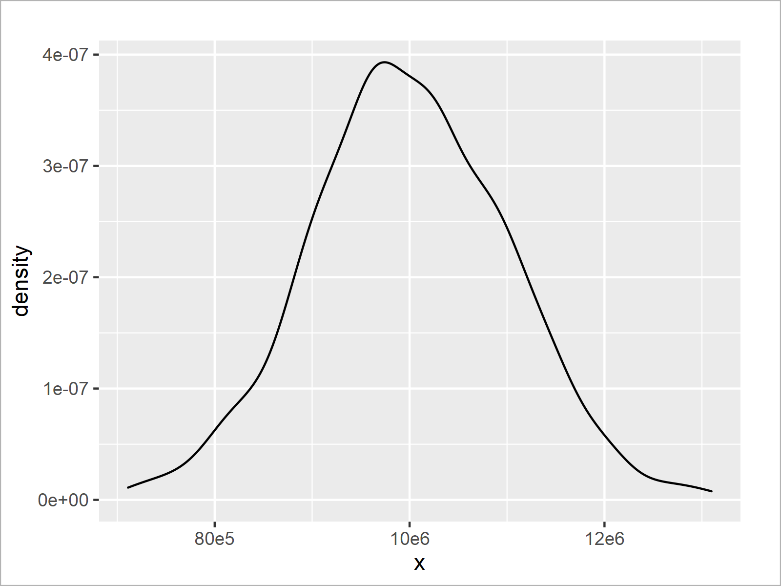
As shown in Figure 3, we have plotted another version of our ggplot2 density graph. Each exponent of the scientific notation was reduced by 1.
The notable point of this example is that we have used our own function to adjust the axis tick marks of our ggplot2 plot. This provides us with the possibility to manually specify the way how we want to display our axes, and we can specify the axes in the forefront of the creation of a graphic.
This grants a high flexibility when creating a ggplot2 plot in R!
Video, Further Resources & Summary
Have a look at the following video that I have published on my YouTube channel. In the video, I explain the R programming code of this tutorial in a live session in the R programming language.
In addition, you may have a look at the related tutorials on this website:
- Transform ggplot2 Plot Axis to log10 Scale in R
- formatC Function in R
- Set Axis Breaks of ggplot2 Plot
- Remove Axis Labels & Ticks of ggplot2 Plot (R Example)
- Add X & Y Axis Labels to ggplot2 Plot
- Change Formatting of Numbers of ggplot2 Plot Axis
- Change Font Size of ggplot2 Plot in R
- Drawing Plots in R
- Introduction to R
Please note that the content of this tutorial was inspired by a question and its answers in the Statistics Globe Facebook group. Thanks a lot to Remo Röthlin and Qasim Khan for their valuable input!
In summary: You have learned in this tutorial how to modify the scientific notation on the axis of a ggplot2 plot in the R programming language. Please let me know in the comments below, if you have any further questions.
Subscribe to the Statistics Globe Newsletter
Get regular updates on the latest tutorials, offers & news at Statistics Globe.
I hate spam & you may opt out anytime: Privacy Policy.
Thank you!
Welcome to the Statistics Globe newsletter. From now on, I’ll send you regular emails about statistics, data science, AI, and programming with R and Python.
I’m Joachim Schork. On this website, I provide statistics tutorials as well as code in Python and R programming.
Statistics Globe Newsletter
Get regular updates on the latest tutorials, offers & news at Statistics Globe. I hate spam & you may opt out anytime: Privacy Policy.
Thank you!
Please check your email inbox and click the confirmation link to complete your subscription. If you don’t see the email within a few minutes, please also check your spam/junk folder.


