Control Line Color & Type in ggplot2 Plot Legend in R (Example)
In this article, I’ll show how to modify the lines and colors of a ggplot2 legend in the R programming language.
The content is structured as follows:
Let’s jump right to the example.
Example Data, Packages & Basic Plot
As a first step, I need to construct some data that we can use in the following examples:
set.seed(965743)                 # Create example data
data <- data.frame(x = 1:20,
                   y = rnorm(100),
                   group = letters[1:5])
head(data)                       # Head of example data
#   x           y group
# 1 1  0.36482821     a
# 2 2  0.29886899     b
# 3 3 -0.24979381     c
# 4 4  0.03346469     d
# 5 5 -1.15812369     e
# 6 6 -0.63967012     a
The previous RStudio console output shows the structure of the example data – It contains three columns. The first variable x consists of integers ranging from 1 to 20, the second column y contains random numeric values, and the third variable indicates the groups to which the numeric values belong.
If we want to create a graph of our data with the ggplot2 package, we also need to install and load ggplot2:
install.packages("ggplot2")      # Install & load ggplot2 package
library("ggplot2")
Next, we can draw a graph of our data:
ggp <- ggplot(data, aes(x, y,    # Line plot created with ggplot2
                        color = group,
                        linetype = group)) +
  geom_line()
ggp                              # Draw plot

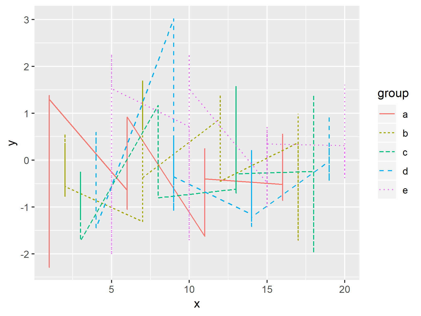
The output of the previous code is shown in Figure 1 – It shows a line chart created with the ggplot2 package. Colors and line types of the plot are selected based on the default specifications of the ggplot2 package.
Example: Manually Adjust Line Type & Color in ggplot2 Legend
The following R programming code illustrates how to select colors and line types manually. We can change the line styles with the scale_linetype_manual function and the color of each line with the scale_color_manual function. Consider the following R code:
ggp +                            # Change linetype and color manually
  scale_linetype_manual(values = c(rep("solid", 2), rep("dashed", 2), "twodash")) +
  scale_color_manual(values = c("red", "green", "black", "orange", "pink"))

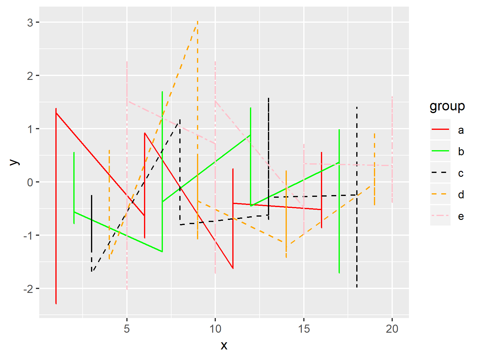
Figure 2 illustrates the output of the previously shown code: A line chart with manually specified line types and colors.
Video & Further Resources
Have a look at the following video of my YouTube channel. I’m explaining the contents of this article in the video.
In addition, you could read some of the other tutorials on my homepage:
- Create Legend in ggplot2 Plot
- Draw Multiple Variables as Lines to Same ggplot2 Plot
- Control Size of ggplot2 Legend Items
- Change Display Order of ggplot2 Plot Legend
- Coloring Plot by Factor
- Combine Multiple ggplot2 Legends
- Show ggplot2 Legend at the Bottom of a Plot & Horizontally Aligned
- R Graphics Gallery
- The R Programming Language
To summarize: In this tutorial you learned how to adjust line colors and types of a ggplot2 legend in the R programming language. If you have additional questions, let me know in the comments section below. Furthermore, don’t forget to subscribe to my email newsletter to get updates on new articles.


2 Comments. Leave new
Thanks Joachim
I’m confused it the first example by “y”.
You said there were only two variables in the dataframe and neither were y.
How can you plot x against y when y is not in the dtataframe?
Hi Jeff,
Thank you so much for this hint! The code is correct, but unfortunately I made a little mistake when printing and describing the data. I have just updated the tutorial, so now it should make more sense.
Thanks again,
Joachim