Change Fill and Border Color of ggplot2 Plot in R (Example)
In this article, I’ll explain how to modify fill and border colors of a ggplot2 graphic in the R programming language.
The tutorial will contain these topics:
Let’s start right away.
Example Data, Packages & Basic Plot
The following data is used as basement for this R tutorial:
data <- data.frame(x = 1:6,        # Create example data
                   y = c(3, 1, 5, 4, 2, 4),
                   group = factor(letters[1:3]))
data                               # Print example data

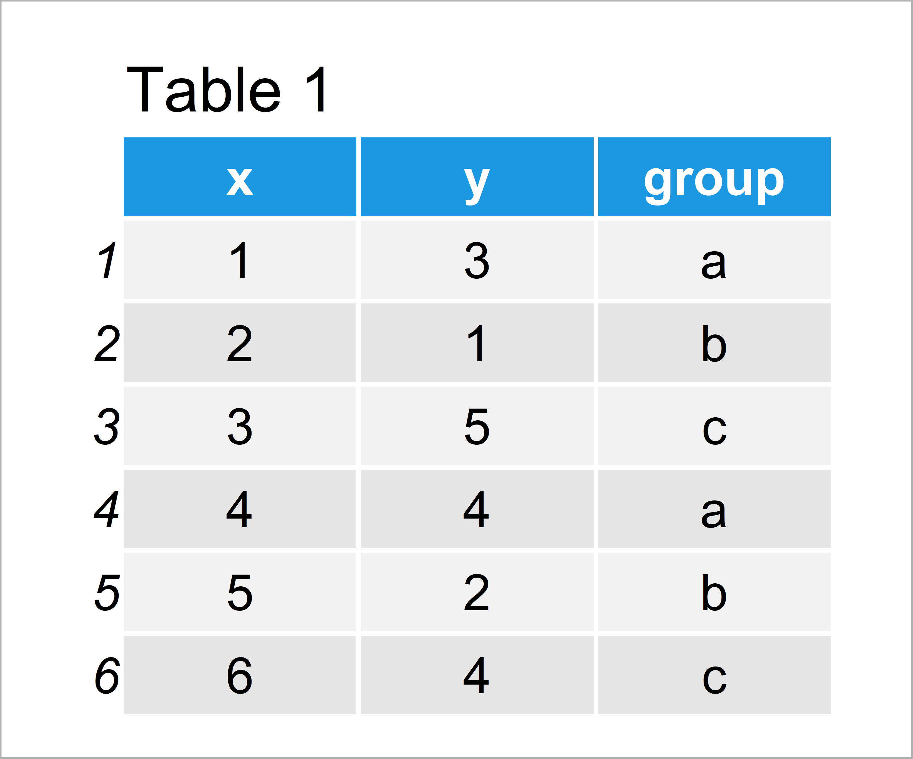
Table 1 shows the structure of our example data: It is constructed of six rows and three columns.
For the examples of this tutorial, we’ll also have to install and load the ggplot2 package to RStudio:
install.packages("ggplot2")        # Install & load ggplot2 package
library("ggplot2")
Now, we can plot our data as shown below:
ggp <- ggplot(data,                # Create ggplot2 scatterplot
              aes(x, y,
                  color = group,
                  fill = group)) +
  geom_point(size = 7,
             shape = 21,
             stroke = 3)
ggp                                # Draw ggplot2 scatterplot

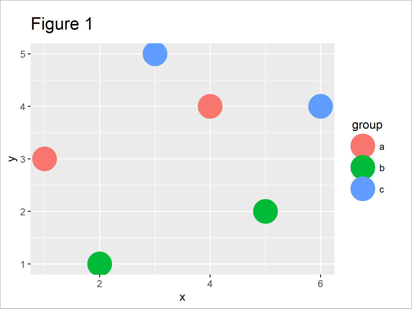
The output of the previously shown R code is shown in Figure 1 – We have created a scatterplot with default color coding for our three groups.
Note that we have specified the shape and stroke arguments within the geom_point function.
Example: Change Fill & Border Color of ggplot2 Plot Using scale_fill_manual() & scale_color_manual()
This example shows how to modify the fill and border colors of a ggplot2 scatterplot using the scale_fill_manual and scale_color_manual functions.
Within both of these functions, we have to specify a new predefined color or a hex color code for each of our groups.
Have a look at the following R code:
ggp +                              # Change fill & border color
  scale_fill_manual(values = c("a" = "yellow",
                               "b" = "#1b98e0",
                               "c" = "#353436")) +
  scale_color_manual(values = c("a" = "#353436",
                                "b" = "yellow",
                                "c" = "#1b98e0"))

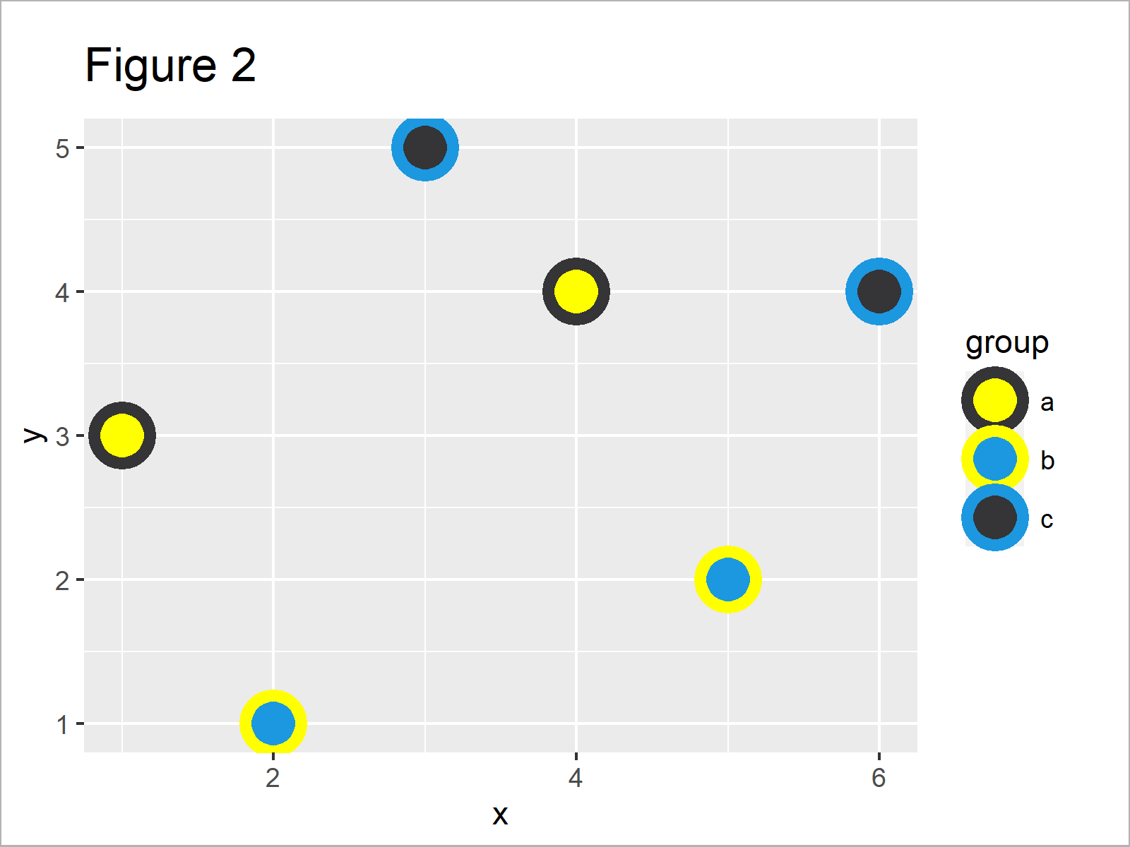
As shown in Figure 2, the previous syntax has created a new xy-plot with different filling colors and borders of the points.
Video & Further Resources
Have a look at the following video of the Statistics Globe YouTube channel. I explain the R syntax of this article in the video tutorial.
Furthermore, you might have a look at the other articles which I have published on my homepage.
- Change Line Width in ggplot2 Plot
- Change Colors in ggplot2 Line Plot in R
- Introduction to the ggplot2 Package
- Change Spacing Between Horizontal Legend Items of ggplot2 Plot
- Change Font Size of ggplot2 Plot
- Plotting Data in R
- R Programming Language
To summarize: At this point of the tutorial you should know how to adjust fill and border colors of ggplot2 graphs in R. In case you have any additional comments or questions, let me know in the comments.
Subscribe to the Statistics Globe Newsletter
Get regular updates on the latest tutorials, offers & news at Statistics Globe.
I hate spam & you may opt out anytime: Privacy Policy.
Thank you!
Please check your email inbox and click the confirmation link to complete your subscription. If you don’t see the email within a few minutes, please also check your spam/junk folder.
I’m Joachim Schork. On this website, I provide statistics tutorials as well as code in Python and R programming.
Statistics Globe Newsletter
Get regular updates on the latest tutorials, offers & news at Statistics Globe. I hate spam & you may opt out anytime: Privacy Policy.
Thank you!
Please check your email inbox and click the confirmation link to complete your subscription. If you don’t see the email within a few minutes, please also check your spam/junk folder.


