Draw Multiple Function Curves to Same Plot in R (2 Examples)
In this R tutorial you’ll learn how to draw a graph showing several function curves.
Table of contents:
You’re here for the answer, so let’s get straight to the R syntax…
Creating Example Functions
For the examples of this R tutorial, we’ll have to create some user-defined functions that we can print to our plot:
my_fun1 <- function(x) { x^3 - x * 300 }           # Create own functions
my_fun2 <- function(x) { x^3 * 2 + x^2 + x * 10 + 5 * 10^10 }
my_fun3 <- function(x) { - x^3 + x^2 - 2 * 10^10 }
We have stored three functions in the function objects my_fun1, my_fun2, and my_fun3. Let’s plot these function curves!
Example 1: Plotting Multiple Curves to Same Graph Using Base R
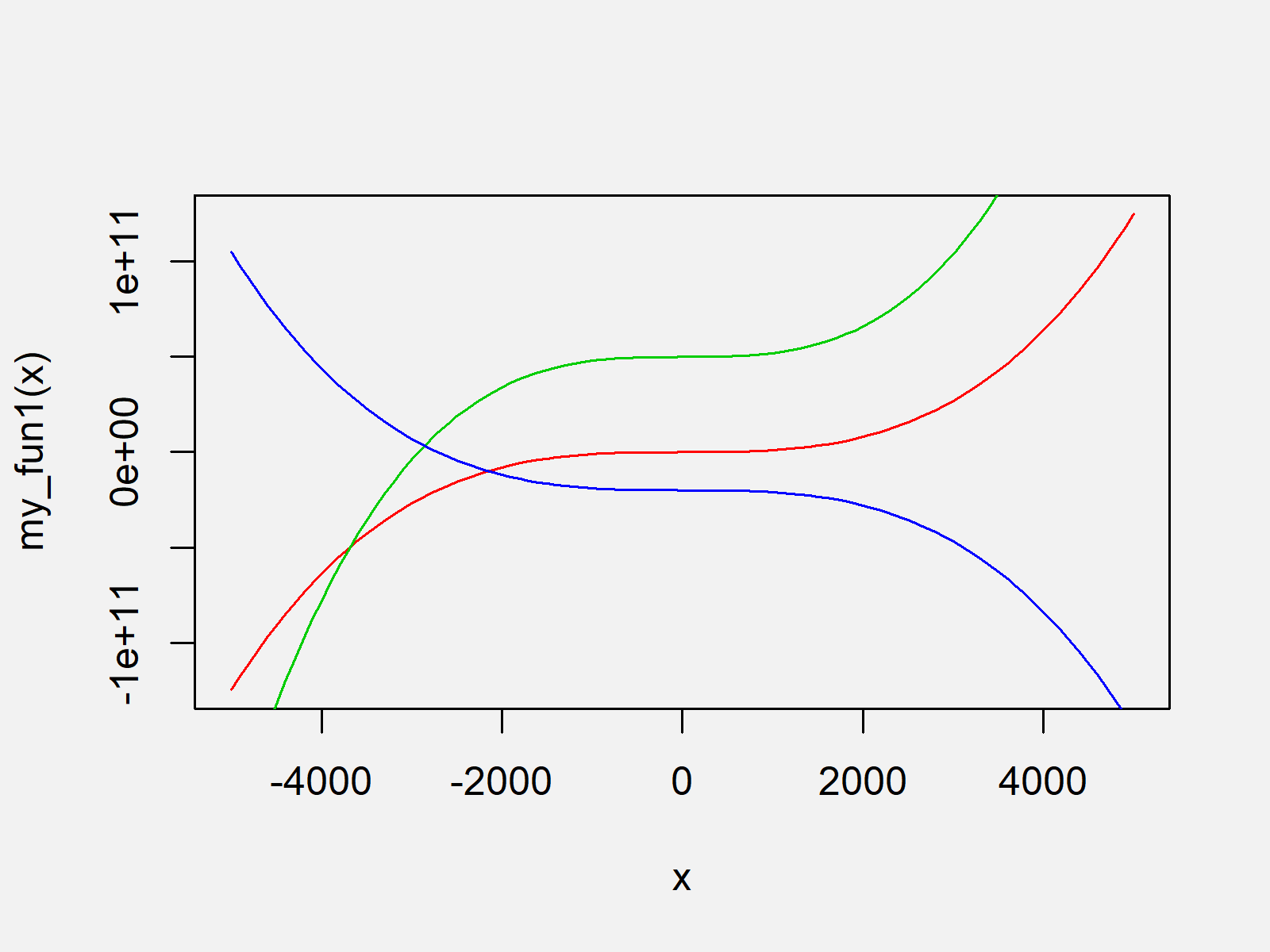
Example 1 explains how to use the basic installation of the R programming language to draw our functions to the same graph. We can do that by using the curve function as shown below:
curve(my_fun1, from = - 5000, to = 5000, col = 2)  # Draw Base R plot
curve(my_fun2, from = - 5000, to = 5000, col = 3, add = TRUE)
curve(my_fun3, from = - 5000, to = 5000, col = 4, add = TRUE)

The output of the previous R programming code is shown in Figure 1 – A Base R graph containing multiple function curves.
Note that the y-axis of the Base R plot depends on the function we have drawn first (i.e. fun1). In case you want to set the axis limits manually, you would have to do that the first time you are calling the curve function.
Example 2: Plotting Multiple Curves to Same Graph Using ggplot2 Package
In Example 2, I’ll explain how to use the functions of the ggplot2 package to plot multiple functions to the same graph.
First, we need to install and load the ggplot2 package:
install.packages("ggplot2")                        # Install ggplot2 package
library("ggplot2")                                 # Load ggplot2 package
Furthermore, we have to create a data frame that contains the range of x values and the corresponding y values of our three user-defined functions:
data_fun <- data.frame(x = - 5000:5000,            # Create data for ggplot2
                       values = c(my_fun1(- 5000:5000),
                                  my_fun2(- 5000:5000),
                                  my_fun3(- 5000:5000)),
                       fun = rep(c("fun1", "fun2", "fun3"), each = 10001))
head(data_fun)                                     # Show head of data
#       x       values  fun
# 1 -5000 1.675125e+15 fun1
# 2 -4999 1.673625e+15 fun1
# 3 -4998 1.672127e+15 fun1
# 4 -4997 1.670629e+15 fun1
# 5 -4996 1.669132e+15 fun1
# 6 -4995 1.667636e+15 fun1
Note that the previous data frame was created in long format, since it is easier to draw data in long format when using the ggplot2 package.
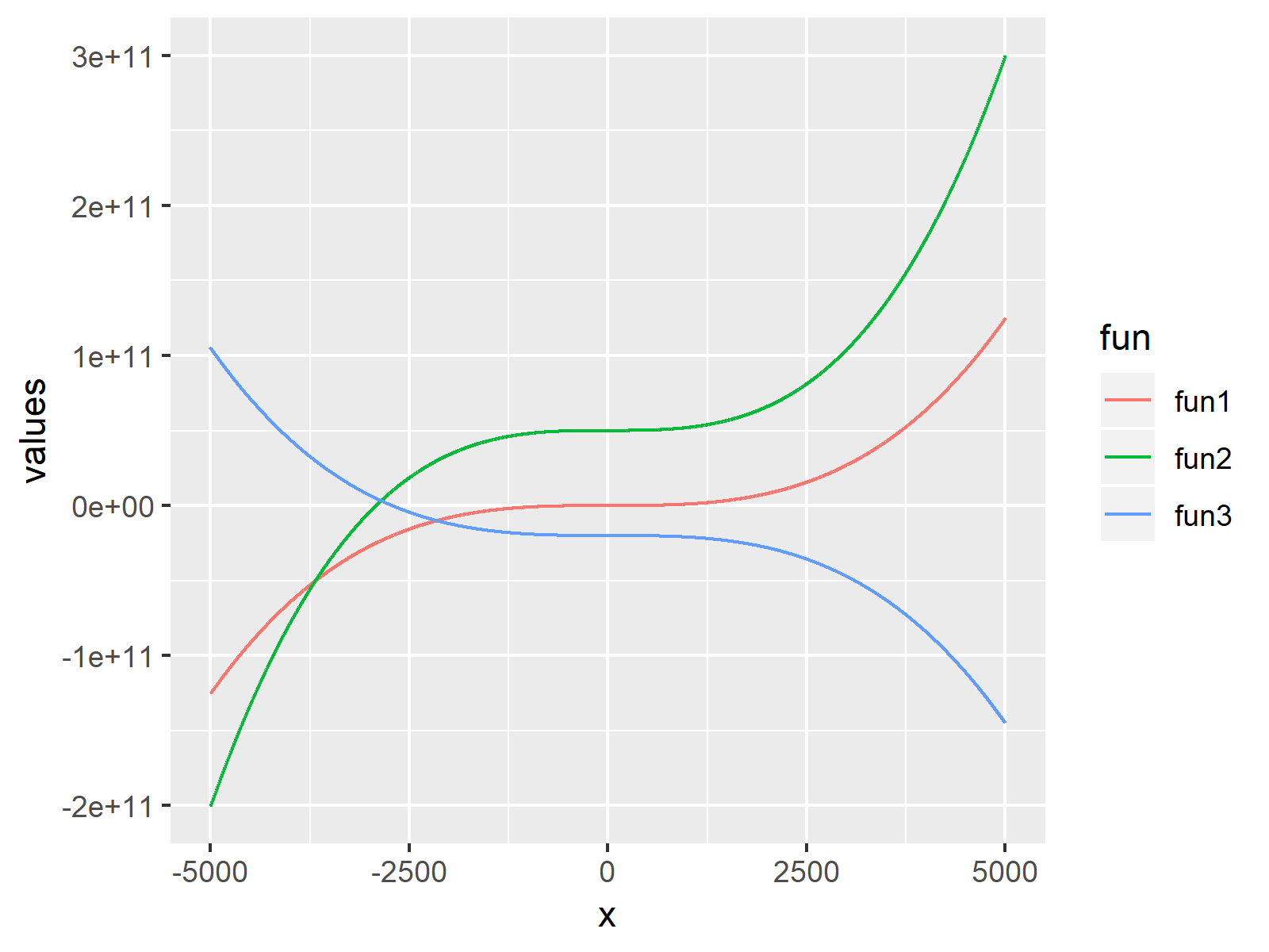
Now, we can draw our functions graph in ggplot2 as follows:
ggplot(data_fun,                                   # Draw ggplot2 plot
       aes(x, values, col = fun)) +
  geom_line()

The output of the previous R programming code is shown in Figure 2 – A ggplot2 plot that shows three different function curves in the same graph with the same scales.
Video & Further Resources
Do you need further information on the R programming code of this tutorial? Then you may have a look at the following video of my YouTube channel. In the video, I show the R programming code of this tutorial in a live session.
Furthermore, I can recommend to read the related articles of https://statisticsglobe.com/.
- Draw Multiple Variables as Lines to Same ggplot2 Plot
- Draw Multiple Graphs & Lines in Same Plot
- Drawing Plots in R
- R Programming Overview
To summarize: You learned in this article how to plot multiple function lines to a graphic in the R programming language. In case you have any additional questions, let me know in the comments section.


2 Comments. Leave new
See https://ggplot2.tidyverse.org/reference/geom_function.html to see how one does not have to generate the y-values
Thank you for sharing another alternative for the readers.
Regards,
Cansu