Remove Axis Labels & Ticks of ggplot2 Plot (R Programming Example)
This tutorial illustrates how to delete axis labels and ticks of a ggplot2 plot in R.
The article will consist of one examples for the removal of axis information. To be more specific, the page contains the following information:
- Creation of Exemplifying Data
- Example: How to Remove Axis Labels & Ticks of ggplot2 Plot in R
- Video & Further Resources
Let’s dive right into the tutorial.
Creation of Exemplifying Data
As a first step, we need to install and load the ggplot2 R package:
install.packages("ggplot2")                                        # Install ggplot2
library("ggplot2")                                                 # Load ggplot2
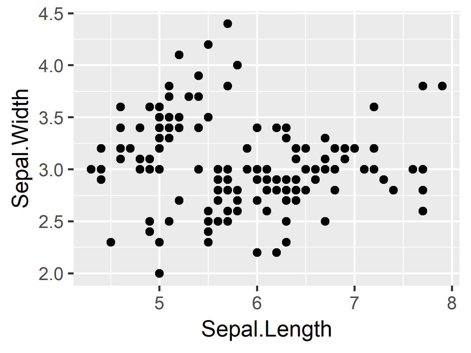
In the following example, we will use the iris data set, which is already available in the default installation of the R programming language. We can draw a scatterplot of the first two columns of the iris data frame as follows:
my_ggp <- ggplot(iris, aes(x = Sepal.Length, y = Sepal.Width)) +   # Create basic ggplot2
  geom_point()
my_ggp

Figure 1: Default Scatterplot Created by ggplot2 R Package.
Figure 1 illustrates how our basic ggplot scatterplot looks like. It contains axis labels and axis ticks. Now let’s remove these labels and ticks…
Example: How to Remove Axis Labels & Ticks of ggplot2 Plot in R
If we want to delete the labels and ticks of our x and y axes, we can modify our previously created ggplot2 graphic by using the following R syntax:
my_ggp +                                                           # Remove axis labels & ticks
  theme(axis.text.x = element_blank(),
        axis.ticks.x = element_blank(),
        axis.text.y = element_blank(),
        axis.ticks.y = element_blank())

Figure 2: Axes without Axis Labels & Ticks.
As you can see based on Figure 2, we just removed all labels and ticks of both axes. We did that by using the arguments axis.text.x, axis.ticks.x, axis.text.y, and axis.ticks.y within the theme() function.
Video & Further Resources
Do you need further information on the R syntax of this article? Then you may want to watch the following video of my YouTube channel. In the video instruction, I illustrate the R programming codes of this tutorial in RStudio:
In addition, you might have a look at some of the related articles of my website:
- ggplot2 Package in R – Tutorial & Examples
- Remove Axis Values of Plot in Base R
- Change Font Size of ggplot2 Plot
- Adjust Space Between ggplot2 Axis Labels and Plot Area
- Rotate ggplot2 Axis Labels in R
- Set Axis Limits in ggplot2 R Plot
- R Graphics Gallery
- The R Programming Language
In this R post you learned how to manually create a ggplot2 plot without x and y axis labels and ticks. If you have further questions on how to not show particular labels, tell me about it in the comments.


2 Comments. Leave new
Nice video. How do I add and/or increase the size of the ggplot2 plot x and y axis ticks.
Hi Kevin,
Thank you! 🙂 You can find a tutorial + video on increasing font size in ggplot2 here: https://statisticsglobe.com/change-font-size-of-ggplot2-plot-in-r-axis-text-main-title-legend
Regards,
Joachim