Draw 3D Plot of PCA in Python (Example)
In this tutorial, you’ll learn how to create a Principal Component Analysis (PCA) plot in 3D in Python programming.
Let’s have a look at the table of contents:
Step 1: Add-On Libraries and Data Sample
First of all, we will need to import some libraries with which we will perform and plot our PCA. These will help us with the data analysis, calculation, model building and data visualization of our PCA plot in 3D:
import numpy as np
import pandas as pd
import matplotlib.pyplot as plt
from sklearn.datasets import load_breast_cancer
from sklearn.preprocessing import StandardScaler
from sklearn.decomposition import PCA

plt.style.use('ggplot')
In order to create this PCA plot we will use the breast cancer data set, from the scikit-learn library. First of all, we will use the load() function from scikit-learn to load our data set and then convert it into a pandas DataFrame:
b_cancer = load_breast_cancer()

df = pd.DataFrame(data=b_cancer.data,
                  columns=b_cancer.feature_names)

df.iloc[:, 0:6].head(6)
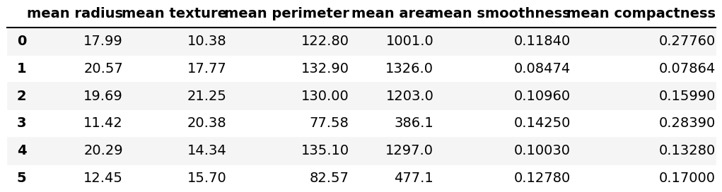
Our data set has 569 rows and 30 columns. Above, we can see the first 6 rows from the first 6 columns by using the head() function and the iloc[] method.
Now, let’s conduct the PCA in Python!
Step 2: Standardize the Data and Perform the PCA
Before performing the PCA, we need to standardize our data using the StandardScaler() function and then store the scaled data.
scaler = StandardScaler()

scaler.fit(df)

Bcancer_scaled = scaler.transform(df)
Now that we have already scaled our data, we can perform the PCA using 3 components. If you wonder how one should decide the number of components, see Optimal Number of Components in PCA.
pca = PCA(n_components=3)

pca.fit(Bcancer_scaled)

pca_bcancer = pca.transform(Bcancer_scaled)
Step 3: Create the 3D Plot of the PCA
To plot our PCA in 3D, first, we have to define some attributes. First of all, we will define the axes in our 3D PCA plot:
Xax = pca_bcancer[:,0]
Yax = pca_bcancer[:,1]
Zax = pca_bcancer[:,2]
Each axis represents one of the first three components. We will also define the labels, referring to the diagnosis and point colors. We can extract the diagnosis classification target via .target.
cdict = {0:'m',1:'c'}
label = {0:'Malignant',1:'Benign'}
y = b_cancer.target
Now, we can finally create our PCA plot in 3D. We will use a for loop to plot each point colored by the diagnosis. In order to plot in 3 dimensions, we should use the projection='3d' input inside the fig.add_subplot() function:
fig = plt.figure(figsize=(14,9))
ax = fig.add_subplot(111,
                     projection='3d')

for l in np.unique(y):
 ix=np.where(y==l)
 ax.scatter(Xax[ix],
            Yax[ix],
            Zax[ix],
            c=cdict[l],
            s=60,
           label=label[l])

ax.set_xlabel("PC1",
              fontsize=12)
ax.set_ylabel("PC2",
              fontsize=12)
ax.set_zlabel("PC3",
              fontsize=12)

ax.view_init(30, 125)
ax.legend()
plt.title("3D PCA plot")
plt.show()
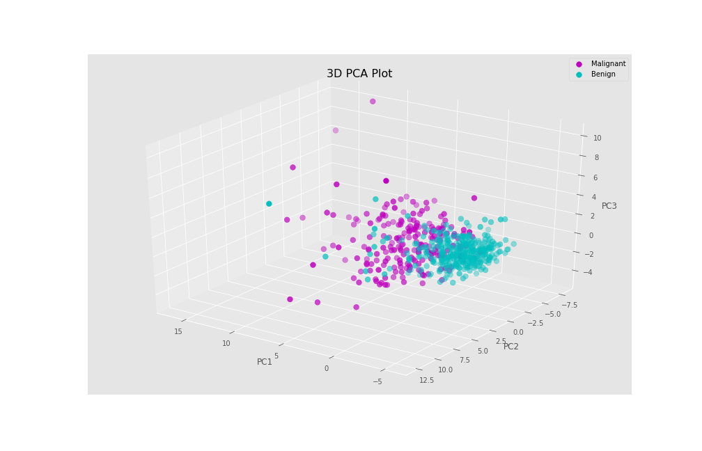
As a result, we get our PCA data in 3D, showing the principal component scores for each individual.
Video, Further Resources & Summary
Do you need more explanations on how to perform a Principal Component Analysis in Python? Then you should have a look at the following YouTube video of the Statistics Globe YouTube channel.
You may also be curious about some of the other tutorials on Statistics Globe:
- What is a Principal Component Analysis?
- PCA Using Correlation & Covariance Matrix
- Choose Optimal Number of Components for PCA
- Principal Component Analysis in Python
- Scatterplot of PCA in Python
- Statistical Methods
In this post, we explained how to make a PCA plot in 3 dimensions in Python. If you have any questions, please leave a comment below.

This page was created in collaboration with Paula Villasante Soriano. Please have a look at Paula’s author page to get more information about her academic background and the other articles she has written for Statistics Globe.

I’m Joachim Schork. On this website, I provide statistics tutorials as well as code in Python and R programming.
Statistics Globe Newsletter
Get regular updates on the latest tutorials, offers & news at Statistics Globe. I hate spam & you may opt out anytime: Privacy Policy.