Replace X-Axis Values in R (Example) | How to Change & Customize Ticks
In this R tutorial you’ll learn how to modify x-axis values manually.
The content of the post looks as follows:
Let’s get started.
Creating Example Plot
Let’s first create an exemplifying graphic in R:
plot(1:5) # Create plot in Base R

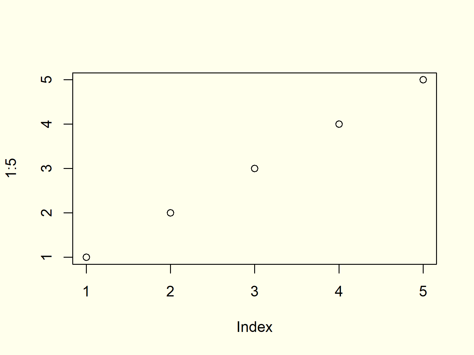
Figure 1: Plot with Default X-Axis Values.
Figure 1 shows the output of the previous R code: A scatterplot with an x-axis ranging from 1 to 5.
Example: Changing X-Axis Values to Letters
Let’s assume that we want to modify our x-axis tick marks so that the currently shown numbers are replaced by upper case letters. Then, we first have to create a graph without any axis values:
plot(1:5,                       # Create plot without x-axis
     xaxt = "n",
     xlab = "My X-Axis")

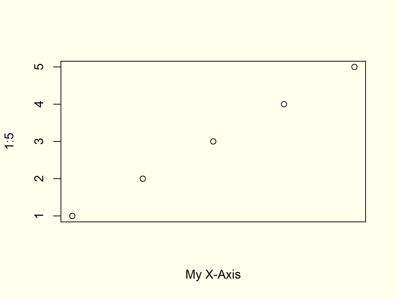
Figure 2: Plot without X-Axis Values.
Figure 2 shows our plot without axis values.
Now, we can add custom axis values by using the axis function as shown below:
axis(1,                         # Define x-axis manually
     at = 1:5,
     labels = LETTERS[1:5])

Figure 3: Plot with Custom X-Axis Values.
Figure 3 shows our final result: A scatterplot with custom axis values.
Video & Further Resources
Do you need more explanations on the R codes of this article? Then I can recommend having a look at the following video instruction which I have published on my YouTube channel. I show the R programming syntax of the present tutorial in the video.
Furthermore, you might have a look at the related articles that I have published on my website. I have released numerous tutorials already.
- Remove Axis Values of Plot in Base R
- Rotate Axis Labels of Base R Plot
- axis() Function in R
- Change Formatting of Numbers of ggplot2 Plot Axis
- R Graphics Gallery
- The R Programming Language
In summary: You have learned in this tutorial how to change the values on our axis scale in the R programming language.
In this tutorial, I have illustrated how to do this based on an exemplifying scatterplot. However, please note that it would also be possible to change the axis values of other types of graphs such as a histogram, boxplot, barchart, line plot, or a density plot by using the same kind of R code.
If you have further questions, please let me know in the comments section below.
Subscribe to the Statistics Globe Newsletter
Get regular updates on the latest tutorials, offers & news at Statistics Globe.
I hate spam & you may opt out anytime: Privacy Policy.
Thank you!
Welcome to the Statistics Globe newsletter. From now on, I’ll send you regular emails about statistics, data science, AI, and programming with R and Python.
I’m Joachim Schork. On this website, I provide statistics tutorials as well as code in Python and R programming.
Statistics Globe Newsletter
Get regular updates on the latest tutorials, offers & news at Statistics Globe. I hate spam & you may opt out anytime: Privacy Policy.
Thank you!
Please check your email inbox and click the confirmation link to complete your subscription. If you don’t see the email within a few minutes, please also check your spam/junk folder.


26 Comments. Leave new
How can I customize ticks to string values? E.g. “Control”, “Trial 1”, “Trial 2”.
Thank you for any help.
Hey,
You can add basically any text you want by using the label argument in the axis function. Have a look at the following example code:
Regards,
Joachim
How can I customize range in the axis, for instance point A= 5-10, B=10-15 and so on
Hey Apsana,
Are you looking for this?
Regards,
Joachim
Is there a way to manually change axis ticks values also with ggplot2?
Many Thanks,
Enrico
Hey Enrico,
Are you looking for this?
Regards,
Joachim
Hello Joachim,
thank you for your help it’s a very easy solution! However in my case I am using plot (to plot ggeffects object from ggeffects package), and apparently it doesn’t work. Let me explain you my situation:
p5 <- ggemmeans(B9, "variable") #where B9 is a GLMM S4 object
#p5 is now a data.frame with x (level 0 or 1) in the first column, the predicted value in the 2nd column and the Standard error in column n°3
plot(p5, ci.style="errorbar", add.data=FALSE, dodge = 1) +
xlab("")+ ylab("Predicted Probability of Hit") + ggtitle ("Effect of Listening Time") +
theme(plot.title = element_text(hjust = 0.5), text=element_text(family="Calibri", size=12,color="grey20"),
title = element_text(family="Calibri", size=12,hjust=0.5),
axis.title.y = element_text(family="Calibri", size=12,vjust=2),
axis.text.x = element_text(family="Calibri",vjust=0.5, size=10),
axis.text.y = element_text(family="Calibri",vjust=0.5, size=10),
axis.ticks.y = element_line(c("60","70"), color="grey35", size=0.2))
In this way on my x axis I get 0 and 1 but I want to change it with 0=10 seconds and 1=50 seconds..
levels(p5$x) <- c("10 seconds","50 seconds") doesn't work.
scale_x_discrete() doesn't work cause apparently there is an already existing mapping of the aesthetic (probably inherent to "plot" from ggeffects?)
I don't really know how to solve this issue.. I could just copy the value but then it's tricky for the error bars.
Thank you very much for your help,
Regards
Enrico
Hey Enrico,
Thank you for the clarifications. Could you please execute the following line of code and share the output? This would make it much easier for me to reproduce your data.
Regards,
Joachim
Hello again and thanks for your help.
Here you are the output:
variable | Predicted | 95% CI
———————————————-
0 | 0.59 | [0.54, 0.63]
1 | 0.75 | [0.70, 0.78]
Note that if I run “levels(p5$x) <- c("10 seconds","50 seconds")",
the output would be the following:
variable | Predicted | 95% CI
———————————————-
10 seconds | 0.59 | [0.54, 0.63]
50 seconds | 0.75 | [0.70, 0.78]
but running the above reported code "plot(…..)" will return a plot with 0 and 1 on the x-axis..
It shouldn't since I labelled it, but the issue might be related to how "plot()" function from ggeffects read the argument data.. I am really lost on it, I hope there's a way to overcome this and that im now wasting my and your time.
Thank you again,
Best
Enrico
Hey Enrico,
I have tried to reproduce your situation. However, could you please explain why you are using the plot() function (i.e. plot(p5, ci.style=”errorbar”, add.data=FALSE, dodge = 1) ) to draw your data? The plot function creates Base R plots instead of ggplot2 plots, and this line already returns warning messages when I run your code.
Regards,
Joachim
Hi Joachim,
so “plot()” could either be a generic X-Y plotting function, a default scatterplot function or ggeffects-objects plot function. In my case is the last one (type F1 on “plot()” after installing and loading ggeffects and you’ll see all the informations), and it’s a function generated for plotting ggeffects objects (in my case –> ggmeans()). The ggeffects-object is a ggplot2-type object (as you can see I used ggtitle() and other adding codes for ggplot2). I could use ggplot() + geom_col() but I would be struggling with geom_errorbar() (I wouldn’t know how to reproduce the same graph with normal ggplot2 functions): for that reason plot() was made, as a straightforward solution for those objects. If you have any suggestion on how to proceed avoiding “plot()” from ggeffects, I would be very thankful for receiving it.
Thank you very much again,
Best
Enrico
Hey Enrico,
Unfortunately, I’m still not able to reproduce your situation. I have tried the following code, but the plot function still doesn’t work as you are describing:
I do not have any experience with the ggeffects package, so maybe it might be better to ask this question to the Statistics Globe Facebook group. Perhaps somebody there knows how to resolve this problem: https://www.facebook.com/groups/statisticsglobe
Regards,
Joachim
Hello again Joachim and thank you for your time.
I think the problem in your codes is that the p5 object is not a ggeffects object (namely an object obtained through a function inside ggeffects such as “ggmean”). Unfortunately I don’t have Facebook but thank you for the hint. I decided to change the coding of the variable’s level in the dataset before running the regression model so that at the end I will hopefully obtain what I need.
Thank you very much again,
Best
Enrico
Hey Enrico,
Thank you for the further explanations. I’m sorry that I couldn’t help you more, and I hope you’ll find a solution soon.
Regards,
Joachim
How do you manually add standard error bars when you don’t have the replicate data? What coding should you use? Geom_errorbar()??
Hey Louise,
Are you looking for this?
Regards,
Joachim
Hello, I am trying to add the error bars to a bar chat
Ah OK, then please have a look here.
Regards,
Joachim
Hi – is there a way I can change one level of my x-axis only? I have one layer of Before After Before After….. which I want to leave, but below that I have it as Q1 Q2 Q3 etc. I want to change the Q1 Q2 Q3 level to other text.
Hello Lisa,
I am not sure if I get you correctly. What do you mean by level? Could you please give some more details? What should be the final labels of your x-axis?
Best,
Cansu
Hi Joachim,
I have a density plot in R, and I want to change the x-axis major unit.
Currently, the x-axis is showing as:
0.0, 0.1, 0.2, 0.3, 0.4, 0.5, 0.6
But I just want the x-axis to show as:
0.0, 0.2, 0.4, 0.6
Thank you for any help
Hey J,
Thanks for your kind comment. Please have a look at the following example code:
I hope this helps!
Joachim
Thanks a lot, Joachim! 🙂
You are very welcome, glad it was helpful! 🙂
Regards,
Joachim
Hi Joachim,
I have made a forestplot from the meta and metafor package and the axis goes from -20 to 20 with 5 steps in total. I do not want it to start from -20, but from 0 to 30, and the steps to be 6.
I tried the axis function but it does not work as an argument in the forest function.
Thank you
Hey Theodoros,
Thanks for the kind comment. Could you please share your code?
Regards,
Joachim