Reverse Axis Limits of Plot in Base R & ggplot2 (2 Examples)
This tutorial demonstrates how to exchange the axis limits of a graphic in the R programming language.
Table of contents:
Let’s get started:
Example Data
Consider the following example data:
data <- data.frame(x = 1:5,         # Create example data
                   y = 1:5)
data                                # Print example data
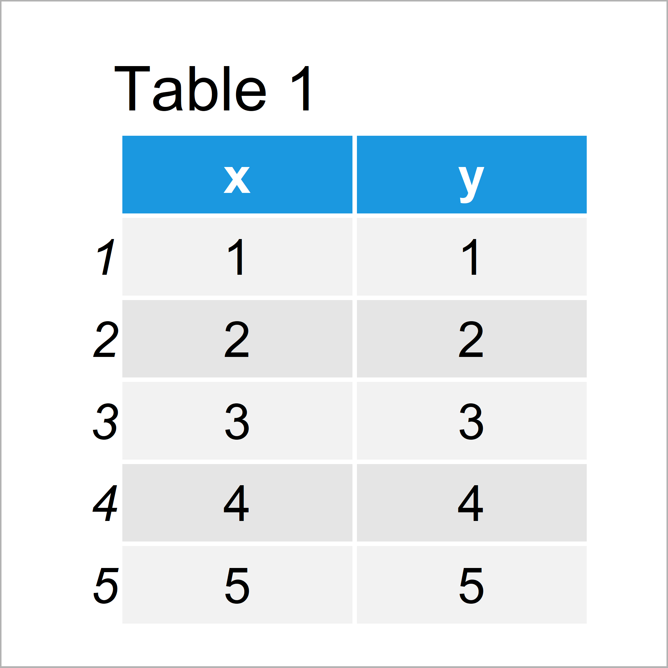
Table 1 reveals the structure of our example data: It has five rows and two numeric columns x and y.
Example 1: Reverse Y-Axis of Base R Plot
In Example 1, I’ll demonstrate how to reverse the y-axis limits of a plot using the basic installation of the R programming language.
Let’s first draw a Base R plot with default axis limits:
plot(data$x, data$y) # Plot with default axes
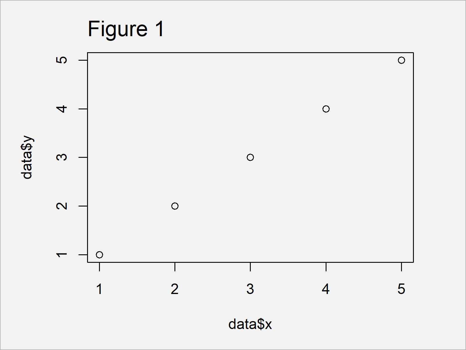
Figure 1 shows the output of the previous R programming syntax: We have created a scatterplot with default axis limits, i.e. starting with the smallest value and ending with the largest value.
We can reverse this order using the ylim argument of the plot function in combination with the rev and range functions:
plot(data$x, data$y,                # Reversed y-axis
     ylim = rev(range(data$y)))
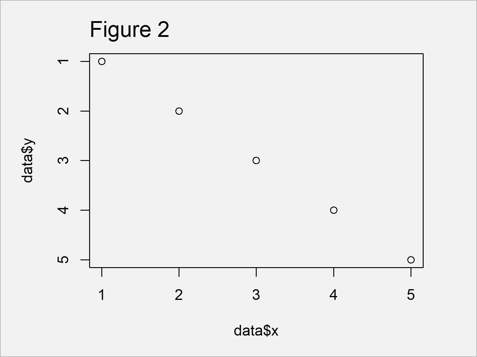
After running the previous syntax the graphic shown in Figure 2 has been created. As you can see, the y-axis limits have been exchanged.
Note that we could use the xlim argument to reverse the x-axis limits as well.
Example 2: Reverse Y-Axis of ggplot2 Plot
The following R programming code explains how to change the ordering of the y-axis limits of a ggplot2 plot.
We first need to install and load the ggplot2 package, if we want to use the corresponding functions:
install.packages("ggplot2")         # Install & load ggplot2 package
library("ggplot2")
As a next step, we can create a plot object called ggp, and we can draw this plot object using the following R code:
ggp <- ggplot(data, aes(x, y)) +    # Create ggplot2 Plot with default axes
  geom_point()
ggp                                 # Draw ggplot2 Plot with default axes
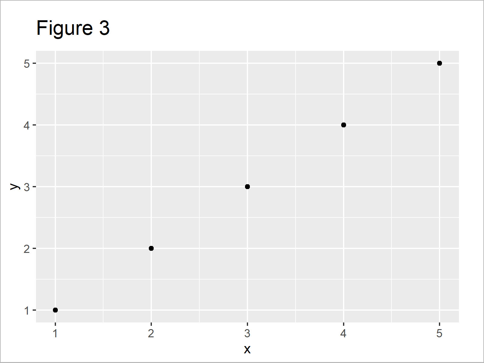
As shown in Figure 3, the previous R code has plotted a ggplot2 xy-plot with default axis limits.
If we want to reverse the axis limits on our ggplot2 y-axis, we can use the scale_y_reverse function as shown below:
ggp +                               # Reversed y-axis
  scale_y_reverse()
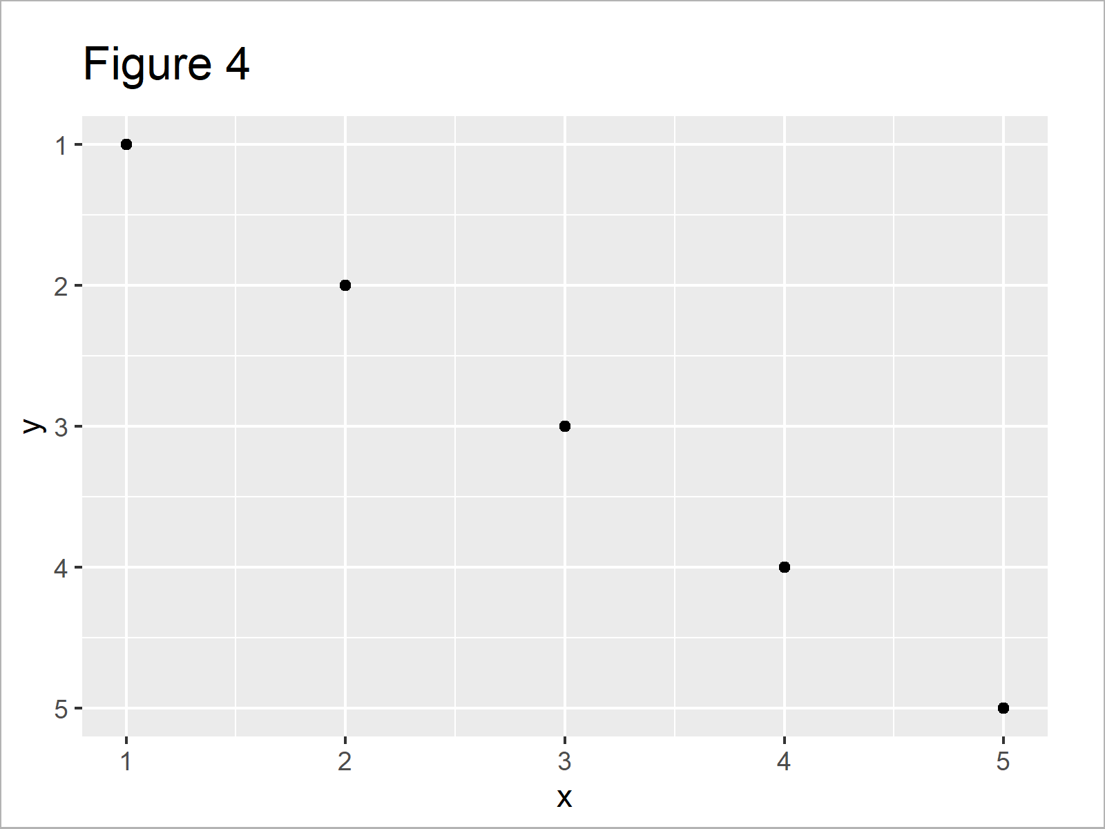
After executing the previous R syntax the ggplot2 graphic with reversed y-axis scale shown in Figure 4 has been drawn.
Video & Further Resources
Would you like to learn more about graphs in R? Then I can recommend having a look at the following video tutorial of my YouTube channel. In the video, I’m explaining the R programming syntax of this tutorial:
Furthermore, you could read the related R articles of this website. You can find some articles about related topics such as ggplot2 and graphics in R below:
- Set Axis Limits in ggplot2 R Plot
- Set Axis Limits of Plot in R
- Set Axis Limits of ggplot2 Facet Plot
- Drawing Plots in R
- R Programming Overview
Summary: In this tutorial, I have explained how to reverse the axis scale limits of a plot in R.
In this tutorial, we have used a scatterplot for illustration of the R codes. However, please note that we could apply the same kinds of codes to other graphics such as barplots, boxplots, histograms, line plots, and heatmaps.
Let me know in the comments section, if you have any additional questions.
Subscribe to the Statistics Globe Newsletter
Get regular updates on the latest tutorials, offers & news at Statistics Globe.
I hate spam & you may opt out anytime: Privacy Policy.
Thank you!
Welcome to the Statistics Globe newsletter. From now on, I’ll send you regular emails about statistics, data science, AI, and programming with R and Python.
I’m Joachim Schork. On this website, I provide statistics tutorials as well as code in Python and R programming.
Statistics Globe Newsletter
Get regular updates on the latest tutorials, offers & news at Statistics Globe. I hate spam & you may opt out anytime: Privacy Policy.
Thank you!
Please check your email inbox and click the confirmation link to complete your subscription. If you don’t see the email within a few minutes, please also check your spam/junk folder.


