Change Colors of Axis Labels & Values of Base R Plot (2 Examples)
In this R tutorial you’ll learn how to modify the colors of axis labels and values in a plot.
Table of contents:
You’re here for the answer, so let’s get straight to the examples!
Creation of Example Plot (Default Colors)
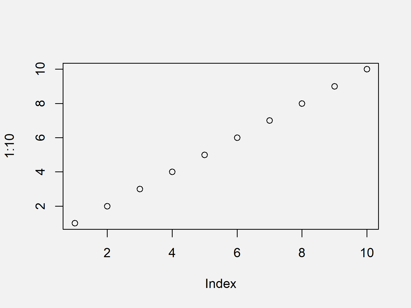
As a first step, let’s create a scatterplot in Base R using the default specifications:
plot(1:10) # Plot with default colors

As shown in Figure 1, we created a black and white graphic with the previously shown syntax.
Let’s change the colors of our plot…
Example 1: Changing Color of Axis Labels in Base R Plot
In this example, I’ll explain how to adjust the axis label colors of our example plot by applying the col.lab argument.
Have a look at the following R code:
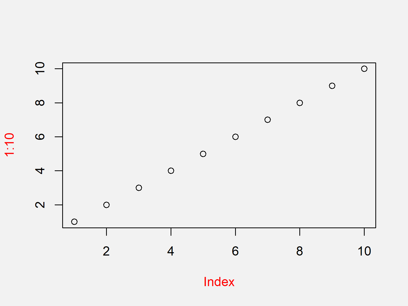
plot(1:10, col.lab = "red") # Plot with red axis labels

The output of the previously shown code is shown in Figure 2 – A scatterplot with red axis labels (i.e. the names of our axes).
Let’s change more colors…
Example 2: Changing Color of Axis Values in Base R Plot
In this example, I’ll show how to modify the color of our axis values using the col.axis argument.
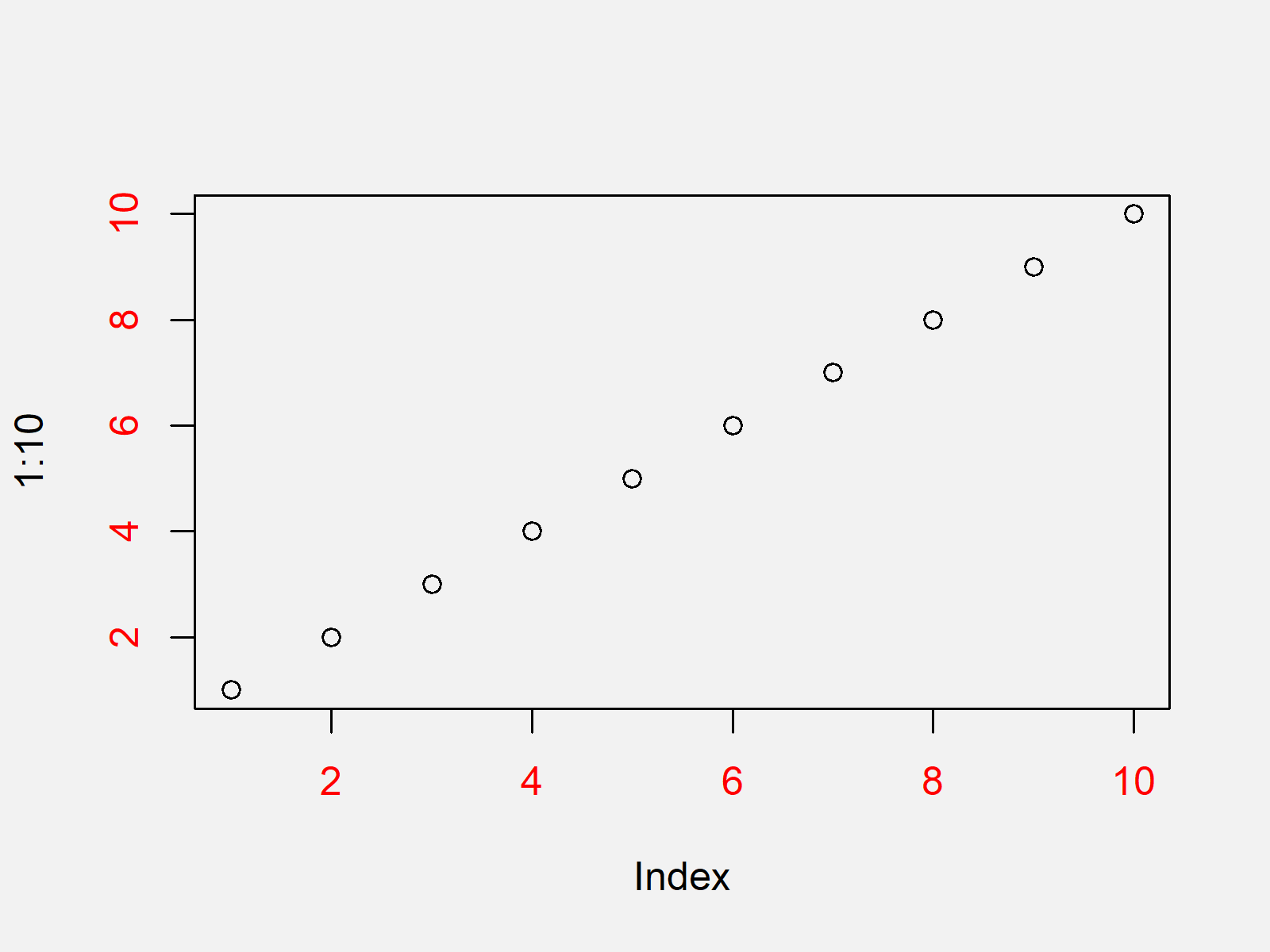
plot(1:10, col.axis = "red") # Plot with red axis values

As shown in Figure 3, we created an xy-plot with red axis values with the previous syntax.
Video, Further Resources & Summary
Do you need more info on the R syntax of this page? Then you could watch the following video of my YouTube channel. I’m explaining the content of this tutorial in the video.
In addition, you could read the other articles of this website. A selection of articles about similar topics such as lines, labels, numeric values, and ggplot2 is listed below:
- Rotate Axis Labels of Base R Plot
- Change Colors in ggplot2 Line Plot in R
- Remove Axis Values of Plot in Base R
- Change Formatting of Numbers of ggplot2 Plot Axis
- Change Spacing of Axis Tick Marks in Base R Plot
- Remove Axis Labels & Ticks of ggplot2 Plot (R Example)
- Graphics Overview in R
- R Programming Examples
You learned in this article how to adjust axis colors in a plot in the R programming language. Let me know in the comments below, in case you have any further questions.


4 Comments. Leave new
I am using labels that are dates and would like to alternate colors to emphasize year over month names
Hey Philip,
Just to clarify: You want to show the years in a different color than the months?
Regards
Joachim
Having a similar problem I want to show every color with different color, style
Hey Nikos,
Could you please explain this in some more detail? I’m afraid I don’t understand what you are looking for.
Regards,
Joachim