Change Spacing of Axis Tick Marks in Base R Plot (2 Examples)
In this article you’ll learn how to modify the space between axis ticks of a Base R plot in R programming.
The tutorial consists of the following topics:
Let’s get started:
Creation of Example Data
The following data will be used as basement for this R programming tutorial:
x <- 1:100        # Create example data
y <- 1:100
As you can see based on the previously shown R code, our example data is consisting of two numeric vectors ranging from 1 to 100.
As next step, we can draw our data with the plot function:
plot(x, y) # Default axis ticks

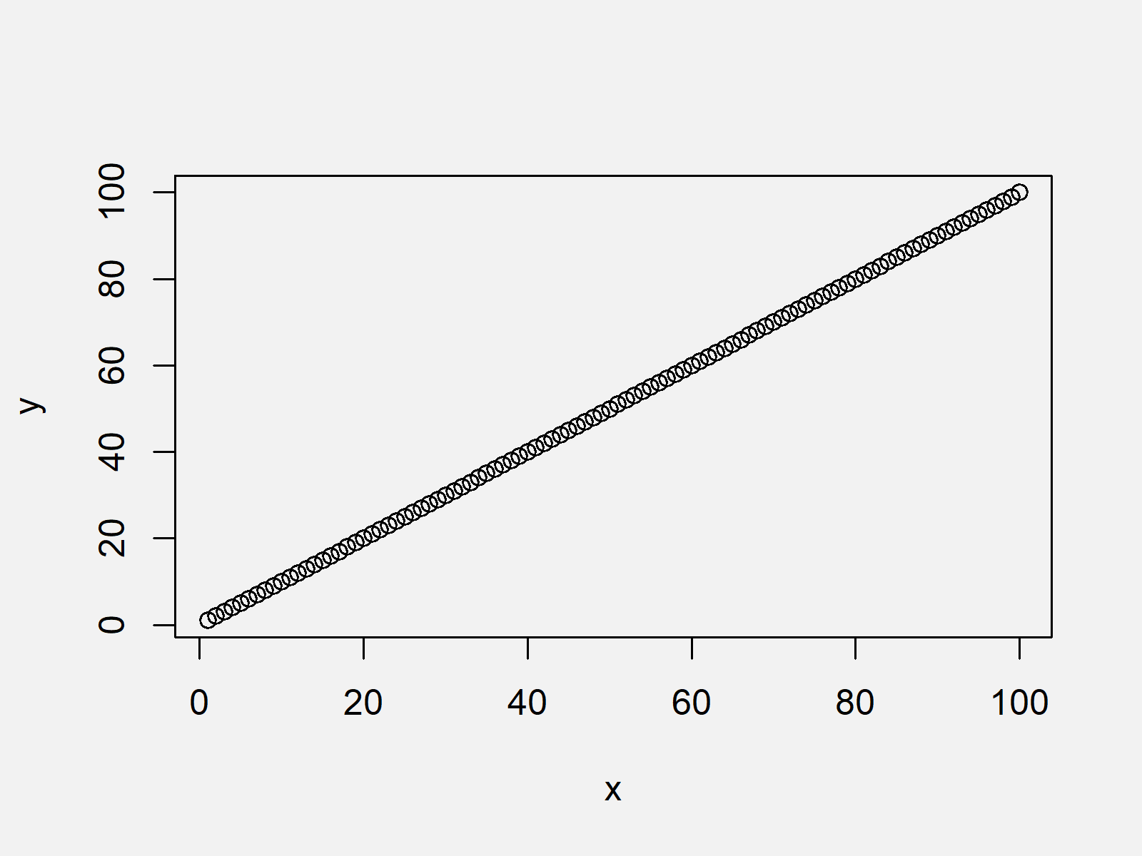
Figure 1 shows the output of the previous R code: A scatterplot with default axis ticks. In the following examples, I’ll show how to change the white space between those ticks manually…
Example 1: Change Spacing Between Axis Ticks Using xaxp & yaxp
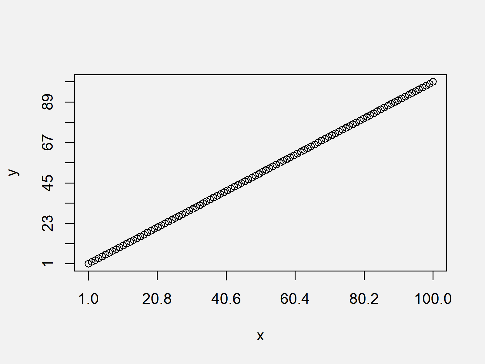
This Example shows how to adjust axis tick intervals based on the xaxp and yaxp arguments of the plot function. For each of these two arguments, we need to specify a vector with the first and last tick mark positions as well as with the number of ticks:
plot(x, y,        # Change axis ticks with xaxp & yaxp
     xaxp = c(1, 100, 5),
     yaxp = c(1, 100, 9))

As shown in Figure 2, we created a scatterplot with manually adjusted ticks on the x-axis and y-axis with the previously shown syntax.
Example 2: Change Spacing Between Axis Ticks Using axis() Function
The following R syntax shows how to change axis tick marks using the axis function. First, we have to create a plot without axis ticks. Second, we are adding ticks by applying the axis function:
plot(x, y,        # Change axis ticks with axis function
     xaxt = "n",
     yaxt = "n")
axis(side = 1, at = c(10, 50, 100))
axis(side = 2, at = c(25, 50, 75, 100))

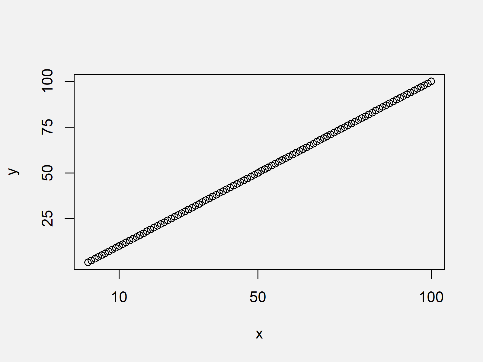
The output of the previous R syntax is shown in Figure 3: It shows the same xy-plot with axis tick marks at different positions.
Video, Further Resources & Summary
I have recently released a video on my YouTube channel, which explains the R programming syntax of the present post. Please find the video below.
Besides the video, you may want to read the other articles of my website:
- Replace X-Axis Values in R
- Remove Axis Values of Plot in Base R
- Rotate Axis Labels of Base R Plot
- axis() Function in R
- R Graphics Gallery
- The R Programming Language
In summary: In this article you learned how to adjust the interval between axis tick marks in the R programming language. If you have further questions, don’t hesitate to let me know in the comments below.


4 Comments. Leave new
how do you get the gird null to follow these extra ticks to get a higher density grid?
Hi Callum,
Have a look at Example 2. You can specify as many axis ticks for the “at” argument as you want.
Regards,
Joachim
How do we get them to have equal space, forexple in your last example, how can we have equal space between 0 to 10 and 10 to 50?
Hi Naz,
This would lead to a distorted graph, because 0-10 is a smaller range than 10-50. I’m not sure if it is possible to do that in the same graph.
However, you may have a look at graphs with axis breaks. See here, for more details: https://statisticsglobe.com/r-ggplot2-barplot-with-break-and-zoom-in-axis
I hope that helps!
Joachim