Customize Tooltip & Hover Text in ggplotly Graph in R (2 Examples)
Hi! This tutorial will show you how to modify the tooltip and hover text in a ggplotly graph in the R programming language.
Here is an overview:
Let’s get into the R code!
Install & Load plotly & ggplot2 Libraries
Here, we will install and load the plotly and ggplot2 R libraries. Therefore, run the lines of code below in your preferred R code editor or IDE to install and load both libraries:
# install plotly & ggplot2
install.packages(c("plotly", "ggplot2"))

# load plotly & ggplot2
library(plotly)

library(ggplot2)
Now that we have loaded both libraries into our R programming environment, we can build visualizations. However, we need a dataset to visualize.
Create Example Dataset
We will create an example dataset that we will use to build the visualization in this project. Run the the lines of code below to create and preview the example dataset:
df <- data.frame(
  cars = c("Toyota", "Mercedes", "Honda", "GMC", "Citron"),
  quantity = c(150, 100, 250, 200, 350)
)

print(df)

#      cars quantity
#1   Toyota      150
#2 Mercedes      100
#3    Honda      250
#4      GMC      200
#5   Citron      350
Great! We can now visualize the data.
Example 1: Build Basic Plot
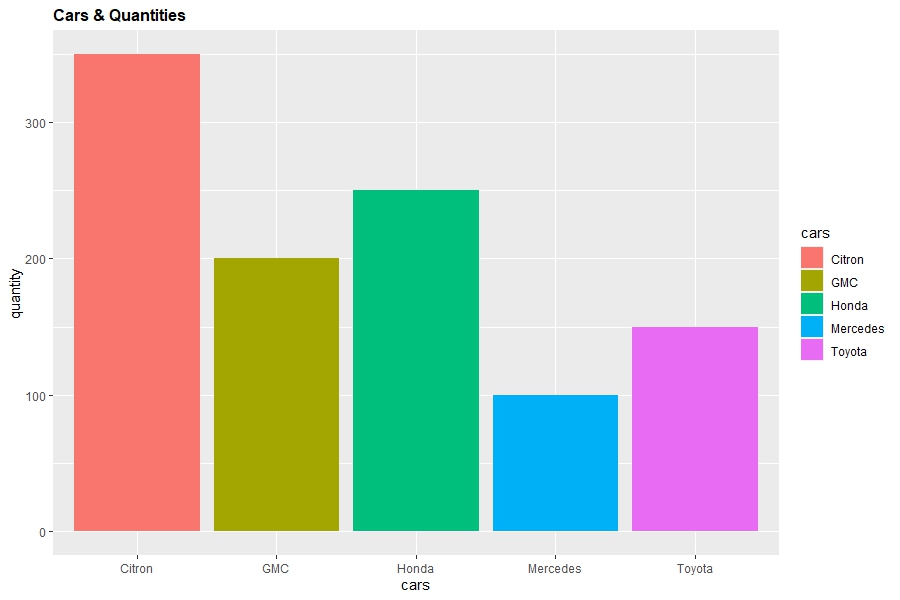
In this first example, we will build a basic and static bar plot that we will then convert into an interactive plotly visualization:
viz <- ggplot(df)+aes(x = cars, y = quantity, fill = cars)+geom_bar(stat = "identity")+
  labs(title = "Cars & Quantities") +
  theme(plot.title = element_text(size = 12,face = "bold"))

viz

In the above example, we start by passing the dataframe to the ggplot() function. Then, we use the aes() function to map the cars variable to the x-axis, the quantity variable to the y-axis, and to fill the bars with different colors based on cars.
We use the geom_bar() function to create the actual bar chart, with stat = "identity" indicating that the heights of the bars correspond directly to the quantity values.
Then the labs() function is used to set the title of the plot to "Cars & Quantities" and the theme() function customizes the appearance of the plot title by specifying its size and making it bold.
Finally, we display the plot by calling viz.
Now, to turn the static bar plot into an interactive plotly graph, we just need to run two lines of code as demonstrated below:
viz <- ggplotly(viz)

viz
What we simply did was to wrap the ggplot2 plot object in the ggplotly() function, which effectively turned the static plot into an interactive plotly object.
Now, you can hover over, zoom, or pan the plot. However, when you hover over the plot, you will notice that the cars column of the dataframe appears twice, at the top and at the bottom. We do not want that, and that is why we will make some adjustments in the next example.
Example 2: Modify Tooltip & Hover Text
In this second example, we will demonstrate how to customize the tooltip and hover text of the ggplotly graph above. We will make a slight adjustment to the code from the previous example in order to customize the hover text:
viz <- ggplot(df)+
       aes(x = cars, y = quantity, fill = cars, text = paste("<b>Cars:</b>",cars,"<br><b>Quantity:
           </b>",quantity))+geom_bar(stat = "identity")+
       labs(title = "Cars & Quantities") +
       theme(plot.title = element_text(size = 12,face = "bold"))

viz <- ggplotly(viz, tooltip = "text")

viz
Hovering over the plot, you would have noticed that the tooltip and hover text have been customized compared to the last example.
To customize the hover text, we defined the text = argument in the aes() function where we added HTML formatting to the hover text to make it bold.
Also, in the ggplotly() function, we defined the tooltip = argument as "text". By so doing, only the defined texts will be displayed in the tooltip.
By using these methods, you can fully customize the tooltip and hover text in your plot to meet your specific needs.
Video, Further Resources & Summary
Do you need more explanations on how to customize the tooltip and hover text in a ggplotly graph in R? Then you should have a look at the following YouTube video of the Statistics Globe YouTube channel.
In the video, we explain in some more detail how to customize the tooltip and hover text in a ggplotly graph in R.
The YouTube video will be added soon.
So, we have demonstrated how to adjust or modify the tooltip and hover text of a ggplotly graph in R. Furthermore, you could have a look at some of the other interesting plotly and ggplot2 tutorials on Statistics Globe:
- plotly Contour Plot in R (3 Examples)
- plotly Treemap in R (3 Examples)
- plotly Sunburst Chart in R (3 Examples)
- Set Axis Limits in ggplot2 R Plot (3 Examples)
- theme_test ggplot2 Theme in R (6 Examples)
- Introduction to R Programming
This post has shown how to customize the tooltip and hover text in a ggplotly graph in R. I hope you found it helpful! In case you have further questions, you may leave a comment below.
This page was created in collaboration with Ifeanyi Idiaye. You might check out Ifeanyi’s personal author page to read more about his academic background and the other articles he has written for the Statistics Globe website.


