Change Y-Axis to Percentage Points in ggplot2 Barplot in R (2 Examples)
In this R tutorial you’ll learn how to set the axis labels of a barchart in percentage points.
The tutorial contains this:
Let’s dive right into the examples…
Example Data, Packages & Basic Graphic
We’ll use the data below as basement for this R programming tutorial:
data <- data.frame(x = LETTERS[1:5],    # Example data
                   y = c(0.4, 0.7, 0.1, 0.3, 0.6))
data                                    # Print data
#   x   y
# 1 A 0.4
# 2 B 0.7
# 3 C 0.1
# 4 D 0.3
# 5 E 0.6
The previous output of the RStudio console shows that our example data has five rows and two columns.
If we want to use the functions of the ggplot2 package, we also have to install and load ggplot2:
install.packages("ggplot2")             # Install ggplot2 package
library("ggplot2")                      # Load ggplot2
Next, we can draw the example data.
ggp <- ggplot(data, aes(x, y)) +        # ggplot2 with default y-axis labels
  geom_bar(stat = "identity")
ggp                                     # Draw plot

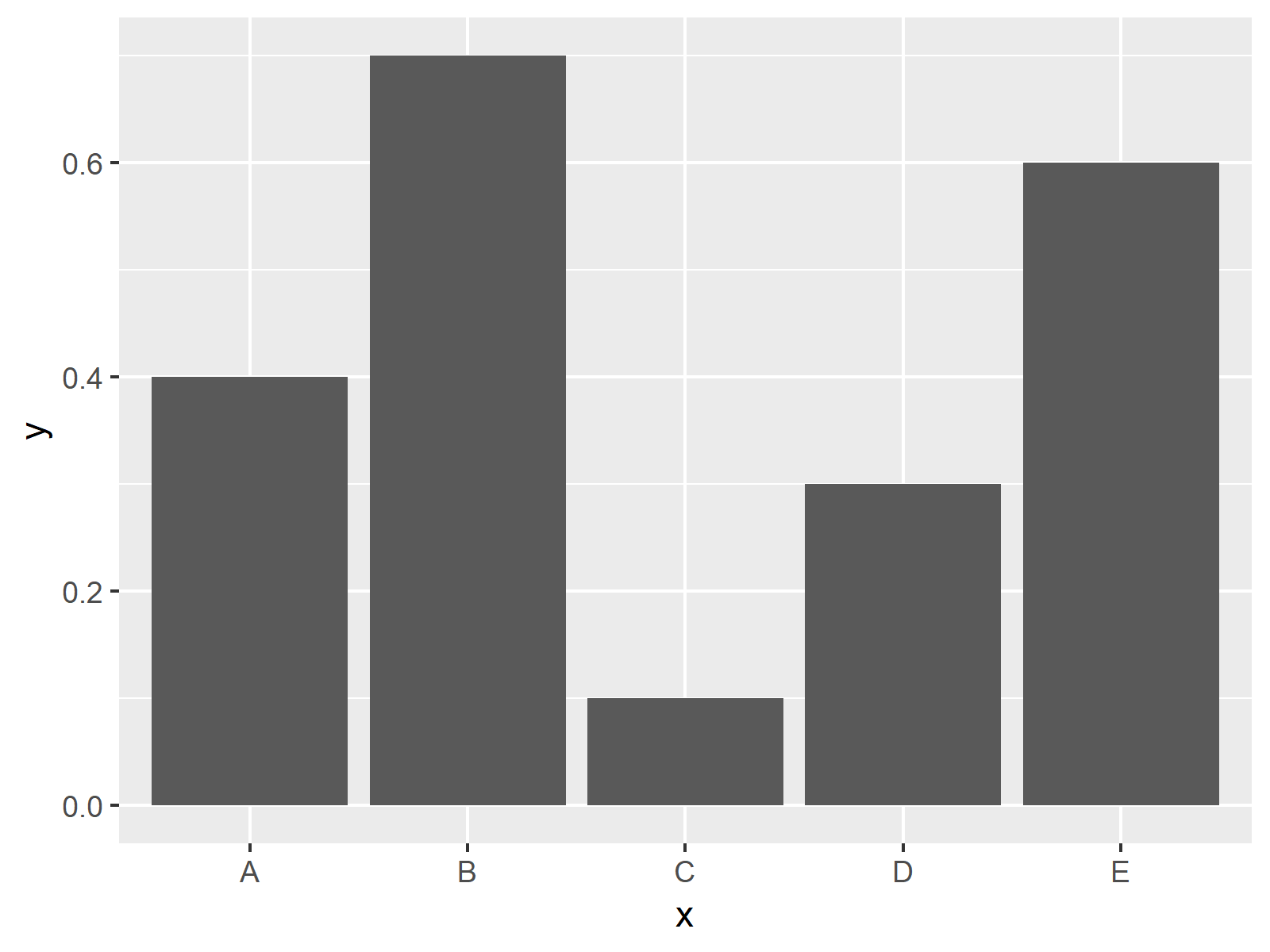
The output of the previous code is shown in Figure 1 – A ggplot2 barchart with default axis values.
Example 1: Set Y-Axis to Percent Using scale_y_continuous Function
In Example 1, I’ll show how to customize axis values of a barchart using the scale_y_continuous function. Have a look at the following R syntax and the resulting graphic:
ggp +                                   # Change y-axis to percent
  scale_y_continuous(labels = scales::percent)

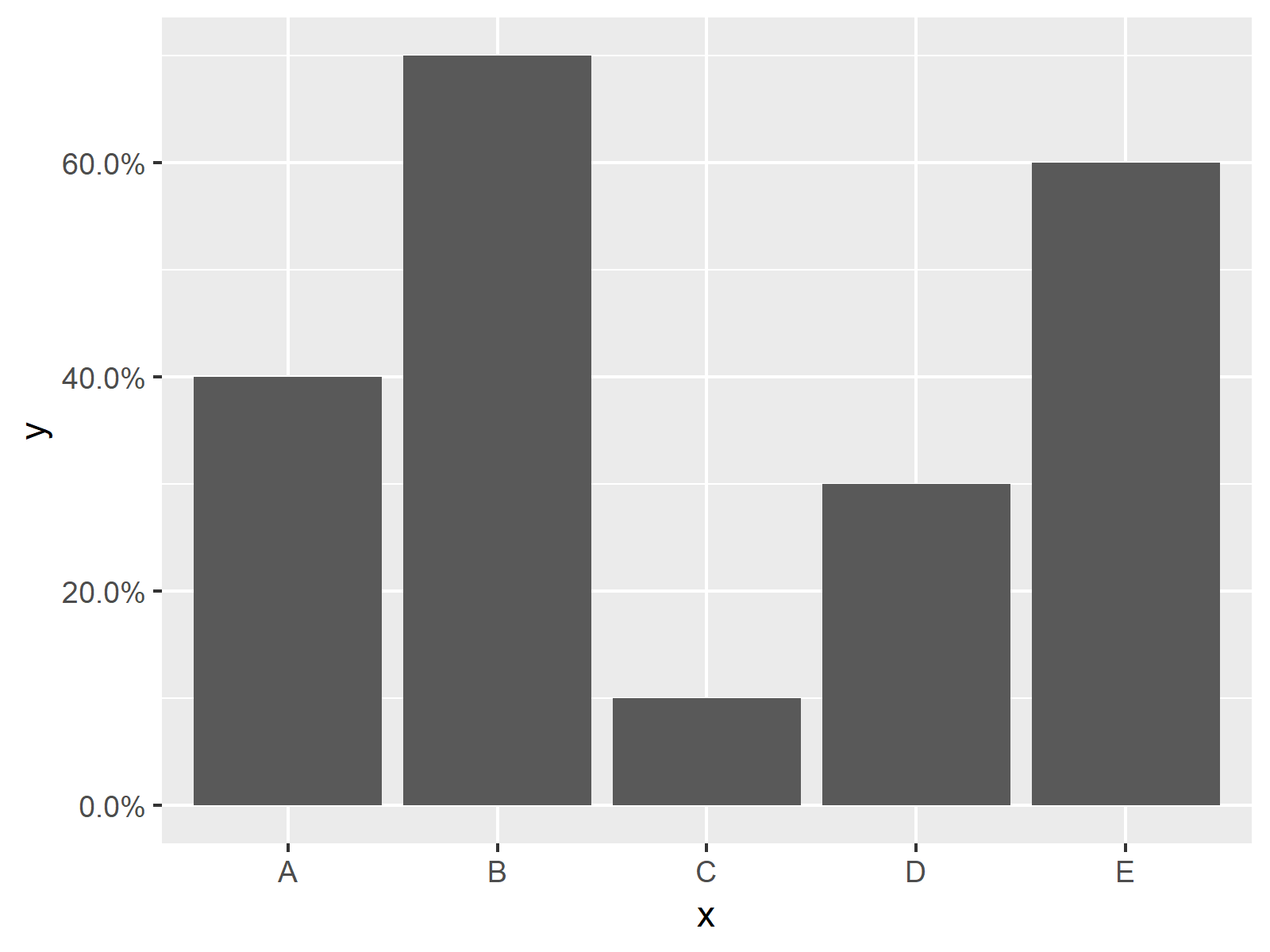
Figure 2 shows the output of the previously shown R syntax: A ggplot2 barchart with percentage points as y-axis labels.
You can also see that the percentage points are shown with one digit after the decimal point. In the next example, I’ll show how to change that…
Example 2: Set Y-Axis to Percent with User-Defined Accuracy
The following R programming syntax explains how to adjust the accuracy (i.e. how precise the percentage points are rounded) of the percentages on the y-axis:
ggp +                                   # Specify accuracy of y-axis
  scale_y_continuous(labels = scales::percent_format(accuracy = 1))

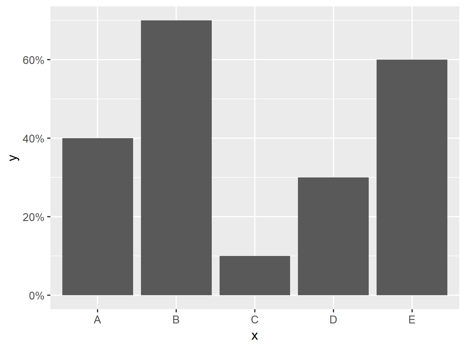
As illustrated in Figure 3, we plotted a barchart with percentage points rounded to zero digits.
Video & Further Resources
In case you want to learn more about the ggplot2 package and data visualization in R, please have a look at the following video tutorial, where I give a detailed introduction with different examples:
In addition, you may want to have a look at the related tutorials on this homepage:
- Plotting Categorical Variable with Percentage Points
- Change Formatting of Numbers of ggplot2 Plot Axis
- Adjust Space Between ggplot2 Axis Labels and Plot Area
- Rotate ggplot2 Axis Labels
- Set ggplot2 Axis Limit Only on One Side
- R Graphics Gallery
- The R Programming Language
At this point you should know how to adjust ggplot2 axis labels of a barplot to show relative proportion values in R.
Please note that a similar R code could also be applied to other types of ggplot2 graphics such as line plots or histograms.
If you have additional questions, don’t hesitate to let me know in the comments section.
Subscribe to the Statistics Globe Newsletter
Get regular updates on the latest tutorials, offers & news at Statistics Globe.
I hate spam & you may opt out anytime: Privacy Policy.
Thank you!
Welcome to the Statistics Globe newsletter. From now on, I’ll send you regular emails about statistics, data science, AI, and programming with R and Python.
I’m Joachim Schork. On this website, I provide statistics tutorials as well as code in Python and R programming.
Statistics Globe Newsletter
Get regular updates on the latest tutorials, offers & news at Statistics Globe. I hate spam & you may opt out anytime: Privacy Policy.
Thank you!
Please check your email inbox and click the confirmation link to complete your subscription. If you don’t see the email within a few minutes, please also check your spam/junk folder.


4 Comments. Leave new
Thanks for your great tutorials and videoes which are perfect for R dummies like me!
I’m using ggplot for a stacked bar chart. I want the Y axis to be in percentage and I also want the bars to start from the X axis. Since this is using two scale_y_continous lines (scale_y_continuous(expand=c(0,0)) and scale_y_continuous (labels = (scales::percent)), R won’t accept it. How can I solve this?
Thanks,
Michal
Hello Michal,
Sorry for the late response. Have you tried it this way?
ggp +
scale_y_continuous(labels = scales::percent, expand=c(0,0))
Regards,
Cansu
Simple yet elegant. How didn’t I think of that myself? Thanks!
Haha, it is always a bit tricky with ggplot. You are welcome 🙂