Display Only Integer Values on ggplot2 Axis in R (Example)
In this tutorial you’ll learn how to draw a ggplot2 axis containing only integers in R.
The content of the page is structured as follows:
Let’s dive right in.
Example Data, Packages & Default Plot
First, we’ll have to create some data that we can use in the examples later on:
set.seed(10821)                     # Create data
data <- data.frame(x = rnorm(100, 100, 2),
                   y = rnorm(100))
head(data)                          # Head of data
#           x           y
# 1 100.31996  1.45011641
# 2 101.13881  0.65336914
# 3  96.82407 -0.80131958
# 4 100.10791 -0.44847950
# 5  94.59277 -0.02716243
# 6 101.58426  1.48654344
As you can see based on the previous output of the RStudio console, our example data consists of two columns both containing random numeric values.
If we want to create a plot of our data with the ggplot2 add-on package, we also have to install and load ggplot2:
install.packages("ggplot2")         # Install & load ggplot2
library("ggplot2")
Next, we can plot our data:
ggp <- ggplot(data, aes(x, y)) +    # Create default ggplot2 graph
  geom_point()
ggp                                 # Print plot

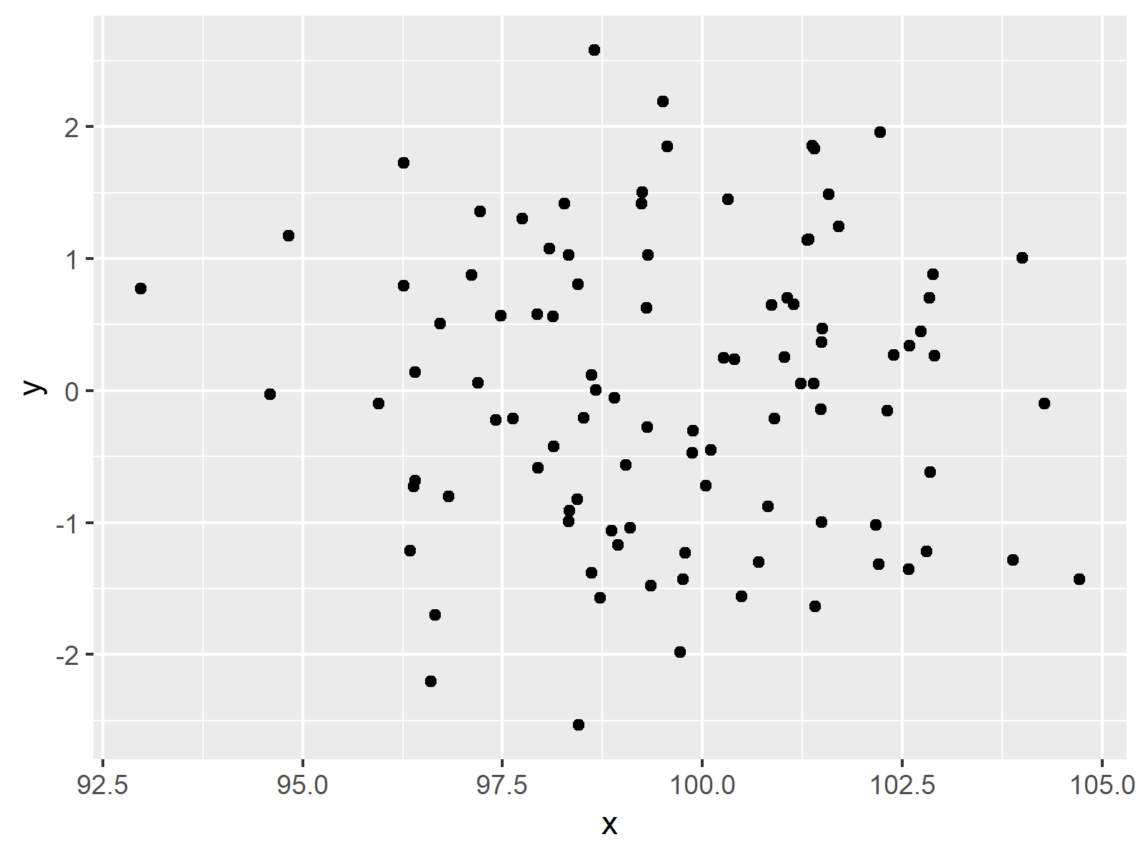
The output of the previous code is shown in Figure 1 – A default ggplot2 plot with non-integer values on the x-axis.
Example: Display Prettier Axis Values Using scales Package
This Example explains how to remove non-integer numbers from ggplot2 axes in R. First, we have to install and load the scales package:
install.packages("scales")         # Install & load scales
library("scales")
Now, we can use the pretty_breaks function of the scales package to modify our axis values.
ggp +                               # Improve scales
  scale_x_continuous(breaks = pretty_breaks())

As shown in Figure 2, the previous syntax created a ggplot2 scatterplot showing only integer numbers as axis breaks.
Video & Further Resources
Would you like to know more about the ggplot2 package? Then you may have a look at the following video of my YouTube channel. I explain how to use the ggplot2 package in much more detail:
Besides that, you may read the other tutorials of my website.
- Change Y-Axis to Percentage Points in ggplot2 Barplot
- Change Formatting of Numbers of ggplot2 Plot Axis
- Rotate ggplot2 Axis Labels
- Adjust Space Between ggplot2 Axis Labels and Plot Area
- R Graphics Gallery
- The R Programming Language
At this point you should know how to create a ggplot2 axis with only integer values in the R programming language. Let me know in the comments, if you have further questions.
Subscribe to the Statistics Globe Newsletter
Get regular updates on the latest tutorials, offers & news at Statistics Globe.
I hate spam & you may opt out anytime: Privacy Policy.
Thank you!
Welcome to the Statistics Globe newsletter. From now on, I’ll send you regular emails about statistics, data science, AI, and programming with R and Python.
I’m Joachim Schork. On this website, I provide statistics tutorials as well as code in Python and R programming.
Statistics Globe Newsletter
Get regular updates on the latest tutorials, offers & news at Statistics Globe. I hate spam & you may opt out anytime: Privacy Policy.
Thank you!
Please check your email inbox and click the confirmation link to complete your subscription. If you don’t see the email within a few minutes, please also check your spam/junk folder.


