Add Significance Level & Stars to Plot in R (Example) | ggsignif Package
In this tutorial, I’ll demonstrate how to annotate significance levels to a ggplot2 plot using the ggsignif package in the R programming language.
Table of contents:
Here’s how to do it:
Example 1: Draw Boxplot with Significance Stars
The following R code illustrates how to create a box-and-whisker plot with significance levels in the R programming language.
For this, we first have to create an exemplifying data set:
set.seed(567445)                                  # Create example data for boxplot
data_box <- data.frame(group = rep(LETTERS[1:4], each = 100),
                       value = c(rnorm(100),
                                 rnorm(100, 3),
                                 rnorm(100),
                                 rnorm(100, - 5)))
head(data_box)                                    # Print head of example data
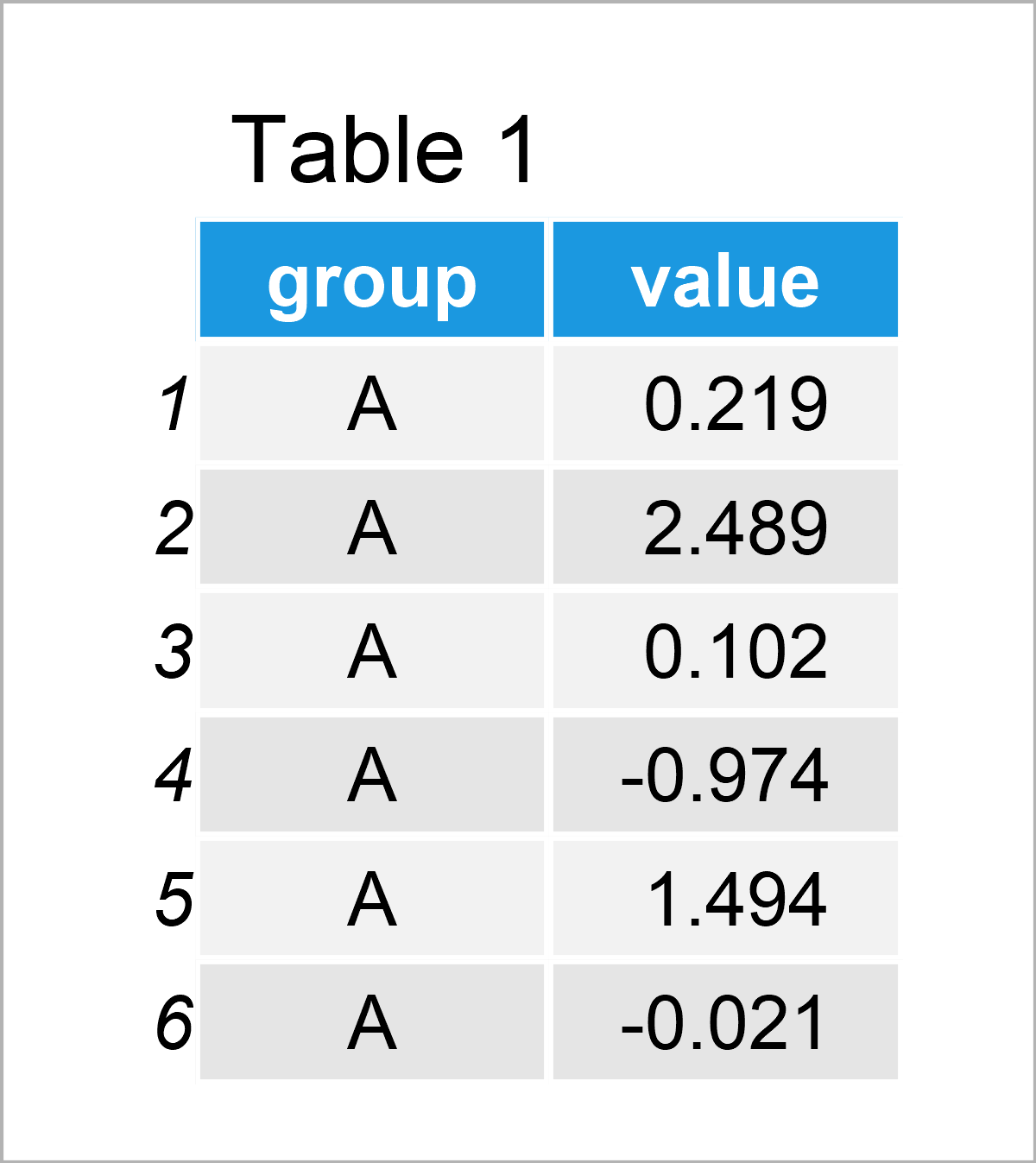
By running the previous R programming code, we have managed to create Table 1, i.e. a data frame containing 400 rows and the two columns called group and value.
In this tutorial, we will draw our data using the ggplot2 package. In order to use the functions of the ggplot2 package, we first need to install and load ggplot2.
install.packages("ggplot2")                       # Install ggplot2 package
library("ggplot2")                                # Load ggplot2 package
In the next step, we can draw a boxplot without significance levels using the code below:
ggp_box <- ggplot(data_box,                       # Create ggplot2 boxplot
                  aes(x = group,
                      y = value)) +
  geom_boxplot()
ggp_box                                           # Draw ggplot2 boxplot
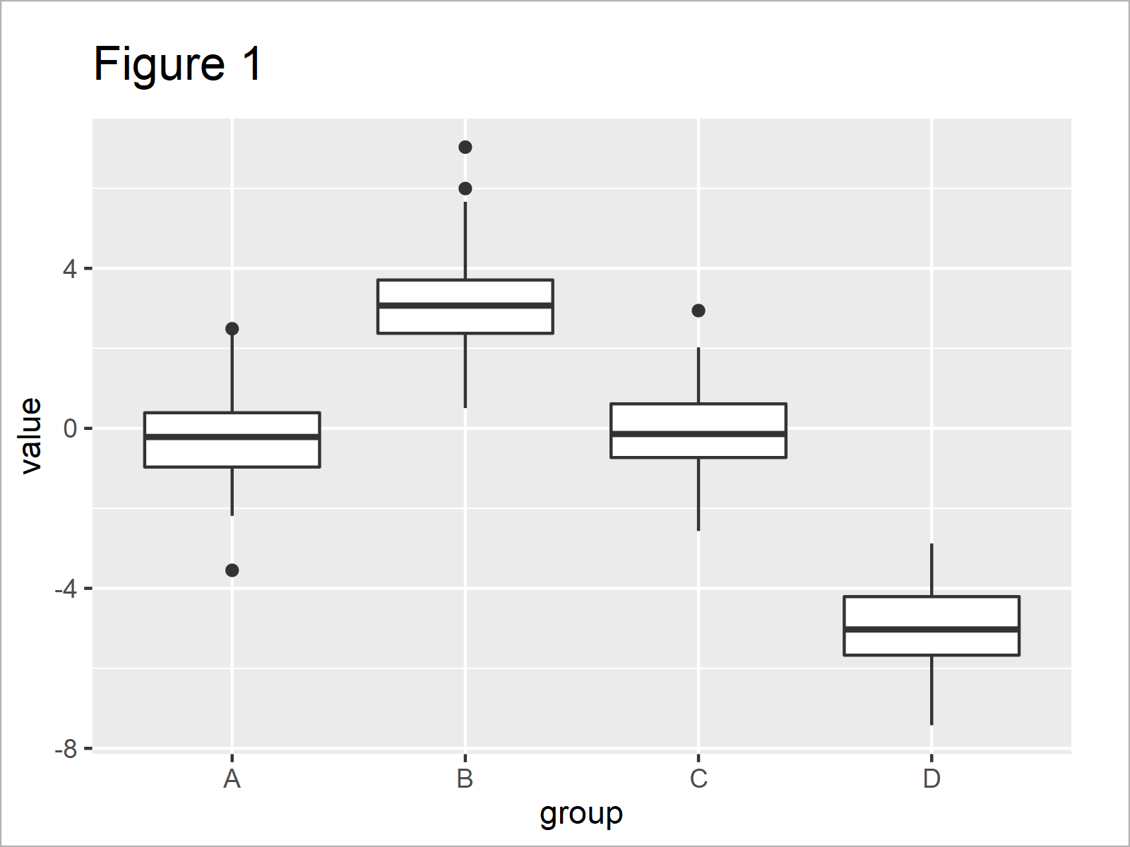
In Figure 1 you can see that we have plotted a boxplot showing the four groups in our example data in separate boxes.
Let’s assume that we want to test whether the different boxplots (i.e. the different groups in our data) are significantly different. Furthermore, let’s assume that we would like to add the significance levels to our graphic.
Then, we first have to install and load the ggsignif package.
install.packages("ggsignif")                      # Install ggsignif package
library("ggsignif")                               # Load ggsignif package
The ggsignif package, developed by Constantin Ahlmann-Eltze and Indrajeet Patil, allows you to enrich your ggplots2 graphs with group-wise comparisons.
To accomplish this, we can apply the geom_signif function (or alternatively the geom_stat function) as shown below. Within the geom_signif function, we have to specify the groups that we want to compare.
Let’s do this:
ggp_box +                                         # Add p-value to plot
  geom_signif(comparisons = list(c("A", "B")))
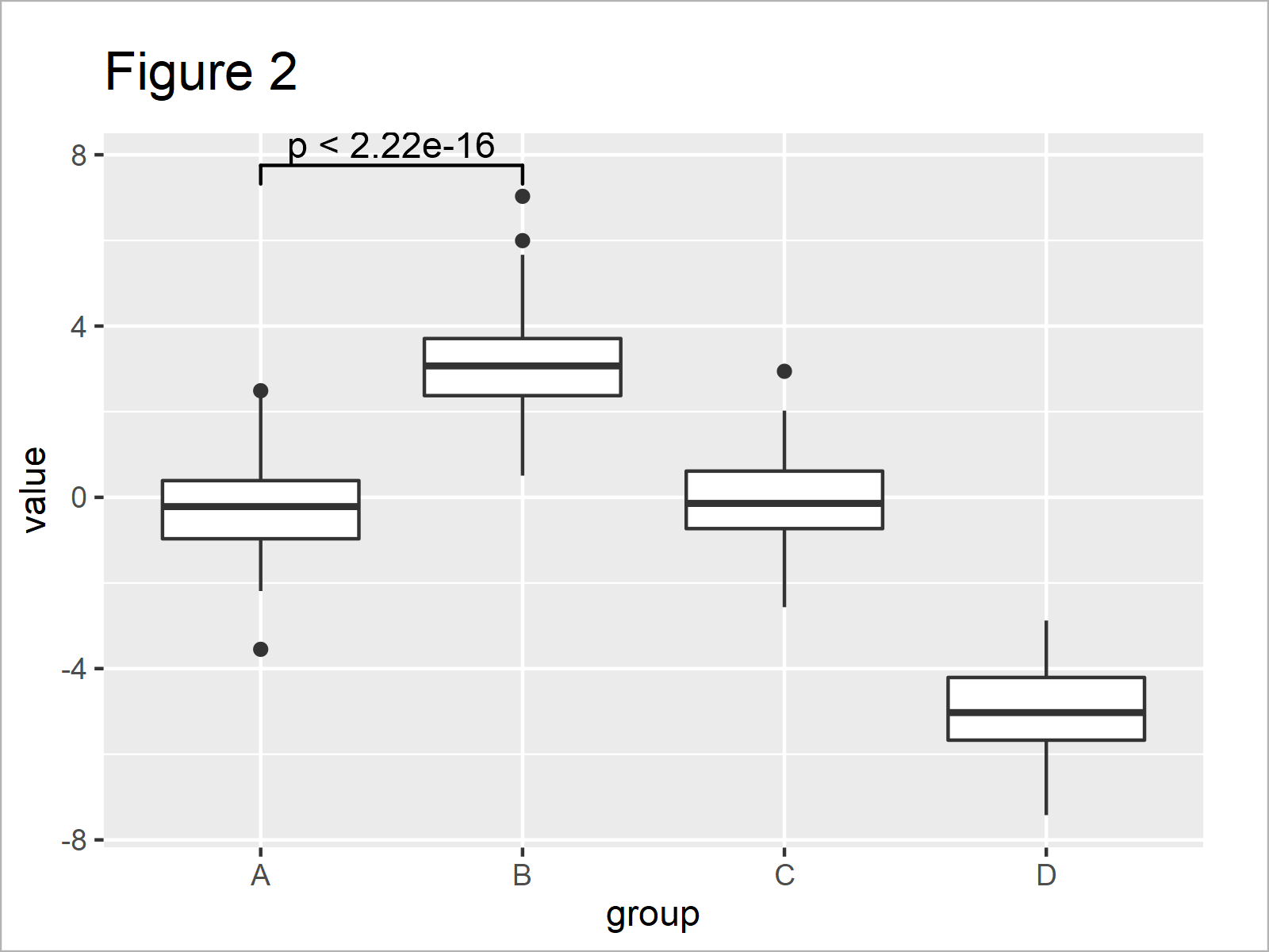
By executing the previous syntax, we have managed to create Figure 2, i.e. a ggplot2 boxplot with a significance level that compares the groups A and B.
In the previous plot, we have used the p-value to compare our groups. However, we may show significance stars instead by setting the map_signif_level argument to TRUE:
ggp_box +                                         # Add significance stars to plot
  geom_signif(comparisons = list(c("A", "B")),
              map_signif_level = TRUE)
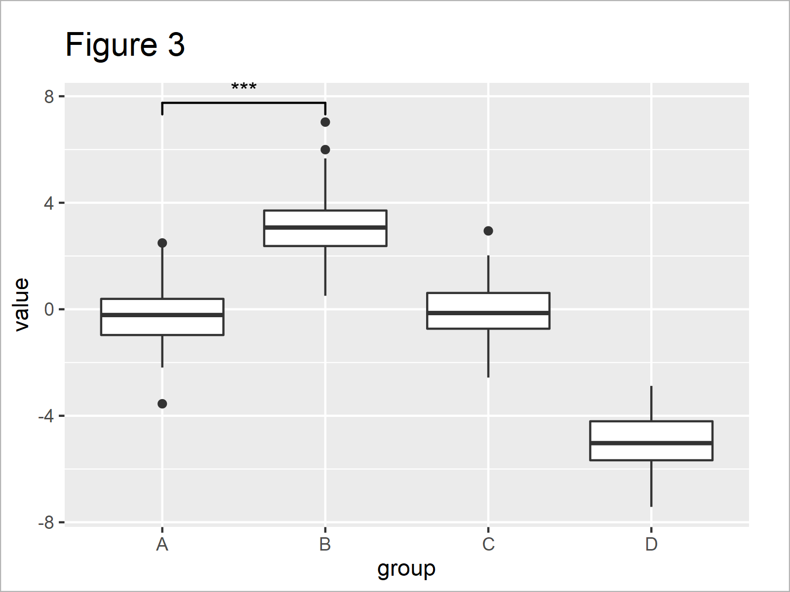
Figure 3 shows the output of the previous syntax – i.e. our boxplot with significance stars.
It is also possible to compare multiple groups at the same time. For this, we have to extend our comparison list, and to avoid a visual overlap we should also specify the y-axis positions where we want to show the significance stars:
ggp_box +                                         # Comparison of multiple boxplots
  geom_signif(comparisons = list(c("A", "B"),
                                 c("A", "C")),
              map_signif_level = TRUE,
              y_position = c(7.5, 9))
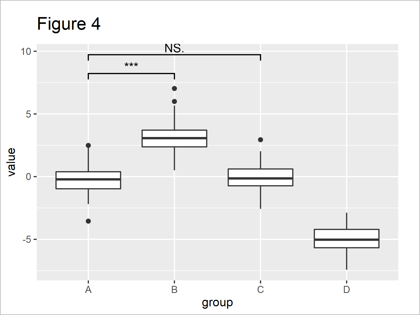
In Figure 4 you can see that we have created another version of our boxplot where the group A is compared simultaneously with the groups B and C.
The geom_signif function also enables the user to modify the design of the significance levels. For instance, we can change the color, line size, and text size as shown below:
ggp_box +                                         # Change design of significance levels
  geom_signif(comparisons = list(c("A", "B"),
                                 c("A", "C")),
              map_signif_level = TRUE,
              y_position = c(7.5, 9.5),
              col = 2,
              size = 2,
              textsize = 5) +
  ylim(- 8, 12)
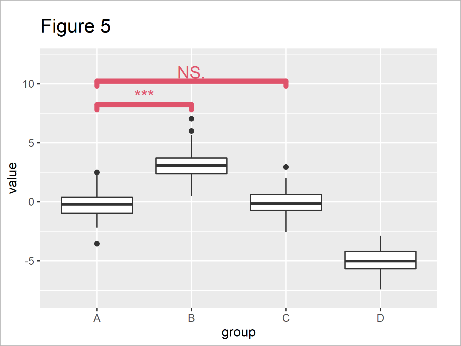
As you can see in Figure 5, we have increased the size of the significance levels, and we have changed the color to red.
Example 2: Draw Barplot with Significance Stars
In Example 1, I have shown how to annotate significance levels to a boxplot. However, it’s also possible to add significance levels to other types of graphs.
Example 2 demonstrates how to use the ggsignif package to add significance comparisons to a barplot.
First, we have to create another example data set:
data_bar <- data.frame(group = rep(LETTERS[1:3],  # Create example data for barplot
                                   each = 2),
                       subgroup = letters[1:2],
                       value = c(1, 1.1, 2, 1.2, 3.7, 4.2))
data_bar                                          # Print example data
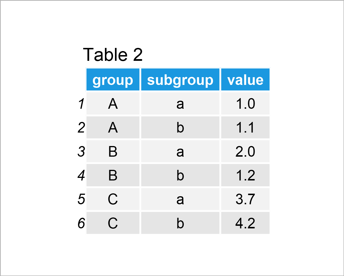
The output of the previous R syntax is visualized in Table 2: A data frame containing six rows and the variables group, subgroup, and value.
We can draw a grouped barchart of these data using the R syntax below:
ggp_bar <- ggplot(data_bar,                       # Create ggplot2 barplot
                  aes(x = group,
                      y = value)) +
  geom_bar(stat = "identity",
           position = "dodge",
           aes(fill = subgroup))
ggp_bar                                           # Draw ggplot2 barplot
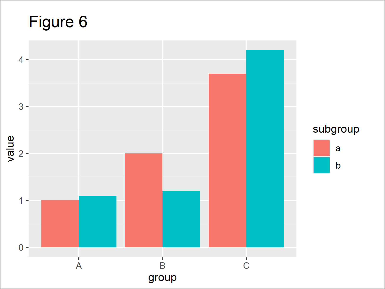
As revealed in Figure 6, the previous R syntax has created a grouped ggplot2 barchart.
Next, we can use the geom_signif function to annotate comparisons of the main groups to this graph:
ggp_bar +                                         # Add significance stars to barplot
  geom_signif(comparisons = list(c("A", "B")),
              map_signif_level = TRUE)
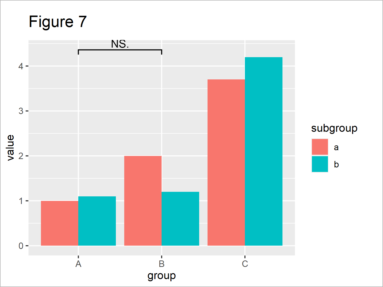
As shown in Figure 7, the previous R programming syntax has plotted a comparison between the main groups A and B on top of the previously created grouped barchart.
As you can see, this significance level indicates that the two groups are not significantly different. However, this non-significance might be due to the way how we have formatted our data.
Let’s assume that we know from a previously conducted data analysis that these two groups are, in fact, significantly different. Then, we might use the annotations argument within the geom_signif function to overwrite the default significance level:
ggp_bar +                                         # Change significance levels manually
  geom_signif(comparisons = list(c("A", "B")),
              map_signif_level = TRUE,
              annotations = c("***"))

After executing the previously shown R code the barplot with significance stars shown in Figure 8 has been plotted.
So far, we have only compared the main groups in our barchart. However, it’s also possible to add significance comparisons for the subgroups.
To achieve this, we can apply the geom_signif function twice – once for the main groups, and once for the subgroups.
Consider the R code below:
ggp_bar +                                         # Add significance levels for grouped barplot
  geom_signif(comparisons = list(c("A", "B")),
              map_signif_level = TRUE,
              annotations = c("***")) +
  geom_signif(stat = "identity",
              data = data.frame(x = c(0.7, 1.7, 2.7),
                                xend = c(1.3, 2.3, 3.3),
                                y = c(1.5, 2.5, 4.5),
                                annotation = c("NS.", "***", "*")),
              aes(x = x,
                  xend = xend,
                  y = y,
                  yend = y,
                  annotation = annotation))
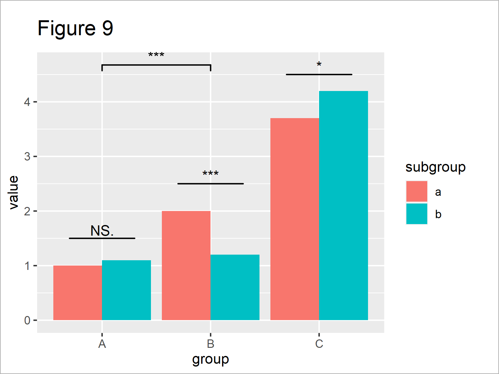
After running the previous R code the barplot you can see in Figure 9 has been created. We have drawn a comparison for the main groups A and B, as well as for all the subgroups.
Looks great, if you ask me! 🙂
Video, Further Resources & Summary
If you are interested in data visualization in R and the functions of the ggplot2 package, you have to watch the following video, where I explain the ggplot2 package in much more detail (beginners & advanced users).
In addition, you could have a look at some of the related tutorials which I have published on my homepage.
- Add Number of Observations by Group to ggplot2 Boxplot
- Draw Boxplot with Means in R
- Draw Multiple Boxplots in One Graph Side-by-Side
- Boxplots in R
- Draw Grouped Barplot in R
- Draw Stacked Barplot in R
- Barplots in R
- R Programming Overview
To summarize: In this R post you have learned how to put stars to a ggplot2 graphic to indicate the significance level. In case you have further questions, please tell me about it in the comments section.
Subscribe to the Statistics Globe Newsletter
Get regular updates on the latest tutorials, offers & news at Statistics Globe.
I hate spam & you may opt out anytime: Privacy Policy.
Thank you!
Welcome to the Statistics Globe newsletter. From now on, I’ll send you regular emails about statistics, data science, AI, and programming with R and Python.
I’m Joachim Schork. On this website, I provide statistics tutorials as well as code in Python and R programming.
Statistics Globe Newsletter
Get regular updates on the latest tutorials, offers & news at Statistics Globe. I hate spam & you may opt out anytime: Privacy Policy.
Thank you!
Please check your email inbox and click the confirmation link to complete your subscription. If you don’t see the email within a few minutes, please also check your spam/junk folder.


18 Comments. Leave new
Please dear Joachim Schork, you helped me too much and again i would like to get an information on where you used two geom_signif codes to compare groups and subgroups. Which numbers are in the x and xend in the second geom_siginf codes for subgroups p-values. Please, help me with this information.
Thank you ahead
Hey Somda,
Following up on your Facebook comments, I have done another research. I found this article, which seems to explain your question (especially the part on grouped barplots).
I hope this helps!
Joachim
How can I visually represent significant differences from a multiple comparisons t.test between 4 independent groups at 8 time points on a line plot? Basically, I want to add (*) to stat_summary(geom = “line”). I have been using ggpubr::compare_means to get the comparison results and then calling annotate() to manually adjust a vector of 8 x and y values to add a label of a,b,c,d,e,f. This is not a fast process but all the ggplot2 modifier packages are not compatible with geom_line. I’ve started using a sequence of ggpubr::stat_compare_means where each instance is a different group and manually adjusting the y position to stack the marks but this is not sophisticated.
I know what I want to do is get filter the highest y value (of the error bars) at each time point to transform by adding a fixed value for space for the label (a, b, c, d, e, or f ) above the error bar. The labels will need to be assigned to a comparison, then a logical applied to either is or is not significant and the correct label applied to the x and y at the properly spaced distance from the line.
I’m just not there in my coding life to write the code quickly and am a PhD student with too much work already. Can someone please write this code for me?
Hi Brandon,
Could you please share an image that looks like the one you want to create?
Regards,
Joachim
Hi Joachim,
Is this also possible for a stat = “count” plot? I encounter the error:
stat_signif requires the following missing aesthetics: y
Kind regards
Bente
Hey Bente,
Could you please share your entire code and explain the structure of your data set?
Regards,
Joachim
I Joachim,
I tried your method with my data but it doesn’t work. I think it’s because my x axis is composed of numeric data. I have this error message :
Error in `geom_signif()`:
! Problem while computing stat.
ℹ Error occurred in the 4th layer.
Caused by error in `setup_params()`:
! Can only handle data with groups that are plotted on the x-axis
I tried to put as.factor to x data but it still doesn’t works
I provide more details about my problem here https://stackoverflow.com/questions/76280724/how-to-draw-the-significance-level-in-plot-r
You can find there the reproductable code and the data I used.
Hello Barth,
The geom_signif() function is used to add significance brackets between groups in plots; it requires groups on the x-axis. Here, the x-axis is numerical (time frame), and you have applied a log transformation, which is why geom_signif() is not working as expected.
Here are two options:
Option 1: If you have specific groups in your data, you can convert the x-axis to a factor variable. Here’s an example:
Note that this will change the x-axis to a categorical variable, and the scale_x_log10() will no longer be applicable.
Option 2: If you still want to use a continuous x-axis, you may manually add lines and text to signify the significant difference. This is a workaround and might need adjustment depending on the actual data:
In this case, we’ve added a significance asterisk “***” manually between 5 and 10 on the log scale. You’ll need to adjust the y values and sizes according to your actual data and aesthetic preferences.
Please note that both these approaches are based on assumptions about your data and your specific use case. Always make sure that the statistical methods you’re using are appropriate for your data and your research question.
Regards,
Cansu
Thanks a lot Cansu !
Welcome!
Many thanks Joachim, this reduces a lot of hardcoding. However while using geom_signif, I have a feeling that we are working with a blackbox. How can we know what method it uses to calculate the stats? It seems the default is Wilcox test for paired samples. However if I want to use other tests, how I can find these options to other tests as well as I found geom_pwc similar to this. However it also doesnt specific what tests and limited to T_test and Wilcox tests only. Also it seems there is no option to do ANOVA also. Please correct me if Im wrong in saying that.
Hello,
Sorry, I was out of the office. That’s why I couldn’t respond back sooner. You can see the documentation to check what type of tests can be selected and how you can specify them. For geom_signif(), see here; for geom_pwc(), see here. You can not test Anova directly, unfortunately. However, you can use the anova function to perform the ANOVA test separately and then use the results to annotate your plot manually.
Best,
Cansu
also forgot to mention while facet for multiple plots it becomes very complex if you have different y axis ranges. If you could provide more info on this it would be very helpful.
Also look forward to a video on how to deal with outliers while plotting these types of data across multiple groups. Is there a sound rationale to omit outliers while plotting these graphs. Thankyou
Hello,
If you would like to know more about pairwise comparison in a faceted graph, please see the comments section of Draw Multiple Boxplots in One Graph in R Side-by-Side. There you will see my answer related to that. Unfortunately, we don’t have any separate tutorial regarding this yet. About the outliers, it is up to your professional judgment. If you think they do not carry any important information, you can omit them.
Best,
Cansu
Hello,
Would it be possible to change displayed P values from scientific notation to standard display mode? So far I tried to use solutions found here without any luck https://stackoverflow.com/questions/5352099/how-can-i-disable-scientific-notation The direct modification of “annotation =” or “map_signif_level=” was not succesfull. Thank you!
Best,
P.
Hello P,
Would something like this be helpful?
Best,
Cansu
Is there also a way to automatically do for example a t-test for the difference within the subgroups or do i have to ,,manually” add the significance levels for the subgroups here?
In my case I would be interested only if there is a difference in the subgroups, but not the main groups, is that possible?
Thank you in advance,
K
Hello Kathi,
If you would like to know more about pairwise comparison in a subgroup, please see my answer to John Mintziras in the comments section of Draw Multiple Boxplots in One Graph in R Side-by-Side. You will see there the visual and the respected code. I also copy the code here.
I hope it addresses your question.
Best,
Cansu